

Stop treating navigation bars like a layout mystery — Flexbox makes them predictable and quick to build.
In this step-by-step guide you’ll make a semantic HTML navbar, use CSS Flexbox to line up the logo and links, add a mobile-friendly hamburger with media queries, and wire a tiny JavaScript toggle to open and close the menu.
You’ll see working code for each step, know what success looks like at each breakpoint, and get quick fixes for common hiccups.
By the end you’ll have a responsive, accessible nav ready for any project.
Step 1: Set Up the Basic HTML Structure for the Navigation Menu

Start by building the skeleton for your navigation bar inside a simple HTML file. You’ll create a <nav> element, add a container for the logo, and include an unordered list for your navigation links. This structure keeps everything semantic and readable, which means screen readers and search engines understand your menu without extra work.
Inside the <nav>, place a <div> or <header> to hold your logo and the list. Each navigation item lives inside a <li> element, and each link is wrapped in an <a> tag. This setup is standard for marking up a navigation menu because it tells browsers and assistive tools exactly what role this section plays.
<nav class="navbar">
  <div class="logo">
    <a href="#">MyBrand</a>
  </div>
  <ul class="nav-links">
    <li><a href="#home">Home</a></li>
    <li><a href="#about">About</a></li>
    <li><a href="#services">Services</a></li>
    <li><a href="#contact">Contact</a></li>
  </ul>
  <div class="menu-toggle">
    <span></span>
    <span></span>
    <span></span>
  </div>
</nav>
The <nav class="navbar"> is your container for the entire navigation bar. The .navbar class will receive Flexbox rules in the next step.
.logo wraps your site name or logo image. Keeps branding separate from menu items.
<ul class="nav-links"> is an unordered list holding all the navigation links. This list will also become a flex container so the links arrange horizontally.
Each <li><a href="#">Link</a></li> wraps one navigation link. This structure is accessible and easy to style.
.menu-toggle is a placeholder for the hamburger icon. The three <span> elements will become the three horizontal bars you see on mobile menus.
Step 2: Apply Core CSS Flexbox Styling to Arrange the Navigation Items
Now turn the .navbar into a flex container so the logo and the navigation links sit side by side. Set display: flex on .navbar, then use justify-content: space-between to push the logo to the left and the links to the right. Add align-items: center to vertically center everything, which prevents the logo and menu from looking misaligned when one is taller than the other.
* {
  margin: 0;
  padding: 0;
  box-sizing: border-box;
}

body {
  font-family: 'Arial', sans-serif;
}

.navbar {
  display: flex;
  justify-content: space-between;
  align-items: center;
  background-color: #333;
  padding: 1rem 2rem;
  height: 70px;
}

.logo a {
  color: #fff;
  font-size: 1.5rem;
  text-decoration: none;
  font-weight: bold;
}

.nav-links {
  display: flex;
  list-style: none;
  gap: 2rem;
}

.nav-links li a {
  color: #fff;
  text-decoration: none;
  font-size: 1rem;
  transition: color 0.3s;
}

.nav-links li a:hover {
  color: #ff6347;
}

.menu-toggle {
  display: none;
  flex-direction: column;
  cursor: pointer;
}

.menu-toggle span {
  width: 25px;
  height: 3px;
  background-color: #fff;
  margin: 4px 0;
}
display: flex on .navbar makes the direct children (logo, nav-links, menu-toggle) flex items so they can line up horizontally.
justify-content: space-between spreads items across the main axis with the logo at the start and the nav-links at the end, leaving space in between.
align-items: center aligns all flex items along the vertical (cross) axis so the logo and links sit centered in the 70px tall navbar.
display: flex on .nav-links turns the list into a flex container so the <li> elements arrange in a row instead of stacking vertically.
gap: 2rem adds consistent spacing between each navigation link without using margins on individual items.
display: none on .menu-toggle hides the hamburger icon on desktop screens. You’ll reveal it in the next step when the screen is narrow enough for mobile layout.
Step 3: Make the Navigation Bar Fully Responsive with Media Queries

Add a media query to detect when the screen width drops below a certain point, then change the layout so the navigation links stack vertically instead of sitting in a row. A common breakpoint is 768px (tablets and smaller) or 600px (larger phones). Inside the media query, hide the horizontal nav-links by default, switch them to flex-direction: column, and show the hamburger toggle so users can tap it to reveal the menu.
@media (max-width: 768px) {
  .menu-toggle {
    display: flex;
  }

  .nav-links {
    position: absolute;
    top: 70px;
    left: 0;
    width: 100%;
    background-color: #333;
    flex-direction: column;
    align-items: center;
    gap: 0;
    max-height: 0;
    overflow: hidden;
    transition: max-height 0.3s ease;
  }

  .nav-links.active {
    max-height: 300px;
  }

  .nav-links li {
    width: 100%;
    text-align: center;
    padding: 1rem 0;
    border-top: 1px solid #444;
  }
}
@media (max-width: 768px) applies these rules when the viewport is 768 pixels wide or narrower, targeting tablets and phones.
display: flex on .menu-toggle reveals the hamburger icon so users know they can tap it to open the menu.
flex-direction: column on .nav-links stacks the navigation items vertically instead of arranging them in a row.
The max-height transition trick starts at 0 to hide the menu, then expands to 300px when the .active class is added, creating a smooth slide down effect without JavaScript animations.
Step 4: Build and Style a Hamburger Menu for Mobile Devices

The hamburger icon is three horizontal lines that sit in the top right corner on small screens. You already added the HTML structure (three <span> elements inside .menu-toggle), and you set .menu-toggle to display: flex; flex-direction: column in the media query. Now style the spans so they look like menu bars, and add spacing between them using the margin property or the gap property on the parent.
When a user taps the hamburger, you’ll toggle a class (.active) on the .nav-links element. That class changes max-height from 0 to a larger value, revealing the menu. You can also animate the hamburger bars themselves so the top and bottom bars rotate into an “X” shape when the menu is open, giving users a clear visual cue that tapping again will close the menu.
.menu-toggle {
  display: none;
  flex-direction: column;
  cursor: pointer;
  gap: 4px;
}

.menu-toggle span {
  width: 25px;
  height: 3px;
  background-color: #fff;
  transition: transform 0.3s, opacity 0.3s;
}

.menu-toggle.active span:nth-child(1) {
  transform: rotate(45deg) translate(5px, 5px);
}

.menu-toggle.active span:nth-child(2) {
  opacity: 0;
}

.menu-toggle.active span:nth-child(3) {
  transform: rotate(-45deg) translate(7px, -7px);
}
Set .menu-toggle to display: none by default. This keeps the hamburger hidden on desktop screens where the full menu is always visible.
Use flex-direction: column and gap to stack the three bars. This creates the classic three line hamburger icon without manual margins.
Add cursor: pointer. Changes the cursor to a hand when hovering over the icon, signaling that it’s clickable.
Transition the bars using transform and opacity transitions so the hamburger smoothly morphs into an “X” when the menu is open.
Apply .active class transforms. Rotate the first and third bars, hide the middle bar, and position them so they form a cross, giving users a clear “close” icon.
Step 5: Add JavaScript Interactivity to Toggle the Menu

Use a small JavaScript snippet to listen for clicks on the .menu-toggle element. When a click happens, toggle the .active class on both .menu-toggle (to animate the hamburger into an X) and .nav-links (to slide the menu open or closed). This keeps the logic simple and lets CSS handle the animations through the classes you already defined.
const menuToggle = document.querySelector('.menu-toggle');
const navLinks = document.querySelector('.nav-links');

menuToggle.addEventListener('click', () => {
  menuToggle.classList.toggle('active');
  navLinks.classList.toggle('active');
});
document.querySelector grabs the first element matching the selector. Here you select .menu-toggle and .nav-links so you can manipulate them.
addEventListener('click', ...) waits for a click event on the hamburger icon, then runs the function inside.
classList.toggle('active') adds the active class if it’s missing, or removes it if it’s already there. Makes the same button open and close the menu.
Why toggle both elements? Toggling active on .menu-toggle rotates the bars into an X. Toggling it on .nav-links changes max-height so the menu slides down or up.
Step 6: Visual Examples of the Navigation Menu at Different Screen Sizes
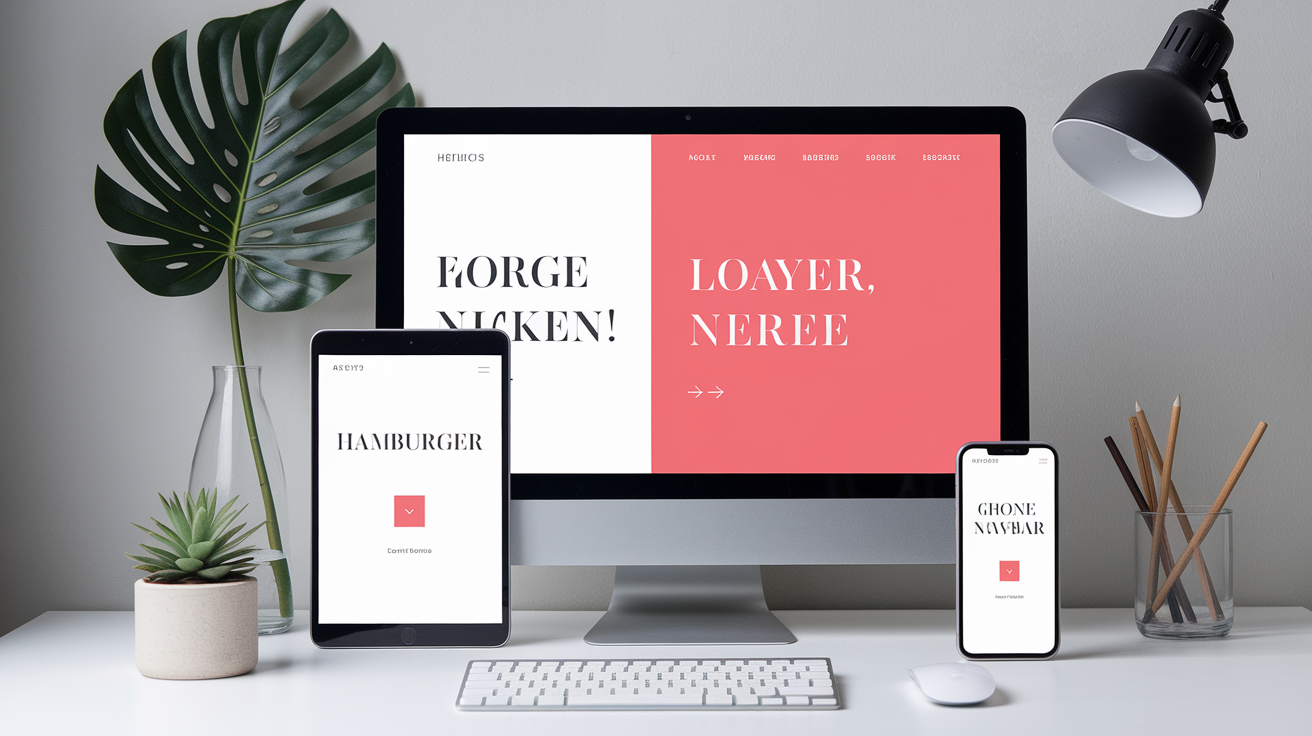
On a wide desktop screen, the navigation bar displays as a single horizontal row. The logo sits on the left, the navigation links (Home, About, Services, Contact) line up on the right with even spacing between them, and the hamburger icon is completely hidden. Users see all their navigation options at once, and they can click any link without opening a menu.
When the screen shrinks below 768 pixels wide (tablet or large phone), the hamburger icon appears in the top right corner. The horizontal navigation links disappear from view, hidden by the max-height: 0 rule. When a user taps the hamburger, the menu slides down below the navbar, showing all links stacked vertically.
Each link takes the full width of the screen, and tapping any link navigates to that section. Tapping the hamburger again (now an X) collapses the menu back up.
Desktop (above 768px): Logo on the left, horizontal links on the right, no hamburger icon visible. Everything stays in one row.
Tablet/Mobile (768px and below): Logo on the left, hamburger icon on the right, navigation links hidden until the user taps the icon. Links stack vertically when revealed.
Active mobile menu: Hamburger bars rotate into an X, menu slides down with links centered and stacked, each link has a border separating it from the next.
Step 7: Complete Code Reference (HTML, CSS, JS Combined)

Here’s the full working code in one place so you can copy it into your project. Save the HTML as index.html, paste the CSS inside a <style> tag in the <head> or in an external styles.css file, and place the JavaScript at the bottom of the <body> or in a separate script.js file. This complete example includes all the structure, styling, and interactivity you need to get a responsive Flexbox navigation bar running right away.
<!DOCTYPE html>
<html lang="en">
<head>
  <meta charset="UTF-8">
  <meta name="viewport" content="width=device-width, initial-scale=1.0">
  <title>Responsive Flexbox Navbar</title>
  <style>
    * {
      margin: 0;
      padding: 0;
      box-sizing: border-box;
    }

    body {
      font-family: 'Arial', sans-serif;
    }

    .navbar {
      display: flex;
      justify-content: space-between;
      align-items: center;
      background-color: #333;
      padding: 1rem 2rem;
      height: 70px;
    }

    .logo a {
      color: #fff;
      font-size: 1.5rem;
      text-decoration: none;
      font-weight: bold;
    }

    .nav-links {
      display: flex;
      list-style: none;
      gap: 2rem;
    }

    .nav-links li a {
      color: #fff;
      text-decoration: none;
      font-size: 1rem;
      transition: color 0.3s;
    }

    .nav-links li a:hover {
      color: #ff6347;
    }

    .menu-toggle {
      display: none;
      flex-direction: column;
      cursor: pointer;
      gap: 4px;
    }

    .menu-toggle span {
      width: 25px;
      height: 3px;
      background-color: #fff;
      transition: transform 0.3s, opacity 0.3s;
    }

    @media (max-width: 768px) {
      .menu-toggle {
        display: flex;
      }

      .nav-links {
        position: absolute;
        top: 70px;
        left: 0;
        width: 100%;
        background-color: #333;
        flex-direction: column;
        align-items: center;
        gap: 0;
        max-height: 0;
        overflow: hidden;
        transition: max-height 0.3s ease;
      }

      .nav-links.active {
        max-height: 300px;
      }

      .nav-links li {
        width: 100%;
        text-align: center;
        padding: 1rem 0;
        border-top: 1px solid #444;
      }

      .menu-toggle.active span:nth-child(1) {
        transform: rotate(45deg) translate(5px, 5px);
      }

      .menu-toggle.active span:nth-child(2) {
        opacity: 0;
      }

      .menu-toggle.active span:nth-child(3) {
        transform: rotate(-45deg) translate(7px, -7px);
      }
    }
  </style>
</head>
<body>
  <nav class="navbar">
    <div class="logo">
      <a href="#">MyBrand</a>
    </div>
    <ul class="nav-links">
      <li><a href="#home">Home</a></li>
      <li><a href="#about">About</a></li>
      <li><a href="#services">Services</a></li>
      <li><a href="#contact">Contact</a></li>
    </ul>
    <div class="menu-toggle">
      <span></span>
      <span></span>
      <span></span>
    </div>
  </nav>

  <script>
    const menuToggle = document.querySelector('.menu-toggle');
    const navLinks = document.querySelector('.nav-links');

    menuToggle.addEventListener('click', () => {
      menuToggle.classList.toggle('active');
      navLinks.classList.toggle('active');
    });
  </script>
</body>
</html>
Step 8: How to Use and Expand Your Responsive Flexbox Navigation Bar
Drop this code into any HTML file and open it in your browser to see the navbar in action. Resize the browser window to watch the layout switch from horizontal to vertical, and click the hamburger to test the menu toggle. If you’re building a multi-page site, replace the #home, #about anchors with real page paths like about.html or services.html so the links navigate correctly.
You can customize colors, fonts, and spacing by editing the CSS variables or the property values directly. Change background-color: #333 to match your brand, swap Arial for a Google Font import, or adjust gap: 2rem to tighten or loosen the spacing between links. If you want the navbar to stick to the top of the page as users scroll, add position: fixed; top: 0; width: 100%; z-index: 1000; to .navbar.
You can add dropdown menus by nesting a second <ul> inside a <li>, set it to position: absolute, and toggle visibility on hover or click.
Include icons using a library like Font Awesome or Feather Icons and place <i> elements next to link text for visual cues.
Improve accessibility by adding aria-label="Main navigation" to the <nav>, use aria-expanded on the hamburger to announce menu state, and make sure focus styles are visible with outline rules.
Animate the menu slide by replacing the max-height trick with a CSS transform: translateY(-100%) animation for smoother performance.
Add a search bar by inserting an <input type="search"> inside the .nav-links list, give it flex: 1 so it grows, and style it to match your theme.
Final Words
We jumped straight into the build: set up semantic HTML, turned the nav into a flex container, added breakpoints, built a hamburger, wired a small JS toggle, and combined everything into a final snippet.
Each step showed what to change and what you should see, like a horizontal menu on desktop and a stacked, toggleable menu on mobile. If something breaks, retrace the markup, flex rules, and the toggle listener.
Now you can build a responsive navigation bar with css flexbox step by step, tweak styles, and add extras like animations or improved accessibility. Keep experimenting, you’ve got a reusable pattern to rely on.
FAQ
Q: How to make a responsive navbar with Flexbox?
A: A responsive navbar built with Flexbox uses semantic nav and ul markup, display:flex for horizontal layout, flex-wrap or media queries to stack items, plus a hamburger toggle (CSS or JS) for small screens.
Q: How do you create a responsive navigation bar using CSS?
A: Creating a responsive navigation bar using CSS starts with nav+ul HTML, Flexbox for alignment, media queries at breakpoints to change layout, and a hamburger button plus simple JS to open and close the menu.