

Think a portfolio needs JavaScript or fancy frameworks to look professional?
You’d be surprised.
You can build a fast, clean, responsive portfolio using only HTML and CSS.
In this step-by-step guide we’ll set up the files, write semantic HTML, and style layouts with Flexbox and Grid so your work reads well on phones and big screens.
No backend, no build tools, just two files you can open in a browser.
Ready to build something that actually shows your skills?
Overview of Building a Responsive Portfolio with HTML and CSS
A responsive portfolio website is your personal showcase that works on any screen, phone to desktop. You build it with HTML for structure and CSS for layout, colors, and spacing. Sticking with just HTML and CSS keeps things beginner-friendly, fast, and simple. No JavaScript or backend to juggle yet.
HTML gives you the bones: headers, navigation, sections, forms. CSS handles the visual stuff and makes everything adapt to different screen widths. When you design responsively, you’re using flexible layouts, scalable fonts, and media queries to shift elements around so the site stays readable and usable whether someone’s on a tiny phone or a 27-inch monitor.
A typical portfolio includes:
Header and navigation – your logo or name plus links to other sections
Hero – big introductory banner with your name, title, maybe a call-to-action or social links
About – short bio, photo, description of your skills or experience
Work or Projects – showcases your best work with images, logos, or links
Contact – a form or contact details so visitors can reach you
Testimonials or Academic Qualifications (optional) – adds credibility with peer reviews or education details
Footer – copyright info, extra links, or social icons
At the file level, you’ll create two main files: index.html holds the content, styles.css holds all the styling rules. You might also add an /assets folder for images, icons, or other media. That’s the foundation. Simple, organized, and ready to scale as you add more sections or polish later.
Pros and Cons of Creating a Portfolio with HTML and CSS Only

Building a portfolio with pure HTML and CSS has clear benefits and some trade-offs. If you’re learning to code or want a fast, clean site, starting without JavaScript makes sense. But you’ll give up certain interactive features unless you add scripting later.
Pros:
Fast load times – no heavy JavaScript frameworks or libraries slow down the site
Easy to learn – HTML and CSS are the first languages most developers learn
Simple to host – static files work on GitHub Pages, Netlify, or any basic web server
Good accessibility – semantic HTML and simple styles improve screen-reader compatibility
Portable and maintainable – all your code sits in a few readable files
Cons:
Limited interactivity – no dynamic forms, animated modals, or live filtering without JavaScript
Manual updates – you edit HTML directly to add new projects or change content
No server integration – can’t connect to databases or send form data without backend code or a third‑party service
Basic animations – CSS can do transitions and keyframe effects, but complex interactions need JS
Less impressive polish – clients or employers may expect fancier effects that require scripting
Understanding HTML Structure for a Responsive Portfolio

A clean, semantic HTML structure makes your portfolio easier to read, easier to style, and easier for search engines or assistive tech to understand. Semantic HTML5 elements like <header>, <nav>, <main>, <section>, and <footer> tell browsers and screen readers what each part of your page does. You’re not relying on generic <div> tags for everything.
Start with the required HTML boilerplate at the top of index.html. That’s <!DOCTYPE html> to signal HTML5, then <html lang="en"> to set the language. Inside <head>, include <meta charset="UTF-8"> so characters render correctly and <meta name="viewport" content="width=device-width, initial-scale=1.0"> so mobile browsers scale the page properly instead of zooming out to desktop width. Add a <title> for the browser tab and link your CSS file with <link rel="stylesheet" href="styles.css">.
Your required HTML elements for a basic portfolio:
<header> – wraps your site logo or name and the main navigation
<nav> – holds navigation links (Home, About, Work, Contact)
<main> – wraps the primary content sections, one per page
<section> – each major block (Hero, About, Work, Contact) gets its own section
<form> – inside the Contact section, with <input> for name and email, <textarea> for message, and a submit button (4 form controls total)
<footer> – at the bottom, typically holds copyright or extra links
If your Contact form needs to be functional, you’ll point the action attribute to a backend endpoint or a service like Formspree. For now, you can leave it pointing to # as a placeholder while you build the layout.
Key CSS Layout Techniques for a Responsive Portfolio

CSS layout tools give you control over how sections arrange themselves at different screen sizes. The most common techniques are Flexbox, Grid, and responsive spacing systems. You’ll also use a CSS reset to eliminate browser inconsistencies and wrappers to keep content readable on wide screens.
A CSS reset removes default margins and padding so every browser starts from the same baseline. Most resets include * { margin: 0; padding: 0; box-sizing: border-box; } to apply consistent spacing and make width/height calculations predictable. Once the reset is in place, you can build your layout using Flexbox for one‑dimensional arrangements (like a horizontal nav bar or a row of social icons) and Grid for two‑dimensional layouts like a gallery of project cards.
Responsive spacing and typography often rely on CSS custom properties (variables). A Utopia-based system uses variables like --step-5 for large headings and --step-1 for small text, with values that scale automatically based on viewport width. You can also define spacing variables for margins and padding to keep rhythm consistent across the site. Wrappers (classes like .wrapper or .wrapper_inner) constrain the maximum width of content and center it horizontally, preventing text from stretching across a huge monitor.
| Technique | Use Case | Benefit |
|---|---|---|
| Flexbox | Navigation menus, social-icon rows, button groups | Simple one‑direction alignment and spacing |
| Grid | Project galleries, card layouts, multi‑column sections | Two‑dimensional control over rows and columns |
| Utopia variables | Font sizes and spacing that scale with viewport | Automatic responsiveness without many media queries |
| Wrappers | Constraining content width on large screens | Improves readability and centers content |
Essential Components of a Portfolio Website
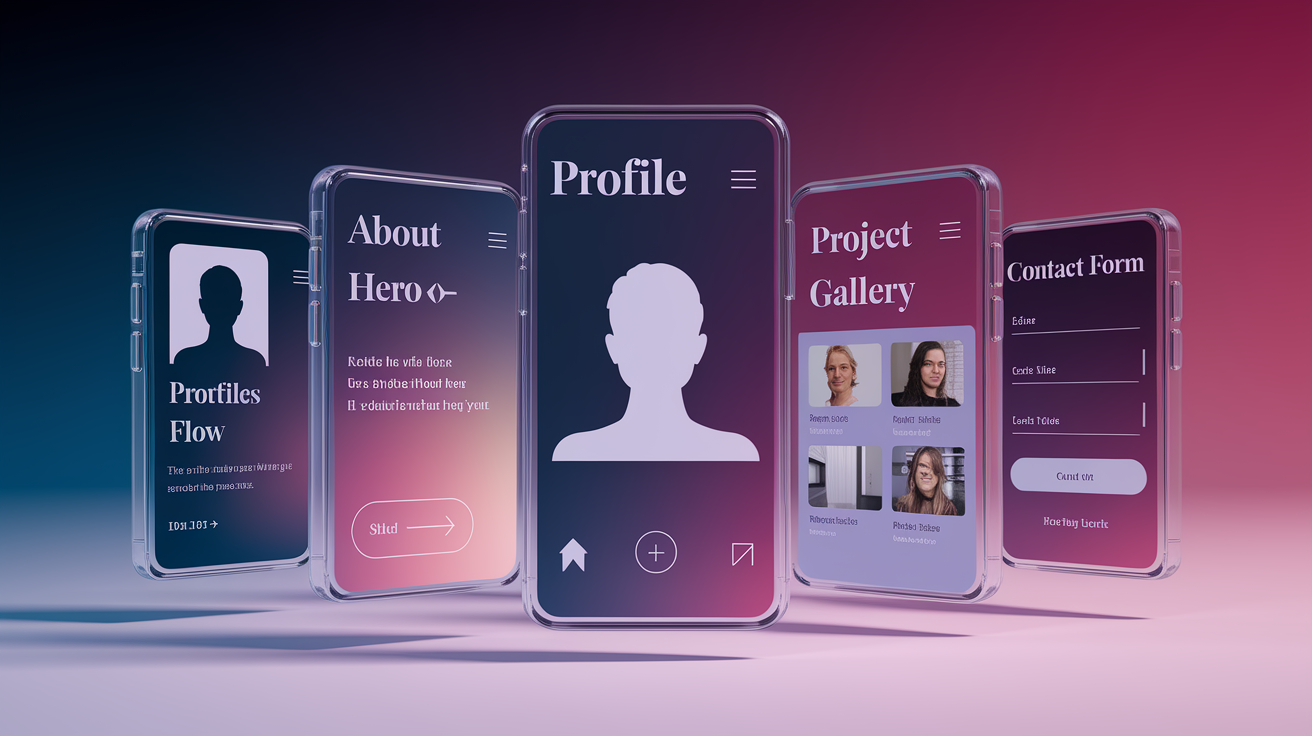
Every portfolio site has a few standard components that visitors expect to see. These parts work together to tell your story, showcase your work, and make it easy for someone to reach you.
The hero section sits at the top and introduces you with your name, title, and maybe a short tagline. It often includes a background image or gradient, centered text, and a row of social links (GitHub, LinkedIn, Twitter). The CSS uses Flexbox to center content vertically and horizontally, and you can add padding or a dark overlay to make text readable over images.
The about section gives context: who you are, what you do, what you’re good at. A common pattern is to use Flexbox to place a profile photo on one side and a bio paragraph on the other. You might wrap the image in a <figure> with a <figcaption> for the alt text, and add padding or a subtle box-shadow to separate the image visually. On small screens, the layout switches to vertical stacking so the photo sits above the text.
The work or projects section shows what you’ve built or where you’ve worked. You can display company logos inside a <ul> with <li> items, then use Flexbox to arrange them horizontally with even spacing. If you’re showing project cards, Grid works better because you can control rows and columns and let items wrap automatically. Each card might include a project image, title, short description, and a link to the live demo or repo.
The contact section makes it easy for visitors to send you a message. The typical setup is a <form> with two <input> fields (name and email), one <textarea> (message), and one submit button. Four form controls total. You can style the inputs to match the rest of the site, add placeholder text for guidance, and use CSS to stack them vertically on mobile or place them side-by-side on larger screens.
The footer closes the page with copyright info, extra navigation links, or social icons. It’s usually short and centered, with a subtle background color to separate it from the main content.
Key UI parts to include:
Header with navigation – logo and links to main sections
Hero banner – name, title, call-to-action, and social links
About block – photo and bio text
Work showcase – logos, project cards, or a portfolio grid
Contact form – name, email, message, and submit button
Footer – copyright, extra links, or social icons
How to Create a Responsive Portfolio Website Step by Step

Building a responsive portfolio means setting up your files correctly, writing clean HTML sections, and applying CSS that adapts to different screen sizes. Here’s how to do it from start to finish.
Setting Up the Project Files
Create a new folder on your computer for the project. Inside that folder, create three things: a file named index.html, a file named styles.css, and a folder named assets to hold images or icons.
Required files:
index.html – contains all the HTML structure and content
styles.css – holds all the CSS styling rules
/assets – stores images, icons, or other media files
Open index.html and start with the HTML5 boilerplate. Type <!DOCTYPE html> at the very top, then open <html lang="en">. Inside the <head>, add <meta charset="UTF-8"> and <meta name="viewport" content="width=device-width, initial-scale=1.0"> so the page scales correctly on phones. Add a <title> tag with your name or “My Portfolio,” then link your stylesheet with <link rel="stylesheet" href="styles.css">. Close <head> and open <body>. Now you’re ready to build sections.
Building the HTML Sections
Each major part of your portfolio gets its own semantic tag. Follow these steps:
-
Add the header and navigation. Inside
<body>, create a<header>element. Inside that, add a<div>with a class like.containerto wrap your logo and nav. Put your name or logo in an<h1>or a<div class="logo">, then create a<nav>element. Inside<nav>, write a<ul>with four<li>items: Home, About, Work, Contact. Wrap each in an<a href="#sectionID">so clicking jumps to that section. -
Create the hero section. After
</header>, open a<section id="hero">. Inside, add a centered<div>with your name in an<h1>, your title in a<p>, and a row of social links inside another<div>. Use<a>tags for each link (GitHub, LinkedIn, etc.) and point them to your real profiles or leave them as#placeholders for now. -
Build the about section. Open
<section id="about">. Create a flex container<div>inside. On one side, add a<figure>with an<img src="assets/profile.jpg" alt="Your Name">and a<figcaption>if you want. On the other side, write a few paragraphs about your skills, experience, or background. -
Add the work section. Open
<section id="work">. Write an<h2>heading like “Projects” or “Work.” Below that, create a<ul>and add<li>items for each project or company logo. If you’re showing cards instead of logos, wrap each project in a<div class="card">with an image, title, description, and link. -
Create the contact section and footer. Open
<section id="contact">. Add a short intro paragraph, then create a<form>. Inside the form, add two<input>elements (one for name, one for email), one<textarea>for the message, and one<button type="submit">. After the Contact section, close<main>if you wrapped everything in one, then add a<footer>with a copyright line and any extra links. Close</body>and</html>.
Styling with CSS and Adding Responsiveness
Open styles.css and start with a CSS reset at the top. Add the following to normalize spacing:
* {
  margin: 0;
  padding: 0;
  box-sizing: border-box;
}
Now you can layer on layout and design rules. Here’s what to include:
Reset and base styles – set default font family, line-height, and text color on body
Utility classes – create .flex for display: flex, .flex_center for centered flex containers, and .wrapper to constrain width and center content
Header and navigation – use Flexbox on the header to align logo and nav horizontally, remove underlines from links and set a background color
Hero section – center text with Flexbox, add padding, and apply a background image or gradient
About section – use Flexbox to place image and text side-by-side, add padding and a subtle border or shadow on the image
Work section – use Flexbox or Grid to lay out project cards or logos, set gaps between items and center the container
Write media queries at the bottom of your CSS to adjust layout on smaller screens. A common breakpoint is @media (max-width: 768px) for tablets and phones. Inside the query, switch flex containers to flex-direction: column so elements stack vertically, reduce padding, and adjust font sizes if needed. You can also remove decorative effects like image skew or large shadows to keep the design clean on mobile.
Comparing Layout Approaches for Responsive Portfolios

Choosing between Flexbox and Grid depends on the layout pattern you’re building. Flexbox works best for one‑dimensional arrangements (items in a single row or column) while Grid handles two‑dimensional layouts where you need control over both rows and columns at the same time.
For a navigation bar, Flexbox is the natural choice because you’re lining up links horizontally (or vertically on mobile). You set display: flex on the <ul>, add gap for spacing, and optionally use justify-content: space-between to spread links evenly. If you want the nav to wrap when it runs out of space, add flex-wrap: wrap. For a project gallery with cards that need to align in rows and columns, Grid is simpler. You define display: grid, set grid-template-columns: repeat(auto-fit, minmax(250px, 1fr)) to create responsive columns, and add gap for spacing. The cards automatically wrap into new rows without extra markup.
Wrappers and media queries work with either layout system. A wrapper constrains the maximum width of your content (typically 1200px or so) and centers it with margin: 0 auto. Media queries let you switch from Grid to Flexbox or from horizontal to vertical stacking at specific breakpoints, so your layout adapts smoothly from desktop to phone.
When to choose each:
Flexbox – navigation bars, button groups, rows of social icons, simple card rows, stacking content vertically on mobile
Grid – project galleries, multi‑column layouts, complex card grids, aligning items in both dimensions
Wrappers – any section where you want to limit line length and center content horizontally
Media queries – every responsive layout needs them to adjust spacing, font sizes, and flex/grid behavior at different screen sizes
Combination approach – use Grid for the main layout, Flexbox inside individual components, and wrappers to constrain width
How to Use Your Portfolio and Benefit from It

Once your portfolio is live, you can use it to apply for jobs, showcase projects to clients, or share your work on social media. Hosting is straightforward. GitHub Pages lets you publish static HTML/CSS sites for free, and services like Netlify or Vercel deploy automatically whenever you push changes to a Git repo.
After you host the site, promote it by adding the link to your resume, LinkedIn profile, and email signature. If you’re applying for developer roles, include the portfolio URL in your cover letter or job application. Recruiters and hiring managers often visit portfolio sites to see real examples of your code and design work, so a clean, working site makes a strong first impression.
Actionable tips to get the most out of your portfolio:
Test across devices and browsers – open your site on a phone, tablet, and desktop. Check it in Chrome, Firefox, and Safari to catch layout bugs.
Add social icons – link to your GitHub, LinkedIn, Twitter, or other profiles so visitors can connect with you.
Host on GitHub Pages or Netlify – both are free and simple. Push your code to a repo and enable hosting in the settings.
Update your projects regularly – add new work as you complete it. Remove outdated or weak examples to keep the showcase relevant.
Include a resume download button – add a link to a PDF of your resume so visitors can save it without leaving the site.
Write clear project descriptions – for each project, explain what it does, what you built, and what technologies you used. One or two sentences is enough.
Final Words
Built the layout, added semantic HTML sections (header, hero, about, work, contact), styled with CSS using Flexbox and Grid, and wrote media queries for a mobile-first flow. You learned the file setup: index.html, styles.css, and an assets folder.
Follow the steps and you’ll create a responsive portfolio website with html and css step by step, test it across devices, and polish spacing and images. Small wins add up—project cards, a working contact form, and a hosted site. Keep iterating; you’re on the right track.
FAQ
Q: What is a responsive portfolio and why should I build one with HTML and CSS?
A: A responsive portfolio is a site that adapts to phones, tablets, and desktops. Building it with HTML and CSS gives a fast, accessible, easy-to-host foundation you can enhance later.
Q: What files do I need to start a responsive portfolio project?
A: You need index.html, styles.css, and an assets/ folder for images and fonts. Add the declaration and the meta viewport tag in the HTML head.
Q: What sections should I include in my portfolio website?
A: Your portfolio should include a header/nav, hero, about, projects/work, testimonials or highlights, contact section, and a footer with copyright or social links.
Q: How do I structure the HTML semantically for accessibility?
A: Structure the HTML with header, nav, main, section, article when needed, and footer. Include lang, meta charset, and viewport tags to improve accessibility and proper rendering.
Q: How do I make my portfolio layout responsive?
A: Make the layout responsive by using a mobile-first approach: flexible wrappers, scalable typography, Flexbox for simple rows, Grid for card layouts, and media queries for breakpoints.
Q: Do I need JavaScript for a functional portfolio?
A: You don’t need JavaScript for a functional portfolio; HTML/CSS alone is fast and accessible. Add JavaScript later for interactive features like animated filters, modal project previews, or form validation.
Q: How should I handle images and srcset for responsiveness?
A: Use srcset and sizes so the browser selects the right image. Store scaled images in /assets, use modern formats like WebP, and set max-width:100% so images scale with their containers.
Q: What core CSS techniques should I use for layout and spacing?
A: Use a CSS reset and box-sizing: border-box for consistency, Flexbox for nav and small groups, Grid for galleries, Utopia-like variables for scalable spacing, and a wrapper to constrain width.
Q: How do I test, host, and promote my portfolio?
A: Test across browsers and device sizes using devtools. Host on GitHub Pages or similar. Add social links, a resume download, clear project descriptions, and update projects regularly.
Q: How do I design a simple, accessible contact form?
A: Build a contact form with labeled name and email inputs, a message textarea, and a submit button. Use proper input types, client and server validation, and clear success or error messages.