Are your buttons just bland rectangles that nobody notices?
This guide shows how Button Design CSS and smart hover effects can make them grab attention and guide users.
You’ll get hands-on patterns: resets for a consistent base, smooth hover and active transitions, clear focus rings for keyboard users, and style recipes—flat, gradient, ghost, neumorphic (soft, embossed), and glass-like looks.
Each example is practical and browser-tested so you can paste code, tweak colors, and see the win right away.
By the end you’ll build buttons that look polished and work well on desktop and mobile.
Overview Of CSS Button Design Fundamentals
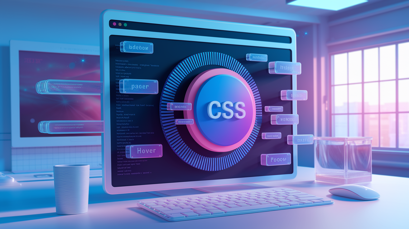
CSS button design is how you use Cascading Style Sheets to control what buttons look like and how they act on a webpage. It covers size, color, hover effects, animations, and what happens when someone clicks or tabs to the button with a keyboard. Good button design makes your site easier to use and shows people which actions matter most.
Basic CSS styling starts with properties like background-color, padding, border, border-radius, and box-shadow. These work on semantic HTML elements like <button type="button">Submit</button>. Browsers apply their own default button styles, and those defaults look different between Chrome, Firefox, and Safari. To get consistent results, you’ll reset those defaults first. Modern CSS3 features like gradients, RGBA transparency, and rounded corners are supported across all major browsers now, so you can build rich button visuals with just a few lines of code.
Core techniques in CSS button design:
Hover effects change color or scale when the mouse moves over the button.
Active states show a “pressed down” look when the button is clicked.
Gradients and shadows add depth and visual hierarchy.
Responsive sizing uses rem, em, or clamp() to keep buttons readable on all screens.
Icon integration combines SVG or icon fonts with text labels.
Keyframe animations animate borders, shadows, or text for extra polish.
CSS button design is beginner friendly because you can see changes instantly in the browser. Copy, paste, tweak the values, refresh the page, and watch your button transform. Most button styling needs no JavaScript at all.
Pros & Cons Of Using CSS For Button Design
CSS buttons are lightweight, load fast, and give you complete creative control without adding extra JavaScript files or image assets. You can edit colors, sizing, and effects in one stylesheet and apply changes across hundreds of buttons at once. CSS buttons are also accessible by default if you use semantic <button> elements, and they work with keyboard navigation and screen readers out of the box. Theming is straightforward with CSS variables. You can swap light mode and dark mode styles by toggling a single class.
On the downside, browser inconsistencies mean you’ll need to reset default styles for truly uniform buttons. Complex animations, especially those using many pseudo elements or heavy box-shadow blur, can slow down older devices or lower end hardware. Advanced visual effects like 3D transforms or multi-layer gradients take time to fine tune and may break if you’re not testing across browsers. Touch devices don’t trigger :hover states, so you need fallback styling or careful state management to keep buttons usable on phones and tablets.
| Benefit | Drawback |
|---|---|
| No extra HTTP requests for images | Default browser styles vary and need resets |
| Fast load and render times | Complex animations can impact performance |
| Easy to theme with CSS variables | :hover doesn’t work on touch screens |
| Fully accessible with semantic HTML | Advanced effects require careful cross-browser testing |
| Single stylesheet controls all buttons | Steep learning curve for complex pseudo-element techniques |
Understanding CSS Hover Effects For Buttons

Hover effects trigger when a user moves their mouse or trackpad over a button, signaling that the element is interactive. The :hover pseudo class lets you change any CSS property. Common changes include background-color (shifting to a lighter or darker shade), color (for the text), border-color, or box-shadow. A simple hover might look like this: :hover { background-color: #002ead; } to shift from a dark blue to a brighter blue.
To smooth the transition between states, use the transition property on the button itself, not inside the :hover rule. A typical transition is transition: background-color 0.3s ease; or transition: all 0.7s; for a slower, more noticeable effect. Transforms like transform: scale(1.05); or transform: translateY(-2px); create a lift or grow effect. Pseudo elements (:before and :after) let you build slide-in overlays, animated underlines, or gloss wipes without adding extra HTML. Position a :before element behind the button and slide it in on hover with left: 0; and transition: left 0.4s;.
Popular hover styles:
Slide-in background puts a colored overlay that slides from left or top.
Fade effect makes button opacity or background fade in smoothly.
Scale up grows the button slightly larger.
Border animation draws a border around the button edges.
Text-shadow shift moves or intensifies shadow on hover.
Gradient shift animates or rotates background gradient.
Hover states don’t work on touchscreens. On a phone or tablet, tapping the button immediately triggers :active and :focus, skipping :hover entirely. Build your button design so the default state is clear enough to tap without needing a hover preview.
What Are CSS Button States?
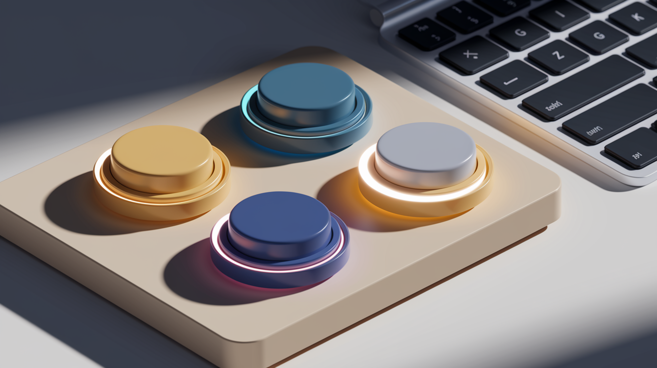
Button states are the visual changes that happen when a user interacts with a button in different ways. The :hover pseudo class changes the button when the mouse moves over it. This is usually the first state people think of. It’s the easiest to spot. A common pattern is to lighten the background slightly or add a subtle shadow, like box-shadow: 0 2px 8px rgba(0,0,0,0.2); on hover.
The :focus pseudo class applies when the button is selected via keyboard. If someone presses Tab to navigate through the page, :focus highlights the currently selected element. Browsers add a default outline (often a blue or black ring) around focused elements for accessibility. Removing this outline with outline: none; makes the site unusable for keyboard users. If you need a custom focus style, replace the outline with a visible alternative, like outline: 2px solid #0a0a23; outline-offset: 2px; or use box-shadow: 0 0 0 3px rgba(10,10,35,0.3); paired with transition: box-shadow 0.2s; so the focus ring fades in smoothly.
The :active state represents the exact moment when the button is being clicked or pressed. This state only lasts as long as the mouse button is held down or the screen is touched. A typical active style simulates a physical press by moving the button 1px down with transform: translateY(1px); or adding an inset shadow like box-shadow: inset 0 2px 4px rgba(0,0,0,0.3);. This gives instant feedback that the action registered.
Best practices for button states include making sure your focus indicator has enough contrast (at least 3:1 against the background), keeping hover and focus visually distinct but both clearly interactive, and always including an active state so users see their click happen. Never remove the focus outline without replacing it with an equally visible indicator. On dark backgrounds, use lighter outlines or shadows. On light backgrounds, use darker ones. Test with keyboard navigation (Tab key) to confirm every button is reachable and visibly highlighted.
Visual Styles Used In CSS Button Design
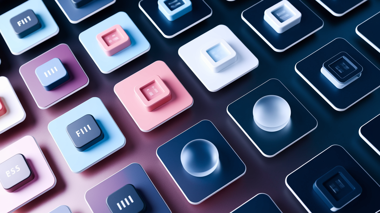
Button design in CSS has evolved from simple bordered rectangles to rich, multi-layered styles that reflect current design trends. Early web buttons relied on images and table hacks. With CSS3, you can now build visually sophisticated buttons using only code. Modern button styles range from flat minimalism to layered depth effects, each serving different UI contexts and brand aesthetics.
Common button style types:
Flat is solid color, no shadows or gradients, clean and minimal.
Gradient blends two or more colors in the background for depth.
Ghost has transparent background with a visible border and text.
Outline is similar to ghost with emphasis on border over fill.
3D depth uses shadow and highlight layers to simulate a raised surface.
Neumorphic (soft UI) creates subtle inset and outset shadows for a soft, embossed look.
Glassmorphism uses semi-transparent background with backdrop filter blur.
Elevated adds large drop shadow below the button to “lift” it off the page.
CSS3 gives you the tools to build all of these with properties like linear-gradient(), box-shadow, border-radius, and RGBA colors for transparency. A simple gradient button uses background: linear-gradient(to bottom, #5a67d8, #4c51bf); and pairs it with border-radius: 8px; for rounded corners. Neumorphic buttons combine light and dark shadows on opposite sides, like box-shadow: 6px 6px 12px #d1d9e6, -6px -6px 12px #ffffff; on a light gray background. Glassmorphism uses backdrop-filter: blur(10px); and background: rgba(255,255,255,0.1); to create frosted glass effects.
Cross-browser support for these features is strong in modern versions of Chrome, Firefox, Safari, and Edge. Older browsers like Internet Explorer 11 may not support backdrop filter or advanced gradients, so always include a fallback background-color. Use feature detection or check browser support tables if you need broad compatibility.
How To Do Button Design With CSS (Step‑By‑Step)
How to do Basic Button Reset
Browsers apply their own default styles to <button> elements, which can differ in padding, borders, background, and font. To make sure your buttons look identical across all browsers, start by resetting these defaults.
Set border: none; to remove the default border (usually a gray inset border in most browsers).
Use background-color: transparent; or your own color to override the default gray background.
Add appearance: none; (and vendor prefixed -webkit-appearance: none; for Safari) to strip OS native button styling.
Reset the outline with outline: none; only if you’re providing a custom focus indicator later. Never leave buttons without a visible focus state.
Set font-family: inherit; and font-size: inherit; so the button text matches your site’s typography.
Include cursor: pointer; so the mouse cursor changes to a hand when hovering over the button.
Example reset: .button { border: none; background: none; appearance: none; font: inherit; cursor: pointer; }
How to do Responsive Button Sizing
Buttons need to be large enough to tap on touchscreens and readable on all screen sizes. Padding creates internal space around the text, and min-height plus min-width keep the button from shrinking too small.
Use padding: 12px 24px; as a starting point. The first value is top/bottom, the second is left/right.
Set min-height: 44px; to meet the recommended minimum touch target size for mobile (Apple and Google both suggest 44 to 48px).
For very small buttons like icon only actions, use at least min-width: 44px; and min-height: 44px;.
Prefer relative units like rem or em over px for accessibility. For example, padding: 0.75rem 1.5rem; scales with the user’s font size setting.
Use clamp() for fluid sizing across breakpoints, like font-size: clamp(0.875rem, 2vw, 1rem);.
Test on actual devices or browser dev tools with touch emulation to confirm tap targets feel comfortable.
How to do Button Color & Background Design
Button color creates hierarchy and guides the user’s eye to primary actions. Background and text color must have enough contrast for readability.
Set background-color: #0a0a23; (or any color that matches your brand).
For gradients, use background: linear-gradient(135deg, #667eea 0%, #764ba2 100%);.
Use color: #ffffff; or another light color if your background is dark. Always check contrast ratios (aim for at least 4.5:1 for normal text).
RGBA lets you add transparency, like background-color: rgba(10,10,35,0.9); for a semi-transparent button over images or videos.
Combine background with border-radius: 8px; for rounded corners and box-shadow: 0 2px 4px rgba(0,0,0,0.1); for subtle depth.
For outline/ghost buttons, use background-color: transparent; with border: 2px solid #0a0a23; and color: #0a0a23;.
How to do Hover, Focus & Active States
Interactive states give feedback that the button is clickable and responding to user input.
Add :hover { background-color: #002ead; } to shift the background color when the mouse moves over the button.
Include transition: background-color 0.3s ease; on the base button rule so the color change is smooth, not instant.
For keyboard focus, style :focus with a visible outline or shadow: :focus { outline: 2px solid #0a0a23; outline-offset: 2px; box-shadow: 0 0 0 3px rgba(10,10,35,0.2); }.
Use :active to show a pressed state: :active { transform: translateY(1px); box-shadow: inset 0 2px 4px rgba(0,0,0,0.2); }.
Combine :focus-visible instead of :focus if you only want the outline to appear for keyboard users, not mouse clicks. This is supported in modern browsers: :focus-visible { outline: 2px solid #0a0a23; }.
Always test with Tab navigation to confirm the focus ring is visible and the button is reachable.
How to do CSS Variables For Theming
CSS variables (custom properties) let you define colors and sizes once and reuse them across all your buttons, making theme updates fast and consistent.
Define variables in :root or on a parent container: :root { --btn-bg: #0a0a23; --btn-color: #ffffff; --btn-padding: 12px 24px; --btn-radius: 8px; }.
Apply variables in your button rule: .button { background-color: var(--btn-bg); color: var(--btn-color); padding: var(--btn-padding); border-radius: var(--btn-radius); }.
For hover states, define a hover variable: --btn-bg-hover: #002ead; and use it in :hover { background-color: var(--btn-bg-hover); }.
Create theme variations by overriding variables in a class: .dark-theme { --btn-bg: #1a1a2e; --btn-color: #eaeaea; }.
Use fallback values for older browsers that don’t support custom properties: background-color: var(--btn-bg, #0a0a23);.
CSS variables make it easy to swap light mode and dark mode, or apply brand color changes, by updating a few lines at the top of your stylesheet.
Comparison Between CSS Button Design Approaches
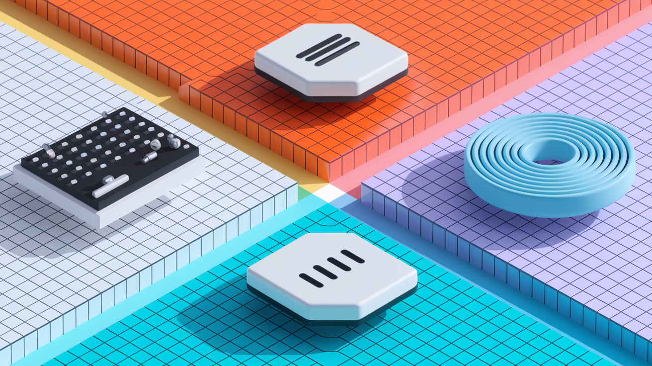
Developers style buttons in different ways depending on their workflow, team size, and project requirements. Custom CSS gives you full control and lets you write exactly the styles you need, with no extra code or framework opinions. CSS frameworks like Bootstrap ship with pre-built button classes that cover common use cases and save setup time. Utility first frameworks like Tailwind use small, single purpose classes that you combine directly in your HTML. Material Design follows Google’s design system, with specific rules for elevation, ripple effects, and shadow layers.
| Approach | Flexibility | Learning Curve | Customization Level | Typical Use Case |
|---|---|---|---|---|
| Custom CSS | Complete | Moderate | Full control | Unique brand identity, design-heavy sites |
| Bootstrap | Medium | Low | Override via custom CSS | Rapid prototyping, admin dashboards |
| Tailwind | High | Moderate | Compose utility classes | Fast iteration, component-based projects |
| Material-style | Low | Low | Follow design spec | Apps matching Google’s design language |
How To Use CSS Button Design In Real Projects
In production, buttons need to follow clear hierarchy rules so users know which action is most important. Primary buttons get the strongest visual weight, usually a bold color with high contrast. Secondary buttons are less prominent, often using an outline or ghost style. Tertiary buttons might be plain text links styled to look clickable. Label your buttons with short, action based verbs like “Save Changes” or “Add to Cart” instead of vague words like “Submit” or “Go.”
Implementation tips for real projects:
Spacing. Use consistent margin or gap between buttons (at least 8 to 12px) so users don’t accidentally tap the wrong one.
Contrast. Check color contrast with a tool like WebAIM’s contrast checker. Aim for 4.5:1 for normal text, 3:1 for large text.
Touch targets. Keep buttons at least 44px tall and 44px wide on mobile for easy tapping.
Dark mode variations. Define separate button colors for dark themes using CSS variables or a .dark-mode class override.
Icon alignment. When combining icons with text, use flexbox to center both vertically: display: flex; align-items: center; gap: 8px;.
Consistency. Use the same border-radius, padding, and hover behavior across all buttons so users recognize interactive elements instantly.
Cross-browser testing confirms your buttons work in Chrome, Firefox, Safari, and Edge. Test on real mobile devices or use browser dev tools in responsive mode. Check that focus outlines are visible, hover effects trigger smoothly, and active states show the press. Responsive layouts should stack buttons vertically on narrow screens and display them side by side on wider viewports using media queries or flexbox wrapping.
Maintainability improves when you centralize button styles. Use CSS variables for colors, sizing, and spacing. If you’re working with a preprocessor like SASS or LESS, create mixins for button variants so you can generate primary, secondary, and ghost buttons from a single source. Keep your button styles in one stylesheet section or component file so updates happen in one place. This approach scales as your project grows and keeps your codebase easy to read.
Final Words
We covered the core building blocks of CSS button design: resets, sizing, color and background, hover/focus/active states, visual styles, and practical steps for real projects.
You now know why CSS buttons are lightweight and where they can trip up (browser defaults, performance). The step-by-step sections showed resets, responsive sizing, color choices, state styling, and variables for theming so you can reuse work.
Use these button design css basics to make accessible, responsive buttons. Keep iterating—small tweaks give big wins.
FAQ
Q: What is CSS button design and why is it important?
A: CSS button design is styling HTML buttons to guide users and improve UI. It controls look, spacing, states, and interactions so calls to action are clear, consistent, and usable.
Q: What basic CSS properties are used to style buttons?
A: Basic CSS properties used to style buttons include background-color, padding, border, border-radius, box-shadow, color, and transitions, plus pseudo-classes like :hover, :focus, and :active for interaction.
Q: How do I create effective hover effects for buttons?
A: To create effective hover effects, use :hover with smooth transitions (0.3–0.7s), transforms or pseudo-elements for motion, and keep changes subtle; add fallbacks because hover doesn’t work on touch screens.
Q: How do I make buttons accessible and keyboard-navigable?
A: To make buttons accessible, use semantic
Q: What visual button styles can I choose from?
A: Common visual button styles include flat, gradient, ghost, outline, 3D/elevated, neumorphic, and glassmorphism, each combining color, shadows, radius, and transparency to match your design.
Q: How do I reset default browser button styles?
A: To reset defaults, apply appearance:none, border:none, a base background, and set padding, font, and outline rules so buttons render consistently across browsers.
Q: How should I size buttons for responsive layouts?
A: For responsive sizing, use padding, min-height (about 40px), min-width, and relative units like rem or clamp so touch targets stay comfortable across devices and breakpoints.
Q: How do I style active (pressed) and focus states for buttons?
A: Style active states with a slight translate or inset shadow for pressed feedback and use a clear, high-contrast focus ring so keyboard users always see the current element.
Q: How can CSS variables simplify button theming?
A: CSS variables like –btn-bg and –btn-color centralize theme values, let you switch palettes quickly, and update every button by changing one value for fast, consistent theming.
Q: Should I use a framework or custom CSS for buttons?
A: Choosing frameworks versus custom CSS depends on needs: custom gives full control, Bootstrap gives ready classes, Tailwind offers utility flexibility, and Material gives consistent patterns with moderate learning.
Q: What are practical tips for using button design in real projects?
A: Use clear action labels, consistent primary/secondary hierarchy, adequate spacing, icon alignment, dark-mode variants, and test across browsers and devices for accessibility and maintainability.