

Still writing separate mobile and desktop stylesheets?
Tailwind CSS responsive flips that idea: it starts with mobile and layers styles upward using breakpoint prefixes like sm:, md:, and lg:.
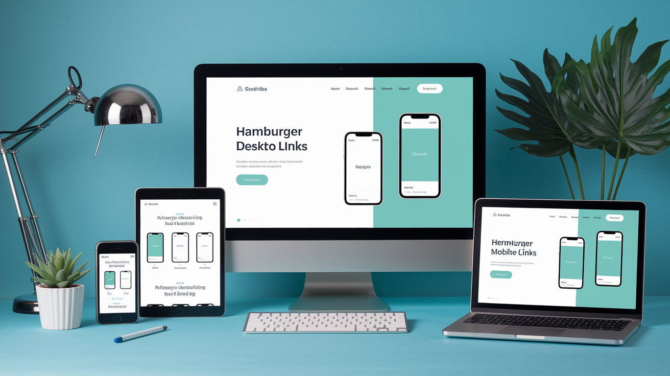
In this post we’ll show how mobile-first breakpoints let you build adaptive layouts that stay simple and predictable.
You’ll get the basics (default breakpoints and utility syntax), practical patterns (flex, grid, spacing), and when to tweak your config.
By the end you’ll be able to make interfaces that feel right on phones and desktops without extra CSS.
Mobile‑First Responsiveness in Tailwind CSS

Tailwind CSS starts with mobile and works its way up. Every utility class you write without a prefix applies to the smallest screens first. Phones, narrow viewports, anything under 640 pixels. Then you add styles for bigger screens using breakpoint prefixes like sm:, md:, and lg:. You’re building a foundation for mobile, then upgrading as screen space grows.
Base classes stick around everywhere unless you override them. Write text-center and that alignment stays on every device. But add md:text-left and you’re saying, “Keep it centered on phones, switch to left alignment once we hit medium screens.” This cascading approach keeps your markup clean. You’re not juggling separate mobile and desktop stylesheets. You’re writing one set of classes that adapt as the viewport widens.
Breakpoint prefixes give you the full responsive toolkit. Each prefix targets a minimum screen width, so lg:flex-row kicks in at 1024 pixels and stays active on larger screens. You can stack multiple prefixes on the same element. Common ones:
sm:for screens 640px and widermd:for screens 768px and widerlg:for screens 1024px and widerxl:for screens 1280px and wider
Tailwind CSS Breakpoints Explained

Tailwind ships with five default breakpoints, each tied to a minimum screen width. These thresholds cover the full range of modern devices. Compact phones to wide desktop monitors. The system uses min-width media queries under the hood, so once a breakpoint activates, it stays active for every screen size above it. You don’t write separate rules for tablets and desktops. Just prefix your utilities and let Tailwind handle the cascade.
If the defaults don’t match your design specs, swap them out or add new ones in tailwind.config.js. The framework treats breakpoints as design tokens. Tweak a single value and it updates every responsive class across your project. Here’s what you get out of the box:
| Breakpoint | Minimum Width | Typical Use Case |
|---|---|---|
| sm | 640px | Large phones, small tablets in portrait |
| md | 768px | Tablets in portrait, older desktops |
| lg | 1024px | Tablets in landscape, laptops |
| xl | 1280px | Desktop monitors, wide laptops |
| 2xl | 1536px | Large desktop monitors, high-res displays |
Responsive Utility Class Syntax

Writing responsive utilities in Tailwind follows a simple pattern. Breakpoint name, colon, utility name. When you write md:bg-blue-500, you’re telling Tailwind to apply that blue background starting at 768 pixels wide. It stays active on every screen above that threshold. The syntax stays consistent across every utility class. Backgrounds, borders, typography, spacing, display properties. Once you learn the pattern, you can make anything responsive.
Stacking multiple breakpoints on a single element lets you create smooth transitions across devices. Start with flex-col on mobile, switch to md:flex-row on tablets, then add lg:gap-8 to increase spacing on desktops. Each breakpoint builds on the last. You’re layering changes instead of rewriting the whole layout at every screen size. This keeps your HTML readable and your responsive logic easy to debug.
Common responsive class patterns:
text-sm md:text-base lg:text-lgscales text size as the viewport growshidden md:blockhides on mobile, shows on medium screens and upgrid-cols-1 md:grid-cols-2 lg:grid-cols-3adds columns as space allows
Breakpoint prefixes work with every utility in Tailwind. If a class exists, you can prefix it. That means hover: and focus: can combine with breakpoints too. md:hover:bg-gray-200 applies a hover background only on medium screens and larger. The framework never blocks you from chaining modifiers.
Building Responsive Layouts with Flexbox and Grid

Flexbox and Grid become layout powerhouses when you pair them with Tailwind’s responsive prefixes. The most common pattern? Stack content vertically on mobile, then switch to horizontal rows on larger screens. Write flex flex-col md:flex-row and you get a single-column layout on phones that transforms into a side-by-side arrangement once the viewport hits 768 pixels. This works for navigation bars, card layouts, sidebars, multi-section pages. Anywhere you need content to reflow based on available width.
Grid shines when you need precise control over columns and spacing. Start with grid grid-cols-1 to show one item per row on mobile. Add md:grid-cols-2 to split into two columns on tablets. Then lg:grid-cols-3 to fit three columns on desktops. Each breakpoint adds columns without breaking the mobile layout. Pair responsive column counts with responsive gaps like gap-4 md:gap-6 lg:gap-8 to keep spacing proportional as the grid expands. The result feels intentional and balanced at every screen size.
Alignment and justification can shift per breakpoint too. Use items-start md:items-center to change vertical alignment, or justify-between md:justify-center to reposition items horizontally. These tweaks let you optimize for readability and visual hierarchy on each device. A centered layout might look clean on desktop but cramped on mobile, so you align items to the start on small screens and center them once there’s room to breathe.
Wrapping and ordering give you even more layout flexibility. Add flex-wrap to let items drop to a new line when space runs out. Use responsive order utilities like order-last md:order-first to rearrange elements without touching the HTML. Common responsive layout techniques:
- Switching flex direction from column to row at breakpoints
- Adjusting grid column counts to fit more items as screens grow
- Scaling gaps between items to match viewport size
- Changing alignment and justification per breakpoint
- Reordering elements to prioritize mobile hierarchy
Responsive Spacing and Typography

Tailwind lets you scale spacing and text size right inside your class list. Your design feels proportional on every device. Start with smaller padding and margins on mobile like p-4 or m-2, then increase them at larger breakpoints with md:p-6 and lg:p-8. This keeps interfaces tight and scrollable on phones while giving desktop users the breathing room they expect. You’re using Tailwind’s spacing scale and letting breakpoints decide when to step up.
Typography follows the same pattern. Write text-base for mobile, then layer on md:text-lg and lg:text-xl to make headings and body text grow with the screen. Smaller text on phones keeps line lengths readable and prevents awkward wrapping. Larger text on desktops uses the extra width to improve legibility and visual impact. You can mix responsive font sizes with responsive line heights and letter spacing. leading-snug md:leading-relaxed or tracking-tight lg:tracking-normal to fine-tune readability at every breakpoint.
Spacing and typography changes ripple through your layout without manual calculation. Increase padding at md: and buttons and cards automatically feel more spacious. Bump text size at lg: and headings command more attention without crowding the viewport. These responsive adjustments keep your design cohesive and intentional, adapting to user context instead of forcing a single rigid layout across all devices.
Customizing Responsive Behavior

Tailwind’s default breakpoints cover most projects. But some designs need a custom threshold between “phone” and “tablet” or a max-width cap for ultra-wide monitors. You define custom breakpoints in tailwind.config.js under theme.screens. If you need styles to kick in at 900 pixels instead of 1024, you can override lg or add a new breakpoint name entirely. Custom screens work exactly like the defaults. Prefix any utility with your breakpoint name and Tailwind generates the matching media query.
Extending the default breakpoints keeps the originals in place while adding your own. Use theme.extend.screens to insert a new breakpoint without wiping out sm, md, and the rest. Adding 'tablet': '900px' gives you a tablet: prefix for that specific width, and all the standard prefixes still work. Need a max-width breakpoint instead of a min-width? Define a screen as an object like 'max-lg': { max: '1023px' } and Tailwind applies those styles only up to that threshold. This is useful for hiding desktop navigation on smaller screens or capping layout width on very large displays.
Custom breakpoints should solve a real layout problem, not complicate your config. Adding ten breakpoints makes your stylesheet harder to maintain and your classes harder to predict. Stick with Tailwind’s defaults unless you have a specific design constraint. An older device in your user base, a brand guideline that requires exact pixel breakpoints, or a layout that genuinely breaks between two standard thresholds.
Real‑World Responsive Examples
Responsive navigation bars typically stack menu links vertically on mobile and arrange them horizontally on larger screens. You might wrap links in a flex flex-col md:flex-row container, hide the full menu with hidden md:flex, and show a hamburger icon using block md:hidden. Profile images or logos scale with h-8 w-8 md:h-12 md:w-12. Spacing between links grows with space-y-4 md:space-y-0 md:space-x-6. This pattern keeps mobile navigation compact and thumb-friendly while spreading desktop links across the header for easy scanning.
Card grids are another common responsive build. Start with grid grid-cols-1 gap-4 to show one card per row on phones. Add md:grid-cols-2 lg:grid-cols-3 xl:grid-cols-4 to pack in more cards as width allows. Each card might use responsive padding like p-4 md:p-6 and responsive text like text-sm md:text-base to keep proportions balanced. Images inside cards can stay flexible with w-full h-auto and add a max width at larger breakpoints using md:max-w-xs to prevent them from stretching too wide.
Hero sections often combine responsive typography, spacing, and layout direction. A headline might start at text-2xl md:text-4xl lg:text-5xl to scale up dramatically on desktops. Supporting text uses text-base md:text-lg, and call-to-action buttons get extra padding with px-6 py-3 md:px-8 md:py-4. The container switches from flex-col on mobile to md:flex-row on tablets, positioning text and an image side by side. Common real-world responsive patterns:
- Navigation bars that toggle between vertical mobile menus and horizontal desktop layouts
- Product or content grids that add columns as viewport width increases
- Hero sections that stack text and images on mobile and arrange them side by side on larger screens
Final Words
We jumped straight into Tailwind’s mobile‑first flow: base utilities for small screens, breakpoint prefixes that scale styles up, and how to use them in real layouts.
You practiced responsive utility syntax, learned the default breakpoints, built flex and grid layouts, handled spacing and typography, and saw how to customize screens in tailwind.config.js.
Try these patterns in a small project — the tailwind css responsive approach makes layouts predictable and fast. Keep experimenting; you’ll end up with clean, adaptable UIs that feel solid.
FAQ
Q: What does mobile-first mean in Tailwind CSS?
A: Mobile-first in Tailwind CSS means styles apply to small screens first, and breakpoint prefixes like sm:, md:, lg: scale or override those styles as the screen size increases.
Q: How do base classes and breakpoint prefixes interact in Tailwind?
A: Base classes apply to all screen sizes, and breakpoint prefixes override them at larger widths; place the prefix before a utility (for example md:text-lg) to change that property from the breakpoint up.
Q: What are Tailwind’s default breakpoints and typical uses?
A: Tailwind’s default breakpoints are sm 640px, md 768px, lg 1024px, xl 1280px, and 2xl 1536px, used to target small phones through tablets, laptops, and large desktop screens.
Q: How do responsive utility class prefixes work in Tailwind?
A: Responsive utilities use prefixes like sm:, md:, lg:, placed before a class (for example sm:px-4); they apply that utility at the named breakpoint and up, letting you change styles per screen size.
Q: Can I customize Tailwind’s breakpoints?
A: You can customize breakpoints by editing theme.screens in tailwind.config.js, defining new names or values, then rebuilding so Tailwind generates classes for your custom screen widths.
Q: How do I build responsive layouts with flexbox and grid in Tailwind?
A: Use responsive utilities to switch layouts—example: flex-col to md:flex-row, grid-cols-1 to lg:grid-cols-3—adjust gaps, wrapping, and alignment at breakpoints for fluid responsive layouts.
Q: How do I scale spacing and typography responsively in Tailwind?
A: Scale spacing and text with breakpoint prefixes like text-sm md:text-lg or p-2 lg:p-6 so font sizes, padding, and margins increase at chosen breakpoints for improved readability and layout.
Q: What common mistakes should I avoid when making Tailwind responsive?
A: Common mistakes include forgetting Tailwind is mobile-first, misordering classes, and not rebuilding after config changes; verify unprefixed classes affect small screens and prefixed ones override upward.
Q: What are practical responsive examples to build with Tailwind?
A: Practical examples include a collapsible navbar that becomes horizontal at md:, card grids that add columns at lg:, and hero sections that switch from stacked to side-by-side layouts.
