

Want to hide a wall of text without making your page annoying?
Accordions (collapsible panels) do exactly that: they let users peek at headings and open only what’s needed, which cuts scrolling and clutter.
They work great for FAQs, product specs, and mobile layouts where screen space is tight.
In this post we’ll show how to build them, avoid common usability pitfalls, and make sure they’re keyboard- and screen-reader friendly so everyone can find what they need.
Understanding Accordion UI Components in Web Design

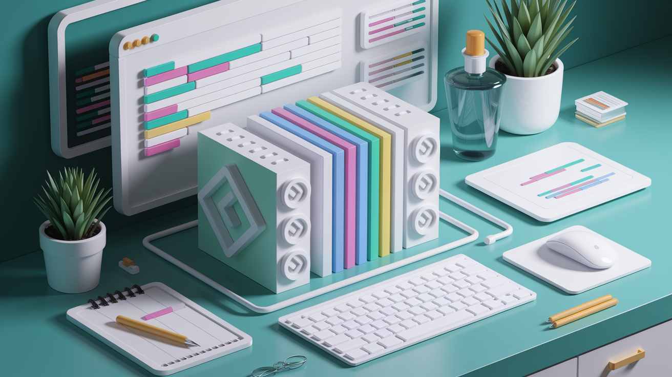
An accordion is a vertical stack of clickable headers that reveal or hide content panels when you interact with them. Three things make up an accordion: a heading that tells you what’s inside, an icon showing whether it’s open or closed, and the panel itself where the actual content lives. The heading works like a button, the icon flips when you toggle it, and the panel holds whatever you need to see (a paragraph, a list, whatever).
Designers reach for accordions when they want to cut down on visual mess, keep people from scrolling forever, and help users skim categories before deciding what to open. You see just the headings at first. That means you can hunt for the exact thing you need without wading through everything else. This matters a lot on mobile, where screen space is tight and dumping all the content upfront would bury what’s actually important.
You’ll find accordions used for:
- FAQ pages where people look for one or two answers
- Product details split into specs, shipping, and reviews
- Mobile layouts where cutting down scroll keeps things scannable
- Dashboard settings grouped by topic
- Multi-step forms that open one section at a time
- Homepage content blocks where visitors browse categories one by one
Accordions work through progressive disclosure. Show users what they need now, let them control when to see more. That’s rooted in user control and freedom, one of those ten usability principles everyone talks about. Done right, accordions turn overwhelming content into something that feels doable and focused.
Causes of Poor Accordion Usability in Web Design

Accordions add interaction cost. Every time you want to see something hidden, you scroll to the right heading, read it, decide if it’s worth clicking, move your mouse or thumb, click to expand, then wait for it to open. That’s five steps before you even start reading. If the first panel isn’t what you need, you do it all over again. When you have to open several panels to finish a task, it gets old fast.
Hidden content also creates discovery problems. If a heading is vague or uses jargon, people skip right past it and never find what they’re looking for. Out of sight, out of mind. Auto-close behavior makes this worse. When opening one section collapses all the others, you can’t compare anything or cross-reference details without constantly reopening stuff.
Other things that wreck accordion usability:
- Auto-collapsing panels when you open a new one, which breaks comparison tasks
- Unclear icons that don’t tell you something’s expandable
- Poor keyboard support that locks out anyone using Tab, Enter, and Space
- Using accordions on pages with barely any content, where the interface looks empty and you’re adding clicks for no reason
- Accessibility oversights like missing ARIA states, headings that don’t work with keyboards, or collapsed content still in the tab order confusing screen readers
Implementing Effective Accordion Components in Web Design
You can build an accordion with HTML, CSS, and JavaScript, or just use built-in HTML elements that need less code. What you pick depends on how much control you need over open/close behavior, animation, and whether multiple panels can stay open.
HTML/CSS Basics
A basic accordion starts with a container holding pairs of headings and panels. Each heading acts as a clickable trigger, usually a <button> for proper keyboard access. The panel is a <div> or <section> hidden with display: none or max-height: 0 in CSS. An icon (chevron or plus sign) sits inside or next to the heading and rotates or changes when the panel opens. Spacing between items and padding inside panels keeps everything readable and gives touch targets enough room (44×44 pixels minimum).
CSS-Only vs JavaScript Approaches
You can skip JavaScript entirely using the native <details> and <summary> elements. The <summary> acts as the heading, everything inside <details> becomes the collapsible panel. This works without JavaScript and is accessible by default. But you don’t get much control over animations and can’t add features like “expand all” buttons or remember which panels were open. JavaScript lets you track state, animate smoothly with CSS transitions, manage multi-open or single-open behavior, and add global controls. If you need detailed control or complex interactions, JavaScript is better.
Multi-Open vs Single-Open Patterns
Multi-open accordions let users expand as many panels as they want at once. Good for comparing content or printing several FAQ answers. Single-open accordions automatically collapse the previous panel when you click a new one, keeping the page short and reducing scroll. Single-open works for simple menus or pages with just a few sections. Multi-open is better for dense content, schedules, or docs where people need to see multiple items side by side. For long accordion lists, add “Expand All” and “Collapse All” buttons so users can skip the repetitive clicking.
Things that make accordions work better:
- Make both the heading text and icon clickable so users don’t have to aim for a tiny target
- Don’t auto-scroll the page when a panel expands, let users scroll themselves
- Use consistent visual cues and keep the icon position stable across devices
- Provide clear “Expand All” and “Collapse All” controls on pages with many items
Accessibility for Accordion UI Components

Accessible accordions need headings that behave as buttons so keyboard users can activate them with Enter or Space. The heading should have role="button" if it’s not a real <button> tag, and it must receive focus when users press Tab. The aria-expanded attribute tells screen readers whether the panel is visible (aria-expanded="true") or hidden (aria-expanded="false"), and this value updates every time someone toggles the panel. The aria-controls attribute connects the heading button to the panel’s ID, creating a relationship assistive technology can announce.
Collapsed content must be both visually hidden and programmatically unreachable. Use aria-hidden="true" on the panel when it’s closed, or remove the panel’s content from the tab order so keyboard users don’t land on interactive elements they can’t see. If you use display: none or visibility: hidden in CSS, the browser automatically hides the content from assistive technology. That works as long as you remove those properties when the panel expands. Screen reader users should hear a clear state announcement when they activate the toggle, like “Shipping details, button, expanded” or “FAQ question one, collapsed.”
Key accessibility elements:
- Heading marked as a button with
role="button"or a real<button>element, keyboard-operable with Enter and Space aria-expandedthat updates to “true” or “false” on every state changearia-controlslinking the button to the panel’s unique ID- Collapsed panels hidden with
aria-hidden="true"or removed from the tab order - Touch targets sized at least 44×44 pixels
- Clear focus indicators on the heading button so keyboard users know where they are
Accessibility isn’t a checkbox. It’s essential. When accordions lack proper ARIA states or keyboard support, screen reader users hear confusing announcements or can’t tell which panels are open. Keyboard-only users get stuck. Motor-impaired users struggle to hit tiny click areas. Building accessibility in from the start means everyone can find and interact with your content.
Enhancing UX and Visual Design of Accordions

Good accordion design starts with icon choice. Chevrons and plus/minus symbols perform best because they clearly signal expandability and state change. A chevron pointing down when collapsed and up when expanded maps intuitively to the direction the panel will move. A plus icon that rotates into a minus or close symbol when the panel opens also works. Don’t use a right-pointing arrow for vertically sliding panels. Right arrows suggest horizontal movement and confuse people about what will happen when they click.
Visual design considerations that improve usability:
- Keep the icon in a consistent position so users can toggle rapidly without hunting
- Use subtle slide-in and slide-out transitions instead of instant changes (200–300ms CSS transition feels smooth)
- Differentiate collapsed and expanded states with more than just the icon. Try changing background color, border weight, or adding a subtle shadow to the open panel.
- Write short, descriptive headings that clearly summarize what’s inside
- Make the entire heading bar clickable, not just the icon
Visual hierarchy and predictable interactions matter as much as technical implementation. Users should instantly recognize that a section is expandable by looking at the icon and layout. If the icon is ambiguous or positioned inconsistently, people will click less and discover less. Microcopy like “See details” or “View all shipping options” inside a heading can clarify what users will get when they expand, especially if the category name is too generic. Generous white space around headings and between panels makes the interface feel calm instead of cramped.
SEO and Content Strategy for Accordion-Based Layouts

Search engines can crawl accordion content as long as it appears in the HTML when the page loads, even if it’s visually hidden with CSS. Google and other crawlers read the source code, not just what’s visible on screen. Collapsed panels will still be indexed. The risk isn’t crawlability, it’s discoverability. If your headings are vague or don’t include keywords, users searching for that content might not click your result even if the page ranks. Clear, descriptive headings improve both usability and SEO.
Deep linking to expanded sections gives users a way to load the page with a specific panel already open. Add a URL fragment like #shipping-policy and use JavaScript to detect the fragment on page load, scroll to the matching heading, and expand that panel automatically. This lets you share direct links in emails, support docs, or social posts that take people straight to the answer they need. Fragment URLs also help users bookmark specific sections and return later without re-scanning the whole page.
Best practices for indexing and linking:
- Use descriptive, keyword-rich headings that match the language your audience actually searches for, like “How do I reset my password?” instead of “Account Help”
- Implement FAQ schema markup if your accordions contain frequently asked questions (this can trigger rich snippets in search results)
- Provide deep links with URL fragments so users and search engines can reference specific sections directly
- Don’t bury critical conversion content like pricing, contact info, or primary CTAs inside collapsed panels where users might miss it
Preventing Recurring UX or Technical Issues in Accordion Design

Preventing accordion issues starts with consistent guidelines documented in a design system or component library. When every accordion on your site uses the same icon, the same ARIA attributes, and the same interaction patterns, users learn once and benefit everywhere. A shared component also prevents developers from rebuilding the wheel and accidentally introducing accessibility bugs or inconsistent behavior across pages.
Testing catches problems that guidelines alone can’t prevent. Use automated tools like Lighthouse or axe DevTools to check for missing ARIA states, insufficient color contrast, or keyboard traps. Then test manually with real screen readers like VoiceOver on macOS and iOS, NVDA on Windows, and TalkBack on Android. Navigate the accordion using only Tab, Enter, and Space keys to confirm keyboard operability. Load the page on different browsers (Chrome, Firefox, Safari, Edge) to catch cross-browser layout or JavaScript issues that automated tests miss.
Preventative measures that reduce repeated mistakes:
- Maintain a single source of truth in a design system with code snippets, ARIA patterns, and visual guidelines so every new accordion starts from a known-good baseline
- Run automated accessibility audits on every pull request or deployment to catch regressions before they reach production
- Test keyboard navigation and screen reader announcements during QA, not as an afterthought
- Document edge cases like printing behavior, horizontal accordions, and nested panels so developers know how to handle them consistently
Continuous testing means checking accordions every time you update the codebase, change frameworks, or add new content. Accessibility and usability aren’t one-and-done tasks.
When to Seek Further Help With Accordion Implementation

Complex accordion behaviors often exceed what a single developer can comfortably build and test alone. If you need nested accordions, lazy-loading content that only fetches data when a panel opens, or deep integration with a framework like React, Vue, or Angular, consider using a vetted component library like Radix, Headless UI, or Chakra UI. These libraries provide accessible, keyboard-friendly accordions out of the box and handle state management, ARIA attributes, and focus control for you.
User testing reveals whether your accordion actually helps people complete tasks or just adds extra clicks. If analytics show that users are opening most of the panels on a page, you’re better off showing the content inline instead of hiding it. If session recordings reveal people hunting for content and missing it because headings are unclear, that’s a sign to rewrite your microcopy or reconsider whether an accordion is the right pattern for that page.
You should involve experts or adopt prebuilt solutions when:
- You’re building accordions with advanced features like animation syncing, programmatic open/close based on user behavior, or integration with state management libraries
- Accessibility testing reveals bugs you don’t know how to fix, such as focus traps, incorrect ARIA announcements, or keyboard navigation loops
- Your team lacks the budget or in-house expertise to implement accessible accordions from scratch, making a well-tested third-party library a safer and faster choice
Final Words
You learned how accordions work: stacked headers, icons, content panels, and why they shrink clutter and boost scannability.
We covered common usability traps — hidden content, auto-close behavior, and keyboard gaps — plus implementation paths: HTML/CSS basics, details/summary, and JavaScript patterns.
Accessibility, animations, SEO, testing, and when to grab a library or expert were all included so you can ship a solid pattern.
Use these practical tips to build an accessible, usable accordion in web design that feels reliable to users. You’ve got this.
FAQ
Q: What is the accordion feature on a website?
A: The accordion feature on a website is a vertically stacked set of headers that toggle associated content panels, letting users hide or reveal sections to reduce clutter, improve scannability, and save mobile scrolling.
Q: What is an accordion in HTML?
A: An accordion in HTML is a pattern built from headings and panels, often implemented with details/summary or a button+div plus ARIA attributes so content stays in the DOM for accessibility and SEO.
Q: What is the advantage of an accordion on a website?
A: The advantage of an accordion on a website is that it reduces visual clutter, improves findability with scannable headings, minimizes mobile scrolling, and groups related content like FAQs or product details for faster access.
