

Ever stared at a pixel-perfect mockup and felt lost trying to turn it into working HTML and CSS?
You’re not alone.
This tutorial gives a practical, step-by-step walkthrough that uses the five-pass method so you can break designs into layout, components, colors, structure, and edge cases before you code.
You’ll learn how to map mockup regions to semantic HTML, apply Flexbox and Grid, create reusable CSS variables, and plan responsive behavior.
By the end, you’ll have a clear checklist and a working page that matches the design and is easy to update.
Immediate Step‑By‑Step Walkthrough for Converting a Design Mockup Into HTML and CSS

Before you write a single line of code, you need a way to break down what you’re looking at. That’s where the five‑pass method comes in. It’s a structured review that moves from big picture to smallest details, making sure you capture every layout pattern, color token, and interactive state before your fingers touch the keyboard.
Start with a layout pass. Scan the mockup from outside‑in, top‑to‑bottom, left‑to‑right and record high‑level structures. Things like “header with horizontal nav,” “main content column with consistent left/right alignment,” “multiple two‑column sections,” and “footer with three columns.” Notice padding and margins that repeat across sections. This pass is about seeing the skeleton, not the skin.
Next, move to element‑level details. Identify buttons (primary blue, secondary white, plus that special “Learn more” header link), headings, sub‑headings, and body text sizes. You might spot 16px, 18px, 20px. Catalog repeated UI pieces like card components with icon, heading, and list. Image and caption pairs. Custom bullets. Inline versus footer link styles. This pass builds your component library before you build anything.
A detailed breakdown of the five passes:
- Layout pass — Header/nav, columns, section padding, alignment patterns.
- Element pass — Buttons, headings, text sizes, cards, lists, links.
- Color pass — Export or capture hex values, name them as “primary,” “secondary,” etc.
- Structure pass — Map regions to semantic HTML like
<header>,<main>,<nav>,<footer>. - Edge‑case pass — Hover/focus states, mobile stacking, form error states, ambiguous design intent.
For a practical guide to this multi‑pass evaluation, see A Step-by-Step Process for Turning Designs Into Code.
These five passes produce a written inventory of everything the design needs. You end up with a list of components, a color palette with named tokens, a clear structural hierarchy, and notes about interactivity and responsive behavior. That inventory becomes your implementation checklist, your estimate foundation, and your collaboration map. When you start coding, you’ll know exactly what to build, in what order, and what might need clarification from the designer or stakeholder.
Understanding the HTML Structure Behind Mockups
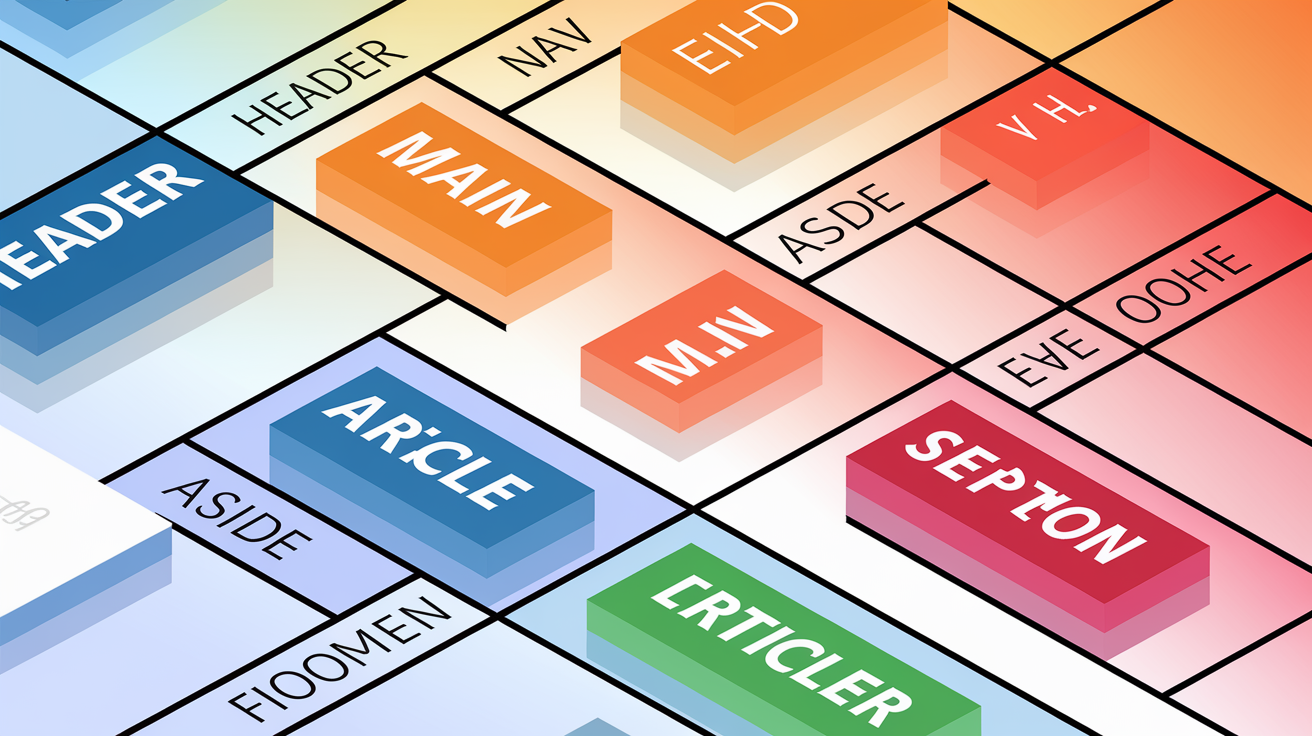
Once you’ve cataloged the visual elements, it’s time to decide which HTML tags will represent each piece. Your goal is converting design layers and groups into a semantic structure that mirrors the content hierarchy. Think of the mockup as a series of nested boxes, each with a job. The outer boxes are regions like header, main, and footer. The inner boxes are sections, articles, and asides.
A typical mockup might break into top‑level regions like this: a sticky header with logo and nav, a hero section with headline and call‑to‑action, a series of explainer sections (disease, treatment, trial details), an eligibility statement, a company overview, and a footer with three columns of links. Each of those regions should map to a semantic container that makes sense to screen readers, search engines, and future developers.
Common semantic elements you’ll use:
<header>— Site or section masthead, usually contains logo and nav.<nav>— Primary navigation menu or breadcrumb trail.<main>— The dominant content of the page, unique per URL.<section>— Thematic grouping of content with its own heading.<article>— Self‑contained composition like a blog post or card.<footer>— Bottom region with copyright, links, contact info.
Using the right tags improves your accessibility tree, the structural map that assistive technologies read. A div‑only layout creates a flat, meaningless tree. Semantic HTML produces a clear outline with landmarks and headings that help users navigate. When you open your browser’s accessibility inspector, you should see labeled regions and a logical heading sequence. That clarity also makes your CSS easier to write because you can target nav instead of .top-menu-wrapper-div. It’s predictable, maintainable, and beginner‑safe.
Applying CSS Layout Techniques to Match the Mockup

With your HTML skeleton in place, you’re ready to position elements exactly where the design shows them. Modern CSS offers two main tools for this: Flexbox and CSS Grid. Flexbox excels at aligning items in a single direction (row or column), making it perfect for nav bars, button groups, and side‑by‑side content blocks. CSS Grid handles two‑dimensional layouts, so it’s your choice for multi‑column sections, card grids, and complex footers.
Use Flexbox when you need to center a button, distribute nav links evenly, or stack a card’s icon, heading, and text vertically. Use Grid when the design has repeating columns (like a three‑column footer or a gallery of cards) or when you need control over both rows and columns. The choice isn’t either/or. You’ll often nest Flexbox inside Grid containers or vice versa, depending on what each component needs.
Using Flexbox for Component Alignment
Flexbox is ideal for navbar layouts where links need to spread across the width or cluster to one side. Set display: flex; on the parent, then use justify-content: space-between; to push logo left and nav right. For a centered hero section, wrap the headline and button in a flex container with flex-direction: column; and align-items: center;. Flexbox also handles vertical centering without guessing margins. If the mockup shows an icon next to text, a single flex row with align-items: center; lines them up perfectly.
Using CSS Grid for Complex Sections
Grid shines when the design has a repeating structure like a three‑column footer or a card gallery. Define display: grid; and grid-template-columns: repeat(3, 1fr); to create three equal columns. Add gap: 2rem; to match the spacing from the mockup. For sections that switch from two columns on desktop to one column on mobile, you’ll override the grid definition inside a media query. Grid also makes it easy to create asymmetric layouts, like a wide content column next to a narrow sidebar, by specifying exact column ratios.
Converting Color Palettes, Typography, and Spacing Into CSS
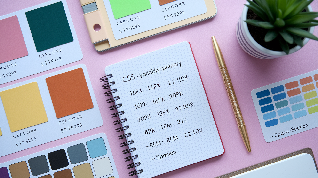
After layout comes style. You’ve already captured the color palette in pass three of your evaluation. Now you need to translate those hex values into reusable CSS variables so you can apply “primary” or “secondary” everywhere instead of copying #3a5fcd fifty times. Open your design tool’s color inspector, export the swatches, or manually grab each hex. Then assign each one a name that describes its role, not its appearance.
For typography, note the font families, weights, and three body text sizes you found (16px, 18px, 20px). Convert fixed pixel sizes to relative units like rem for better scaling. If the base is 16px, then 18px becomes 1.125rem and 20px becomes 1.25rem. Set line‑height values that match the mockup’s visual rhythm. Spacing follows the same pattern. If sections have consistent top/bottom padding of 80px and cards have 40px internal padding, define those as variables too.
| Design Value | Token Name | CSS Example |
|---|---|---|
| #3a5fcd (blue) | –color-primary | background-color: var(–color-primary); |
| 20px body text | –text-lg | font-size: var(–text-lg); /* 1.25rem */ |
| 80px section padding | –space-section | padding-block: var(–space-section); /* 5rem */ |
Using variables makes updates instant. If the designer changes the primary blue, you edit one line instead of hunting through every stylesheet. It also clarifies which colors are intentional and which are one‑offs that might indicate missing design documentation. When you see var(--color-secondary) in your button styles, you know it’s part of the system. When you see a random #e8e8e8 hard‑coded in a single rule, you know to ask if that’s intentional or a mistake.
Responsive Design Principles When Converting Mockups
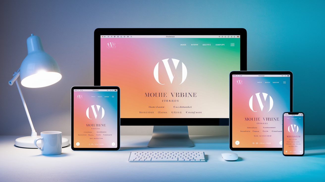
Your mockup probably shows a desktop view and maybe a mobile view. Your job is filling in the gaps between those two extremes and making the layout adapt smoothly at every screen size. The most common pattern you’ll see is two‑column sections that stack vertically on mobile. That’s a simple Grid or Flexbox shift inside a media query, but you need to plan for it from the start.
Use relative units like percentages, em, or rem for widths, padding, and font sizes so elements scale naturally. Avoid hard‑coding widths in pixels unless the design explicitly requires a fixed size (like a logo). Choose breakpoints based on where your content breaks, not where popular devices sit. If your three‑column footer looks cramped at 768px, add a query there to switch to one column. If your hero text wraps awkwardly at 920px, adjust it.
Actionable responsive techniques:
- Start with mobile‑first CSS, then add complexity at larger breakpoints.
- Use
flex-wrap: wrap;orgrid-auto-flow: dense;to let content reflow naturally. - Set
max-widthon text containers so lines don’t stretch too wide on large screens. - Test layouts at awkward in‑between sizes (like 850px) to catch unexpected wrapping.
- Use
clamp()for fluid typography that scales between minimum and maximum sizes.
Responsive design also means thinking about touch targets, readable line lengths, and navigation that works on small screens. If the desktop nav is a horizontal list, you might convert it to a hamburger menu on mobile. That requires JavaScript to handle the open/closed state accessibly, which brings us back to your edge‑case notes from pass five. Responsive isn’t just layout. It’s interaction patterns, performance, and making sure every user gets a usable experience no matter how they access your site.
Preparing Assets: Images, SVG Icons, and Webfonts
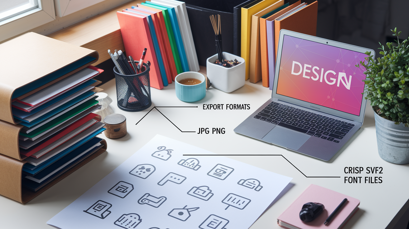
Before you can place an image or icon in your HTML, you need to export it from the design file in the right format and make it web‑ready. Raster images like photos should export as JPG or PNG. Use JPG for photos and complex images with gradients. Use PNG for graphics with transparency or sharp edges. SVG is your best choice for icons, logos, and simple illustrations because it scales infinitely and you can style it with CSS.
Export images at the exact dimensions they’ll display, or at 2× for high‑DPI screens if file size allows. Then run them through a compression tool like TinyPNG or ImageOptim to strip metadata and reduce file size without visible quality loss. A 500KB hero image can often compress to 150KB, cutting load time significantly. For icons, export SVG and consider inlining small ones directly in your HTML so you can change colors via fill or stroke properties in CSS.
Optimization tips:
- Export raster images at the display size, not original canvas size.
- Use WebP format if browser support meets your project requirements (most modern browsers).
- Inline SVG icons under ~2KB to save HTTP requests and enable CSS styling.
- Lazy‑load images below the fold so the browser prioritizes visible content.
Webfonts need careful handling too. If the mockup uses a custom typeface, grab the font files in WOFF2 format for best compression. Host them yourself or link to a service like Google Fonts. Either way, preload the font file in your HTML <head> to reduce render‑blocking delays. Set a fallback font stack so text remains readable while the custom font loads. Poor font loading creates a flash of invisible text (FOIT) or a flash of unstyled text (FOUT), both of which hurt user experience. Plan your @font-face rules and font-display strategy during this prep phase.
Structuring Files, CSS Organization, and Reusable Components
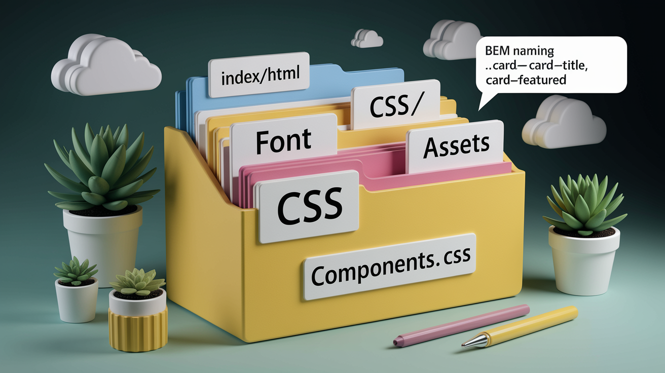
A well‑organized project structure makes future updates predictable and helps you onboard collaborators without a long handoff document. Start with a simple folder layout: css/ for stylesheets, assets/ for images and fonts, and index.html at the root. As your project grows, split CSS into separate files like base.css for resets and typography, layout.css for Grid and Flexbox rules, and components.css for buttons, cards, and other repeating UI pieces.
Name your CSS classes clearly and consistently. If you’re using BEM (Block Element Modifier), a card component might have .card, .card__title, .card__icon, and .card--featured. If you prefer utility‑first classes, you’ll apply .flex, .gap-4, .text-lg directly in your HTML. Either approach works, but pick one and stick to it. Mixed naming creates confusion and makes global searches harder.
Reusable components save time and reduce errors. If the mockup shows five identical card layouts, build one .card component and reuse it. Before you start coding each card, classify it using the four‑component readiness categories: 100% ready (copy‑paste), existing but needs tweaks (predictable effort), new but straightforward (predictable effort), or new and unclear (research required). That classification helps you estimate how long the work will take and surfaces questions early.
CSS Architecture Principles
CUBE CSS (Composition, Utility, Block, Exception) and BEM are two methodologies that help you decide where styles belong. CUBE encourages separating global styles (composition and utilities) from component‑specific styles (blocks) and one‑off exceptions. BEM uses a strict naming convention to keep specificity low and components portable. Both approaches prevent the “append‑only stylesheet” problem where every new feature adds more CSS without removing the old. Pick a methodology that matches your project’s complexity and your team’s comfort level, then document your choice so everyone follows the same patterns.
Setting Up the Development Environment and Tools

You’ll need a code editor, a way to preview your work in a browser, and version control to track changes. VS Code is a solid choice because it’s free, fast, and has built‑in Emmet abbreviations that speed up HTML writing. Install a live‑reload extension or use a local dev server like Vite so your browser updates automatically when you save a file. That instant feedback loop keeps you moving instead of manually refreshing every ten seconds.
Create a project folder and initialize a Git repository with git init. Even if you’re working solo, version control lets you experiment fearlessly because you can always roll back. Set up a .gitignore to exclude node_modules/ or other build artifacts. If you’re using a preprocessor like SASS, install it via npm and configure a watch task to compile .scss files into .css on save. If you’re sticking with plain CSS, you can skip the build step entirely and link your stylesheet directly.
For advice on environment setup and starter CSS practices, see Convert Figma Design to HTML and CSS in 2025.
Required setup steps:
- Install a code editor (VS Code) and enable live preview or live‑reload extension.
- Create project folders:
css/,assets/images/,assets/fonts/. - Add a CSS reset or normalize file to eliminate browser default styling inconsistencies.
- Initialize Git and make your first commit with the base folder structure.
- (Optional) Install a preprocessor like SASS or a utility framework like Tailwind CSS.
- Set up a local dev server (Vite, Webpack Dev Server, or a simple Python
http.server) for testing.
Start with the simplest setup that lets you write code and see results. You can always add complexity later. A beginner‑safe environment means fewer moving parts, less troubleshooting, and more time actually building the mockup.
Quality Checks, Accessibility, and Cross‑Browser Testing
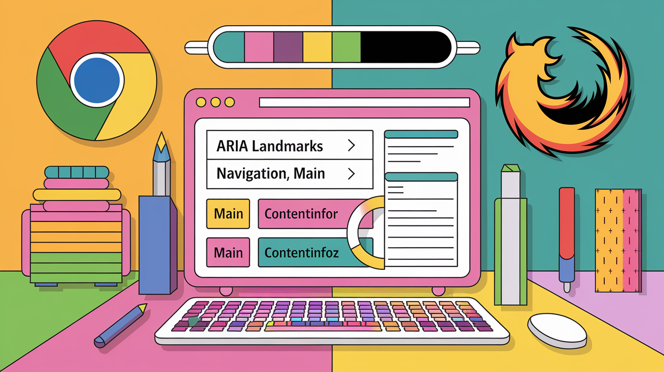
After you’ve built the layout and applied styles, it’s time to verify everything works for real users. Open your browser’s accessibility inspector and review the accessibility tree. You should see labeled landmarks (banner, navigation, main, contentinfo) and a logical heading outline (H1, H2, H3 in sequence). If you see a flat list of unlabeled divs, go back and add semantic tags and ARIA labels where needed.
Test keyboard navigation by tabbing through the page without a mouse. Every interactive element (links, buttons, form fields) should receive visible focus styles. If your design includes a hover menu, make sure it also opens and closes with keyboard controls and announces its state to screen readers. Pure CSS hover tricks often fail accessibility tests because they don’t update ARIA attributes or handle focus properly. You’ll need JavaScript for that.
Check responsive behavior by resizing your browser window slowly from desktop to mobile. Watch for text that wraps awkwardly, images that overflow their containers, or buttons that disappear off‑screen. Open your site in Chrome, Firefox, and Safari (or Edge) to catch browser‑specific rendering differences. Flexbox and Grid have excellent support now, but older properties like gap on flex containers weren’t always consistent. Cross‑browser testing catches those edge cases before your users do.
QA tasks to complete:
- Inspect the accessibility tree and verify semantic structure.
- Tab through the page and confirm all interactive elements are keyboard‑reachable with visible focus.
- Test responsive breakpoints and content reflow on narrow and wide screens.
- Load the page in at least three browsers to check layout consistency.
- Validate hover, focus, and active states for buttons and links match the mockup.
Accessibility and quality assurance aren’t final steps you tack on at the end. They’re part of the build process. When you write semantic HTML from the start and test interactivity as you go, you avoid expensive rework later. A screen reader user or keyboard‑only user should have the same functional experience as a mouse user. If they don’t, your conversion isn’t complete.
Common Mistakes When Converting Mockups and How to Avoid Them
Even experienced developers fall into predictable traps when converting designs. The most frequent mistake is ignoring responsiveness until the end. You build a pixel‑perfect desktop layout, then try to squeeze it into a mobile viewport and everything breaks. Avoid this by testing at multiple screen sizes from the beginning. Write your media queries as you build each section, not in a final “make it responsive” sprint.
Another common error is using fixed pixel values everywhere. Hard‑coded widths, font sizes, and margins make scaling impossible. Use relative units like rem, em, and percentages so your layout adapts naturally. Reserve pixels for borders, shadows, and elements that must remain a fixed size. Missing semantic tags is also frequent. Developers reach for <div> and <span> out of habit, creating a structure that looks fine but offers no meaning to assistive technologies. Choose expressive tags first, then add classes for styling.
Prevention measures:
- Test responsiveness continuously, not at the end.
- Use relative units (
rem,em,%) for spacing, typography, and widths. - Write semantic HTML before adding divs for layout hooks.
- Double‑check spacing values against the mockup instead of eyeballing alignment.
- Define hover and focus states for every interactive element during initial styling.
- Capture edge cases (form errors, empty states, loading states) in your evaluation passes and build them from the start.
Pixel‑perfect styling doesn’t mean matching every measurement to the exact pixel. It means respecting the design’s intent: the visual hierarchy, the spacing rhythm, the color relationships. If the mockup shows 40px padding and you implement 2.5rem (which equals 40px at default browser settings), that’s pixel‑perfect because it scales. If you hard‑code padding: 40px; everywhere, you’ve locked yourself into a fixed size that breaks the moment a user changes their browser’s base font size. Think in systems, not single values, and your conversions will be robust, accessible, and maintainable.
Final Words
We stripped the mockup into five passes—layout, elements, colors, structure, and edge cases—and used that map to plan HTML, CSS, and assets.
Then we mapped groups to semantic HTML, chose Flexbox or Grid, created CSS tokens, set breakpoints, optimised images, and organised files. Simple checks like hover states and accessibility keep the build solid.
Now you can start converting design mockups to HTML and CSS step by step with a repeatable workflow. Do one section at a time, test often, and enjoy the steady wins — you’re ready to ship responsive UI.
FAQ
Q: What’s the fastest way to convert a design mockup to HTML and CSS?
A: The fastest way to convert a design mockup to HTML and CSS is to follow the five-pass method: analyze layout, identify elements, extract colors, map semantic structure, and handle edge cases before coding.
Q: What is the five-pass method for converting mockups?
A: The five-pass method breaks the mockup into layout patterns, element patterns, color palette, semantic regions, and edge cases so you plan reusable components and spacing before writing code.
Q: How do I map mockup layers to semantic HTML?
A: Mapping mockup layers to semantic HTML means turning visual groups into header, nav, main, section, aside, and footer tags so markup is accessible, predictable, and easier to maintain.
Q: When should I use Flexbox versus CSS Grid?
A: Use Flexbox when aligning items in one direction—nav bars, centered blocks, side-by-side components—and use CSS Grid for complex two-dimensional layouts like multi-column sections and card grids.
Q: How do I convert colors, typography, and spacing into CSS?
A: Converting colors, typography, and spacing into CSS means export hex values, name tokens (like –color-primary), set text sizes (16px, 18px, 20px), and store them as CSS variables.
Q: How do I make a mockup responsive?
A: Making a mockup responsive means developing mobile-first, using relative units (%, em, rem), picking sensible breakpoints, and stacking two-column sections into single columns with media queries.
Q: How should I prepare images, SVGs, and webfonts for the web build?
A: Preparing assets means export raster images (JPG/PNG) and vectors (SVG), compress images, inline SVGs for styling when needed, and load webfonts carefully to avoid blocking the page.
Q: How do I organize files and CSS for reusable components?
A: Organizing files and CSS means separate global tokens from component styles, use a predictable folder layout, and adopt a naming system like BEM or CUBE so components stay reusable and testable.
Q: What tools should I set up before coding a mockup?
A: Set up VS Code, a live-reload dev server (Vite or Webpack), Git for version control, a starter CSS reset, and optional preprocessors like SASS or utility frameworks like Tailwind.
Q: How do I check accessibility and cross-browser compatibility?
A: Checking accessibility and cross-browser compatibility means using semantic HTML, keyboard focus states, ARIA for interactions, testing in multiple browsers, and verifying hover/focus and mobile reflow.
Q: What common mistakes do people make when converting mockups?
A: Common mistakes include ignoring responsiveness, using fixed pixels everywhere, skipping semantic tags and focus states, inconsistent spacing, and skipping edge-case behaviors during QA.
Q: Why reuse repeated components when converting designs?
A: Reusing repeated components speeds the build, reduces rework, keeps styles consistent, and makes effort estimates clearer because you build once and adapt with small variations.