

Think CSS is just pretty colors and fonts?
It’s actually the control panel that makes sites feel modern and work smoothly.
In this post you’ll get hands-on techniques—Flexbox and Grid for layouts, responsive images and fluid typography, animations that run smoothly, and color and accessibility rules—that let you build fast, adaptable interfaces without piling on JavaScript.
Each technique includes a quick example and a simple check so you know when it works.
By the end you’ll have clear patterns to style real pages that look great on any device.
Core CSS Design Principles and Immediate Techniques to Achieve Modern Styling

CSS is what turns raw HTML into something people want to look at. It controls layout, colors, fonts, spacing, backgrounds, filters, animations, and how everything shifts across different screen sizes. You can build interfaces that respond to user actions without writing a single line of JavaScript. It’s the layer between structure and experience.
A few core concepts determine how styles actually get applied. The cascade follows stylesheet order and source priority. Specificity decides which rule wins when there’s a conflict (inline styles beat IDs, IDs beat classes, classes beat element selectors). Inheritance passes certain properties like color and font-family down through the DOM, but layout stuff like margin and padding doesn’t inherit. The box model defines total element space: content plus padding plus border plus margin. Positioning comes in five flavors: static (default flow), relative (offset from normal spot), absolute (positioned relative to nearest positioned ancestor), fixed (stuck to viewport), and sticky (normal until you scroll past a threshold, then it locks).
Here’s what you’ll use constantly when building actual sites:
Flexbox handles 1D layouts. Set display: flex and control direction with flex-direction (row, column, or reversed versions). Perfect for navigation bars, card rows that need to wrap, or anything that needs dynamic alignment along one axis.
Grid handles 2D layouts. Use display: grid, define rows and columns with grid tracks, and place items exactly where you want them. Great for page templates or complex responsive layouts that shift structure at different breakpoints.
Responsive images combine fluid widths with srcset to serve different resolutions per device. Keeps file sizes reasonable without sacrificing quality on high-res screens.
Typography scaling uses rem or viewport units so text adjusts across breakpoints. Keeps headlines readable on phones without making them tiny on desktops.
Animation basics split between @keyframes for complex sequences and transition for simple state changes like hover effects. Stick with transform and opacity when possible since they run on the GPU.
Color usage covers hex, rgb, rgba, and hsl formats. Maintain WCAG contrast ratios so text stays readable for everyone.
These aren’t abstract ideas. A product card might use Flexbox for vertical stacking on mobile, then switch to Grid for a gallery view on tablets. Responsive typography keeps headings from overwhelming small screens. Animations guide attention during state changes (button press, menu slide) without killing performance. Every visual choice flows from understanding how cascade, box model, positioning, and layout systems combine.
Modern CSS Layout Design With Flexbox and Grid

Flexbox works along a single axis. Set display: flex on a container and child elements become flex items. The main axis runs in whatever direction you pick with flex-direction (row, column, or reversed), and the cross axis runs perpendicular. It’s excellent for distributing space, aligning items, or reordering content without touching HTML structure. Use it for navigation, card layouts that wrap, centered content, or any component where elements need to stretch, shrink, or align as viewport size changes.
Grid handles rows and columns at the same time. Set display: grid, define tracks with grid-template-rows and grid-template-columns, then place items using line numbers or named areas. Grid supports spanning multiple rows or columns, explicit placement, and complex responsive patterns that completely restructure at different breakpoints. Common breakpoints sit around 768px for tablets and 1024px for laptops. Tracks accept fixed units like px or flexible units like fr (fractional space). The gap property controls spacing between tracks without adding margin to individual items.
| Technique | Ideal Use Case |
|---|---|
| Flexbox | 1D layouts, dynamic alignment, navigation menus, card rows that wrap, vertically centering content |
| Grid | 2D layouts, page templates, complex responsive grids, precise item placement, magazine-style designs |
Responsive CSS Design Patterns and Media Queries

Media queries apply CSS conditionally based on viewport width, height, orientation, or other device characteristics. Most common pattern uses min-width or max-width to target ranges. Mobile-first starts with base styles for small screens and layers on complexity at larger breakpoints (“min-width: 768px applies when viewport hits at least 768px wide”). Desktop-first does the opposite. Breakpoints cluster around common device sizes (768px tablets, 1024px laptops) but should really be driven by where your content starts breaking, not by specific devices.
Media queries handle layout changes (single-column to multi-column), typography adjustments (bigger font-size and line-height for readability), and component behavior (showing or hiding navigation, reordering elements, toggling between list and grid views).
Container queries let a component adjust based on its parent container size instead of viewport size. Still relatively new, but they make components truly modular since they work across different page contexts. Fluid layouts use percentage widths, vw/vh units, or the clamp() function to scale smoothly without hard breakpoints. “font-size: clamp(1rem, 2vw, 2rem)” sets a minimum of 1rem, preferred size of 2vw (viewport width), and maximum of 2rem. Text scales fluidly but stays readable at extremes.
Combine these with responsive images using srcset and you’ve got a system that adapts to screen size, container context, and user preferences without duplicating components or drowning in media query lists.
CSS Design for Typography, Color, and Visual Hierarchy
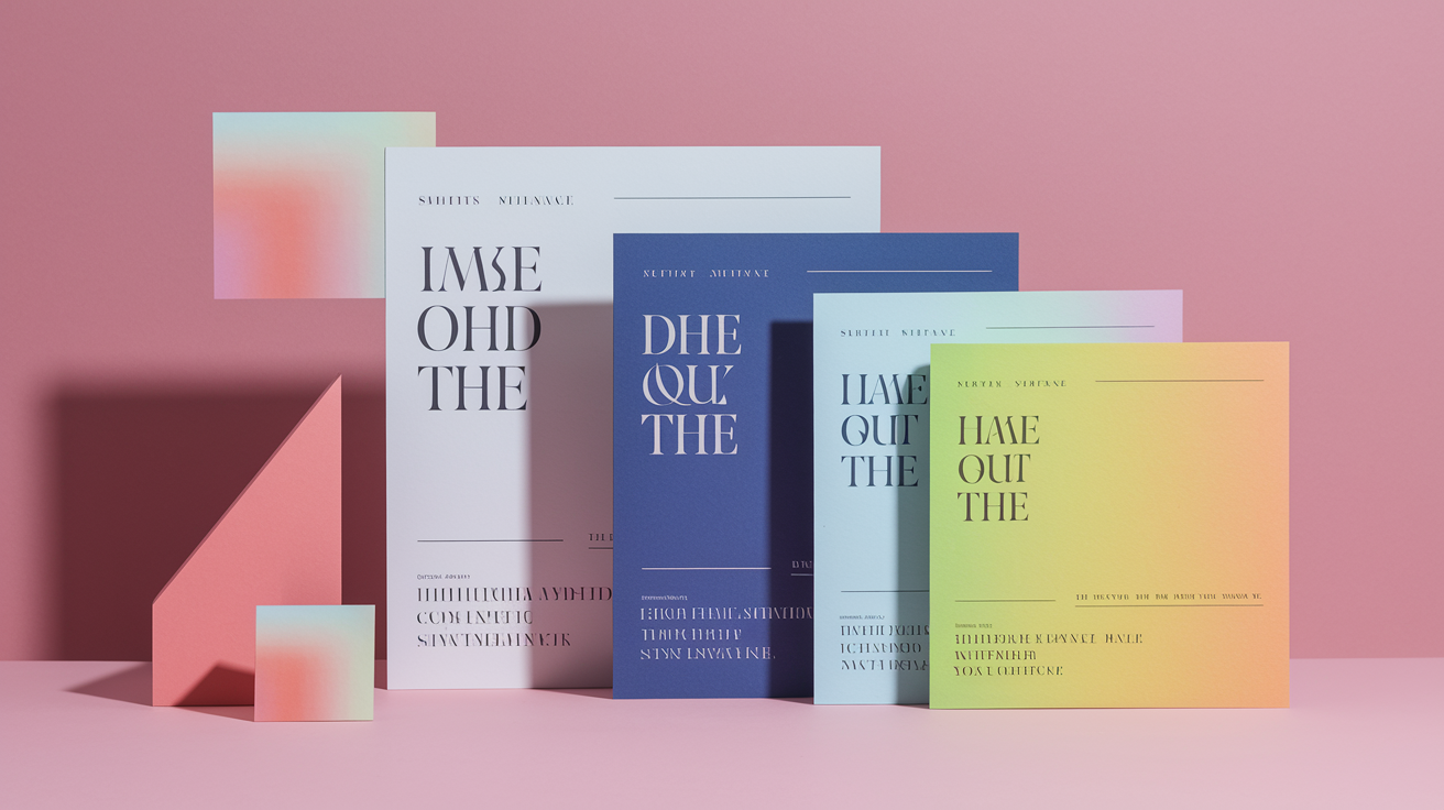
Typography starts with font-family (fallback stacks or web fonts like Google Fonts), font-size (use rem for scalability), font-weight (400 for normal, 700 for bold), line-height (1.5 to 1.6 for body text), and letter-spacing (adjust for headings or all-caps). Responsive typography scales font-size across breakpoints. Start with a comfortable mobile base, then increase at tablet and desktop widths. Use relative units like rem or em so text respects user browser settings. Consider fluid sizing with clamp() for smooth scaling between breakpoints.
Color formats include hex (#FF0000), rgb (rgb(255, 0, 0)), rgba (adds alpha transparency like rgba(255, 0, 0, 0.5)), and hsl (hsl(0, 100%, 50%) for hue, saturation, lightness). HSL is often easier to manipulate programmatically since you can shift hue or adjust lightness without recalculating multiple channels. Gradients (linear-gradient, radial-gradient) add depth. Visual effects like box-shadow, text-shadow, and filters (blur(), grayscale(), sepia()) create layering and emphasis.
Choose colors with sufficient contrast to meet WCAG guidelines. Text and background combinations need to pass contrast ratios for readability, especially for users with low vision or color blindness.
Visual hierarchy principles:
Size draws attention. Larger elements naturally get noticed first. Use font-size and scale to signal importance.
Weight makes things stand out. Bold text (font-weight: 700) pops against regular text (font-weight: 400). Use it sparingly for headings and key labels.
Spacing creates breathing room. Margin and padding group related elements close together and separate unrelated sections with whitespace.
Contrast improves readability. High contrast between text and background helps everyone. Color contrast also guides focus to interactive elements.
Alignment creates visual order. Consistent alignment (left, center, right, justified) feels intentional. Misaligned elements feel chaotic or unfinished.
CSS Animations, Transitions, and Motion Techniques

Transitions smooth changes between two states over a set duration. Define the property to animate, duration, timing function, and optional delay. “transition: background-color 0.3s ease-in-out;” changes background color smoothly over 0.3 seconds when the value updates (like on hover or focus). Transitions work best for simple state changes where you know start and end values. They’re lightweight and feel responsive since they trigger immediately when the CSS property changes.
Animations use @keyframes to define multi-step sequences with full control over intermediate states. Declare keyframes with percentages (0%, 50%, 100%) or keywords (from, to), then reference the animation by name and set duration, timing function, iteration count, and direction. A loading spinner might rotate continuously with “animation: spin 1s linear infinite;” where @keyframes spin rotates from 0deg to 360deg. Animations run independently of user interaction and can loop, reverse, or pause. More powerful than transitions but require more code and planning.
Transform and opacity are performance-friendly since they trigger GPU acceleration. Browsers can composite these changes without recalculating layout or paint. Use transform for movement (translate), rotation (rotate), scaling (scale), and skewing (skew). Avoid animating properties like width, height, top, or left since they force layout recalculations every frame and can cause jank on lower-powered devices.
The prefers-reduced-motion media query detects if a user requested reduced motion in their OS settings. Respect this preference by disabling or simplifying animations. “@media (prefers-reduced-motion: reduce) { * { animation: none !important; transition: none !important; } }” removes motion for users who experience discomfort or distraction from animated interfaces.
CSS Architecture and Scalable Design Systems

Choosing a Naming Convention
BEM (Block Element Modifier) structures class names as .blockelement–modifier to create predictable, self-documenting selectors. A card component might use .card for the block, .cardtitle for an element inside the card, and .card–featured for a modifier that changes appearance. This pattern avoids deep selector chains and specificity conflicts since every class is flat and single-purpose. Predictability reduces the need for !important overrides and makes it easier for team members to locate styles or add variations without accidentally breaking existing components.
Understanding CSS Layering
ITCSS (Inverted Triangle CSS) organizes styles into seven layers ordered from least to most authority. The Vendor layer sits at the top and contains third-party code (like extracted Bootstrap files) so it has the least specificity and can be easily overridden. Settings follow next and hold preprocessor variables, fonts, and configuration (no styles output from this layer). Tools contain mixins and functions with no direct output. Generic includes resets and normalization. Elements define base HTML element styles (h1, a, p). Components hold the majority of project-specific UI code. Utilities or Helpers sit at the bottom with the highest authority (classes like .show, .hide, or color helpers that override component defaults when needed).
Number-prefixed directory names (01-vendor, 02-settings, etc.) visually communicate cascade order to new developers and reinforce the layering system.
Working With Utility-First Concepts
Utility-first CSS uses single-purpose classes that apply one specific style rule. Instead of writing custom classes for every variation, you compose layouts and styles by combining utilities in your HTML. “class=’flex items-center gap-4 p-2 bg-blue-500 text-white'” applies display flex, vertical centering, gap spacing, padding, background color, and text color in one line. This approach reduces repetition since the same utilities reuse across components, increases consistency because every spacing or color value comes from a predefined scale, and speeds up development since you rarely context-switch to a stylesheet.
Utility-first can lead to verbose HTML and requires discipline to avoid inline-style-like chaos. Balance utilities with component classes when patterns repeat frequently enough to justify extraction.
CSS Preprocessors, PostCSS, and Workflow Optimization

Sass and Less extend CSS with variables, mixins, nesting, and functions. Variables store reusable values like colors, font sizes, or breakpoints. “$primary-color: #3498db;” lets you update one value and see changes cascade throughout the stylesheet. Mixins bundle reusable snippets of CSS that accept parameters, like a button mixin that outputs padding, border-radius, and background color based on size and variant arguments. Nesting lets you write child selectors inside parent blocks for better readability, though deep nesting can increase specificity and make debugging harder. Functions perform calculations or manipulate values (Sass includes color functions like lighten() and darken() to generate variations programmatically).
PostCSS is a tool that processes CSS with JavaScript plugins. Autoprefixer automatically adds vendor prefixes (-webkit-, -moz-) based on browser compatibility data, so you write standard CSS and the build step handles legacy support. Other plugins minify code, inline critical CSS, or transform future CSS syntax into compatible equivalents. PostCSS integrates into build pipelines alongside preprocessors. You can write Sass, compile to CSS, then run PostCSS for prefixing and optimization in a single workflow.
Typical CSS build optimization steps:
Compile transforms Sass/Less source files into plain CSS for browser delivery.
Prefix adds vendor prefixes with Autoprefixer to support older browser versions without manual code duplication.
Minify removes whitespace, comments, and shortens variable names to reduce file size. Combine with gzip or brotli compression for further savings.
Extract critical CSS inlines above-the-fold styles directly in HTML
to speed up initial render. Defer non-critical styles for lazy loading.Monitor bundle size tracks CSS file size over time. Set budgets and alerts to catch regressions before they impact load performance.
Accessible and Inclusive CSS Design Techniques

WCAG color contrast guidelines require readable ratios between text and background. 4.5:1 for normal text, 3:1 for large text (18px bold or 24px regular), and higher ratios for AAA compliance. Use contrast checkers during design to verify that color combinations meet minimum standards. High contrast improves readability for users with low vision, color blindness, or anyone viewing a screen in bright sunlight. Don’t rely on color alone to convey information. Pair color with text labels, icons, or patterns so colorblind users can distinguish states and actions.
Focus outlines must be visible for keyboard navigation. The default browser outline (often a blue ring) signals which element has focus, letting keyboard-only users know where they are in the interface. Many design systems remove the default outline with “outline: none;” for aesthetic reasons, then fail to replace it with a custom focus style. Always define an alternative. “:focus { outline: 2px solid #3498db; outline-offset: 2px; }” provides a clear, accessible indicator. Skip the outline only when you provide an equally visible replacement, like a background color change, border, or shadow.
A practical fix: if your design removes default focus outlines, add a custom :focus style to every interactive element. A button component might define “:focus { box-shadow: 0 0 0 3px rgba(52, 152, 219, 0.5); }” to create a visible ring when focused via keyboard. Test by tabbing through the page. If you lose track of where focus is, the design needs stronger visual cues. This small change ensures keyboard users can navigate confidently without needing a mouse.
Debugging, Browser Tools, and Compatibility in CSS Design

Browser DevTools let you inspect live styles, edit rules in real time, and see exactly which selectors apply or override. The Elements panel (Chrome/Edge) or Inspector (Firefox/Safari) highlights the selected DOM node and displays all matching CSS rules in order of specificity. You can toggle individual properties on and off, adjust values with arrow keys, or add new rules to test changes before editing source files. Device emulation mode simulates different screen sizes and pixel densities, letting you preview responsive behavior without switching to physical devices. Use it to test breakpoints, inspect layout shifts, and catch overflow or clipping issues.
Vendor prefixes (-webkit-, -moz-, -ms-, -o-) provide fallback support for CSS features that aren’t yet standardized or widely implemented. Modern tooling like Autoprefixer handles this automatically, but if you’re writing prefixes manually, place the prefixed versions before the standard property so the browser uses the standard version when available. “display: -webkit-flex; display: flex;”.
Testing must include Chrome, Safari, Firefox, and Edge as a baseline. Safari on macOS and iOS often lags behind Chromium-based browsers in adopting new CSS features, so verify that Grid, Flexbox, container queries, or custom properties work as expected on Apple devices.
| Tool | Use Case |
|---|---|
| DevTools | Live CSS editing, specificity inspection, responsive emulation, performance profiling, layout debugging |
| Prefixed Properties | Fallback support for experimental or non-standard features; ensure compatibility with older browser versions |
| Compatibility Testing | Cross-browser validation on Chrome, Safari, Firefox, Edge; test on real devices or emulators for mobile |
Final Words
Open your editor and apply the basics: the box model, cascade, specificity, plus flexbox for one-dimensional layouts and grid for two-dimensional layouts. Start small and test as you go.
Use media queries around 768px and 1024px, scale typography, pick color formats (hex, rgb, hsl), add subtle transitions, and organize styles with a predictable architecture and build steps.
These css design fundamentals turn choices into practical sites that load fast and work for everyone. Keep practicing. Each small win builds real skill.
FAQ
Q: What does CSS design do and why is it important?
A: CSS design defines how a site looks and lays out content, controlling layout, colors, spacing, fonts, and responsive behavior so pages stay readable, consistent, and visually appealing across devices.
Q: What are the foundational CSS concepts I must know?
A: The foundational CSS concepts are the cascade (rules order), specificity (selector weight), inheritance, and the box model (content, padding, border, margin), which decide which styles apply and how elements size.
Q: When should I use Flexbox vs Grid?
A: Use Flexbox for one-dimensional layouts like nav bars or rows, and use Grid for two-dimensional layouts that need rows, columns, and item spanning; choose based on layout complexity and alignment needs.
Q: How do I make a layout responsive with media queries?
A: To make a layout responsive, write mobile-first styles and add media queries at breakpoints (commonly ~768px and ~1024px) to change grid/flex directions and spacing for wider screens.
Q: What are practical tips for typography and color in CSS?
A: Practical tips are scalable type using relative units, predictable font weights (400, 700), clear contrast with hex/rgb/hsl colors, and using spacing and subtle shadows to establish visual hierarchy.
Q: How do transitions differ from animations and when should I use each?
A: Transitions animate changes between two states for simple hover or state shifts, while animations (@keyframes) run scripted sequences; use transitions for small tweaks and animations for more complex motion.
Q: How can I make motion accessible in CSS?
A: Making motion accessible means honoring prefers-reduced-motion, detecting that media query to reduce or disable nonessential animations, and keeping any allowed motion subtle and brief.
Q: What CSS architecture should I use for scalable projects?
A: For scalable projects, use predictable patterns like BEM for class names, ITCSS for layered structure, and utility-first ideas to reduce repetition and speed up consistent styling.
Q: What build steps do modern CSS workflows include?
A: Modern workflows typically compile Sass or Less, run PostCSS with Autoprefixer, minify output, extract critical CSS, and monitor bundle size to boost performance and delivery.
Q: How do I debug cross-browser CSS issues effectively?
A: To debug cross-browser issues, use DevTools for live edits and device emulation, add vendor prefixes or fallbacks, and test early in Chrome, Safari, Firefox, and Edge.
