

Think your FAQ page helps customers? Most don’t, they hide answers in long text and confuse people.
A well-designed FAQ page gives fast, clear answers without the hunting.
This post shows practical, test-backed best practices for user-friendly layouts: search-first headers, clear categories, collapsible accordions, visual steps, and accessibility basics.
You’ll learn how to pick the right layout for your audience, speed up mobile visits (over half of FAQ traffic is mobile), and cut support tickets by making info easy to find.
By the end you’ll have a simple checklist to build or fix your FAQ page.
Core Principles of Effective FAQ Page Design

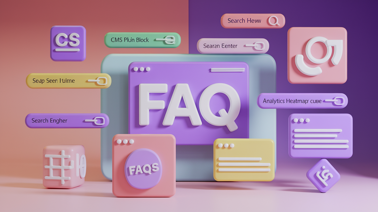
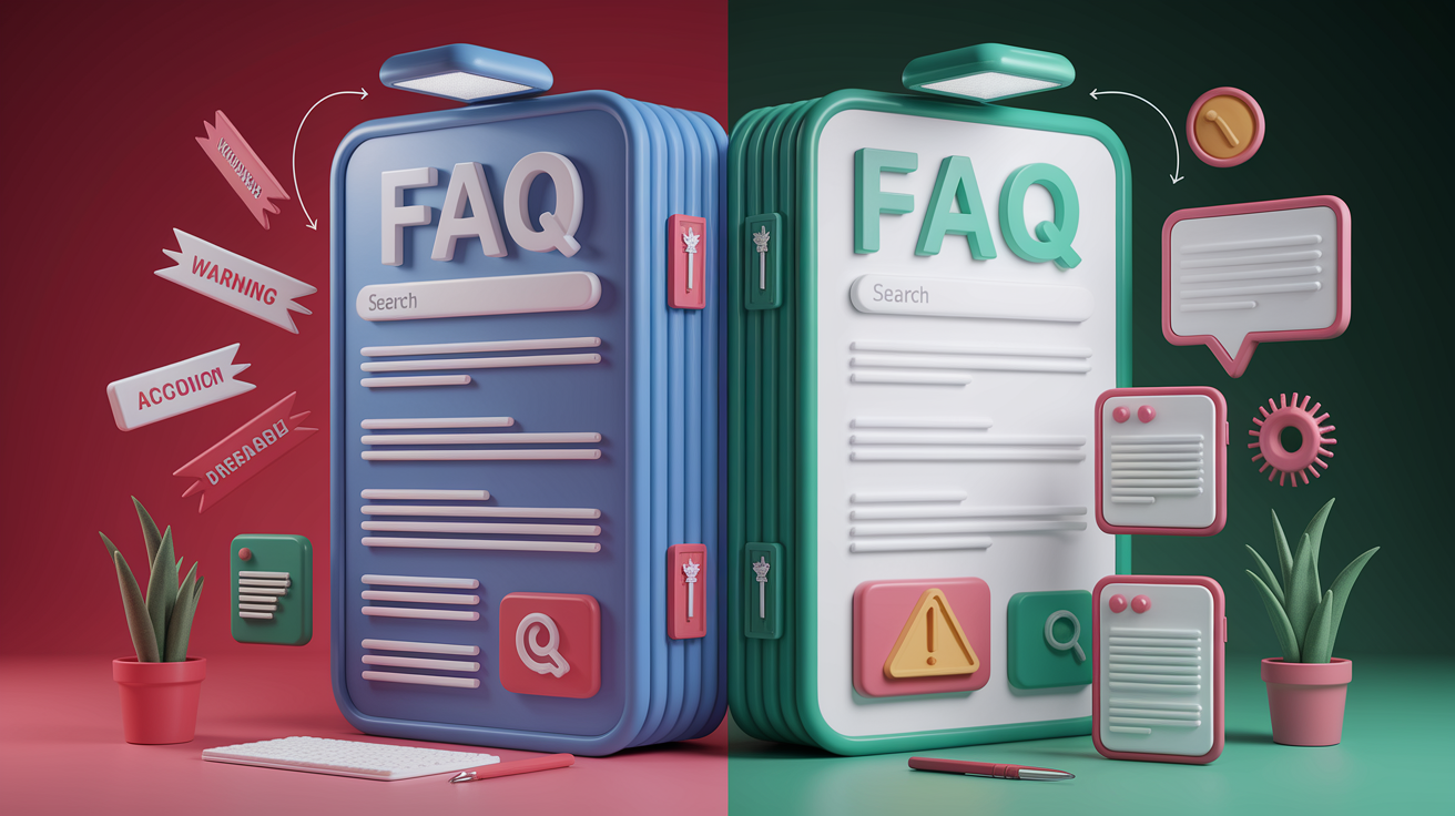
An effective FAQ page gets people to fast answers while respecting how they actually look for help. The pattern that works pairs collapsible accordions with clear categories and a search bar up top. Accordions let you scan question titles without drowning in text walls, while categories group related stuff so you can jump straight to shipping, returns, or account issues. A search bar handles specific queries instantly. Sites like Adobe, WhatsApp, and Wistia all put search front and center because users often land knowing exactly what they need.
Strong FAQ design cares about readability through intentional typography, spacing, and visual hierarchy. Use generous white space around each question block, readable font sizes (16px minimum on mobile), and consistent heading styles. Multi-format answers beat text alone. Mix short paragraphs with annotated screenshots, 60 to 90 second screen recordings, and simple diagrams. Real data shows that adding visuals to text-only answers can lift “This solved my problem” ratings by 30 to 50 percent, because different people prefer different ways to learn.
Every FAQ page should include these six components:
- Clear layout with logical grouping and visual breathing room
- Search bar at the top for keyword lookups
- Category navigation or jump links for browsing by topic
- Collapsible answers (accordions) to cut cognitive load
- Visual aids like screenshots, GIFs, or short videos
- Contact options displayed when self-service isn’t enough
Clarity, accessibility, and strategic placement tie everything together. Drop your FAQ link in the header nav, footer, product pages, checkout flow, and customer portal. Anywhere users naturally look for help. Make sure the page loads quickly, works on mobile, and uses semantic HTML so screen readers and search engines can parse it cleanly.
Choosing the Right FAQ Layout for User Needs

Layout choice depends on how big your FAQ is, how complex your questions are, and whether you’re serving multiple audiences. Accordions work best for straightforward, single-audience FAQs with 10 to 30 questions. Users scan titles, tap to expand, move on. Categorized grids or lists with jump links scale better when you’ve got 40+ questions spread across distinct topics like billing, shipping, and account stuff. Search-first layouts suit technical products or enterprise tools where users arrive with precise queries. Microsoft and Adobe both lead with a search bar, then show categories below.
Audience segmentation becomes essential when a single FAQ tries to serve hosts and guests, or personal users and enterprise admins. Real examples show that adding a persona switcher at the top, like Airbnb’s host/guest toggle, reduces wrong-audience tickets by over 40 percent. If you audit your last 200 support tickets and find more than 20 percent are from the wrong user type, add segmentation immediately. Filters work similarly. McDonald’s and Vrbo use audience or location filters so users see only relevant questions instead of scrolling past stuff that doesn’t apply.
Five layout patterns worth considering:
- Category grid: tiles or cards linking to topic clusters, good for broad product lines
- Accordion-only: single-page collapsible list, best for under 30 straightforward questions
- Hybrid sidebar: Mailchimp-style sidebar categories with expandable answers on the right
- Search-first: prominent search bar with suggested results, fallback to categories below
- Persona-based: switcher or separate landing pages per audience (host/guest, personal/business)
FAQ Information Architecture and Organization Strategies

Good information architecture starts with understanding how users mentally group their problems. Organize FAQs by topic (Ordering, Shipping, Returns, Account), by user journey stage (Getting Started, Using Features, Troubleshooting), or by persona (Students, Teachers, Admins). Run a quick card-sort exercise or audit your last 100 support tickets to see which themes repeat, then build your top structure around those patterns.
Six organizational models you’ll see:
- Topic-based: Billing, Shipping, Returns, Account Management
- Journey-based: Getting Started, Daily Use, Advanced Features, Troubleshooting
- Persona-based: Personal Users, Teams, Enterprise, Developers
- Product-line-based: Product A, Product B, Accessories, Services
- Alphabetical: simple fallback when topics are too diverse to categorize cleanly
- Hybrid: broad categories with filters or tags for cross-cutting concerns (mobile, international, refunds)
Limit your top categories to three to five whenever you can. Research shows that offering more than six categories increases abandonment because users struggle to decide which bucket fits their question. If you’ve got more than 50 questions, use filters or tags instead of creating eight top sections. Real sites managing over 200 help articles rely on filters. Users select “iOS” or “Billing” and see a refined list rather than scrolling endlessly. Heatmaps can reveal which categories get fewer than 5 percent of clicks. Consolidate or rename those low-traffic sections.
Breadcrumbs and jump links improve navigation inside large FAQ sections. A sidebar with anchor links (like Mailchimp uses) lets users skip directly to “How do I reset my password?” without reading every question above it. Breadcrumbs help users backtrack when they land on a nested article from search, showing the path Home > Account > Security > Password Reset. Both patterns reduce frustration and keep people moving toward answers instead of hitting the back button.
Writing High-Quality FAQ Content and Microcopy

Write questions in the exact words your customers use. Pull phrasing from support tickets, live chat logs, and search console queries rather than guessing. Start every answer with a direct, one-sentence solution. “You can reset your password from the login screen by clicking ‘Forgot Password?'” Then add detail below for users who need it. Don’t open with background or disclaimers. Lead with the answer.
Keep answers short and action-oriented. Aim for 50 to 100 words per answer when possible, and break longer responses into numbered steps or bullet points. If a question requires deeper explanation, provide a simple answer up front and add an “Advanced configuration” or “More details” section below. This progressive disclosure approach serves beginners and power users on the same page without overwhelming either group. Conversational tone helps. Write like you’re sitting next to the person, not lecturing from a stage. Spotify and Mailchimp both use friendly, human voices that match their product personalities.
Four microcopy principles for clarity:
- Lead with the answer: put the solution in the first sentence, context second
- Use active verbs: “Click Save” beats “The Save button should be clicked”
- Match user vocabulary: say “refund” if your customers say refund, not “credit reversal”
- Add visuals for clarity: annotated screenshots or 60-second videos for “how do I” questions
End every answer with a clear next step when appropriate. If the user needs to contact support, include a link or button. If they should try a specific feature, guide them there. Adding “What to do next” sections has been shown to reduce follow-up contacts by 15 to 25 percent because users know exactly how to proceed instead of guessing or reopening a ticket.
Making FAQs Accessible, Mobile-Ready, and Fast

Accessibility starts with semantic HTML and ARIA roles. Use proper heading tags (H2 for question titles, H3 for subsections) so screen readers can navigate the page structure. Add ARIA labels to accordion buttons. aria-expanded="false" when collapsed, "true" when open. And make sure each button controls a unique content region with matching IDs. Keyboard navigation must work flawlessly. Users should be able to tab through questions, press Enter or Space to expand, and Escape to collapse.
Mobile-first layout isn’t optional. Over half of FAQ traffic comes from phones, so test every design on small screens first. Use large tap targets (minimum 44×44 pixels), readable font sizes (16px body text), and collapsible sections to avoid endless scrolling. Some high-performing sites load FAQ pages in under 200 milliseconds. Prioritize lightweight markup, lazy-load images below the fold, and avoid render-blocking scripts. Fast pages keep users engaged and reduce the chance they’ll abandon for live chat.
Five accessibility must-haves:
- Keyboard navigation: Tab, Enter, Escape work correctly for accordions and search
- ARIA roles and labels: proper
aria-expanded,role="button", and region IDs - Clear heading hierarchy: H2 for questions, logical structure for screen readers
- High contrast and legible type: 4.5:1 minimum contrast ratio, 16px+ body text
- Responsive layout: mobile-first design, touch-friendly tap targets, no horizontal scroll
Enhancing FAQ Pages With Search, Filters, and Smart Features

A prominent search bar at the top of your FAQ page handles users who arrive knowing their question. Make the input field wide enough to type a full sentence, and show autocomplete suggestions as soon as the user types three characters. Instant feedback reduces search abandonment. Build synonym lists so “refund” and “money back” both surface the same article, and track zero-result queries in your analytics to identify gaps in your content.
Context-aware FAQs take search further by surfacing relevant questions based on the user’s recent activity, current page, or role. If someone just tried to upload a file and hit an error, show file-related troubleshooting questions in a sidebar or sticky widget. Audit your support tickets by page or feature to identify clusters of issues tied to specific product areas, then build contextual FAQ modules for those spots. Real implementations show that contextual help reduces contacts significantly because users get answers before they even think to search.
Four search and filter improvements:
- Autocomplete with suggestions: show matching question titles as users type
- Synonym expansion: map common variations to the same canonical question
- Faceted filters: let users narrow by topic, product, or user type without reloading
- Contextual clusters: surface FAQs tied to the current page or recent user action
Persona routing and device detection refine results automatically. Detect whether the user is on iOS, Android, or desktop and show platform-specific answers first. If you serve multiple user types, add a simple switcher at the top. “Are you a host or a guest?” Then filter the entire FAQ to match. One case study reported a 40 percent drop in misdirected tickets after adding role-aware routing, because users no longer waded through irrelevant answers.
Boosting Conversions and Reducing Support Tickets Through FAQ Design

A well-designed FAQ page deflects tickets and guides users toward conversions in the same motion. When someone lands on “What’s your return policy?” and finds a clear, trustworthy answer, they’re more likely to complete the purchase. Fresh, accurate content paired with persona segmentation has produced three-times increases in self-service and measurable drops in repeat contacts. Adding actionable “What to do next” sections at the end of each answer reduces follow-up questions by 15 to 25 percent because users know the exact next step, whether that’s booking a repair, calculating a fee, or proceeding to checkout.
Track six key performance indicators to measure FAQ effectiveness:
- Ticket deflection rate: percentage of sessions that end without a contact
- Helpfulness rating: thumbs-up percentage or multi-option feedback scores
- Bounce rate from FAQ: users who land and leave without clicking deeper
- Search abandonment: queries that return zero results or no clicks
- Time on page: long reads may signal confusion; quick exits often mean success
- Repeat visitors: users returning to the same article suggest incomplete answers
Multi-option feedback widgets generate actionable improvement signals. Instead of a simple thumbs-up or thumbs-down, offer four buttons: “Solved,” “Hard to find,” “Incomplete,” or “Wrong.” This granular data tells you whether to rewrite the answer, improve search, add detail, or correct outdated information. Flag any article with a helpfulness score below 60 percent and rewrite it within 30 days. Quarterly reviews catch content that drifts out of date, and automated alerts can trigger updates when bounce rates spike or search abandonment crosses a threshold.
SEO and Schema Markup for High-Visibility FAQ Pages

SEO for FAQ pages starts with keyword research focused on natural, question-based queries. Use tools like Google Search Console, AnswerThePublic, or your own site-search logs to find the exact phrasing users type. “How do I reset my password?” or “What’s your return window?” Use those phrases as your H2 question titles. Internal linking matters too. Link from product pages, blog posts, and help articles back to your FAQ, and link from FAQ answers to relevant guides or product pages to keep users moving through your site.
Structured data makes your FAQ answers eligible for rich snippets and the “People Also Ask” carousel in search results. Implement FAQ schema using JSON-LD markup in the page head or inline. Each question and answer pair gets its own Question and acceptedAnswer block, which search engines parse to display expandable answers directly in results. This visibility boost drives organic traffic and positions your brand as a trusted answer source before users even click through.
| Schema Element | Purpose |
|---|---|
| @type: FAQPage | Declares the page as an FAQ, enabling rich result eligibility |
| mainEntity (array of Questions) | Contains all question-answer pairs on the page |
| Question: name | The exact question text, matching your H2 or accordion title |
| Question: acceptedAnswer | Wraps the answer text in plain HTML or Markdown format |
| Answer: text | The full answer content, including any inline links or formatting |
Featured snippets favor concise, well-structured answers. Write the first sentence of each answer to stand alone as a complete response, then add supporting detail below. Use bullet points, numbered steps, or short tables when appropriate. Search engines often pull these formats directly into position-zero results. Keep your FAQ content fresh. Google favors recently updated pages, so add a “Last updated” timestamp and refresh answers quarterly or whenever products, policies, or common questions shift.
Tools, Templates, and CMS Integrations for Building FAQ Pages
Most modern content-management systems offer built-in or plugin-based FAQ modules. WordPress users can choose from dedicated FAQ plugins that bundle accordion widgets, schema markup, and category management in one package. Shopify apps provide similar features with drag-and-drop editors and automatic schema injection. Page builders like Elementor include accordion widgets, search-form blocks, and full-page FAQ templates that you can customize with brand colors, fonts, and layouts in minutes.
Help-center platforms like Intercom, Zendesk, and HubSpot Service Hub offer end-to-end solutions with search, feedback widgets, analytics dashboards, and AI-powered answer suggestions. These systems scale to hundreds or thousands of articles, support role-based content, and integrate directly with live chat so agents can push FAQ links mid-conversation. Some platforms include live status indicators, contextual help widgets, and workflow automation that flags outdated content or drafts new articles from resolved tickets.
Five tool categories to consider:
- CMS plugins and page builders: WordPress FAQ plugins, Elementor accordion templates, Shopify FAQ apps
- Dedicated help-center platforms: Zendesk, Intercom, HubSpot Service Hub, Freshdesk
- Search and filtering tools: Algolia, Swiftype, or native CMS search with synonym support
- Schema generators: online JSON-LD builders or CMS plugins that auto-inject FAQ schema
- Feedback and analytics: Hotjar for heatmaps, Google Analytics for bounce/time metrics, custom feedback widgets
Common Mistakes in FAQ Page Design and How to Avoid Them
The most common mistake is publishing a long, unstructured accordion list with 40+ questions nobody actually asks. This wall-of-accordion approach overwhelms users and buries the few questions people really need. Audit your support logs, identify the top 15 to 20 recurring questions, and start there. Remove or archive low-traffic questions after six months if they generate zero engagement.
Seven mistakes to avoid:
- No search bar on pages with more than 20 questions: users scroll endlessly or give up
- Generic answers that ignore user type: hosts and guests need different information
- Outdated content without timestamps: users distrust answers that feel stale
- Text-only answers for visual tasks: screenshots and videos improve comprehension by 30 to 50 percent
- Hidden or hard-to-find FAQ links: place links in header, footer, and product pages
- No feedback mechanism: you can’t improve what you don’t measure
- Ignoring mobile layout: over half your traffic is on phones; test there first
Set a maintenance rhythm. Review your FAQ quarterly, flag articles older than six months for a freshness check, and rewrite any answer with a helpfulness score below 60 percent within 30 days. Monitor search-abandonment rates and zero-result queries weekly to catch content gaps early. Assign ownership. One person or team should be responsible for keeping the FAQ accurate, complete, and aligned with current product features and policies.
Key Things to Keep in Mind for Successful FAQ Page Design
Successful FAQ design is never “set and launch.” Treat your FAQ as a living document that evolves with your product, policies, and customer questions. Define clear update triggers: new product launches, policy changes, declining helpfulness scores, or recurring questions that aren’t yet documented. Track performance metrics (page traffic, bounce rate, helpfulness ratings, and ticket deflection) and use that data to prioritize rewrites, add new questions, or restructure categories. Many high-performing sites add “last updated” timestamps to every article, signaling freshness and building user trust.
Balance self-service with human escalation. Your FAQ should solve the majority of common questions, but always provide a clear, easy path to support when it doesn’t. Sticky chat widgets, visible contact links, and “Still need help?” sections at the end of each answer ensure users never feel stuck. Continuous improvement comes from closing the loop: collect feedback, monitor ticket logs, update content, measure impact, and repeat. That cycle turns a static FAQ into a powerful support tool that reduces costs, improves customer experience, and frees your team to focus on complex, high-value conversations.
Final Words
In the action, we walked through core patterns—accordion behavior, categorization, and search-first layouts—and why each helps users find answers fast.
We covered information architecture, microcopy tips, multi-format answers (text, screenshots, video), accessibility, smart search, SEO, and tools, plus common mistakes to avoid.
Focus on clarity, scannability, and the right placement across your site. Keep measuring and updating. With those steps, you’ll see your faq page design cut support load and make users happier.
FAQ
Q: How to design, format, and display an FAQ page?
A: To design, format, and display an FAQ page, start with a scannable layout: top search, clear categories, and collapsible answers (accordion). Prioritize short first-sentence answers, mobile-first spacing, and accessible markup.
Q: What should a FAQ page include?
A: A FAQ page should include a clear layout, search bar, categories, collapsible answers, helpful visuals or short videos, contact/escalation options, and last-updated timestamps so users find fast, reliable answers.
