

Most sites still send the same giant image to phones and desktops.
That wastes bandwidth, makes pages slow, and gives blurry pictures on high-density screens.
If you care about speed and happier visitors, you need smarter images.
This post shows how to optimize images for the web and use srcset responsively so the browser picks the right file for each screen and network.
You’ll learn which formats to use (AVIF, WebP, JPEG), how to generate multiple widths, and how to write srcset and sizes that actually work in the real world.
Core Principles of Web Image Optimization and Responsive srcset Usage
Images eat up more bandwidth than anything else on your page. Scripts, fonts, stylesheets—all of it combined still loses to images in the byte-count race. For almost 25 years, developers just slapped one file per image slot. Same file whether you’re on a phone with a shaky 3G connection or a 5K monitor on fiber. That meant wasted bandwidth on mobile, blurry visuals on retina displays, and slow load times everywhere.
Optimized images and responsive srcset fix this. You give the browser a set of candidates, and it picks the smallest file that works for the visitor’s screen and network.
Modern formats like WebP and AVIF compress way harder than JPEG without looking worse. How you compress matters too. Lossy versus lossless, quantization levels, chroma subsampling—all of it trades file size against how sharp things look. Srcset and the sizes attribute tell the browser which image widths you’ve got and how wide the image will actually render. The browser does the math: multiplies the CSS width by device pixel ratio, then grabs the smallest source file that covers what it needs.
Responsive image markup handles five big jobs: retina screens, fluid layouts, combining both, art direction (different crops per breakpoint), and format negotiation (AVIF for modern browsers, JPEG for holdouts). When you provide multiple widths and formats, the browser can make smart calls based on network conditions. Sometimes it’ll grab a smaller file on slow connections even when a bigger one would technically fit the screen.
Here’s what works:
Use modern formats. AVIF compresses best, WebP has broad support, JPEG catches everyone else.
Compress smart. Lossy at 70 to 85% quality for JPEG usually looks fine and cuts file size in half.
Provide multiple widths. Generate 320w, 640w, 1024w variants so the browser has real choices.
Define sizes. Use the sizes attribute with vw, px, or calc() to communicate rendered width at each breakpoint.
Enable art direction. Use <picture> and <source media> to swap crops when layout shifts.
Layer format fallbacks. Stack <source type="image/avif">, then WebP, then JPEG so every browser decodes something.
Web Image Compression and Modern Format Selection
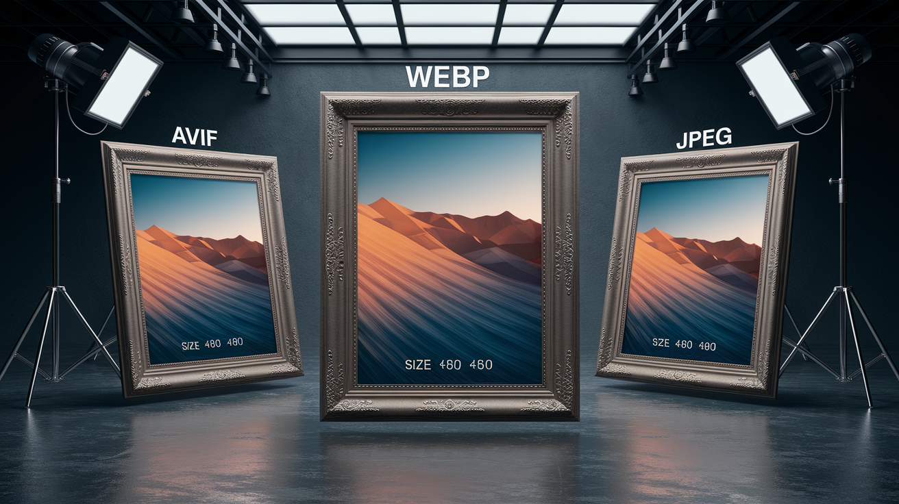
AVIF crushes file sizes harder than anything else—often 30 to 50% smaller than WebP at the same quality. But browser support is still rolling out, so you need a fallback. WebP balances wide support (Chrome, Edge, Firefox, recent Safari) with solid compression, typically 25 to 35% smaller than optimized JPEG. JPEG is your universal safety net. Every browser handles it, and tools like mozjpeg can shave another 10 to 20% by cleaning up Huffman tables and stripping metadata.
Lossy compression throws away detail to shrink files. Lossless keeps every pixel but gives you bigger files. For photos and complex images, lossy at 75 to 85% quality (on the JPEG scale) usually delivers sharp visuals at half the size of lossless. Chroma subsampling (4:2:0 instead of 4:4:4) cuts another 15 to 25% by reducing color resolution where your eyes don’t notice, with almost no perceptual loss.
Tools like Squoosh let you compare formats and settings side by side. Upload an image, toggle between WebP lossy at 80%, AVIF at 65%, and JPEG at 82%, and watch file size drop while you check quality in real time.
| Format | Advantages | Ideal Use Case |
|---|---|---|
| AVIF | Best compression, smallest files, supports HDR | High-quality photos where every kilobyte matters; serve to modern browsers with JPEG fallback |
| WebP | Broad support, good compression, supports transparency | General-purpose photos and graphics; fallback when AVIF isn’t supported |
| JPEG | Universal support, mature tooling, predictable quality | Universal fallback for all browsers; use optimized encoders like mozjpeg |
Practical Workflow for Preparing Images in Multiple Sizes
Start with a high-res source image. At least 2× the largest display width you expect to serve. A 2048-pixel-wide source gives you room to generate 320, 640, and 1024 variants without quality loss. Store source files in a dedicated folder (src/images/originals/) and keep final optimized variants in public/images/ or your CDN bucket. Separate source from output so your build pipeline always regenerates from clean, uncompressed originals.
Automate resizing with a build script or task runner. Sharp (Node.js), libvips (CLI), or ImageMagick can batch-resize hundreds of images in seconds. Set up your script to read each source file, output 320w, 640w, and 1024w JPEG variants, then repeat the process for WebP and AVIF. Strip EXIF metadata during export to trim a few more kilobytes per file. Name files clearly: lake-320.jpg, lake-640.avif, lake-1024.webp. Consistent naming makes srcset strings easier to generate and debug.
Generate final variants in three formats and store them with clear naming. Here’s what a typical pipeline looks like:
Read source files from your originals folder and loop over each image.
Resize to target widths (320, 640, 1024) using sharp’s .resize({ width: 320 }) or ImageMagick’s -resize 320.
Export each size in JPEG, WebP, and AVIF with quality settings (JPEG 82, WebP 80, AVIF 65).
Strip metadata using sharp’s .withMetadata(false) or jpegtran’s -copy none flag.
Write output files to your public folder with width and format in the filename: lake-320.jpg, lake-320.webp, lake-320.avif.
Understanding srcset Descriptors for Responsive Images
Srcset accepts two kinds of descriptors: x-descriptors for device pixel ratio targeting and w-descriptors for width-based selection. X-descriptors (1x, 2x, 4x) tell the browser which file to use on standard, retina, and ultra-high-density screens when the image’s display size is fixed in CSS pixels. W-descriptors (320w, 640w, 1024w) declare the actual pixel width of each source file. The browser combines that with the sizes attribute and device pixel ratio to pick the right file. You can’t mix x and w descriptors in the same srcset. Browsers ignore the whole attribute if you try.
DPR-aware selection happens automatically when you use w-descriptors and sizes together. The browser multiplies the CSS-rendered width (from sizes) by device pixel ratio to calculate required device pixels, then picks the smallest srcset candidate that meets or exceeds that number. This single mechanism handles both fluid layouts and high-density screens without duplicating your image list.
Pixel Density (x) Descriptors
Use x-descriptors when the image has a fixed display size. A logo that’s always 160 CSS pixels wide, for example. Provide a 320×240 file marked 1x for standard screens and a 640×480 file marked 2x for retina displays. The browser renders both at 320×240 CSS pixels but downloads the higher-resolution file on 2x screens, keeping the logo crisp.
<img src="logo-320.jpg"
     srcset="logo-320.jpg 1x, logo-640.jpg 2x"
     width="320"
     height="240"
     alt="Company logo">
Devices with 4x density (some phones) will fall back to the 2x file if you don’t provide a 4x variant. That’s usually fine. Most visitors won’t notice the difference between 2x and 4x on a small screen.
Width (w) Descriptors
Use w-descriptors when the image’s display size changes with the viewport. Common in fluid grids and full-width hero images. Provide files at 320, 640, and 1024 pixels and declare their widths in srcset: lake-320.jpg 320w, lake-640.jpg 640w, lake-1024.jpg 1024w. Pair this with a sizes attribute so the browser knows how wide the image will render. The browser converts sizes to CSS pixels, multiplies by DPR, and selects the smallest file that covers the required device pixels.
<img src="lake-640.jpg"
     srcset="lake-320.jpg 320w,
             lake-640.jpg 640w,
             lake-1024.jpg 1024w"
     sizes="100vw"
     alt="Mountain lake at sunrise">
If the viewport is 800 pixels wide and the device is 2x, the browser needs 1600 device pixels. It picks lake-1024.jpg (the closest candidate without going too far under the required size, depending on the exact algorithm and network conditions). On a 1x screen at 800px, it picks lake-640.jpg or lake-1024.jpg.
How to Use the sizes Attribute for Fluid Layouts
The sizes attribute tells the browser how wide the image will be in CSS pixels at different viewport widths. It accepts a comma-separated list of media conditions and lengths, evaluated left to right. When a media query matches, the browser uses that length. If no query matches, it uses the final default length. Lengths can be vw (viewport width percentage), px, em, or calc() expressions. But not container-relative percentages like 50%, because sizes is evaluated before layout runs.
An image in a three-column grid above a 36em breakpoint and full-width below it uses sizes="(min-width: 36em) 33.3vw, 100vw". On a 1024px-wide viewport above 36em, the browser calculates 1024 × 0.333, roughly 341 CSS pixels. On a 2x screen, that becomes 682 device pixels, so the browser picks the smallest srcset candidate ≥ 682px, probably the 640w or 1024w file depending on available sources. Including width and height attributes (or aspect-ratio in CSS) reserves space in the layout, preventing cumulative layout shift when the image loads.
Here’s how the browser calculates which file to fetch:
Evaluate sizes. On a 1024px viewport with sizes="(min-width: 36em) 33.3vw, 100vw" and the condition true, compute 1024 × 0.333 = 341 CSS pixels.
Multiply by device pixel ratio. On a 2x screen, multiply 341 × 2 = 682 device pixels required.
Select from srcset. Pick the smallest source in srcset with a w value ≥ 682. If srcset lists 320w, 640w, 1024w, the browser chooses 1024w (640 < 682, so next step up is 1024).
Art Direction Using the picture Element
Art direction means swapping different crops, compositions, or orientations at specific breakpoints. Show a wide panorama on desktop and a tight portrait crop on mobile, rather than just scaling the same image. The <picture> element wraps multiple <source> tags, each with a media attribute and its own srcset. When a media query matches, the browser uses that source’s srcset. When none match, it falls back to the <img> element’s src or srcset. The <img> inside <picture> is required. Without it, no image renders. Apply all CSS (max-width, object-fit, etc.) to the <img>, not to <picture> or <source>.
Format switching is another common <picture> use case. List <source type="image/avif"> first with AVIF files, then <source type="image/webp"> with WebP files, then an <img> with JPEG. The browser skips sources whose type it doesn’t support and uses the first match. This pattern serves the smallest file to modern browsers and a compatible fallback to older ones, without JavaScript or server-side detection.
You can combine art direction and format switching in one <picture> by layering media-conditioned sources with type attributes. Order matters. The browser evaluates sources top to bottom and stops at the first match.
Example Art-Direction Pattern
Imagine a hero image that’s full-width on mobile and one-third-width in a three-column grid above 36em. On mobile, you crop tight to a subject’s face (96×96 or 192×192 for 1x and 2x). Above 36em, you show the full scene (320×240, 640×480, 1024×768) so visitors see context. The markup looks like this:
<picture>
  <source media="(min-width: 36em)"
          srcset="lake-320.jpg 320w,
                  lake-640.jpg 640w,
                  lake-1024.jpg 1024w"
          sizes="33.3vw">
  <source srcset="lake-crop-96.jpg 1x,
                  lake-crop-192.jpg 2x">
  <img src="lake-640.jpg"
       width="640"
       height="480"
       alt="Mountain lake at sunrise">
</picture>
Below 36em, the first source’s media condition fails, so the browser uses the second source with cropped files at 1x/2x. Above 36em, the first source matches, and the browser picks from the full-size set using the 33.3vw size. This gives you control over composition without duplicating code or serving oversized images to small screens.
Performance Techniques: Lazy Loading, Preloading, and LCP Optimization
Browsers scan HTML early and begin loading images before layout or CSS is parsed. This preload behavior is one of the biggest performance wins in modern browsers. Adding loading="lazy" to an <img> defers loading until the image is near the viewport, saving bandwidth and CPU for images below the fold. But never lazy-load above-the-fold images, especially your Largest Contentful Paint candidate (usually a hero image), because the browser will delay the fetch and hurt LCP.
Intersection Observer provides finer control than native lazy loading by letting you set custom thresholds and trigger logic. You can start loading an image when it’s 200 pixels away from entering the viewport, giving it time to decode before the visitor scrolls to it. For JavaScript-based lazy loading, start with a low-resolution placeholder in src, store the real source in a data attribute, and swap them when the observer fires.
Preloading the hero image with <link rel="preload" as="image" href="hero.jpg"> (or with imagesrcset for responsive candidates) tells the browser to fetch it immediately, even before the HTML parser reaches the <img> tag. This cuts LCP by hundreds of milliseconds on image-heavy pages. But preload only one or two critical images. Preloading too many competes with other resources and can delay first render.
Performance rules for images:
Prioritize above-the-fold images. Avoid loading="lazy" on any image visible without scrolling.
Lazy-load everything else. Use loading="lazy" on images below the fold to defer work and save bandwidth.
Preload the LCP image. Use <link rel="preload"> with imagesrcset if it’s responsive, or a simple href if it’s fixed.
Use Intersection Observer for custom thresholds. Start loading images 200 to 300 pixels before they enter the viewport for smooth scroll experiences.
Server-Side Delivery, CDNs, and Automatic Format Negotiation

Image CDNs like Cloudinary, Cloudflare Images, and imgix handle resizing, format conversion, and quality tuning on the fly. Instead of storing nine files per image (three widths × three formats), you store one high-resolution source and request variants via URL parameters. ?w=640&f=avif&q=80 fetches a 640-pixel-wide AVIF at quality 80. The CDN caches the transformed file at the edge, so subsequent visitors get instant delivery. This workflow cuts storage costs and simplifies your build pipeline.
Automatic format negotiation inspects the browser’s Accept header and serves AVIF to browsers that list image/avif, WebP to those listing image/webp, and JPEG to everyone else. You write one <img src="image.jpg"> tag, and the CDN or origin server rewrites the response Content-Type and body to match the best supported format. Combine this with auto-quality flags (q_auto in some CDNs) that analyze image content and adjust compression per region. High detail in faces, lower in flat skies. Balances fidelity and size.
Edge resizing reduces latency by generating and caching images at CDN points of presence close to your visitors. A request from Tokyo hits a Tokyo edge node, which resizes the image once and serves it from cache to all subsequent Tokyo visitors. The origin server never sees repeat requests for the same size.
| Technique | Benefit | Ideal Use Case |
|---|---|---|
| On-the-fly transforms | Generate sizes and formats via URL; store one source file | Sites with hundreds of images and frequent layout changes |
| Automatic format negotiation | Serve AVIF/WebP/JPEG based on Accept header without markup changes | Simplify srcset by letting the server pick format instead of using multiple source elements |
| Resizing at the edge | Cache transformed images close to visitors, reducing latency and origin load | Global audiences with high traffic; minimizes round-trip time for image delivery |
Testing, Debugging, and Auditing Responsive Images

Lighthouse’s “Properly size images” audit scans your page and reports any image larger than its display size, showing potential kilobyte savings per file. Run Lighthouse in Chrome DevTools or via CLI, check the Opportunities section, and look for lines like “Potential savings: 127 KiB” next to an image filename. WebPageTest goes further by visualizing the full request waterfall and highlighting slow image loads that delay LCP or block rendering.
Use browser DevTools to inspect which file the browser selected. Open the Network panel, filter by Img, and reload the page. Click an image request and check the URL. If you see lake-1024.jpg on a narrow viewport, your sizes attribute might be wrong. Toggle device emulation to test 1x, 2x, and 3x pixel ratios, and confirm the browser picks the expected file at each density. Network throttling (Slow 3G, Fast 3G) lets you verify that the browser chooses smaller files on constrained connections when multiple candidates are close in size.
Check which file the browser selects across viewports:
Open DevTools and switch to the Network panel, filter to Img.
Resize the browser window to 375px wide, reload, and note which file loaded (should be 320w or 640w depending on DPR and sizes).
Resize to 1280px, reload, and confirm the browser now fetches 1024w or larger. If it still fetches 320w, check your sizes attribute for incorrect media queries or missing vw lengths.
Final Words
You trimmed image weight, picked modern formats (WebP/AVIF/JPEG), set sensible compression, and generated multiple widths. You also wired srcset descriptors, calculated sizes for fluid layouts, used picture for art direction, and added lazy loading and preloads.
Follow a simple workflow: choose base assets, automate resizing and format outputs, add srcset + sizes, then test in DevTools. That keeps pages fast and layouts stable.
If you apply these steps, you’ll know how to optimize images for the web and use srcset responsively — and your pages will load faster and feel smoother.
FAQ
Q: What are the core principles of web image optimization and responsive srcset usage?
A: The core principles of web image optimization and responsive srcset usage are using modern formats, keeping file sizes small, offering multiple widths, and letting the browser choose the best file with srcset and sizes.
Q: How do I choose between AVIF, WebP, and JPEG for the web?
A: Choosing between AVIF, WebP, and JPEG depends on support and goals: AVIF gives smallest files, WebP balances support and size, JPEG is widely supported with tuned quality settings like 70–85%.
Q: What compression settings and tricks give good JPEG quality and smaller files?
A: Good JPEG compression uses mozjpeg-like encoders at quality 70–85%, chroma subsampling (4:2:0) and reduced color depth, combined with stripping metadata to cut bytes without visible loss.
Q: How should I prepare source images and automate multiple sizes in a build pipeline?
A: Preparing source images means keeping a high-quality master, then automating resizing to widths like 96/192/320/640/1024 with tools (sharp, libvips), outputting WebP/AVIF/JPEG, and generating srcset metadata in CI or build scripts.
Q: What’s the difference between x (pixel density) and w (width) descriptors in srcset?
A: The difference is that x descriptors target device pixel ratio (1x, 2x) for fixed-size images, while w descriptors list image widths (320w, 640w) used with sizes for fluid layouts; never mix both types.
Q: How do I write the sizes attribute for fluid layouts and prevent CLS?
A: The sizes attribute defines expected rendered width using media queries (e.g., “(min-width:36em) 33.3vw, 100vw”); also declare width/height or aspect-ratio on img to avoid layout shifts.
Q: When should I use the picture element for art direction and how does it work?
A: Use picture for art direction when you need different crops or compositions at breakpoints; picture lets you swap fully cropped sources per media query and fall back to a sensible img at the end.
Q: How should I handle lazy loading, preloading, and LCP for critical images?
A: Handle them by preloading the hero image for faster LCP, using loading=”lazy” for offscreen images, and using Intersection Observer for smarter lazy loading to prioritize above-the-fold assets.
Q: What are the server-side and CDN options for automatic format negotiation and resizing?
A: Server-side and CDN solutions can auto-resize at the edge and negotiate AVIF/WebP/JPEG using the Accept header, reducing latency and serving the smallest supported format per request.
Q: How do I test and debug responsive images to confirm the browser picks the right file?
A: To test and debug responsive images, use DevTools network and element inspectors, emulate DPR and viewports, and check selected file in the resource panel; repeat across breakpoints to verify crispness and size.