

What if your site looks great on desktop but is unusable for roughly one in four people?
Responsive accessibility fixes that.
It means designing so layouts adapt to screens while assistive tech, keyboard users, and people who zoom still get a complete, predictable experience.
Start with semantics, fluid units, and keyboard-friendly controls instead of bolting accessibility on later.
This post gives beginner-friendly best practices and simple tests so you can build sites that stay readable, operable, and fast across phones, tablets, and assistive devices.
You’ll finish with clear wins you can test in a browser.
Core Meaning and Importance of Responsive Accessibility
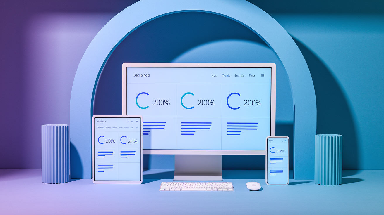
Responsive accessibility is about building websites that work for everyone, no matter what device they’re using or what disability they might have. It’s where responsive design (layouts that adapt to different screen sizes) meets accessibility principles that make sure people using assistive tech can actually navigate, understand, and interact with your content. When you build with responsive accessibility from the start, someone with low vision can zoom your site to 200% on their phone without losing content. A keyboard-only user can reach every button whether they’re on a laptop or tablet.
A lot of beginners treat accessibility like a separate checklist to tackle once the responsive design is done. That creates problems. A button that looks great on desktop might become impossible to reach with a keyboard on mobile if you didn’t plan for focus states and touch targets early. A flexible grid that reflows beautifully can still trap screen reader users if your heading order breaks at smaller viewports. Responsive accessibility isn’t two jobs. It’s one approach to building interfaces that respect device limits and human needs at the same time.
When you get responsive accessibility right, you end up with:
- Content that stays usable when people zoom, resize, or reflow across any viewport
- Assistive tech that receives correct structure and labels at every breakpoint
- Keyboard and touch interactions that work equally well on small screens and big monitors
- Performance wins (faster loads, optimized images) that reduce barriers for users on limited data or older devices
Foundational Principles for Beginners

Before you write your first media query or add an ARIA attribute, you need to understand how responsive design and accessibility reinforce each other. WCAG’s four pillars (perceivable, operable, understandable, robust) aren’t abstract theory. They’re practical filters. Perceivable means users can see or hear your content through their preferred method: screen reader, magnifier, captions. Operable means they can interact with controls using keyboard, mouse, touch, or voice. Understandable means your interface behaves predictably and your language stays clear. Robust means your markup works across browsers, devices, and assistive tech without breaking.
Responsive design uses fluid grids, flexible images, and breakpoints to adapt layout to screen width. Accessibility makes sure that adaptation doesn’t sacrifice meaning, order, or control. A responsive site that hides navigation behind a hamburger menu on mobile is fine, unless that menu can’t be opened with a keyboard or announced properly to a screen reader. A fluid image that scales to fit a small viewport is great, unless it’s missing descriptive alt text or breaks the reading flow when magnified.
Here are five principles that connect responsive design and accessibility for beginners:
- Semantic structure before visual layout. Use proper HTML elements (header, nav, main, button) so assistive tech understands your page regardless of CSS breakpoints or screen size.
- Flexible units and scalable content. Choose relative units (rem, em, %) instead of fixed pixels so text and spacing scale when users adjust browser settings or zoom to 200%.
- Keyboard and touch parity. Make sure every interactive element is reachable by keyboard and large enough (at least 44×44 CSS pixels) for touch on small screens.
- Logical source order. Write your HTML in a meaningful reading sequence. CSS can rearrange things visually, but screen readers and keyboard navigation follow the DOM order.
- Progressive enhancement over assumptions. Start with a baseline experience that works without JavaScript or modern CSS, then layer enhancements so older browsers and assistive tech still function.
Practical Implementation Steps

Building responsive accessibility into your workflow gets easier when you follow a clear sequence. These steps assume you’re starting a new project or refactoring an existing page. Each one builds on the last.
-
Add the responsive viewport meta tag to your HTML head. Include
<meta name="viewport" content="width=device-width, initial-scale=1">and never setuser-scalable=noormaximum-scalebelow 2. This single line enables mobile rendering and respects user zoom preferences. -
Write your HTML with semantic elements and proper heading hierarchy. Use
<header>,<nav>,<main>,<footer>, and headings (<h1>to<h6>) in logical order. Screen readers rely on this structure to navigate your page, and it stays consistent across breakpoints. -
Convert layout to a fluid grid using Flexbox or CSS Grid with relative units. Replace fixed-width containers with flexible boxes. Set widths in percentages or use
flex: 1andgrid-template-columns: repeat(auto-fit, minmax(20rem, 1fr))so content reflows instead of breaking. -
Make images responsive and provide meaningful alt text. Use
srcsetandsizesattributes on<img>elements to serve appropriate image sizes. Every informative image needs descriptivealttext. Decorative images should havealt=""so screen readers skip them. -
Make sure all interactive elements are keyboard accessible with visible focus states. Set
outlineorbox-shadowon:focusand:focus-visiblefor buttons, links, and form controls. Test that you can Tab through every control and activate it with Enter or Space. -
Use CSS media queries mobile-first and test content reflow at common breakpoints. Start styles for small screens, then add
@media (min-width: 768px)and higher to layer in wider layouts. At each breakpoint, verify keyboard focus order matches visual flow and no content gets clipped. -
Validate that text scales to 200% without breaking layout or hiding content. Zoom your browser to 200% and scroll through the page. If horizontal scrolling appears or content overlaps, revisit your units and containers. WCAG 2.1 Level AA requires this.
Code Examples for Real‑World Application

Here’s a simple responsive layout using semantic HTML and Flexbox. The container holds a header, main content area, and footer. Each section uses relative units so it adapts to viewport width and user font-size preferences.
<div class="container">
<header role="banner">
<h1>Site Title</h1>
</header>
<main role="main" id="main">
<h2>Main Heading</h2>
<p>Content goes here.</p>
</main>
<footer role="contentinfo">
<p>© 2024 Your Site</p>
</footer>
</div>
.container {
  display: flex;
  flex-direction: column;
  min-height: 100vh;
  padding: 1rem;
}
main {
  flex: 1;
}
@media (min-width: 768px) {
  .container {
    padding: 2rem;
  }
}
This layout stacks vertically on small screens and adds more padding on wider viewports. The role attributes provide explicit landmarks for older assistive tech, and flex: 1 on <main> pushes the footer down. Because padding uses rem, it respects the user’s base font size.
Responsive images that adapt to viewport width and provide accessible fallback text look like this:
<img
  src="hero-800.jpg"
  srcset="hero-480.jpg 480w, hero-800.jpg 800w, hero-1200.jpg 1200w"
  sizes="(max-width: 600px) 100vw, 50vw"
  alt="Sunrise over a harbor with a steel bridge in the foreground"
>
The srcset attribute lists three image files with their pixel widths. The sizes attribute tells the browser to display the image at full viewport width on screens up to 600px, and half viewport width on larger screens. The browser picks the most appropriate file. The alt text describes the content for screen reader users and appears if the image fails to load.
Scalable typography that adjusts smoothly across viewports can use the clamp() function:
html {
  font-size: 16px;
}
h1 {
  font-size: clamp(1.5rem, 4vw, 3rem);
  line-height: 1.2;
}
p {
  font-size: 1rem;
  line-height: 1.6;
}
The clamp(1.5rem, 4vw, 3rem) function sets a minimum size of 1.5rem, a preferred size of 4% of viewport width, and a maximum of 3rem. This scales text fluidly between breakpoints without sudden jumps. Using rem for the base and for paragraph text respects user font preferences and zoom settings.
Tools and Methods for Testing Accessibility Across Devices
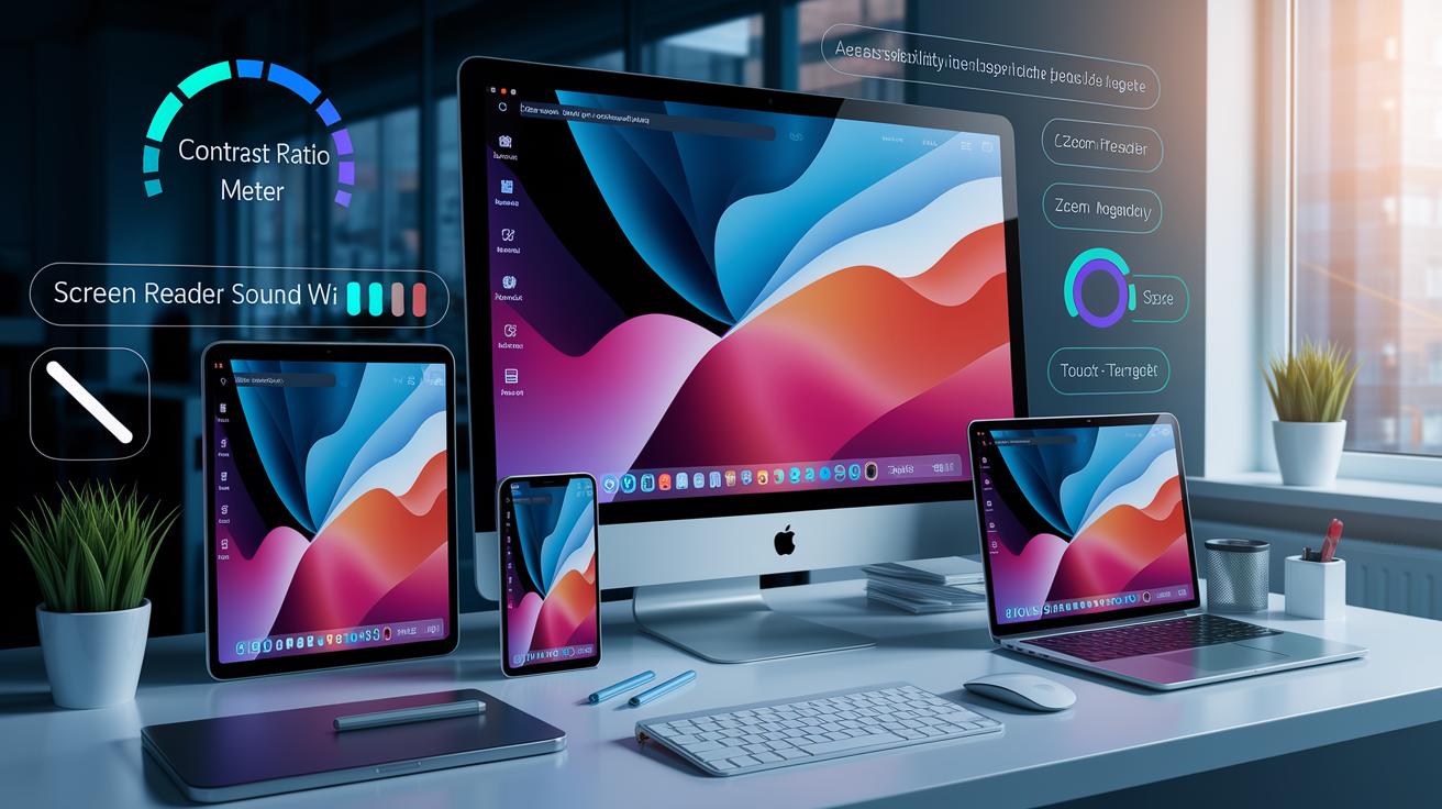
Testing responsive accessibility requires a mix of automated scans and manual checks. Automated tools catch about 30 to 40% of accessibility issues. The rest need human judgment and real assistive tech. Start with browser DevTools to simulate different viewport sizes and check your media queries. Chrome, Firefox, and Edge all include device emulation. Resize the viewport to common breakpoints (320px, 768px, 1024px) and verify content reflows without horizontal scrolling.
Once you’ve confirmed visual responsiveness, add in accessibility tests. Keyboard navigation is the fastest manual check. Disconnect your mouse and Tab through the entire page. Can you reach every button, link, and form field? Is the focus indicator visible at every stop? If you get stuck or lose focus, you’ve found a barrier. Next, zoom your browser to 200% (Cmd/Ctrl and + twice) and scroll through the page. Text should reflow into narrower columns. No content should be clipped or require horizontal scrolling.
Here are six tools and methods for testing responsive accessibility:
- Lighthouse (built into Chrome DevTools). Runs automated accessibility, performance, and best-practice audits directly in your browser. Flags missing alt text, low contrast, and keyboard issues.
- axe DevTools browser extension. Works in Chrome, Firefox, and Edge. Scans the current page and highlights WCAG violations with detailed guidance.
- NVDA (Windows) or VoiceOver (macOS/iOS) screen readers. Navigate your site using only the screen reader to confirm semantic structure, labels, and content order make sense when heard aloud.
- Color contrast analyzers (like WebAIM’s Contrast Checker). Measure text and background color ratios to verify they meet WCAG AA (4.5:1 for normal text, 3:1 for large text).
- Mobile device testing with real phones and tablets. Emulators are useful, but real devices reveal touch-target issues, pinch-zoom behavior, and screen-reader quirks that simulators miss.
- Browser zoom and text-resize tests. Zoom to 200% and separately increase text size in browser settings. Verify layout adapts without breaking or hiding content.
Frequent Beginner Mistakes and How to Fix Them
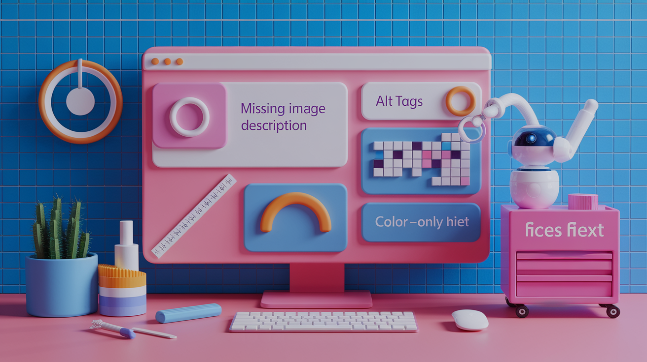
Missing or generic alt text on images. Beginners often leave alt attributes empty on informative images or write “image” as the alt text. Fix it by writing descriptive alt text that conveys the image’s purpose. If the image is purely decorative, use alt="" so screen readers skip it. Example: instead of alt="photo", write alt="Team celebrating product launch in the office".
Blocking pinch-zoom or setting maximum-scale below 2. Some developers add user-scalable=no or maximum-scale=1 to the viewport meta tag, which prevents users from zooming. Fix it by removing those properties or setting maximum-scale=5. WCAG requires users to scale text up to 200% without loss of content or function.
Using fixed pixel units for font sizes and layout. Hard-coded font-size: 14px or width: 300px doesn’t scale when users adjust browser settings or zoom. Fix it by switching to relative units. Use font-size: 1rem (16px by default) and width: 18.75rem (300px equivalent) so everything scales proportionally.
Hiding focus outlines without providing an alternative. Removing :focus { outline: none; } for looks makes keyboard navigation invisible. Fix it by replacing the default outline with a high-contrast border or box-shadow if you remove it. Example: button:focus { outline: 3px solid #0a84ff; outline-offset: 2px; }.
Relying on color alone to convey information. Using red text for errors or green for success without accompanying icons or text labels excludes colorblind users. Fix it by pairing color cues with text, icons, or patterns. Example: add a ✓ icon next to green success messages and an ✗ icon next to red error messages.
Catching these mistakes early saves time. Build a habit of running a quick accessibility scan and a manual keyboard check after every major layout change. Prevention beats retrofitting accessibility into a finished design.
Final Words
In the action, we covered what responsive accessibility means, the core principles to learn, and a step‑by‑step plan to build it. You also got copy‑ready code examples, testing methods, and a list of common beginner mistakes with fixes.
Follow the principles, run the tests, and keep markup simple and semantic. Small wins add up: readable layouts, keyboard support, and flexible media matter.
Keep practicing these responsive accessibility best practices for beginners and treat testing as part of every update. You’ll make sites that work better for everyone, and that’s progress.
FAQ
Q: What is responsive accessibility?
A: Responsive accessibility is designing interfaces that stay usable across screen sizes while meeting accessibility needs, so people using assistive tech or different devices can access content reliably.
Q: Why does responsive accessibility matter for my site or app?
A: Responsive accessibility matters because it widens your audience, improves usability, reduces legal risk, and keeps content reachable for users on small screens or assistive technologies, boosting satisfaction and conversions.
Q: How do I start implementing responsive accessibility as a beginner?
A: To start implementing responsive accessibility, run a quick audit, switch to semantic HTML, use flexible layout units, verify keyboard navigation, and test with a screen reader and multiple viewport sizes.
Q: What foundational principles should beginners know and how does WCAG fit in?
A: Foundational principles beginners should know are WCAG’s perceivable, operable, understandable, and robust pillars, plus responsive basics like fluid layouts and flexible content so assistive tech works across breakpoints.
Q: What practical steps should I follow to implement responsive accessibility?
A: Practical steps to implement responsive accessibility include writing semantic HTML, ensuring keyboard operability, adding flexible images, using scalable typography, creating adaptive layouts, applying ARIA sparingly, and testing early.
Q: How do I make images responsive and accessible?
A: To make images responsive and accessible use srcset and sizes, provide meaningful alt text, prefer the picture element for art direction, and mark purely decorative images as aria-hidden or empty alt.
Q: How do I ensure text scales and remains readable?
A: To ensure text scales and remains readable use relative units like rem, apply responsive clamps or media-query sizes, set generous line-height, include viewport meta, and test browser zoom and mobile reflow.
Q: What tools and methods should I use to test responsive accessibility?
A: Tools and methods to test responsive accessibility include screen readers, color-contrast checkers, browser devtools device toolbar, keyboard-only navigation, manual zoom/reflow checks, and automated accessibility scanners.
Q: What common beginner mistakes should I avoid and how do I fix them?
A: Common beginner mistakes to avoid and fix are missing alt text, using fixed pixel units, inaccessible navigation, poor color contrast, and relying only on automated tests; fix with semantic markup, flexible units, and manual testing.
