

Tired of pages that look great on desktop but fall apart on phones?
If you’re still building separate mobile and desktop versions, you’re doing extra work, losing visitors, and slowing load times.
This guide shows simple, hands-on HTML and CSS techniques like the viewport meta tag, media queries, flexible grids, a mobile-first flow, responsive images, and browser testing, so one codebase adapts to phones, tablets, and desktops, gives faster, more usable pages, and keeps your workflow simple.
What Is Responsive HTML? (With Example)
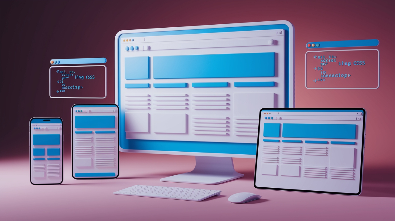
Responsive HTML is how you build webpages that automatically adjust their layout, images, and spacing to fit any screen size. Someone visits on a phone, tablet, or desktop? Same page, different arrangement. Instead of creating separate sites for mobile and desktop, you write one set of HTML and CSS that adapts to the viewport width. The page figures out the device width and rearranges content so it’s readable and usable everywhere.
The viewport meta tag is the first piece of responsive HTML. Without it, mobile browsers zoom out and display the desktop version of the page in a tiny, unreadable view. Adding this tag to your <head> tells the browser to match the page width to the device width and skip the default zoom.
<!DOCTYPE html>
<html lang="en">
<head>
  <meta charset="UTF-8">
  <meta name="viewport" content="width=device-width, initial-scale=1">
  <title>Responsive Page</title>
  <style>
    body {
      font-family: Arial, sans-serif;
      margin: 0;
      padding: 20px;
    }
    .container {
      max-width: 1200px;
      margin: 0 auto;
    }
    .box {
      background: #e0e0e0;
      padding: 20px;
      margin-bottom: 10px;
    }
  </style>
</head>
<body>
  <div class="container">
    <div class="box">Content box one</div>
    <div class="box">Content box two</div>
  </div>
</body>
</html>
In this example, width=device-width sets the page width equal to the screen width, and initial-scale=1 prevents the browser from zooming in or out on load. The .container uses max-width so it never stretches wider than 1200px on large monitors. margin: 0 auto centers it. On a phone, the container fills the screen. On a desktop, it stays centered at 1200px. The .box elements reflow inside the container, stacking vertically on narrow screens and sitting side by side when there’s room.
Using CSS Media Queries for Responsive Layouts

CSS media queries let you apply different styles depending on the viewport width, height, orientation, or resolution. You write a rule inside an @media block, and the browser only uses those styles when the condition matches. This is how you shift from a single-column mobile layout to a multi-column desktop layout without touching the HTML.
The most common media feature is max-width, which means “apply these styles when the viewport is this wide or narrower.” For example, @media (max-width: 768px) targets phones and small tablets. You can also use min-width for a mobile-first approach, adding styles as the screen gets wider. When you combine breakpoints, you create ranges like @media (min-width: 768px) and (max-width: 1024px) to target medium-sized devices.
Typical breakpoints cluster around standard device widths, but you should set breakpoints where your design breaks, not where common devices happen to be. A safe starting set includes 480px (small phones), 768px (tablets), and 1024px (desktops). If your layout looks fine until 900px, use 900px instead of forcing a tablet breakpoint.
Here are six common responsive changes developers apply with media queries:
- Switching from multi-column to single-column layout on small screens
- Adjusting font sizes so text remains readable without zooming
- Changing navigation from horizontal menu to hamburger icon
- Hiding or repositioning sidebars to reduce clutter on mobile
- Resizing images and padding to fit narrow viewports
- Swapping fixed widths for percentage-based or auto widths
.container {
  display: flex;
  flex-wrap: wrap;
  gap: 20px;
}

.box {
  flex: 1 1 100%;
}

@media (min-width: 768px) {
  .box {
    flex: 1 1 calc(50% - 20px);
  }
}

@media (min-width: 1024px) {
  .box {
    flex: 1 1 calc(33.333% - 20px);
  }
}
In this snippet, .box starts at 100% width (one column). At 768px and wider, each box takes roughly half the container width minus the gap. At 1024px and wider, each box takes one third. The layout automatically adjusts as the viewport changes, and the HTML stays the same.
Flexible Grids and Fluid Layout Techniques
Flexible grids use proportional units like percentages or fr units in CSS Grid instead of fixed pixel widths. When you set a column width to 50%, it always takes half the parent container, no matter how wide the screen is. This lets the layout scale smoothly without breakpoints, though you’ll still want media queries to change column counts on small screens.
A fluid layout resizes continuously as the viewport changes. A fixed layout locks elements at specific pixel widths. A responsive layout combines both. Fluid containers with media queries to rearrange or reflow content at key breakpoints. Most modern sites use responsive grids, starting with a fluid base and adding breakpoints to shift from one column to two columns to three columns as space allows.
<div class="grid">
  <div class="col">Column A</div>
  <div class="col">Column B</div>
  <div class="col">Column C</div>
</div>
.grid {
  display: flex;
  flex-wrap: wrap;
  gap: 2%;
}

.col {
  flex: 1 1 100%;
  background: #ddd;
  padding: 20px;
  box-sizing: border-box;
}

@media (min-width: 600px) {
  .col {
    flex: 1 1 48%;
  }
}

@media (min-width: 900px) {
  .col {
    flex: 1 1 31.333%;
  }
}
Each .col starts at 100% width on small screens. Above 600px, each column takes 48% (with 2% gap between), fitting two per row. Above 900px, each takes roughly 31%, fitting three per row. The box-sizing: border-box keeps padding inside the width calculation so the math stays clean.
Mobile-First Design Approach

Mobile-first design means you write your default CSS for the smallest screens, then use min-width media queries to add styles for larger viewports. This flips the old desktop-first method where you started with a full layout and tried to shrink it down. By starting small, you focus on the core content and layer on extras as space allows.
Mobile-first improves performance because phones only load the base CSS and skip the desktop-specific rules. It also forces you to think about what’s actually necessary. If you can’t fit a feature on mobile, maybe it’s not essential. Once the mobile layout works, you add breakpoints to introduce columns, sidebars, and larger typography for tablets and desktops.
body {
  font-size: 16px;
  padding: 10px;
}

.nav {
  display: block;
}

.nav a {
  display: block;
  padding: 10px;
  background: #333;
  color: white;
  margin-bottom: 2px;
}

@media (min-width: 768px) {
  body {
    font-size: 18px;
    padding: 20px;
  }

  .nav {
    display: flex;
    justify-content: space-around;
  }

  .nav a {
    display: inline-block;
    margin-bottom: 0;
    margin-right: 10px;
  }
}
The base styles create a vertical stack of navigation links with small padding. On viewports 768px and wider, the font size bumps up, padding increases, and the nav switches to a horizontal flex layout. Mobile users get the lightweight version. Desktop users get the enhanced version. All from one stylesheet.
Responsive Images and Media Optimization

Responsive images let the browser pick the best image size for the current viewport, saving bandwidth on mobile and delivering sharp visuals on desktop. The srcset attribute lists multiple image files at different resolutions, and the browser downloads only the one it needs. The sizes attribute tells the browser how wide the image will be at different breakpoints, helping it choose the right file before CSS loads.
The <picture> element gives you more control, letting you serve completely different images based on media queries. This is useful for art direction. Showing a cropped portrait image on mobile and a wide landscape image on desktop. You nest multiple <source> elements with different srcset and media attributes, and the browser picks the first match.
Using responsive images cuts page weight on mobile networks and speeds up load times. A 1200px-wide image makes sense on a desktop monitor, but a phone with a 375px screen only needs a 750px image (double for retina). Serving the smaller file can cut the download size by 70% or more.
<picture>
  <source media="(min-width: 1024px)" srcset="hero-large.jpg">
  <source media="(min-width: 768px)" srcset="hero-medium.jpg">
  <img src="hero-small.jpg" alt="Hero image" style="width: 100%; height: auto;">
</picture>
<img
  src="photo.jpg"
  srcset="photo-400.jpg 400w, photo-800.jpg 800w, photo-1200.jpg 1200w"
  sizes="(max-width: 600px) 100vw, (max-width: 1024px) 50vw, 33vw"
  alt="Responsive photo"
  style="max-width: 100%; height: auto;">
The <picture> example shows three breakpoints. Viewports 1024px and wider get hero-large.jpg, 768px to 1023px get hero-medium.jpg, and anything smaller gets hero-small.jpg. The <img> inside acts as the fallback. The srcset example lists three image files with their widths, and sizes tells the browser the image will be full width below 600px, half width between 600px and 1024px, and one third width above 1024px.
Tools for Testing Responsive HTML
Browser devtools include responsive design modes that let you switch between preset device sizes or enter custom viewport dimensions. In Chrome, Firefox, and Edge, you can open devtools, click the device toolbar icon, and drag the viewport to any width. This shows how the layout reflows in real time and catches breakpoint bugs fast.
Online testing tools let you preview your site on multiple screen sizes at once. Services like Responsinator and BrowserStack show your page on a grid of phones, tablets, and desktops. Physical device testing is still important. Emulators are close, but real touch interactions, scrolling behavior, and browser quirks only show up on actual hardware. If you’re building for mobile, test on at least one iPhone and one Android phone.
Here are five recommended testing approaches:
- Use browser devtools responsive mode to check all major breakpoints (320px, 375px, 768px, 1024px, 1440px)
- Test on physical devices (at least one phone and one tablet) to catch touch and performance issues
- Use online tools like Responsinator or Am I Responsive for quick multi-device previews
- Check landscape and portrait orientations on phones and tablets
- Verify images load correctly and text remains readable at every viewport width without zooming
Final Words
In the action, we defined responsive HTML, showed the viewport meta tag, and built a simple responsive layout. We walked through CSS media queries, fluid grids, mobile-first patterns, responsive images, and testing methods.
You saw small code snippets and common breakpoints so you can try them in your editor right away.
Try the examples, resize your browser, and use devtools to test. That hands-on check teaches faster, and your pages will start behaving like real responsive html — keep going, you’re on the right track.
FAQ
Q: What is responsive in HTML?
A: Responsive in HTML means a page adapts its layout and content to different screen sizes using the viewport meta tag, flexible layouts (percentages), responsive images, and CSS media queries.
Q: Is HTML still used in 2026?
A: HTML is still used in 2026 as the core markup for web pages; it structures content while CSS and JavaScript handle styling and behavior across devices and modern frameworks.
Q: How to make an HTML code responsive?
A: To make HTML code responsive, add the viewport meta tag, use flexible units (percent, rem), design fluid grids, apply CSS media queries, and serve responsive images with srcset or picture.
Q: What is an example of a responsive website?
A: An example of a responsive website is a blog or storefront that uses a viewport meta tag, a flexible grid to stack columns on small screens, and scalable images that pick optimal sizes.
