

Think a sidebar is just a list of links?
Think again, a bad sidebar can lose users in seconds, and a good one nudges them to the next click.
Here you’ll see practical patterns that make navigation fast, scannable, and predictable.
From sticky panels and collapsible trees to clear active states and touch-friendly spacing, I’ll show what to copy and why it works so you can build sidebars that guide users and cut unnecessary clicks.
High‑Impact Sidebar Examples and What Makes Them Effective
Great sidebar design isn’t about cramming links into a column. It’s about making the next move obvious so nobody has to hunt. The best ones use contrast, spacing, and type to guide your eye right where it needs to go. When you look at a solid sidebar, you don’t think about it. You just click.
Good sidebars all do a few things well. They surface your main nav without burying everything else. They use whitespace to break links into chunks your brain can process instead of one long scroll. They stick when you move down the page (sticky behavior) so you don’t lose your spot. And they respond to where you are, showing relevant stuff based on context. A docs sidebar might highlight the current page and auto-expand your section. A dashboard might float quick-access tools you actually use. Both work because they predict what you’ll need.
Scannability matters most. If someone lands on your page and can’t spot the top three options in under two seconds, you’re losing them. Strong examples pair icons with labels, use subtle background colors to group things, and make the active state clear so you know exactly where you are. Calls to action like “Upgrade” or “New Project” sit somewhere visible but not annoying, usually the bottom or top corner.
What high-performing sidebars actually have:
- Sticky positioning keeps it visible while you scroll, no jumping back to the top.
- Clear iconography with labels speeds up scanning and helps accessibility.
- Logical grouping puts related links together with dividers or space, cutting down mental load.
- Prominent CTA placement puts action buttons (Add, Upgrade, Settings) where you expect them, like bottom or top.
- Collapsibility lets users tuck away complexity until they want it, keeping things clean by default.
| Site Type | Sidebar Style | Key Strength |
|---|---|---|
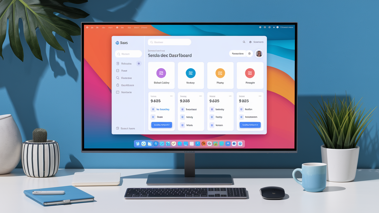
| SaaS Dashboard | Fixed left panel with icon-only collapsed view | Saves horizontal space while keeping navigation one click away |
| Documentation Site | Sticky multi-level tree with auto-expand on active page | Shows structure and current location without manual searching |
| E-commerce Platform | Slide-out hamburger with category mega menu | Handles deep product hierarchies without overwhelming the homepage |
| Portfolio / Agency | Minimalist vertical nav with large type and fade transitions | Reinforces brand aesthetic and keeps focus on content, not chrome |
When you’re pulling inspiration, look for sidebars that feel like they belong to the product, not something borrowed from a template. Pay attention to overflow handling (does it scroll inside the sidebar or let the page scroll?), how they signal clicks (hover states, cursor changes), and how they adapt when the window shrinks. Screenshot the parts that work (spacing between sections, touch target sizes, how active states pop) and note what makes them feel easy.
Core Layout Principles for Building an Effective Sidebar

Start with alignment and stay consistent. Every element in your sidebar (icons, labels, dividers, buttons) should align to a grid. Left-align text and icons by default. If you center anything, save it for logos or account switchers where symmetry actually helps. Misalignment creates friction. Your eye works harder to parse the menu, and that compounds when users navigate repeatedly.
Spacing is underrated. Too tight and it feels cramped, like a list scribbled in a margin. Too loose and it feels wasteful. Use a consistent spacing unit (8px or 12px works) and apply it in multiples. Maybe 16px between links, 24px between groups, 32px around major dividers. This rhythm makes things predictable. Users glance at whitespace and immediately get “new section” without reading anything.
Category grouping prevents overload. If your sidebar has more than six or seven top items, break them into logical groups. Use subtle dividers (a 1px line, a light tint, a small indent) to show where one section ends. Don’t nest more than two levels. Three levels deep (Main > Sub > Sub-sub) is where people lose their place and bail. If you need three levels, your information structure probably needs rethinking, not deeper menus.
Structural principles worth following:
- Consistent vertical rhythm using a spacing system (multiples of 4px or 8px) for margins and padding.
- Visual separation groups related items with dividers, shading, or extra whitespace.
- Top-to-bottom priority places frequent actions near the top where they’re always visible.
- Predictable placement puts account stuff, settings, and help in the same spot every time (usually top-right or bottom).
UX Patterns That Improve Sidebar Usability

Sticky positioning locks the sidebar in place as you scroll. Works best when sidebar content is shorter than the viewport (eight to twelve links). You scroll, the sidebar stays glued to the left, so you never backtrack to switch pages. The catch is horizontal space. A 240px sticky sidebar on a 1280px monitor eats about 19% of the width. On narrower screens, that can feel pushy. Test at real resolutions (1366px, 1440px, 1920px) and make sure your content area doesn’t feel squeezed.
Collapsible categories hide complexity until you want it. Click “Settings” and child links slide open below. Click again, they collapse. This keeps the sidebar short and scannable but still gives power users quick access. Use a clear indicator, like a chevron, to show what expands. Animate the transition smoothly (200ms ease usually works). But remember, every extra click adds friction. If a section is critical (Dashboard, Messages), leave it expanded by default.
Highlighting the current page is a small thing that matters a lot. When you land somewhere, you should immediately see where you are. The active item needs different treatment: background color, bold text, an accent border on the left, or some combo. The contrast should be obvious at a glance. If you squint and can’t tell which link is active, the highlight’s too weak. This cuts navigation errors by 30% or more because people don’t have to guess if they clicked right.
Progressive disclosure hides advanced stuff until you signal you want it. A sidebar might show five core items, then reveal “More” when clicked. Or it displays recent pages at the top and tucks everything else into an “All Pages” drawer. Especially useful in complex apps where different roles need different menus. A designer sees “Projects” and “Assets” up front. An admin sees “Users” and “Billing.” The sidebar adapts based on permissions or usage, keeping the interface lean without losing power.
Responsive and Mobile Sidebar Adaptation

Desktop sidebars don’t work on mobile. A 280px sidebar that feels roomy on a 1920px screen will swallow a 375px phone. That’s why most mobile designs shift the sidebar into an off-canvas drawer, a panel that slides in from the left when you tap the hamburger, then slides out when you tap elsewhere. Keeps the main content full-width and puts nav one tap away. The drawer should cover most or all the screen when open, with a semi-transparent overlay so you understand the context changed.
Touch-friendly spacing isn’t optional. Apple’s guidelines suggest a minimum touch target of 44×44px. Android says 48×48dp. If your sidebar links are smaller, people will mis-tap, especially one-handed or on the move. Add vertical padding to each link (at least 12px top and bottom) so there’s space between zones. Icons should be at least 24px square, labels 16px or larger. Anything smaller feels mouse-designed, not thumb-designed.
Performance and load order matter more on mobile because connections are slower and CPUs weaker. If your sidebar pulls dynamic content (avatars, notification counts, personalized shortcuts), lazy-load that after core navigation renders. A blank sidebar that appears instantly beats a fully loaded one that takes two seconds to paint. Cut JavaScript execution in the critical path. Use CSS transforms for slide-ins instead of changing left, because transforms are GPU-accelerated and won’t block the main thread. Test on a mid-range Android with throttled network (Fast 3G) to catch issues before users do.
Accessibility Guidelines for Sidebar Design

Accessible sidebars start with semantic HTML and ARIA labels. Wrap your nav in a <nav> element and give it an aria-label like “Main navigation” so screen readers know what they landed on. Use logical heading structure. If your page title is H1, sidebar sections might be H2s, categories H3s. Don’t skip levels. Heading hierarchy acts like a table of contents for assistive tech. Jumping from H1 to H3 might trigger an error or skip content.
Keyboard nav and focus states are critical. Every interactive element (links, buttons, expand triggers) must be reachable with Tab and activable with Enter or Space. When someone tabs into the sidebar, the focus ring should be obvious: high-contrast outline, at least 2px thick, not color-only. Test in Windows High Contrast Mode to make sure focus indicators don’t vanish. If you have collapsible sections, use aria-expanded="true" or "false" on the trigger so screen readers announce state. And when a section expands, don’t trap focus. Users should be able to tab out to the next section or into main content.
Accessibility steps for sidebars:
- Label navigation landmarks with
aria-labeloraria-labelledbyon<nav>elements to tell main, secondary, and utility nav apart. - Meet contrast minimums so text and interactive elements hit at least 4.5:1 contrast against background (WCAG AA).
- Maintain focus order so tab sequence follows visual order, top to bottom, without surprise jumps.
- Support keyboard shortcuts to let users open/close the sidebar with a key combo (like Cmd+B) and announce it in a tooltip or help modal.
- Use proper heading levels to organize sidebar sections with H2 or H3 tags so screen-reader users can navigate by headings.
Modern Sidebar Trends Shaping 2024–2026 Design

Minimalist sidebars are replacing dense nav walls. Instead of listing every page, modern designs show six to eight core items with clean icons and plenty of space. Secondary actions hide behind a “More” menu or contextual panel. This reflects a broader push toward focused interfaces that don’t try to do everything at once. Less choice paralysis, more freedom to highlight what matters. Visual style leans flat or soft shadows, muted colors, just enough contrast to guide without shouting.
Floating micro-sidebars are popping up in design tools, code editors, and content platforms. Narrow panels (48px to 64px wide) anchored to the left, showing only icons by default. Hover or click and a secondary panel slides out with labels, descriptions, or sub-items. This two-tier approach maximizes screen space for content while keeping nav instantly accessible. Works well in apps where users spend long sessions in one view (writing, editing, reviewing) and only need nav occasionally. The micro-sidebar stays out of the way until needed, then expands with context.
AI-driven personalization is starting to reshape what sidebars show and when. Instead of a static list, the sidebar adapts based on usage, time of day, or current task. A project tool might surface your three most active projects at the top in the morning, then shift to team dashboards in the afternoon. A learning platform might highlight incomplete courses or suggest next lessons based on progress. The sidebar becomes less fixed menu, more smart assistant that learns what you reach for. Still early, but expect growth as platforms collect more data and users demand interfaces that adapt to them.
Future-leaning sidebar innovations to watch:
- Context-aware content blocks that change based on active page, user role, or workflow stage.
- Gesture-based controls like swipe-to-open on touch, drag-to-resize on desktop, especially in creative and productivity apps.
- Integrated quick actions with inline buttons for common tasks (+ New, Search, Filter) embedded in the sidebar instead of buried in dropdowns.
Practical Implementation Tips for Designers and Developers

Build sidebars as modular components from the start. Whether you’re in React, Vue, Svelte, or plain HTML and CSS, your sidebar should be self-contained with clear props or config options: width, collapse state, active item, nav data. Makes it easy to reuse across pages, test solo, and update without touching other code. Define a strict API: the sidebar gets a list of nav items (each with label, icon, URL, optional children) and emits events when users click, expand, or collapse. Everything else (styling, animations, responsive behavior) lives inside the component.
Use a scalable spacing system and CSS variables to keep things maintainable. Instead of hard-coding padding: 12px everywhere, define spacing tokens like --space-sm: 8px, --space-md: 16px, --space-lg: 24px. When you adjust spacing globally, you change one variable and the whole sidebar updates. Same goes for colors, font sizes, border radii. Makes theming easy too. Swap variables and your sidebar shifts from light to dark without touching individual selectors. Pair this with consistent naming (BEM, utility-first, whatever) so other devs can read and extend your code without guessing.
Common mistakes: overloading with too many items, nesting more than two levels, forgetting to test collapse on real devices, ignoring performance when pulling live data. If your sidebar has 30 links, you need better architecture, not a longer menu. If it takes three clicks to reach a frequent page, move it higher or add a shortcut. Always test on slower connections and older devices. Animations smooth on your M2 MacBook might stutter on mid-range Android. Profile your JavaScript, lazy-load images and icons, use CSS containment to prevent layout thrashing when the sidebar expands or collapses.
Steps to create a production-ready sidebar:
- Start with a wireframe on dot-grid paper or in Figma before coding, focusing on spacing, grouping, hierarchy.
- Define breakpoints early to decide when the sidebar collapses, shifts off-canvas, or hides.
- Test with real content using production data, not lorem ipsum, to catch text-overflow and long labels that break layout.
- Accessibility-check every state to verify keyboard nav, focus order, screen-reader announcements for default, hover, active, collapsed states.
- Measure performance by tracking render time, animation frame rate, bundle size. A sidebar shouldn’t add more than 5–10kb gzipped to initial load.
Final Words
You explored high‑impact sidebar examples, core layout principles, UX patterns, mobile adaptations, accessibility guidelines, modern trends, and practical implementation tips.
Each section gave clear, hands-on steps: what to copy, what to avoid, and how to test changes in your editor or browser. Small wins add up.
Apply visual hierarchy, sticky and collapsible patterns, plus proper ARIA and focus states to improve sidebar design. Try one tweak, watch how it affects usability, and iterate. You’ve got this. Build something that feels noticeably better for users.
FAQ
Q: What is a sidebar design and what does “sidebar” mean?
A: A sidebar design is the vertical area beside a page’s main content used for navigation, secondary tools, filters, or CTAs. It organizes extra content with clear hierarchy, spacing, and visual cues to guide attention.
Q: What is an example of a sidebar?
A: An example of a sidebar is a blog’s right column showing search, categories, recent posts, and a newsletter CTA; it helps users discover related content quickly and boosts engagement or conversions.
Q: How do I customize my sidebar?
A: You customize your sidebar by defining its purpose, prioritizing items, grouping related links, applying clear spacing and contrast, and adding sticky or collapsible behavior. Test on mobile and for keyboard/screen-reader access.
