

Think your homepage layout doesn’t matter?
Think again, a messy layout can lose visitors before they read a single word.
In this post we’ll cut through the design buzz and give you practical layout strategies for modern websites.
You’ll learn when to use single-column, grid, card, and hero patterns, how to plan mobile-first breakpoints, and which CSS tools actually make the job easier.
By the end you’ll have clear rules to build layouts that guide users, boost readability, and improve conversions.
Defining an Effective Web Page Layout Structure
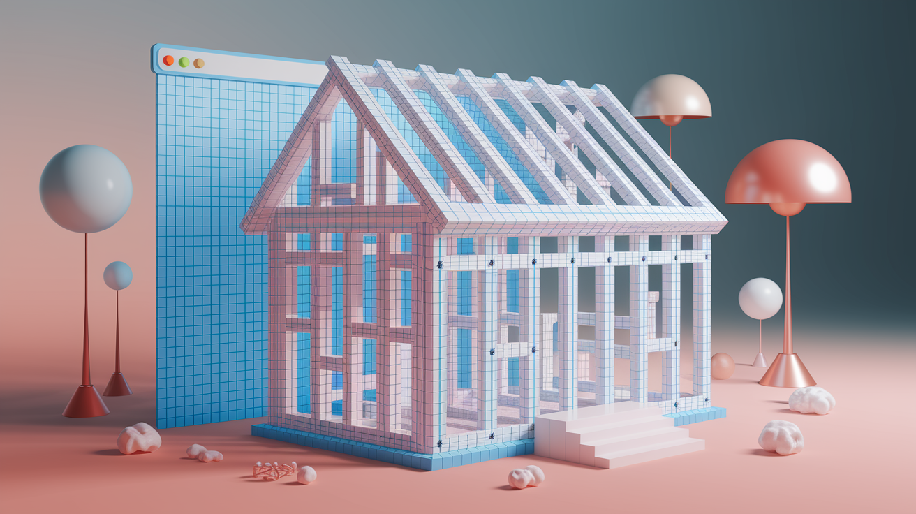
A web design layout is the structural skeleton of your webpage. It’s the invisible framework of columns, rows, margins, and containers that holds everything in place. Think of it like the frame of a house. You can’t see the studs and joists once the walls are up, but without them, nothing stands. On a webpage, that skeleton controls where your header sits, how wide your content stretches, how many columns divide your text, and how much breathing room sits between sections. Common desktop layouts max out between 1140 and 1280 pixels wide, wrapped in a container that keeps content readable instead of stretched edge to edge across a 27-inch monitor.
The first website ever published, back in 1991, used a simple one-column layout. No sidebars. No grids. Just a vertical stack of text and links. That same single-column structure is still the backbone of mobile-first design today, because it works. Layouts guide where a visitor’s eyes land first, how they scan down the page, and whether they can find what they need without hunting. A strong layout improves usability, supports accessibility, boosts conversions, and makes your content readable on any device.
Here’s what a solid layout structure actually does for you:
Divides content into logical, scannable sections so readers don’t get lost in a wall of text. Controls reading flow by placing the most important information where people naturally look first. Creates predictable structure so navigation, calls to action, and key messages land in consistent spots. Defines content groups like header, main content, sidebar, and footer (each with a clear job). Enables consistent spacing systems using margins, padding, and gutters based on repeatable units (often 8px multiples). Supports responsive behavior by defining how those columns and rows reorganize when the screen shrinks from desktop to tablet to phone.
When you understand these structural building blocks (containers, columns, gutters, breakpoints, max widths), you stop guessing and start building real projects with intention. Your layouts look cleaner, load faster, and guide visitors exactly where you want them to go.
Core Types of Page Layouts for Modern Website Design

Not every project needs the same layout. A blog reads differently than a product catalog. A portfolio tells a different story than a news site. Choosing the right layout type depends on how much content you’re presenting, how users will scan it, and what action you want them to take. The core types break down into a handful of proven patterns, each optimized for specific content structures and reading behaviors.
Single-column layouts stack everything vertically in one continuous flow. They’re the default for mobile screens, landing pages, and narrative-driven sites where you want full control over the reading sequence. Multi-column layouts split the page into two, three, or more vertical sections. Common on news sites, dashboards, and content-heavy platforms where sidebars hold navigation, ads, or related links. Card-based and grid layouts arrange content into repeating blocks, perfect for portfolios, product listings, or image galleries where each item gets equal visual weight.
F-pattern and Z-pattern layouts guide eye movement using predictable scanning paths. The F-pattern (where users read the top bar, scan down the left edge, then skim horizontally across key lines) works well for text-heavy pages and search results. The Z-pattern (top-left to top-right, diagonal down, then left-to-right again) suits landing pages with a hero image, headline, subhead, and call to action. Hero-section layouts lead with a full-width image or video at the top, immediately immersing visitors in the brand before they scroll to content below. Magazine and news layouts layer dense editorial content using multiple columns, mixed media, and nested sections to pack maximum information into organized visual zones.
Here’s when each layout type shines:
Single-column works for mobile-first sites, long-form articles, simple landing pages, narrative storytelling. Two-column fits blogs with a sidebar, documentation sites with table-of-contents navigation. Three-column handles news portals, dashboards, content platforms with ads or supplementary links. Card and grid layouts suit product catalogs, portfolios, image galleries, team bios, case-study previews. F-pattern excels at search results, list-based content, text-heavy pages, FAQ sections. Z-pattern handles marketing landing pages, above-the-fold hero sections, simple conversion-focused layouts. Magazine and editorial formats work for publications, feature articles, media-rich storytelling with images, pull quotes, and multimedia embeds.
| Layout Type | Best Use Case |
|---|---|
| Single-column | Mobile-first pages, blog posts, narrative content |
| Two-column split | Blog with sidebar, documentation, e-learning modules |
| Card/grid | Product listings, portfolios, team pages, galleries |
| Hero-focused | Landing pages, brand homepages, campaign microsites |
| Magazine/editorial | News sites, feature articles, media-heavy storytelling |
Responsive Layout Foundations and Mobile-First Planning
Mobile-first means you design for the smallest screen first, then progressively add complexity for larger devices. It’s not just a buzzword. It’s a practical response to the fact that mobile devices generated nearly 60 percent of global web traffic in 2022. When you start with a narrow, single-column layout and layer in features only as screen space allows, you force yourself to prioritize content, simplify navigation, and keep the experience fast. Desktop-first design often leads to clunky, bloated mobile versions because you’re trying to cram a wide layout into a narrow viewport.
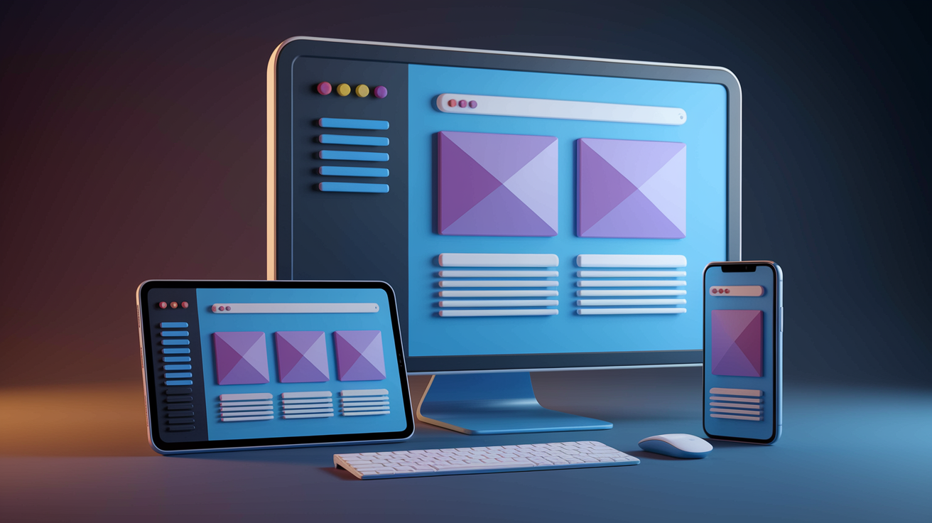
Responsive layouts adapt using breakpoints (specific pixel widths where your design shifts). The most common set, borrowed from Bootstrap 5, includes 576 pixels for small phones, 768 pixels for tablets, 992 pixels for small laptops, 1200 pixels for desktops, and 1400 pixels for large desktops. At each breakpoint, you adjust column counts, font sizes, spacing, and navigation patterns. A three-column grid might collapse to two columns on tablets and a single stack on phones. A horizontal navigation bar might switch to a hidden hamburger menu below 768 pixels. Container max widths typically cap at 1140 to 1280 pixels on desktop to keep line lengths readable.
Media queries in your CSS trigger these changes. Flexible grids built with percentages or CSS Grid’s fr units let columns resize smoothly between breakpoints. Responsive images use the srcset attribute to serve smaller files to mobile devices, cutting load times and data usage. If you ignore mobile-first planning, you risk delivering slow, hard-to-navigate pages to the majority of your visitors.
Here’s what changes when you move from desktop to mobile:
Column counts drop. Three columns become two, then one. Navigation moves off-canvas or into a collapsible menu to save vertical space. Font sizes and line heights adjust to stay readable on small screens. Images scale down or swap for lighter versions using srcset. Touch targets grow to at least 44 by 44 pixels so fingers can tap accurately without zooming.
Picture a standard two-column blog layout at 1200 pixels: a wide content column on the left, a narrow sidebar on the right. At 992 pixels, the sidebar narrows slightly but stays visible. At 768 pixels, the sidebar drops below the main content, stacking vertically. At 576 pixels, everything condenses into a single column with larger tap targets and simplified navigation. That’s responsive planning. You’re not building three separate sites, just one flexible layout that reorganizes itself.
Building Layouts Using CSS Grid, Flexbox, and Frameworks

The workflow for building a layout looks like this: sketch a wireframe, build a clickable prototype, implement the structure with CSS Grid or Flexbox, test across devices, then optimize. CSS Grid handles two-dimensional layouts (rows and columns at the same time). Flexbox handles one-dimensional layouts (either rows or columns, but not both simultaneously). Together, they give you full control without relying on floats or positioning hacks.
A 12-column grid is the standard. You define grid-template-columns: repeat(12, 1fr) in your container, then span child elements across however many columns they need. A main content area might span eight columns, a sidebar four. On mobile, both span all 12 and stack vertically. Flexbox shines for navigation bars, card rows, and centering elements inside containers. Set display: flex on a parent, use justify-content and align-items to control alignment, and let the browser handle the spacing math.
Frameworks speed up the process by providing pre-built grids, responsive utilities, and tested components. Bootstrap 5, released in May 2021, uses the standard breakpoints mentioned earlier and ships with a 12-column grid, typography styles, buttons, forms, and navigation patterns. Tailwind CSS takes a utility-first approach. You compose layouts by applying single-purpose classes like flex, grid, gap-4, and md:grid-cols-2 directly in your HTML. Both are free and widely documented.
Here’s a quick comparison of common layout tools:
CSS Grid gives you native browser support, full two-dimensional control, great for complex page layouts, no dependencies. Flexbox is native, one-dimensional, perfect for navigation bars and card rows, pairs well with Grid. Bootstrap 5 is a component library with a 12-column grid, responsive utilities, and UI elements. Speeds up prototyping but adds CSS weight. Tailwind CSS uses a utility-first framework, compose layouts with small classes, highly customizable, steep learning curve for beginners. Foundation or Bulma are alternative frameworks similar to Bootstrap, smaller communities, lighter CSS footprint in some cases.
To apply a 12-column grid, you’d set up a container div with display: grid and grid-template-columns: repeat(12, 1fr). Then each child element uses grid-column: span 8 or grid-column: span 4 to claim its share of the grid. At smaller breakpoints, you override those spans (grid-column: span 12) so everything stacks. Flexbox works similarly but focuses on arranging items in a row or column without worrying about a rigid grid structure.
Design Principles That Shape Effective Layout Composition
Visual hierarchy tells visitors what to read first. You create it by varying size, weight, color, and placement. Headlines sit larger and bolder than body text. Important content lands above the fold. Call-to-action buttons pop with contrast. Without clear hierarchy, everything competes for attention and nothing wins. Whitespace (also called negative space) gives elements room to breathe. It reduces cognitive load, improves reading flow, and makes pages feel cleaner. Tight, cramped layouts tire readers and increase bounce rates.
Balance and alignment keep layouts from feeling lopsided. Symmetrical balance places equal visual weight on both sides of a centerline (think a logo centered above a headline). Asymmetrical balance uses different elements with similar perceived weight on opposite sides (a large image on the left, a column of text on the right). Grids enforce alignment automatically by snapping elements to invisible columns and rows. When edges line up, the design feels intentional instead of random.
Contrast and color usage guide attention and establish mood. High contrast between text and background ensures legibility. Aim for at least a 4.5:1 ratio for normal text. Muted palettes with one or two accent colors keep layouts calm and professional. Typography hierarchy layers typefaces, sizes, and weights to separate headings from subheads from body copy. Sans-serif fonts are common for layouts because they stay readable at small sizes and on low-resolution screens. Typographic scales using ratios around 1.2 to 1.25 create consistent size jumps. If body text is 16 pixels, a level-two heading might be 20 pixels, a level-one heading 25 pixels.
An 8-pixel baseline grid keeps spacing consistent. Margins, padding, and gaps multiply by eight (16 pixels, 24 pixels, 32 pixels) so everything lines up. When spacing feels random, layouts look amateurish. When spacing follows a system, the design feels polished even if users can’t explain why.
Here are four practical design rules for beginners:
Set one clear focal point per section. Don’t ask visitors to look at five things at once. Use whitespace generously, especially around headings and between sections. Limit your color palette to three or four colors including neutrals and one accent. Align elements to a grid so edges and centers line up predictably.
Navigation, Header, Footer, and Structural Placement Best Practices

The header anchors the top of your layout. It usually holds your logo on the left, primary navigation in the center or right, and sometimes a search bar or call-to-action button. Fixed navigation stays pinned to the top as users scroll, keeping key links accessible. Hidden navigation (often a hamburger icon on mobile) saves vertical space by tucking the menu into an off-canvas panel that slides in on tap. Mega menus drop down to reveal multi-column link grids, useful for sites with deep content hierarchies.
The content area is the main workspace where your body copy, images, forms, and media live. Sidebars sit alongside the content area, holding secondary navigation, recent posts, ads, or supplementary widgets. On mobile, sidebars typically drop below the main content to keep the reading flow intact. The footer closes the layout. It’s not just legal links and copyright text. Modern footers include sitemaps, social icons, newsletter signups, and contact info. A well-structured footer keeps visitors engaged even after they scroll to the bottom.
Placement matters. Navigation belongs above the fold so users know where they are and where they can go. Primary content should load first. Don’t bury your headline below a wall of ads or auto-playing video. “Back to Top” buttons help on long pages, letting users jump to the header without endless scrolling. When layouts follow conventions (logo top-left, navigation top-center or top-right, footer at the bottom), visitors navigate without thinking.
Here’s how to organize structural components:
Place your logo in the top-left corner where eyes naturally land first. Keep primary navigation horizontal at the top on desktop, collapsible on mobile. Use fixed or sticky headers if key links need to stay accessible during scroll. Reserve the footer for secondary navigation, legal links, social proof, and contact details. Add a sidebar only if it serves a clear purpose. Don’t just fill space. Include a “Back to Top” button on pages longer than two or three viewport heights.
Applying Content-First Thinking, Wireframes, and Mockups to Layout Planning

Start with content, not visuals. List the actual pieces you need to display (headline, intro paragraph, three feature blocks, testimonial, call to action), then arrange them in priority order. Content-first thinking forces you to decide what matters before you pick colors or fonts. A wireframe is a low-fidelity sketch showing boxes, labels, and basic hierarchy. It’s intentionally ugly so you focus on structure, not decoration. Tools like pen and paper, Balsamiq, or even a text outline work fine.
Once the wireframe feels right, move to a mockup or prototype. A mockup adds real text, images, and styling so stakeholders can see what the page will actually look like. A prototype makes the mockup clickable, letting you test navigation flows and interactions before writing code. Most projects go through one to three rounds of wireframing and prototyping to iron out layout problems early. Fixing a wireframe takes minutes. Fixing a fully coded page takes hours.
After prototyping, you build. Implement the layout using CSS Grid, Flexbox, or your chosen framework. Then test across devices (desktop, tablet, and at least two phone sizes). Check readability, tap-target sizes, load times, and whether elements overlap or break at different widths. Usability testing with real users catches issues designers miss because they’re too close to the project.
Here’s the step-by-step process from idea to launch:
Audit your content and prioritize what needs to appear on the page. Sketch a low-fidelity wireframe showing content blocks and their order. Build a clickable prototype or high-fidelity mockup with real text and images. Implement the layout in code using responsive techniques and semantic HTML. Test on at least five viewport widths and multiple browsers, including mobile Safari and Chrome.
| Stage | Primary Goal |
|---|---|
| Content audit | Identify all elements and prioritize by importance |
| Wireframe | Arrange content blocks and establish hierarchy without distraction |
| Prototype | Add interactivity and visual design to validate the flow |
| Build | Implement responsive structure with clean, semantic code |
Accessibility and Performance Requirements for Modern Layouts
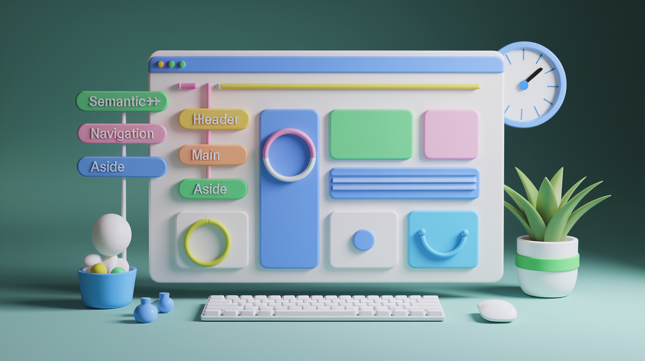
Accessible layouts work for everyone, including users with vision impairments, motor disabilities, or reliance on assistive technologies. Start with semantic HTML. Use <header>, <nav>, <main>, <aside>, and <footer> tags instead of generic divs. Screen readers use these landmarks to help users navigate. Every page needs exactly one <h1> heading, followed by a logical hierarchy of <h2> and <h3> tags. Skipping levels confuses screen readers and breaks the document outline.
Color contrast must meet minimum ratios. Normal text requires at least 4.5:1 contrast against its background. Large text (18 pixels and bold, or 24 pixels regular) needs 3:1. Test contrast using browser dev tools or online checkers. Keyboard navigation is non-negotiable. Users should be able to tab through all interactive elements in a logical order, activate links and buttons with Enter or Space, and close modals with Escape. ARIA roles and labels clarify the purpose of custom components when semantic HTML isn’t enough.
Performance directly impacts usability. Core Web Vitals set specific targets: Largest Contentful Paint under 2.5 seconds, First Input Delay under 100 milliseconds, Cumulative Layout Shift under 0.1. Slow layouts frustrate users. Nearly 80 percent of online customers avoid platforms after performance issues, and satisfaction drops over 15 percent for every extra second of load time. Lazy loading defers offscreen images and videos until users scroll near them, cutting initial page weight. Minimizing HTTP requests, serving optimized images, and using a CDN for third-party assets all contribute to faster loads.
Here are five critical requirements for accessible, performant layouts:
Use semantic HTML tags and a single <h1> per page with a clear heading hierarchy. Ensure all interactive elements are keyboard-accessible and focus states are visible. Meet color-contrast ratios (4.5:1 for normal text, 3:1 for large text). Keep Largest Contentful Paint under 2.5 seconds and Cumulative Layout Shift under 0.1. Implement lazy loading for images and videos below the fold to reduce initial load time.
Practical Examples and Case Study Layout Patterns
Product-centric layouts put specs, demos, and reviews front and center. A typical product page uses a hero image or video at the top, followed by feature infographics, material breakdowns, embedded demo videos, and a customer-review section near the bottom. Never Summer Snowboards does this well. Each product page layers technical details with visual clarity, making it easy for buyers to compare models and understand construction.
Timeline-driven single-page layouts guide visitors through a narrative. Peerspace redesigned their homepage for their 10th anniversary using a scrolling timeline that walks through milestones from 2014 to the present, noting that “over one million brands and individuals” have used their platform. The single-page structure keeps the story cohesive and eliminates navigation friction. Scrollytelling adds visual animations tied to scroll position. R2D3’s machine-learning explainer uses color-coded datasets from San Francisco and New York, animating statistical groupings as you scroll to illustrate how algorithms classify data.
Immersive gallery layouts showcase images with context. The San Francisco Museum of Modern Art includes photos of visitors inside exhibition spaces, giving digital browsers a sense of scale and atmosphere. Embedded video tours let users preview shows before visiting. Minimalist portfolio layouts strip away distractions, letting work speak for itself. Poulos Collective uses a muted palette, abundant whitespace, sans-serif typography, and colored rectangles to separate project categories. In-picture galleries let users browse work samples without leaving the page, and the mobile layout stays fast and clean.
Full-bleed hero sections immerse visitors immediately. A full-width image or video spans edge to edge at the top of the page, often with a headline and call to action overlaid. Intensive’s homepage combines angled 3D visuals and glowing gradients that break the traditional grid while keeping body text readable and conventionally placed. The contrast between bold graphics and structured content creates visual interest without sacrificing usability.
Here are five common layout patterns in modern websites:
Product pages with hero images, spec infographics, demo videos, and customer reviews. Single-page timelines that scroll through milestones, case studies, or brand stories. Scrollytelling narratives with animations tied to scroll position, revealing data or illustrations progressively. Immersive gallery pages with large images, visitor context photos, and embedded video previews. Minimalist portfolios using muted colors, generous whitespace, in-picture project galleries, and mobile-optimized speed.
Key Considerations to Remember When Choosing a Layout

Consistency across components strengthens usability. When buttons, cards, spacing, and typography follow a design system, users learn patterns once and apply them everywhere. Templates typically bundle six to twelve components (header, hero, content blocks, sidebar, call to action, and footer), giving you a tested starting structure. Custom layouts offer more flexibility but require more time and testing to get right. Evaluate your timeline, budget, and design skills before deciding between a template and a from-scratch build.
Future trends lean toward asymmetry, microinteractions, dark mode, bold typography, and glassmorphism (translucent layers with blurred backgrounds). These trends add polish, but don’t chase them at the expense of performance or accessibility. A clean, fast, accessible layout always beats a flashy, broken one.
Here are six essential considerations when selecting or refining a layout:
Match the layout type to your content density and user goals. Single-column for narratives, grids for catalogs. Prioritize mobile-first planning and test at multiple breakpoints before launch. Choose frameworks or custom code based on your timeline, skill level, and need for flexibility. Maintain design-system consistency across spacing, colors, typography, and component patterns. Balance visual trends with accessibility and performance requirements. Plan for scalability. Will the layout handle twice as much content six months from now?
Final Words
You jumped straight into structure and practice: we defined a layout’s role, compared single vs multi-column and card systems, and showed how responsive breakpoints, Grid, and Flexbox bring those ideas to life.
You also learned design rules, navigation placement, accessibility checks, and a content-first workflow that keeps pages readable and fast.
Keep sketching wireframes, test across devices, and pick patterns that fit your content. With a solid web design layout and these steps, you’ll ship clearer, faster pages — and that’s a win.
FAQ
Q: What is layout in web design?
A: A layout in web design is the page’s structural skeleton, arranging columns, rows, margins, and sections to guide reading, improve usability, and support responsive behavior and conversions.
Q: What is a good website layout?
A: A good website layout is one with clear visual hierarchy, consistent grid spacing, readable typography, predictable navigation, and mobile-first responsiveness so users find key content quickly and conversions improve.
Q: What are the 7 C’s of web design?
A: The 7 C’s of web design are Context (layout), Content, Community, Customization, Communication, Connection (links), and Commerce, covering structure, messaging, interaction, personalization, and business goals.
Q: What are the 7 types of layout?
A: The 7 types of layout are single-column, multi-column, card/grid, F-pattern, Z-pattern, magazine/news, and hero/landing layouts, each suited to different content density, reading flows, and device priorities.
