

Are tabs the secret shortcut to cleaner pages — or a hidden trap that buries content and confuses users?
In this post you’ll learn when tabs shine, how to design obvious active states, and how to make them keyboard- and screen-reader friendly.
I’ll give clear patterns for HTML, CSS, and JavaScript, plus responsive fallbacks like accordions and scrollable tab bars so your tabs work on phones.
By the end you’ll know when to use tabs, how to style them, and one or two simple tests to catch common mistakes.
Getting Started: How Web Tabs Work and When to Use Them
Tabs are one of the simplest ways to organize related content without eating up screen space. You’ve got a horizontal list of labeled buttons, a visual cue showing which one’s active, and the content panel itself. Click a tab and its content appears instantly while the others hide. No refresh, no spinner. The pattern’s been around since 2007 and got updated as recently as August 2024 to keep up with responsive design and accessibility needs. When you build them right, in-page tabs feel instant. Navigation tabs might load a new page, but the switch should still feel quick.
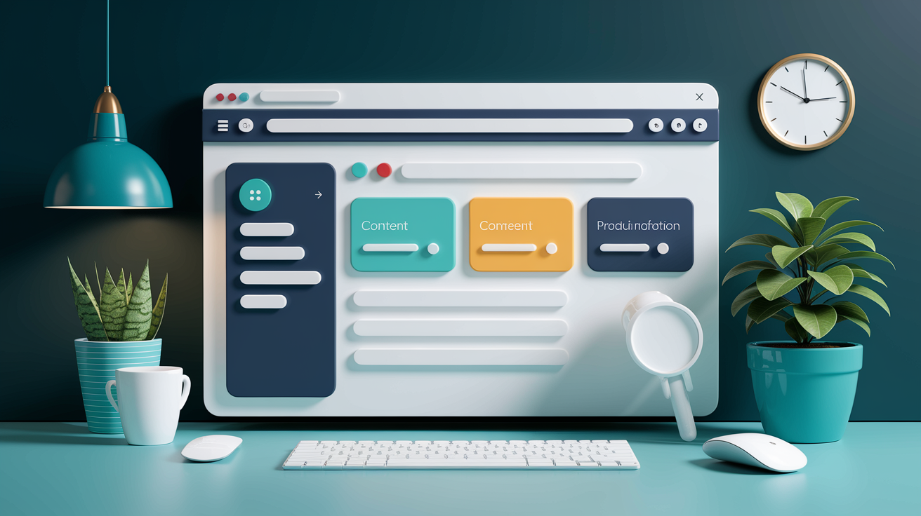
Use tabs when you’ve got a small number of clear groups. Three to five is ideal. Each group needs enough content to justify its own panel, and users shouldn’t need to see more than one at a time. Product info tabs work well when you’re splitting Overview, Features, Specs, and Reviews. Each section stands alone, and people usually check one before moving to the next. Tabs save vertical space and give users control over what they see.
Skip tabs when your content doesn’t have obvious groups, when users need to compare things side by side, or when each tab would only hold a sentence or two. If you’re forcing vague labels like “More” or “Info” onto tabs, the pattern isn’t working. Tabs also fall apart when you have more than six options. Labels start wrapping onto multiple rows or overflowing into hidden carousels, and suddenly the interface is harder to scan than a simple single-page layout with jump links or subheadings.
Visual Design Principles for Effective Tabs

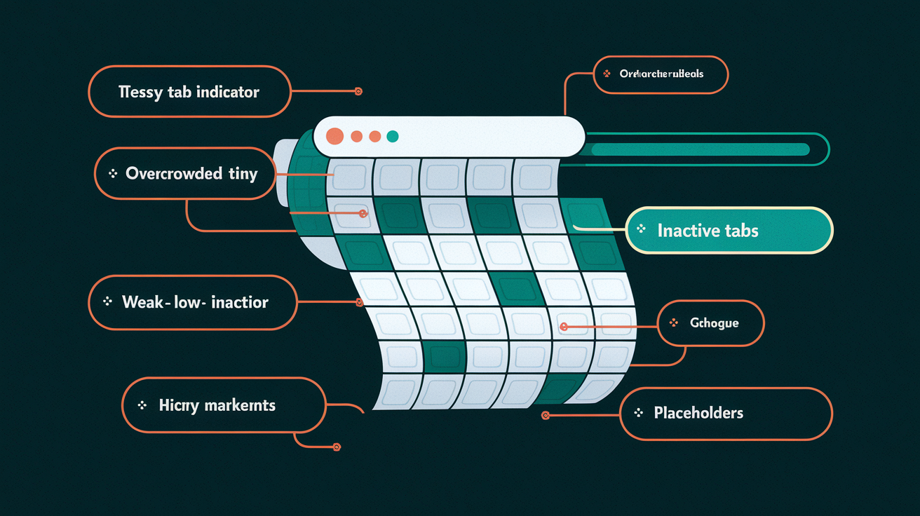
The active tab must be obvious. Use at least two visual indicators to show which tab is selected. Combine bold text with an underline, or pair a colored fill with a thicker bottom border around 2 to 4 pixels. This redundancy matters especially when you only have two tabs. Without strong cues, users lose their place. Don’t rely on a single thin line or subtle color shift. Low-contrast indicators get lost on mobile screens and high-resolution displays.
Unselected tabs should stay visible and readable. Don’t fade them so much they disappear into the background or look disabled. Users need to see what other options exist without guessing. Connect the active tab to its content panel by aligning them in a shared background color or by placing the tab list directly above the panel with no large gap. This proximity reinforces the relationship between the tab label and the content it controls.
Keep your tab list in a single row. Stacking tabs into multiple rows confuses the visual hierarchy and makes it hard to tell which tab pairs with which panel. Position the tab list above the content, not below or to the side. Vertical tab lists work for specialized cases but break the typical mental model. Organize tabs by priority. Put the most frequently accessed content first and make it the default when the page loads.
Core visual rules:
- Use at least two selection indicators (bold + underline, fill color + border weight)
- Avoid thin 1px strokes and low-contrast colors for active states
- Keep labels short, one to two words, and avoid ALL CAPS because they reduce legibility
- Maintain unselected tabs as visible and readable, not ghosted or completely grayed out
- Never wrap tabs onto a second row. If labels don’t fit, rethink the wording or reduce the number of tabs
Accessibility Essentials for Tabs

Keyboard navigation isn’t optional. Users must be able to reach the tab list using the Tab key, then move between tabs using Arrow keys. Pressing Enter or Space should activate the focused tab and display its panel. Home and End keys should jump to the first and last tab. When a new tab activates, move keyboard focus to the start of the new content panel so screen reader users aren’t left disoriented in the middle of hidden content from the previous tab.
Implement the correct ARIA roles and properties. Wrap your tab buttons in a container with role="tablist". Each button gets role="tab", and the active tab receives aria-selected="true" while inactive tabs get aria-selected="false". Every tab must link to its panel using aria-controls, pointing to the panel’s id. The panel itself needs role="tabpanel" and should reference its tab via aria-labelledby. Manage tabindex carefully. Set tabindex="0" on the active tab and tabindex="-1" on inactive tabs so Arrow key navigation works smoothly without conflicting with normal Tab key page flow.
Make sure visible focus rings are there for keyboard users. Don’t remove the browser’s default focus outline unless you replace it with a high-contrast alternative that’s at least as obvious. Touch targets on mobile must meet the 48×48 pixel minimum to prevent mis-taps. Don’t rely on color alone to indicate the active tab. Pair color changes with shape, weight, or iconography so users with color vision deficiencies can still tell which tab is selected. Test your tab component with a screen reader like NVDA, JAWS, or VoiceOver and navigate using only the keyboard to catch issues before launch.
Required keyboard interactions:
- Tab key: Moves focus into the tab list, landing on the active tab, then continues into the content panel.
- Right Arrow / Left Arrow: Shifts focus to the next or previous tab and activates it, wrapping at the ends of the list.
- Home / End: Moves focus and activates the first or last tab in the list.
- Enter / Space: Activates the currently focused tab if it isn’t already active.
- Escape (optional but helpful): Can close or dismiss temporary tab overlays if applicable.
- Focus management: When switching tabs via keyboard, move focus to the top of the new panel to maintain logical reading order.
Implementation Patterns: Creating Tabs with HTML, CSS, and JavaScript
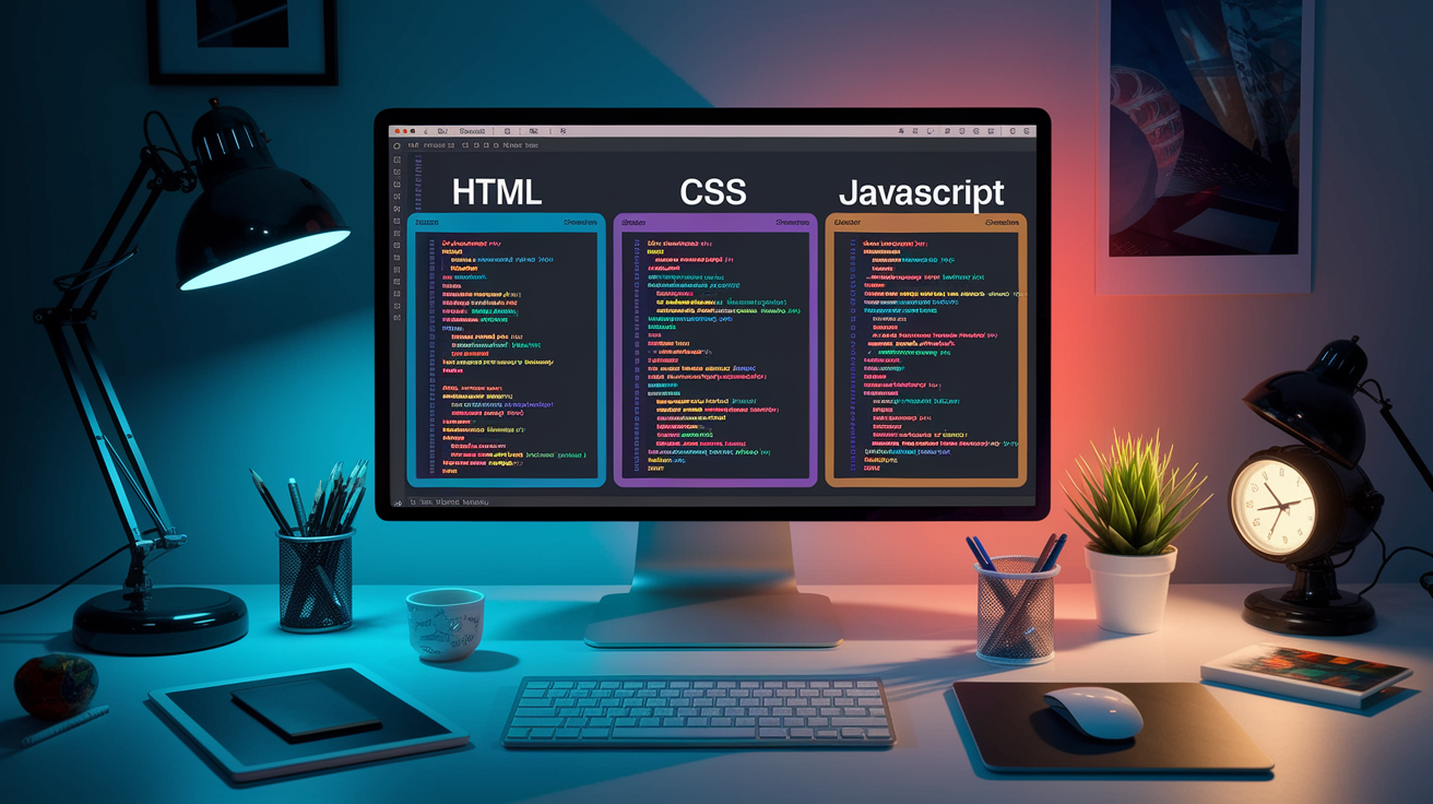
Building tabs from scratch gives you full control over behavior and styling. Start with semantic HTML that mirrors the logical structure of the pattern, add CSS to create clear visual states, and layer on JavaScript to handle keyboard interactions and panel activation. Progressive enhancement is the goal. If JavaScript fails or loads slowly, users should still see all content in a usable form, even if it’s stacked vertically without tab controls.
HTML Structure
Use a container with role="tablist" to hold your tab buttons. Each button should have role="tab", a unique id, and an aria-controls attribute pointing to the id of its associated panel. The active tab gets aria-selected="true" and tabindex="0". Inactive tabs receive aria-selected="false" and tabindex="-1". The content panels sit outside the tab list, each wrapped in a <div> with role="tabpanel" and aria-labelledby linking back to its tab’s id. Hide inactive panels with hidden or aria-hidden="true" plus display: none in CSS so they don’t clutter the reading order. This structure makes sure screen readers announce the tab list, current selection, and panel relationship correctly.
CSS Styling Basics
Define clear active and inactive states. Use a class like .tab--active to apply bold font weight, a thicker bottom border around 2 to 4px, or a contrasting background color. Combine multiple cues. For example, a teal underline plus black text for active, gray text with no underline for inactive. Set consistent spacing with padding inside each tab button and a small gap between tabs. Make sure the tab list and the content panel are visually connected. Either share a common background color or align them with minimal vertical space. On hover, provide subtle feedback like a slight color shift or underline preview so users know the tab is clickable. Avoid transitions longer than 200 milliseconds. Tab switches should feel instant.
JavaScript Behavior
Attach click handlers to each tab button to activate the selected tab and show its panel. When a tab is clicked, remove aria-selected="true" and the active class from the previously active tab, add them to the new tab, hide the old panel, and reveal the new one. Manage tabindex so only the active tab is in the keyboard tab order. For keyboard support, listen for keydown events on the tab list. Arrow keys should move focus to the adjacent tab and activate it immediately. This is called “automatic activation.” Home and End keys jump to the first or last tab. Enter and Space activate the focused tab if you’re using manual activation, where focus moves but the panel doesn’t change until Enter or Space is pressed. Either pattern works, but automatic activation feels faster. Always move focus into the newly revealed panel after activation so keyboard and screen reader users land in the right place.
Responsive Patterns for Tabs
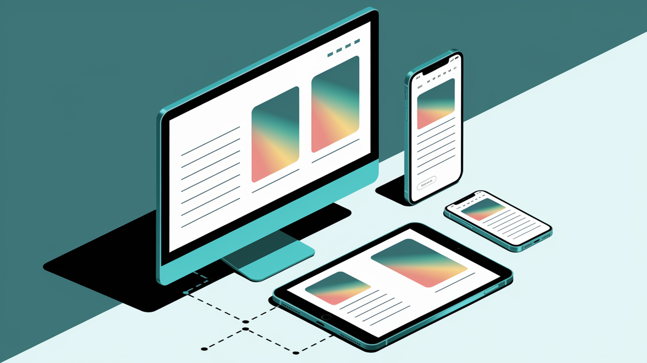
Tabs don’t always translate cleanly to narrow screens. A horizontal tab list that fits comfortably on desktop can overflow or wrap awkwardly on a phone. The safest fallback is to convert tabs into an accordion at a mobile breakpoint. Each “tab” becomes a collapsible heading with its content panel tucked underneath. Accordions handle longer labels better, let users skim all headings at once, and avoid the horizontal scrolling friction that confuses mobile users.
If you want to keep the tab layout on mobile, make the tab list horizontally scrollable and add visual cues so users know more tabs exist off screen. Material Design recommends offsetting the first visible tab by about 52 pixels from the left edge. This partial visibility signals that the list scrolls. You can also add subtle gradient overlays or arrow icons at the edges of the scrollable container. Avoid hiding tabs completely in a dropdown or “More” menu unless you have strong analytics showing users rarely click those tabs. Hidden options get forgotten.
Adaptive strategies for small screens:
- Convert to an accordion layout when viewport width drops below a set threshold (example: 640px)
- Use a horizontally scrollable tab bar with partially visible tabs on each end to indicate more content
- Add subtle scroll indicators like gradient fades or small arrow buttons at the edges
- Reduce label length or switch to icon only tabs if labels are too long, but always provide accessible text alternatives for icons
When Not to Use Tabs (and Better Alternatives)
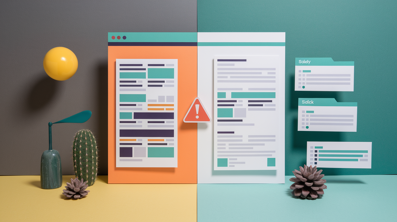
Don’t force content into tabs if users need to compare information across groups at the same time. Analytics dashboards, spec sheets, and legal disclosures often require side by side viewing. Hiding half the data behind inactive tabs adds unnecessary friction. In those cases, a single scrollable page with clear subheadings and a sticky jump link navigation works better.
Tabs also fail when your content doesn’t have natural groupings. If you’re struggling to name your tabs or ending up with vague labels like “Other” or “Miscellaneous,” that’s a sign the structure is unclear. Run a quick card sorting exercise with a few users to see if they naturally group the content the way you expect. If no clear clusters emerge, stick with a linear layout and use headings, dividers, or cards to break up the flow.
When you have more than six tabs, the interface becomes crowded and hard to scan. Consider alternatives like accordions for hierarchical or FAQ content, progressive disclosure like step by step wizards for sequential workflows, or a persistent sidebar for complex applications with many sections. Segmented controls work well for binary or ternary toggles like “Day / Week / Month” views on mobile, and horizontal carousels suit browsing scenarios where swiping feels natural, such as meal categories or product galleries.
Testing and Troubleshooting Tabs

Check your analytics for tab interaction rates. If users load a page with tabs but rarely click to see other panels, either the default tab already shows everything they need or the other tabs are poorly labeled and getting ignored. Compare click through rates across tabs. If one tab gets almost no traffic, rename it with a clearer label or merge its content elsewhere.
Verify keyboard flows manually. Tab into the component, use Arrow keys to move between tabs, press Enter to activate, and confirm that focus moves into the newly visible panel. Test in at least three browsers like Chrome, Firefox, Safari and on both desktop and mobile. Run an automated accessibility scan with a tool like axe DevTools or WAVE to catch missing ARIA roles, low color contrast, and other quick wins.
| Issue | Cause | Fix |
|---|---|---|
| Low tab engagement in analytics | Vague labels, content not chunked logically, or users don’t expect multiple panels | Rename tabs with descriptive nouns, reorganize content groups, or remove tabs and use a single-page layout |
| Keyboard focus disappears after activating a tab | JavaScript doesn’t move focus into the new panel | Add newPanel.focus() or focus the first heading inside the panel after activation |
| Screen reader announces wrong tab count or skips tabs | Missing or incorrect ARIA roles and attributes | Verify role="tablist", role="tab", role="tabpanel", and aria-controls are present and IDs match |
| Active tab not obvious on mobile | Indicator too subtle (thin border, low contrast) or missing on small screens | Increase border thickness to 3 to 4px, pair with bold text, and test contrast ratio (minimum 3:1 for UI components) |
Run A/B tests after redesigning a tab interface. Compare the new version against the old or against a single page alternative and measure task completion rates, time on page, and qualitative feedback. Small changes to label wording or indicator style can have outsized effects on usability.
Common Tab Mistakes to Avoid
One of the most frequent mistakes is stacking tabs into multiple rows when labels don’t fit. This breaks the visual relationship between tabs and their content. Users can’t easily tell which tab controls which panel. If you’re running out of horizontal space, shorten your labels, reduce the number of tabs, or switch to a different pattern like a sidebar or accordion.
Vague or overly long labels hurt scannability. Labels like “Information,” “Details,” or “More” don’t give users a clear picture of what they’ll find inside. Aim for specific one or two word nouns like “Overview,” “Specs,” or “Reviews.” Avoid ALL CAPS. It reduces legibility and makes text harder to scan quickly. Don’t truncate labels with ellipses unless absolutely necessary, and if you do, make sure the full label appears on hover or focus.
Five mistakes to watch for:
- Mixing in-page tabs (instant content switch) with navigation tabs (loads a new page) in the same control. Users expect consistent behavior.
- Using a single weak indicator like a thin 1px underline or color only change that disappears on low-contrast screens.
- Hiding inactive tabs completely or fading them so much they look disabled instead of available.
- Ignoring keyboard navigation and ARIA roles, making the component unusable for screen reader and keyboard only users.
- Allowing a CMS or content team to add unlimited tabs without enforcing a maximum count, leading to overcrowded tab bars that wrap or scroll endlessly.
Final Words
You saw how tabs are built, styled, and made accessible, using 3-5 clear labels, semantic HTML, ARIA roles, and keyboard support.
We covered visual rules, responsive fallbacks (accordion or scrollable tabs), when to avoid tabs, testing checks, and common pitfalls like long labels or stacked rows.
Use these patterns to build useful, predictable web design tabs that keep content organized and users moving. Try one small tabbed panel now and iterate, you’re set to ship something useful.
FAQ
Q: What are tabs in web design and what are they called on a website?
A: Tabs in web design are UI controls that switch between content panels. On websites they’re called tabs, tabbed navigation, or a tabbed interface—labelled buttons or links that show one panel at a time.
Q: What are the four types of tabs?
A: The four types of tabs are primary navigation tabs, in-page content tabs, vertical/stacked tabs, and scrollable or overflow tabs used on small screens to handle many labels.
Q: What tabs should be on a website?
A: The tabs that should be on a website are the main 3–5 content groups—like Home, Products/Features, Pricing, About, and Contact—kept to short, clear labels with prioritized order.
