

Think footers are useless leftovers no one reads?
That’s not true.
A well-built footer guides visitors, boosts SEO, and earns trust.
This post gives a clear checklist of must-have elements: contact, navigation groups, legal links, social icons, and a sitemap or search.
You’ll also get modern layout patterns: multi-column grids, fat footers, thin bars, and full-screen slabs, plus quick fixes for clutter and mobile pain points.
By the end, you’ll have a footer that helps users and supports your site goals.
What an Effective Website Footer Looks Like (Quick Overview)

A strong footer is your site’s safety net. It’s where visitors end up when they’re hunting for something specific, whether they scrolled all the way down looking for your contact email or just smashed the “End” key searching for legal links. The footer needs to deliver without making them dig.
People expect certain things: contact info, navigation links, copyright notice, sitemap access, social icons, and legal policies like privacy and terms. These aren’t extras. They support usability and SEO by strengthening internal linking, signaling site structure to search engines, and giving visitors multiple ways to navigate your content. A solid footer also builds trust by showing credibility markers like review badges, awards, or a physical business address.
Common layouts include single-row thin bars (great for minimalist sites), multi-column grids with 2–4 columns (the most popular choice for desktop), fat footers that mirror mega-menus with 4+ grouped sections, and full-screen slab designs that use bold backgrounds or imagery. Visual separation matters as much as structure. Contrasting background colors, generous spacing, and clear typography help readers distinguish the footer from page content and scan links fast.
Here’s what belongs in most footers:
- Contact information: phone, email, physical address (critical for local SEO)
- Navigation groups: organized categories like Products, Resources, Company
- Copyright notice: current year, owner name, legal symbol
- Legal links: privacy policy, terms of use, cookie settings or “Do Not Sell” compliance
- Social media icons: small, clickable profile links
- Sitemap or search option: helps lost visitors find what they need
Diagnosing Common Website Footer Issues and Their Root Causes

Most footer problems trace back to one thing: treating it like a junk drawer. Designers dump every leftover link, forgotten CTA, and half-baked legal snippet into the footer without organizing it, then wonder why users ignore it completely. The result? A cluttered wall of blue text that fails both usability and accessibility tests.
Deeper issues often include poor visual hierarchy (everything looks equally important, so nothing stands out), low color contrast that makes links hard to read, missing semantic HTML or ARIA labels that break screen reader navigation, and weak categorization where 20+ links sit in a single unbroken list. On mobile, the damage multiplies. Multi-column layouts that don’t collapse cleanly force users to pinch-zoom or scroll horizontally, and tiny touch targets make tapping the right link a gamble. Heatmap tools and scroll-depth analytics consistently show that users do interact with footers when they’re well organized, but abandon them immediately when the design feels like a maze.
Four typical root causes:
- Ungrouped link overload: 30, 40, or 50+ links listed without categories or spacing
- Insufficient contrast: light gray text on white backgrounds that strain readability
- No responsive strategy: desktop grid layouts that break or overlap on mobile screens
- Missing accessibility markup: links and forms without labels, poor focus states, or skipped landmarks
The most immediate fixes start with ruthless editing and clear grouping. Aim for roughly 5–10 primary footer links unless you’re intentionally building a fat-footer sitemap. Group related links under short, descriptive headings like “Products,” “Support,” or “Legal.” Use a contrasting background color to separate the footer from the page body, increase font size to at least 14px, and test your footer on a real phone to confirm tap targets are large enough. Add semantic HTML (<footer>, <nav>) and ARIA labels to navigation regions and forms so assistive technology can parse the structure.
Structuring Website Footer Layouts for Best Results

The layout you pick dictates how fast users can extract value from your footer. A multi-column grid (usually 2–4 columns on desktop) remains the most versatile choice because it balances scanability with information density. You can group navigation, contact details, social links, and legal info into distinct visual zones that users process in seconds.
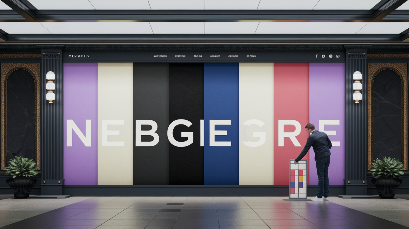
Fat footers take the multi-column approach further by mirroring the depth of a header mega-menu. They typically deploy 4+ grouped columns and work well for SaaS platforms, large ecommerce sites, or content hubs with dozens of internal pages to surface. VSCO’s footer uses four distinct columns plus a mini gallery above the links, creating a rich but organized endpoint. On the opposite end, thin footer bars (like Junction’s single-row link strip) keep the footprint minimal and work beautifully for portfolios, landing pages, or sites where the footer is purely functional. Full-screen slab footers (GenRevv’s bold purple background is a standout example) use the entire viewport width to create a striking visual finish, often pairing a large brand image or CTA with supporting navigation below.
Responsive stacking is non-negotiable. Desktop columns need to collapse into a single vertical stack on mobile, with each group remaining visually separated by headings or spacing. Some designers use accordion-style collapsible sections on mobile to reduce initial clutter, revealing links only when the user taps a category heading.
| Layout Type | Use Case | Example |
|---|---|---|
| Multi-column (2–4 columns) | Standard sites needing organized navigation, contact, and legal links | VSCO four-column footer with mini gallery |
| Fat footer (4+ columns) | SaaS, ecommerce, or content-heavy sites with many internal pages to surface | Mutiny’s detailed sitemap footer segmented by audience |
| Thin footer bar | Minimalist sites, portfolios, or pages where footer is purely utilitarian | Junction’s single-row horizontal link strip |
| Full-screen slab | Brand-forward sites using bold imagery or oversized CTAs in the footer | GenRevv’s near-full-screen footer with curved purple background |
Designing an Effective Website Footer Content Structure

Deciding what goes in the footer is just as important as how you lay it out. The goal is to give users the essentials they expect (contact paths, navigation shortcuts, legal housekeeping) without overwhelming them with every possible link on your site. A good rule of thumb is 5–10 primary links for lean footers, scaling up to 20–30 if you’re intentionally building a fat footer that doubles as an HTML sitemap.
Group related links under clear category headings so users can scan vertically within a topic instead of reading every single link. For example, a “Company” group might include About, Careers, Press, and Blog, while a “Support” group surfaces Help Center, Contact, and FAQ. This categorization mirrors how users think and significantly reduces cognitive load.
Seven link categories worth considering:
- Navigation shortcuts: Home, key product or service pages, popular blog categories
- Contact and location: Email, phone (clickable on mobile), physical address with map link
- Legal and compliance: Privacy Policy, Terms of Use, Cookie Settings, “Do Not Sell” (CCPA)
- Company information: About, Careers, Press or Media Kit, Investor Relations
- Support and resources: Help Center, FAQ, Documentation, Community Forum
- Social and engagement: Social media icons, Newsletter signup link, RSS feed
- Sitemap and search: Link to full HTML sitemap, embedded site search box if absent from header
Enhancing Website Footer Design Aesthetics and Branding
Visual design transforms a functional footer into a memorable brand touchpoint. The footer is often the last thing a visitor sees before leaving your site, so lean into your brand’s personality, whether that’s bold and vibrant like GenRevv’s purple slab or clean and minimal like VSCO’s black-and-white grid.
Color contrast does double duty: it separates the footer from the page content and reinforces brand identity. High-contrast palettes (dark footer on a light page, or vice versa) improve readability and make the footer feel intentional rather than tacked on. Soft, muted palettes like Cecilia’s grays and rounded corners create a calming visual rest at the bottom of the page, while oversized typography (think Diana’s Seafood’s bold blue-and-cream layout) commands attention and communicates confidence. Generous spacing prevents overlap and clutter, especially important when mixing large brand elements with dense link lists.
Five design enhancements to consider:
- Brand color backgrounds: Use your primary or secondary brand color to create a distinct footer zone
- High-contrast text: Ensure links and body copy meet WCAG contrast ratios (at least 4.5:1 for normal text)
- Whitespace and padding: Add vertical and horizontal spacing to prevent cramped layouts
- Custom typography: Use your brand typeface at readable sizes (14px minimum, 16px preferred)
- Subtle background imagery: Layer a faint pattern, gradient, or photograph beneath footer content for depth
Improving Website Footer Accessibility and Compliance

Accessible footer design isn’t optional. It’s a baseline requirement for inclusive UX and legal compliance. Screen reader users rely on semantic HTML and ARIA landmarks to navigate efficiently, so wrapping your footer content in a proper <footer> element and nested <nav> regions tells assistive technology exactly what each section does.
Color contrast failures are one of the most common accessibility violations in footers. Light gray text on white backgrounds might look “elegant,” but if the contrast ratio falls below WCAG’s 4.5:1 threshold, users with low vision or color blindness can’t read your links. Test your color combinations using a contrast checker before you ship. Keyboard navigation matters just as much. Every link, button, and form input in the footer must be reachable via Tab key, with visible focus indicators so users know where they are.
Legal compliance often overlaps with accessibility. Privacy policies, cookie-management links, and “Do Not Sell” options (required under CCPA for certain businesses) need to sit in predictable, easy-to-find locations within the footer. Many sites place these in a slim subfooter bar beneath the main navigation to keep them accessible without cluttering the primary footer content.
Six accessibility requirements to meet:
- Semantic HTML: Use
<footer>,<nav>,<ul>, and heading tags to structure content - ARIA labels: Add
aria-labeloraria-labelledbyto navigation regions and forms - Sufficient color contrast: Achieve at least 4.5:1 for normal text, 3:1 for large text
- Keyboard-friendly controls: Ensure all interactive elements are tabbable with visible focus states
- Descriptive link text: Avoid generic labels like “Click Here,” use “Read our Privacy Policy” instead
- Touch-target sizing: Make tap areas at least 44×44 pixels on mobile (48×48 is safer)
Making Website Footers Mobile‑Responsive

On mobile, screen real estate is precious and users scroll fast. A footer that works beautifully on desktop can become an unreadable mess on a phone if columns don’t stack cleanly or touch targets shrink too small. The solution is mobile-first thinking: design for the smallest screen, then enhance for larger viewports.
Reduce visible link density to 4–8 items per mobile viewport section. If your desktop footer shows 30 links across four columns, collapse those columns into a single vertical stack and consider grouping links under accordion headings so users can expand only the category they need. This keeps the initial footer footprint small while preserving full access to every link. Clickable phone numbers are a must. Wrap phone links in <a href="tel:+1234567890"> so tapping the number launches the dialer immediately. Human Interest and Junction both demonstrate clean responsive footers that prioritize essential links and maintain breathing room on narrow screens.
Test your footer on a real device, not just in a desktop browser’s responsive mode. Tap each link to confirm it’s large enough to hit accurately without zooming, and scroll through the entire footer to check for overlapping text, broken layouts, or floating widgets (like live chat bubbles) that obscure important content.
Five mobile optimization practices:
- Single-column stacking: Collapse desktop grid layouts into one vertical column on screens under 768px
- Accordion grouping: Use collapsible headings for link categories to reduce initial scroll height
- Clickable phone and email links: Use
tel:andmailto:protocols so tapping triggers the correct app - Larger touch targets: Increase padding and font size to ensure tap areas meet 44×44px minimum
- Minimal clutter: Prioritize contact, legal, and top navigation. Hide or defer secondary links
Adding Interactive and Conversion Elements to Website Footers

Footers aren’t just parking lots for leftover links. They’re legitimate conversion zones. About 24% of sites include a newsletter signup form in the footer, capturing visitors who scrolled to the bottom and decided they want to stay connected. Placing a small email capture form (just an input field and a “Subscribe” button) above or alongside your sitemap links gives readers one last easy action before they leave.
CTAs in footers work best when they’re concise and action-oriented. Bevel’s footer uses a prominent headline and an app-download link as the focal point, with sitemap and social links positioned below. The key is not to make the footer your only CTA. It should complement CTAs higher on the page, not replace them. Microinteractions add personality without overwhelming the functional purpose. Nikolai Bain’s footer includes a small interactive game on the left side, and while most sites won’t need something that playful, subtle hover effects on links or animated underlines (like Griflan uses) create a polished, engaging feel.
Social icons remain a staple, but keep them small. Large social widgets or embedded feeds can slow page load and distract from navigation. A simple row of icon links strikes the right balance. Users who want to follow you will click; everyone else appreciates the clean layout.
Five interactive elements to consider:
- Newsletter signup form: Email input and subscribe button positioned near top of footer or in a dedicated column
- Action-oriented CTA: Short headline and button for demos, downloads, or contact (avoid making it the dominant visual)
- Hover effects on links: Subtle color shifts, underlines, or icon animations to confirm interactivity
- Small microinteractions: Animated elements or playful details that reinforce brand personality without slowing the page
- Social media icons: Compact, recognizable icons linking to profiles (avoid large embedded feeds)
Preventing Future Website Footer Design Issues

The best way to avoid footer problems down the road is to build it as a reusable site component from day one. When your footer lives in a single template or component file, updating the copyright year, adding a new legal link, or tweaking navigation happens once and propagates across every page instantly. Hard-coding the footer separately on dozens of pages turns simple updates into multi-hour maintenance nightmares.
Analytics and heatmaps validate whether your footer is actually working. Tools like scroll-depth tracking, Crazy Egg, or Lucky Orange show how many users reach the footer and which links they click. If you discover visitors are scrolling past the footer without interacting, that’s a signal to simplify the layout, improve contrast, or reconsider your link hierarchy. Legal links need regular audits, too. Privacy policies must stay current as data-collection practices change, and jurisdictional compliance links (like CCPA “Do Not Sell”) may become required as laws evolve.
Four long-term maintenance steps:
- Use a component-based footer: Build once, deploy everywhere. Updates propagate sitewide automatically
- Track footer engagement: Monitor scroll depth and link clicks to validate performance and spot usability gaps
- Audit legal links quarterly: Ensure privacy policy, terms, and compliance links reflect current practices and regulations
- Test after site updates: Confirm footer layout and functionality after CMS upgrades, theme changes, or plugin installations
When to Seek Expert Help for Website Footer Design

Most teams can design and maintain a solid footer in-house, but certain situations call for deeper expertise. If you’re managing a multi-location business with 10+ physical branches, deciding how to structure footer contact information and local SEO signals without overwhelming users becomes a UX and information-architecture challenge worth delegating to a specialist.
Scroll-depth analytics that show users consistently ignoring your footer, or heatmaps revealing zero clicks, are red flags that the design isn’t meeting user needs. A UX researcher can run usability tests, interview real visitors, and recommend structural changes based on observed behavior rather than guesswork. Legal-heavy sites (think finance, healthcare, or large consumer platforms) often need expert review to balance compliance requirements with readability, especially when dense legal copy competes with navigation and branding.
Three scenarios requiring expert support:
- Complex multi-location footers: You need to surface contact info for 10+ locations without creating a cluttered, unreadable footer
- Low engagement in analytics: Heatmaps and scroll-depth data show users ignoring the footer entirely, signaling a structural or visual problem
- Legal and compliance complexity: Your footer must accommodate dense legal text, multiple jurisdictional links, or industry-specific disclosures
Final Words
You’ve seen the core: what a footer should include, common layout patterns, content groups, accessibility checks, mobile tweaks, and interactive options. That’s the fast map to a solid footer.
Start small: clean up links, group related items, add clear contact and legal spots, use contrast, and test responsive stacking with Flexbox or Grid. Run heatmaps to confirm.
Apply these steps, tweak, and test. With a clearer website footer design, your site will feel complete and easier to use.
FAQ
Q: What is a footer in website design and what is a good footer for a website?
A: A website footer is the bottom page section; a good footer groups contact info, key navigation, legal links, social icons, and a clear small call-to-action for easy access and trust.
Q: How to build a website footer?
A: To build a website footer, plan content hierarchy, pick a 1–4 column layout, add contact, navigation, legal links, and social icons, then ensure high contrast and mobile-friendly stacking.
Q: What are common footer mistakes?
A: Common footer mistakes are cluttered links, weak contrast, missing accessibility markup, poorly responsive columns, unclear hierarchy, and hiding essential contact or legal information.
