

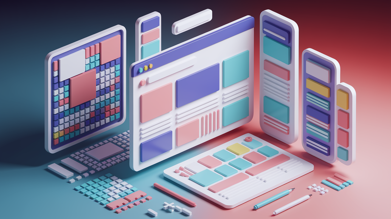
Think one website can fit every screen? Think again.
Responsive design is how one codebase adapts like water to phones, tablets, and big monitors.
This post shows the core principles: fluid grids, flexible images, media queries, and a mobile-first mindset so your layout reflows instead of breaking.
You’ll get practical steps, real examples, and small wins you can test in your browser.
By the end you’ll know how to build sites that work on every screen without extra versions or awkward hacks.
Core Principles Behind Modern Responsive Web Design

Responsive web design makes your site adapt to any screen automatically. Phones, tablets, desktops, whatever. You’re not building separate versions for different devices. Just one flexible layout that rearranges itself based on what’s looking at it.
Every visitor gets a version that fits their screen and works smoothly. Portrait mode on a phone? Works. A 1920px monitor? Also works.
Three techniques make this possible. Fluid grids replace fixed layouts with proportional sizing, so your columns scale instead of breaking apart. Flexible images use rules like max-width: 100% to shrink and grow without overflowing or pixelating. Media queries are CSS conditions that trigger different styles at certain widths. Tell your layout to stack columns when the viewport drops below 600px, and it does.
What responsive behavior looks like:
- Column collapse: Multi-column grids stack into single columns on smaller screens so content stays readable.
- Flexible images: Photos scale proportionally. No broken layouts, no forced horizontal scrolling.
- Breakpoint changes: CSS activates new rules at specific widths like 480px or 800px, rearranging navigation, sidebars, content blocks.
- Mobile-first layering: Base styles target small screens. Larger screens add complexity on top.
- Orientation shifts: Layouts adjust when users rotate from portrait to landscape.
Building responsively is a mindset shift. You stop designing fixed pages and start thinking in systems that collapse, expand, and reflow. It’s not about pixel control on every device. It’s about setting up rules that let your design adapt intelligently to whatever screen shows up.
How Responsive Layouts Work Across Different Screen Sizes

Responsive layouts use breakpoints. Specific viewport widths where your design changes behavior.
When a browser window crosses a breakpoint, media queries activate new CSS rules that rearrange, hide, or resize things. Fluid grids use proportional units like percentages, so columns shrink and grow relative to their container. No fixed pixel widths. The result? A layout that flows smoothly from wide monitors down to narrow phone screens without awkward clipping or horizontal scrolling.
Common layout shifts:
- Column stacking: Four columns at 1292px collapses to two at 1025px, then one on mobile.
- Sidebar moves: Side navigation drops below main content or becomes a collapsible menu.
- Navigation changes: Full horizontal menus turn into hamburger dropdowns or off-canvas drawers.
- Spacing adjustments: Padding and margins shrink to fit tighter viewports without cramping everything.
Flexbox and Grid make these shifts easier. Flexbox handles one-dimensional flows. Stacking nav links, spacing buttons in a row, that kind of thing. Grid handles two-dimensional layouts. Dashboards with sidebars, headers, content sections that need to rearrange independently.
Container queries (newer CSS feature) let components respond to their own container width instead of just the viewport. A card can adapt based on whether it’s in a narrow sidebar or a wide main area. Breakpoints usually land around 480px (phones), 600px (large phones or small tablets), 800 to 1200px (tablets and laptops). But the exact numbers depend on your content and where your layout naturally breaks.
Flexible Images, Media & Modern Optimization Techniques for RWD

Flexible images start with max-width: 100%. That tells an image to shrink if its container gets smaller, but never grow beyond its actual size. For older browsers like IE8, you might add width: 100% as a fallback.
This keeps images from breaking containers and forcing horizontal scrolling. But it doesn’t solve the bandwidth problem. If you deliver a 2000px photo to a phone, that device still downloads the heavy file and scales it down in the browser.
Modern responsive images give you more control. The srcset attribute lists multiple image sizes. The browser picks the best one based on screen width or pixel density. “On a 400px screen, load the 500px version. On a retina laptop, load the 2000px version.”
The <picture> element goes further. You can specify different images for different breakpoints. Crop a photo tighter on mobile or serve an entirely different composition. SVG graphics (icons, logos, illustrations) scale perfectly at any size and usually produce smaller files than bitmaps, so they’re perfect for UI elements that need to stay sharp on high-DPI screens.
Performance techniques reduce image weight and load time. Lazy loading with loading="lazy" delays loading images until they’re about to scroll into view. Faster page loads, less bandwidth wasted on images users never see. Compression tools shrink file sizes without visible quality loss. Newer formats like WebP and AVIF deliver the same quality at smaller sizes than JPEG or PNG.
Retina and high-DPI screens complicate this. Images often need to be twice as wide as the display size to stay sharp, which doubles or triples the file weight. You’ve got to balance sharpness and speed by testing image quality at different sizes and serving appropriate assets per device.
| Technique | Purpose | Notes |
|---|---|---|
| srcset attribute | Serve different image sizes based on viewport width or pixel density | Browser picks the best match automatically; reduces bandwidth on small screens |
| <picture> element | Deliver different images or crops at different breakpoints | Useful for art direction (different compositions for mobile vs desktop) |
| loading=”lazy” | Delay loading off-screen images until user scrolls near them | Speeds up initial page load; supported in modern browsers |
| SVG graphics | Scalable vector images for icons, logos, illustrations | Stay sharp at any size; smaller file size than bitmaps for simple shapes |
Mobile-First Responsive Design Techniques for Beginners

Mobile-first design means writing your base CSS for small screens first. Then you add complexity as the viewport gets wider.
You start with the simplest layout. Single column, stacked navigation, minimal decoration. Then use media queries to progressively enhance the design for tablets and desktops. This forces you to prioritize content and keeps your mobile experience fast and focused, instead of trying to strip down a heavy desktop design and hoping it still works on a phone.
The viewport meta tag is a one-line snippet that tells mobile browsers how to size your page. Without it, older mobile browsers (especially early iOS Safari) would shrink your entire layout proportionally to fit the screen. Everything becomes tiny, forcing users to zoom and pan.
Adding <meta name="viewport" content="width=device-width, initial-scale=1"> tells the browser, “Use the actual device width. Don’t apply any automatic scaling.” That single tag prevents unwanted proportional resizing and lets your media queries work correctly. When a user sees your page on a 400px phone, the browser knows the page is 400px wide, and your media query for max-width: 600px activates.
How relative units make layouts scalable:
- Font scaling: Use
remoreminstead of fixed pixels so text grows or shrinks proportionally. - Margin adaptation: Set margins in
%orvwto maintain spacing relationships as the viewport changes. - Width responsiveness: Size containers with
%orvwso they fill available space gracefully. - Fluid spacing: Combine
remoremwithcalc()to create spacing that adjusts based on font size or viewport dimensions. - Component proportioning: Use
vhfor full-height sections orvwfor width-based scaling that tracks the viewport directly.
Fluid typography uses CSS functions like clamp() to scale font sizes smoothly between a minimum and maximum based on viewport width. Instead of setting discrete sizes at each breakpoint, you write one rule. font-size: clamp(1rem, 2vw, 1.5rem). The browser calculates the size dynamically.
Text grows and shrinks fluidly as users resize their browser or switch devices, without the jump from fixed breakpoints. Viewport units (vw, vh) and calc() also let you define responsive spacing and sizing formulas, so your layout adapts continuously instead of in discrete steps.
Responsive Navigation Patterns and Touch-Friendly Interaction

Responsive navigation usually involves collapsing or hiding menu items as the viewport shrinks. On a wide desktop, you might show a full horizontal menu with every link visible. At tablet width, secondary items might tuck into a dropdown. On a phone, the entire menu often hides behind a hamburger icon that opens a full-screen or off-canvas panel when tapped.
You’re trying to keep navigation accessible without overwhelming the limited vertical space on small screens or forcing users to scroll through a huge menu before they see any content.
Common responsive navigation patterns:
- Off-canvas drawer: Menu slides in from the left or right edge when triggered. Keeps screen clear until needed.
- Dropdown stack: Horizontal menu collapses into a vertical stack, often revealed by tapping a toggle button.
- Priority+ pattern: Most important links stay visible. Overflow links hide behind a “More” menu.
- Sticky bottom nav: Primary actions or tabs anchor to the bottom of the screen on mobile, easy to reach with a thumb.
Touch ergonomics matter because there’s no hover state and fingers are less precise than cursors. Apple and Google both recommend a minimum tap target size of 48×48 pixels. Big enough that users can reliably hit the button without accidentally tapping the wrong thing.
Spacing around touch targets matters just as much. If two buttons sit too close together, users will tap the wrong one. Designing for touch doesn’t hurt cursor users. Larger buttons and clearer spacing work fine with a mouse. But designing only for cursors (relying on hover effects or tiny click targets) breaks the experience on phones and tablets.
Testing Responsive Web Design Across Devices & Browsers

Testing responsive behavior means checking your layout at a wide range of viewport widths and on real devices whenever possible. You can’t just resize your browser window and call it done.
Different devices have different pixel densities, touch behaviors, and browser quirks that only show up when you test on actual hardware. Start with emulation tools during development to catch obvious layout breaks, then validate on real phones, tablets, and older browsers before you ship.
Chrome DevTools (and equivalents in Firefox and Edge) include a device mode that lets you emulate different screen sizes and orientations. Press Ctrl+Shift+M (or Cmd+Option+M on Mac) to toggle the responsive viewport. Pick a preset device or drag the viewport edges to test custom widths. You can simulate touch events, throttle the network to see how the page loads on slow connections, and toggle device pixel ratios to preview retina displays.
DevTools won’t catch every device-specific bug, but it’s fast enough to test breakpoints interactively as you write CSS.
Cloud-based testing services (like BrowserStack or similar platforms) run your site on real devices in a data center and stream the screen back to you. Actual iOS Safari, actual Android Chrome, actual older browser versions. No drawer full of test devices needed.
Google’s Mobile-Friendly Test is a simpler one-shot audit. Paste in your URL and it checks whether your viewport meta tag is set correctly, whether touch targets are big enough, and whether horizontal scrolling is required. Visual regression testing tools take screenshots of your pages at multiple widths and compare them against baseline images, so you can spot unintended layout shifts after a CSS change.
| Tool | Purpose | Notes |
|---|---|---|
| Chrome DevTools device mode | Emulate different viewport sizes and test breakpoints interactively | Fast for development; toggle with Ctrl+Shift+M |
| Lighthouse audit | Scores performance, accessibility, SEO, and best practices including mobile responsiveness | Built into DevTools; highlights viewport, tap-target, and speed issues |
| Google Mobile-Friendly Test | Quick pass/fail check for mobile viewport, touch targets, and horizontal scroll | Free web tool; provides a snapshot of mobile usability |
| BrowserStack-style cloud testing | Run your site on real devices and browsers remotely | Catches device-specific bugs; requires subscription or trial |
Performance and SEO Factors in Responsive Web Design

Responsive web design directly influences SEO because Google uses mobile-first indexing. Your site’s mobile version is what Google crawls and ranks, even for desktop searches.
If your mobile layout is slow, cluttered, or missing important content, your rankings drop. Core Web Vitals (metrics like Largest Contentful Paint, Cumulative Layout Shift, and First Input Delay) measure real user experience on mobile. Google factors them into search rankings. A responsive site that loads fast, doesn’t shift layout unexpectedly, and responds quickly to taps scores better and ranks higher.
Performance strategies start with delivering only what each device needs. Critical CSS (the styles required to render above-the-fold content) should load inline or in the <head> so the page renders immediately. The rest can lazy-load afterward. Images should be served from a CDN to reduce latency. Cache static assets aggressively so repeat visitors load the page faster.
Avoid loading heavy desktop assets (large images, unused JavaScript) on mobile by using responsive image techniques and conditionally loading scripts only when needed. Each unnecessary request or oversized file increases load time and hurts Core Web Vitals, especially on slower mobile networks.
Key SEO benefits of responsive design:
- Mobile-first indexing compatibility: One responsive URL makes it easy for Google to crawl and rank your content without managing separate mobile URLs.
- Reduced bounce rate: Fast, well-adapted mobile layouts keep users on the page longer, signaling quality to search engines.
- Improved usability signals: Proper viewport tagging, readable text, and touch-friendly targets all contribute to better user-experience scores that influence rankings.
Popular Frameworks and Tools That Help You Build Responsive Designs
Responsive CSS frameworks give you pre-built grid systems, components, and utility classes. You don’t have to write every media query and layout rule from scratch.
They’re helpful for beginners because they enforce consistent breakpoints, handle cross-browser quirks, and let you prototype layouts quickly by adding classes to your HTML instead of writing custom CSS for every element.
Bootstrap and Tailwind are two of the most popular, but they take different approaches. Bootstrap uses a mobile-first Flexbox grid where you add classes like col-12 (full width on small screens) and col-md-6 (half width on medium and larger screens) to create responsive columns.
Tailwind is utility-first. You compose layouts by stacking single-purpose classes like w-full (full width) and md:w-1/2 (half width at medium breakpoints).
Pure CSS Grid systems (like CSS Grid Layout itself) give you even more control by letting you define two-dimensional grids without any framework. But they require more CSS knowledge upfront. Prototyping tools like Figma and Sketch help you design responsive layouts visually before you write code, letting you test breakpoints and spacing in a drag-and-drop interface.
Popular tools and frameworks to consider:
- Bootstrap: Mobile-first Flexbox grid, pre-styled components, extensive documentation. Great for rapid development.
- Tailwind CSS: Utility-first classes for fine-grained control. Smaller bundle sizes when purged. Steeper learning curve.
- CSS Grid Layout: Native CSS two-dimensional layout system. No framework needed. Requires manual media query management.
- Figma / Sketch: Visual design and prototyping tools with responsive frame support. Useful for wireframing before coding.
- Foundation: Another responsive framework with a flexible grid and accessibility-focused components. Less popular than Bootstrap but still widely used.
Practical Responsive Design Tips to Keep in Mind

Content-first and mobile-first strategies simplify responsive design decisions by forcing you to prioritize what matters most.
On a small screen, you can’t show everything at once. You’ve got to decide which information is essential and which can wait until the user taps “more” or switches to a larger device. That discipline (figuring out the core message and actions first) makes your mobile experience clearer. Often improves the desktop version too, because you’ve stripped away unnecessary clutter.
Progressive enhancement means building a solid baseline experience that works everywhere, then layering on advanced features for browsers that support them. Start with semantic HTML and basic CSS that renders correctly even in older browsers. Then add Flexbox, Grid, or modern image formats for newer browsers, with fallbacks or polyfills for older ones.
This ensures your site doesn’t break completely if a user visits on an outdated phone or an older version of Internet Explorer. They get a simpler layout, but they still get your content and can complete their task.
Core responsive design reminders:
- Content-first design: Identify the most important information and actions for mobile users. Hide or defer secondary content to prevent overwhelming small screens.
- Progressive enhancement: Build a working baseline with simple HTML and CSS, then add advanced layout and media features for capable browsers.
- Typography rhythm: Use consistent font-size scales and line-height ratios so text remains readable and proportional across all screen sizes.
- Adaptable spacing: Define margins and padding with relative units or responsive formulas so whitespace scales naturally without feeling cramped on small screens or wasteful on large ones.
Final Words
We used fluid grids, flexible images, and media queries to make layouts change smoothly across screen sizes. You saw how breakpoints, CSS Grid and Flexbox, responsive images, mobile-first rules, navigation patterns, testing, and performance tie together.
Try small wins: test in DevTools, add srcset, set the viewport meta tag, and use clamp() for type.
Keep building. Practicing responsive web design is a repeatable skill—practice it on tiny projects and you’ll ship interfaces that feel right on any device.
FAQ
Q: What is responsive web designing?
A: Responsive web designing is an approach that adapts a website’s layout and assets to different screen sizes, platforms, and orientations using fluid grids, flexible images, and CSS media queries for better usability.
Q: How much do responsive web designers make?
A: Responsive web designers make widely varying incomes—typically about $50,000 to $100,000 per year in the U.S., depending on experience, location, and company; freelancers may charge hourly rates instead.
Q: What is responsive web design structure?
A: Responsive web design structure uses a fluid grid, flexible images and media, and CSS media queries with breakpoints to rearrange columns, resize assets, and switch navigation across viewport widths.
Q: Is responsive design still relevant?
A: Responsive design is still relevant because mobile-first indexing, diverse devices, and touch interactions require adaptable layouts and optimized assets to maintain good user experience and search visibility.
