

Ever opened your site on a phone and saw the hero image squashed or the subject chopped off?
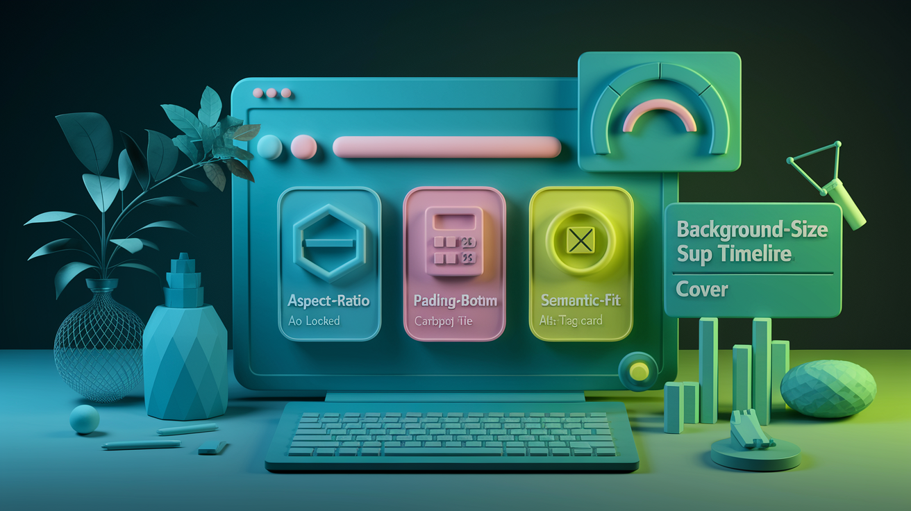
This post shows two reliable fixes: CSS aspect-ratio (locks a box to a width-to-height shape) and the padding-bottom hack (an old trick that keeps the box proportional).
I’ll walk you through when to use each, how background-size: cover and background-position keep the focal point, and quick fallbacks for older browsers.
By the end you’ll know how to make background images scale cleanly on every screen.
Overview Of Responsive Background Images And Modern Aspect-Ratio Techniques
You put a background image on a hero section and it looks perfect on your laptop. Then you check your phone and the image is either squashed, stretched, or cropping out the most important part. That’s the exact problem responsive background images solve. You’ve got two fast solutions: the modern aspect-ratio property or the padding-bottom hack. Both lock the container to a specific shape so your image scales cleanly across every screen size.
Here’s the simplest modern example:
.hero {
  background-image: url('hero.jpg');
  background-size: cover;
  background-position: center;
  aspect-ratio: 16 / 9;
}
That code creates a container that always maintains a 16:9 shape, whether the viewport is 320px or 3840px wide. The background-size: cover ensures the image fills the entire box without distortion, and background-position: center keeps the focal point visible. If the browser doesn’t support aspect-ratio yet, you’d fall back to the padding-bottom method.
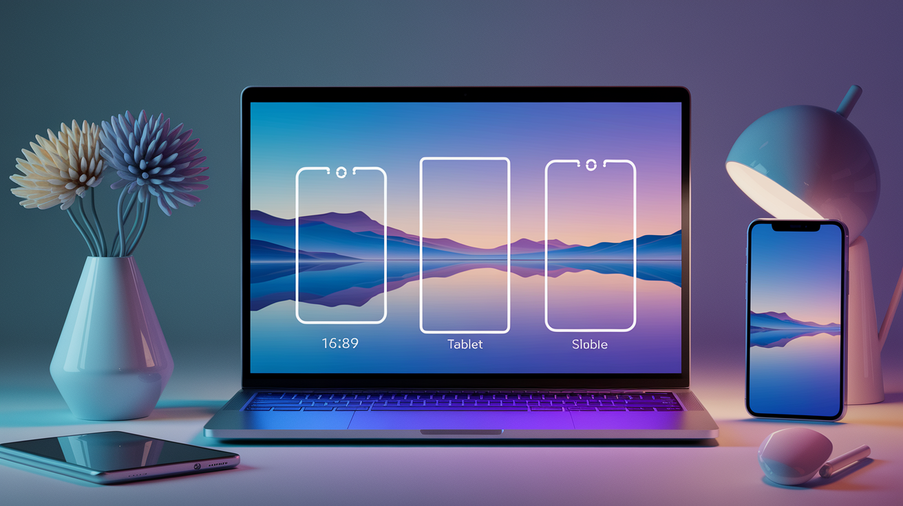
Most projects use a handful of common ratios depending on the design goal:
16:9 works for standard widescreen hero banners and video-shaped sections. 4:3 is the classic photo ratio, slightly taller, works well for feature cards. 1:1 gives you perfect squares for profile images or icon tiles. 3:2 is the traditional print-photo ratio, balanced for editorial layouts. 2:1 goes extra wide, good for panoramic or cinematic headers. 3:1 goes super wide, used for thin strip banners or progress bars.
Each ratio serves a layout purpose. You pick the one that matches your content and then apply it consistently across breakpoints to avoid layout shifts and maintain a polished visual rhythm.
Pros And Cons Of Responsive Background Image Methods
Using background-size: cover gives you automatic cropping that preserves the overall visual balance of the image. You don’t get white bars or distortion. The downside is that edges will be cut off on certain viewports, so if your subject is near the edge, you might lose it. background-position helps by letting you control which part stays visible. Something like background-position: center right keeps the right side anchored.
Fixed aspect ratios work beautifully for images, but they can cause problems when you overlay text or buttons. If the container is locked at 56.25% padding-bottom to maintain 16:9, and your headline wraps to five lines on a small screen, the text might overflow the box or get cut off. That’s why you’ll often see breakpoints that remove the padding-bottom constraint on mobile and let the container grow with the content.
Pros:
Maintains consistent proportions across all viewport sizes. Prevents layout shifts when images load asynchronously. Works with decorative backgrounds that don’t need semantic markup. Lets you control focal points with background-position values. Easy to layer gradients or overlays on top of the background.
Cons:
Crops out edges of the image depending on aspect ratio and viewport shape. Fixed vertical height can squeeze or hide overlay content on small screens. No semantic value for screen readers unless paired with ARIA labels. Older padding-bottom method requires manual percentage math. aspect-ratio property lacks support in very old browsers.
Understanding CSS Aspect-Ratio For Responsive Background Layouts

The CSS aspect-ratio property tells the browser to lock a container to a specific width-to-height relationship, no matter how wide or tall the viewport becomes. You write aspect-ratio: 4/3; and the box will always be four units wide for every three units tall. This replaced the padding-bottom hack because it’s direct, doesn’t require math, and works on any element. Divs with background images, inline images, even video containers.
Browser support rolled out widely starting in 2021. Chromium-based browsers like Chrome and Edge adopted it first, followed by Firefox and Safari. If you need to support older browsers, you can layer a fallback using the padding-bottom method inside an @supports rule. The property applies before other sizing constraints, so if you combine aspect-ratio with an explicit height, the height wins and the ratio is ignored.
Here’s how aspect-ratio affects layout flow:
The browser calculates the missing dimension based on the ratio and the available space. If width is set or constrained by the parent, height is computed to match the ratio. If height is set explicitly, the ratio is overridden and the height takes precedence. The property works on replaced elements like <img> and <video> as well as block containers with background images.
What Is The Padding-Bottom Aspect-Ratio Hack In Responsive Background Images
Before the aspect-ratio property existed, developers used a clever trick with padding to preserve image proportions. Percentage-based padding in CSS is always calculated relative to the element’s width, even for top and bottom padding. So if you set padding-bottom: 56.25% on a container with no height, the browser creates vertical space equal to 56.25% of the container’s width. That locks the box into a 16:9 shape.
The formula to calculate the padding percentage is straightforward once you know it. Take your desired ratio, like 16:9. Divide the width by 100 to get a decimal (16 ÷ 100 = 0.16), then divide the height by that decimal (9 ÷ 0.16 = 56.25). The result is your padding-bottom percentage. So padding-bottom: 56.25% creates a 16:9 container. For a 4:3 ratio, you’d calculate 4 ÷ 100 = 0.04, then 3 ÷ 0.04 = 75, giving you padding-bottom: 75%.
This method works everywhere, even in Internet Explorer, but it’s got a known limitation on small screens. If you place text or buttons inside the container using absolute positioning and the content wraps to multiple lines, it can overflow the fixed-height box. The solution is to use a media query to remove the padding-bottom value on narrow viewports and switch the overlay content back to normal flow with standard padding.
Common aspect ratios using the padding-bottom hack:
16:9 gets you padding-bottom: 56.25%. 4:3 gives padding-bottom: 75%. 3:1 needs padding-bottom: 33.3333%. 2:1 uses padding-bottom: 50%.
Understanding Object-Fit And Its Relation To Responsive Background Behavior
object-fit is a CSS property that applies to replaced elements like <img>, <video>, and <iframe>. It controls how the content inside those elements scales to fill the container, similar to how background-size works for background images. When you set object-fit: cover on an image, the browser scales and crops the image to completely fill the container without distortion, just like background-size: cover does for backgrounds.
The key difference is semantic. Using an <img> tag with object-fit gives you proper alt text, better SEO value, and native lazy-loading support via the loading="lazy" attribute. But you lose some layout flexibility because images are inline replaced elements by default. You can combine object-fit with explicit height hints to prevent shrinking, like height: max(10rem, 30vh), which ensures the image never collapses below 10rem or 30% of the viewport height, whichever is larger.
When to use each approach:
Use <img> with object-fit: cover when the image is content-related and needs alt text or semantic value. Use background-image with background-size: cover when the image is purely decorative or part of the layout. Use object-fit: contain when you want the entire image visible without cropping, even if it leaves empty space. Use object-fit with aspect-ratio to lock an image container to a specific shape and let the image fill it. Combine object-fit with height: max(...) when you need responsive minimum sizes that adapt to zoom or narrow viewports.
How To Implement Responsive Background Images And Aspect-Ratio Techniques

How To Do Option 1: CSS Aspect-Ratio
The native aspect-ratio property is the cleanest way to lock a background container to a specific shape. You write the ratio as two numbers separated by a slash, and the browser handles the rest.
Apply aspect-ratio: 16 / 9; to the container with your background image. Add background-size: cover; and background-position: center; to control scaling and focal point. Use @supports (aspect-ratio: 1) to wrap the rule if you need to provide a fallback for older browsers.
How To Do Option 2: Padding-Bottom Ratio Hack
This legacy method still works everywhere and is a solid fallback when aspect-ratio isn’t supported. You create vertical space using percentage-based padding.
Set the container to height: 0; and padding-bottom: 56.25%; for a 16:9 ratio. Add position: relative; to the container so you can position overlay content inside it. Calculate the percentage using the formula B ÷ (A ÷ 100) = C%, where A is width and B is height. Place any overlay content inside the container as position: absolute; with top: 0; left: 0; right: 0; bottom: 0; to fill the box.
How To Do Option 3: Background-Size Cover + Positioning
Controlling how the image scales and where it crops is critical when your subject isn’t centered. background-size and background-position work together to keep the important parts visible.
Use background-size: cover; to fill the container edge-to-edge without distortion. Set background-position: center; by default, or use values like center right or top center to anchor specific parts of the image. Switch to background-size: contain; if you want the entire image visible with letterboxing instead of cropping.
How To Do Option 4: Flexbox-Centered Overlay
When you need to center text or buttons over a background image, flexbox is the most reliable method. It works better than transform-based centering because it respects text wrapping and doesn’t break on zoom.
Set the container to display: flex; flex-direction: column; justify-content: center; to vertically center the content. Add padding-left and padding-right (like 30px) to inset the text from the edges without using absolute positioning. Use align-items: center; if you also want horizontal centering, or leave it unset for left-aligned text.
How To Do Option 5: Breakpoint Adjustment For Small Screens
Fixed aspect ratios can squeeze overlay content on narrow viewports. You need a breakpoint that removes the ratio constraint and lets the content flow naturally.
Write a media query for small screens, like @media (max-width: 640px). Inside the query, remove padding-bottom or set it to 0 if you’re using the padding-bottom hack. Change the overlay from position: absolute; to position: relative; so it flows inside the container. Add normal padding to the container to give the content breathing room, and use background-position: center; or center right to keep the image focal point visible when it crops vertically.
Comparison Of Responsive Background Image Methods
Each technique solves the same core problem but makes different tradeoffs around browser support, semantics, and layout flexibility. The modern aspect-ratio property is the simplest to write and maintain, but it only works in browsers released after 2021. The padding-bottom hack works everywhere but requires manual percentage math and can cause overflow issues on small screens. Using object-fit on an <img> gives you semantic HTML and better accessibility, but you lose some of the layout control that background images provide.
Performance also varies. object-fit on images can trigger repaints when combined with CSS blend modes or transforms, which can cause flicker during animations. Background images with background-size: cover are generally more stable during scroll or resize events. File format matters more than the CSS method. Switching from JPEG or PNG to WebP can reduce file size by 25–34%, and enabling lazy loading can speed up initial page load by around 35%, according to real-world case studies.
| Method | Semantics | Performance | Browser Support |
|---|---|---|---|
| CSS aspect-ratio | None (decorative) | Fast, no layout shifts | 2021+, fallback needed |
| Padding-bottom hack | None (decorative) | Fast, stable | Universal, IE included |
| object-fit on <img> | Full (alt text, SEO) | Can repaint with blend modes | 2015+, widely supported |
| background-size: cover | None (decorative) | Fast, efficient repaints | Universal |
| srcset with <img> | Full (alt text, SEO) | Adaptive, smaller files | 2014+, widely supported |
How To Benefit From Responsive Background Images And Aspect-Ratio Techniques

Locking your background containers to consistent aspect ratios prevents layout shifts when images load asynchronously. The browser knows the final height before the image arrives, so text and buttons don’t jump around while the page paints. This directly improves Cumulative Layout Shift scores and makes the page feel faster and more stable, even on slow connections.
Switching to modern image formats like WebP can shrink file sizes by 25–34% compared to JPEG or PNG. Combine that with lazy loading and you can speed up initial page load by around 35%, because the browser only fetches images that are visible or near the viewport. Smaller files also mean less data usage for mobile visitors, which can improve engagement and reduce bounce rates, especially on metered or slow connections.
Using background-position to control focal points ensures that the most important part of your image stays visible across different aspect ratios and viewport shapes. Something like background-position: center right anchors the right side of the image so a person’s face doesn’t get cropped out on narrow screens. This small detail improves readability and keeps the design intentional instead of accidental.
Real-world benefits you get from responsive background techniques:
Layout stability. Containers maintain their shape during image load, eliminating content jumps and improving user experience. Performance gains. Smaller file formats and lazy loading can reduce initial load time by 30–35% and cut bandwidth usage significantly. Better readability. Controlled cropping and focal-point positioning keep text overlays legible and subjects visible across all screen sizes. Accessibility support. Using semantic <img> tags with object-fit provides alt text and better screen-reader context than decorative backgrounds. File savings. WebP and AVIF formats deliver 25–34% smaller files than JPEG or PNG, which speeds up pages and reduces hosting costs. Future-proofing. Modern properties like aspect-ratio and container queries let you write cleaner, more maintainable CSS that adapts to new screen sizes without breakpoint bloat.
Final Words
in the action we showed the fastest fixes: CSS aspect-ratio or the padding-bottom hack, plus background-size: cover, background-position, and object-fit examples to keep images looking good.
Pick native aspect-ratio when possible, use padding-bottom as a fallback, and tune background-position or object-fit for focal points. The post also covered pros/cons, common ratios, and step-by-step implementation tips.
These responsive background images and aspect-ratio techniques are practical—try them in a small hero and you’ll get more stable layouts and faster loads. Keep experimenting; you’ll get there.
FAQ
Q: How to make an image background responsive?
A: Making an image background responsive involves using a fixed aspect box (CSS aspect-ratio or padding-bottom), background-size: cover, background-position for the focal point, and media queries for breakpoints.
Q: Is 3/4 or 9 16 better for pictures?
A: Choosing 3:4 or 9:16 depends on context: 3:4 suits portrait photos and galleries; 9:16 fits tall mobile screens and stories. Pick the ratio that matches your container and platform.
Q: What is aspect ratio in responsive design?
A: Aspect ratio in responsive design is the width-to-height relationship of an element. CSS provides aspect-ratio for native boxes, while the padding-bottom hack is the common fallback to preserve that ratio.
Q: What are the best practices for background images?
A: Best practices for background images include background-size: cover, setting background-position to hold the focal point, using aspect-ratio or padding-bottom, optimizing formats (WebP), lazy-loading alternatives, and adding readable overlays.
