

Still designing your portfolio on a 13-inch screen and hoping it looks good on phones?
That approach breaks on mobile and costs you readers.
This step-by-step guide shows how to build a five-section responsive portfolio that actually adapts, covering header, hero, about, projects gallery, and contact, using semantic HTML, mobile-first CSS with Flexbox and Grid, image optimization, and simple JavaScript for the menu and form.
Follow along and you’ll have a fast, accessible site that scales from 320px phones to 2560px desktops.
Getting Started: What You Will Build and the Steps Ahead
You need a portfolio site that works on every device your visitors actually use. Phones, tablets, laptops, big monitors. Fixed-width layouts fall apart on mobile. Images spill over. Navigation vanishes. That stops when you build responsive from the start.
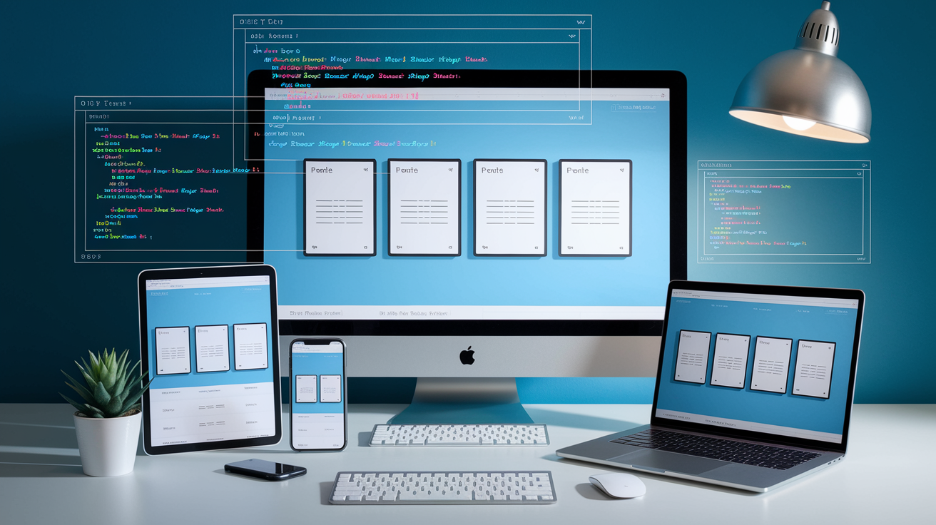
You’re building a five-section portfolio with HTML, CSS, and JavaScript. Header with navigation, hero section with your headline and a call to action, about section introducing who you are, project gallery showing your work in a responsive grid, contact form with validation. Each section reshapes itself as the viewport changes.
The build follows a clear sequence. Plan your content and sketch a layout. Write semantic HTML for accessibility and structure. Apply mobile-first CSS with breakpoints at 600px, 900px, and 1200px. Build layouts using Flexbox and CSS Grid. Optimize images with srcset and lazy loading. Add JavaScript for navigation toggles and form validation. Test across devices and browsers. Deploy to static hosting with a custom domain. Maintain responsiveness through regular audits. Each step builds on the last, so you’ll have a working preview the whole way through.
Your finished portfolio loads fast, passes accessibility audits, and scales cleanly from a 320px phone screen to a 2560px desktop. You control the code. No framework lock in. A deployable project you can update whenever your work changes.
Why Portfolio Websites Fail to Be Responsive

Most portfolio sites break on mobile because they’re built desktop first with fixed pixel widths. A container locked to 1200px looks fine on a laptop but forces horizontal scrolling on a phone. When you skip media queries entirely, the layout stays rigid across every screen size. That’s the core issue. No adaptive rules means no responsiveness.
Large hero images without size constraints push load times past three seconds and blow out mobile data budgets. Navigation menus that don’t collapse into a hamburger icon become unusable on touch screens. Typography set in absolute pixels stays tiny on phones or comically large on tablets. Flexbox and Grid layouts require intentional breakpoint adjustments. Without them, content stacks awkwardly or overflows.
Six common mistakes that guarantee a non-responsive portfolio:
Using fixed pixel widths instead of percentages or viewport units. Writing desktop styles first and trying to scale down with max-width queries. Ignoring image optimization and serving full resolution files to every device. Building navigation without a mobile collapsed state or toggle button. Skipping semantic HTML and ARIA roles, which breaks screen reader navigation. Testing only in Chrome on one screen size instead of across real devices.
Planning Your Responsive Portfolio Build

Before you write any code, define what the portfolio needs to accomplish. Are you job hunting and need to highlight your skills and résumé? Or are you freelancing and need case studies and client testimonials? Your goal determines which sections get the most space and what content you prepare first. If you’re targeting front-end roles, your projects section becomes the hero. If you’re a designer, your visual work and process breakdowns take priority.
Sketch a wireframe showing five core sections in vertical order. Header with logo and navigation, hero banner with your name and a short value statement, about section with your background and skills, project gallery showcasing three to six pieces of work, contact form or email link. This structure works on mobile as a single column, then expands into multi-column layouts at larger breakpoints. Keep the wireframe simple. Boxes and labels, no pixel perfect mockups yet.
Gather your assets before you start building. You’ll need a logo or text lockup, a high quality headshot or avatar, project screenshots or mockups, skill icons or badges if you want them, any testimonials or client logos. Resize images to reasonable dimensions now. Hero images around 1920px wide, project thumbnails around 800px, profile shots around 600px. Export everything as compressed JPEGs or WebP files to save bandwidth. Decide whether you’ll write pure CSS with Flexbox and Grid for full control, or use Bootstrap to speed up responsive scaffolding. Pure CSS gives you lighter files and no framework overhead. Bootstrap gives you pre-built components and a tested grid system.
Five planning steps to complete before coding:
Write down your portfolio’s primary goal and target audience. List the five sections you’ll include and what each one should communicate. Sketch a mobile first wireframe showing vertical stacking of sections. Collect and optimize all images, logos, and text content. Choose pure CSS or a framework based on your control versus speed preference.
| Section | Purpose | Assets Needed |
|---|---|---|
| Header / Navigation | Provide quick access to all sections and establish branding | Logo image or text lockup, navigation labels |
| Hero | Make a strong first impression with a headline and call to action | Background image or gradient, headline copy, CTA button text |
| Projects Gallery | Showcase completed work with images and brief descriptions | Project screenshots, thumbnail images, titles, links to live demos or case studies |
Creating the Semantic HTML Structure for Your Portfolio

Start with an HTML5 boilerplate that includes the DOCTYPE, language attribute, meta charset, and viewport meta tag. The viewport tag is critical. Without <meta name="viewport" content="width=device-width, initial-scale=1.0">, mobile browsers render your page at desktop width and scale it down, defeating responsive design. Inside the body, structure your content with semantic elements that describe what each section does, not just how it looks.
Wrap your site in a <header> containing a <nav> with an unordered list of anchor links to section IDs. Use a <button> element for the mobile menu toggle, even though it won’t do anything until you add JavaScript. Below the header, place a <main> element wrapping all primary content sections. Inside main, use <section> tags with unique IDs matching your nav links: #hero, #about, #projects, #contact. Each section can contain headings (<h1> for the hero headline, <h2> for section titles), paragraphs, lists, or figures for images. Close your page with a <footer> containing copyright text, social links, or secondary navigation.
Forms require accessible markup. Wrap each input in a <label> with a for attribute matching the input’s id. Use type="email" for email fields and type="text" for names to trigger the correct mobile keyboard. Add required attributes to mandatory fields and aria-describedby pointing to error message IDs when validation fails. For the mobile navigation toggle, add aria-expanded="false" to the button and aria-hidden="true" to the hidden menu, then flip those values with JavaScript when the menu opens.
Seven HTML sections to include in order:
Header with logo and navigation links inside a <nav> element. Hero section with an <h1> headline, short paragraph, and a call to action button. About section with an <h2> title, bio paragraph, and optional skills list. Projects section with an <h2> title and a container for project cards, each inside an <article> or <div> with an image, heading, and description. Skills section with an <h2> title and an unordered list or icon grid. Contact section with an <h2> title and a <form> containing labeled inputs for name, email, message, and a submit button. Footer with copyright text, social icons, and optional secondary links.
Styling Your Portfolio with CSS and a Mobile-First Approach

Apply a CSS reset at the top of your stylesheet to remove browser default margins, padding, and box sizing inconsistencies. Use * { margin: 0; padding: 0; box-sizing: border-box; } to start every element with predictable spacing. Then define CSS custom properties (variables) for your color palette, spacing scale, and typography stack. For example, :root { --color-primary: #2563eb; --color-text: #1f2937; --space-unit: 8px; --font-base: 'Inter', sans-serif; } lets you reference var(--color-primary) throughout your styles, making theme changes instant.
Write your base styles for mobile screens first, assuming a 320px to 599px viewport. Set a comfortable body font size between 16px and 18px, line height around 1.6, and a max width on text blocks to prevent lines exceeding 70 characters. Use relative units. Percentages for widths, rems or ems for font sizes, viewport units (vw, vh) sparingly for hero sections. Stack all sections vertically with full width containers. Navigation links should display as a vertical list by default, hidden behind a toggle button. Images and media should be max-width: 100%; height: auto; so they never overflow their containers.
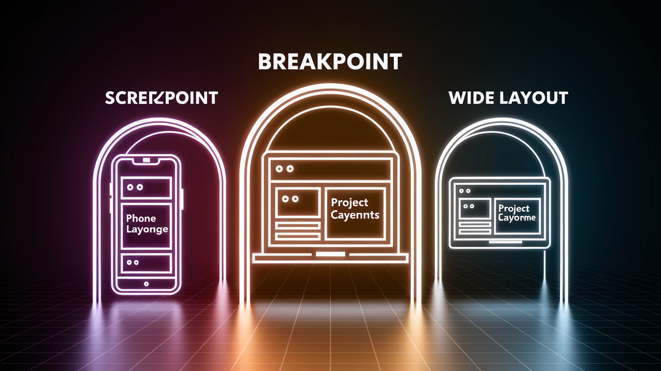
Add min-width media queries to progressively enhance the layout as screens grow. At 600px (small tablets), you might reveal a horizontal navigation bar and switch project cards from one column to two. At 900px (tablets and small laptops), expand to three columns in the project grid, increase heading sizes, and add more whitespace. At 1200px (desktops), lock content to a maximum width like 1140px and center it with margin: 0 auto;. Each breakpoint adds layout complexity without overriding the mobile base. This is the mobile first advantage.
Create visual hierarchy by scaling typography across breakpoints and using spacing to group related content. Headings should be significantly larger than body text. Add breathing room with margins between sections, padding inside cards, and generous line height in paragraphs. Ensure text contrast meets WCAG AA standards, at least 4.5:1 for body text, 3:1 for large headings. Use tools to verify your color combinations before finalizing the palette.
Six CSS fundamentals to implement:
CSS reset to eliminate browser inconsistencies. Design tokens as custom properties for colors, spacing, and fonts. Mobile first base styles with vertical stacking and full width containers. Progressive breakpoints at 600px, 900px, 1200px using min-width queries. Responsive images with max-width: 100%; height: auto;. Accessible color contrast ratios and scalable typography.
| Breakpoint | Device Range | Layout Change | Notes |
|---|---|---|---|
| Base (0–599px) | Mobile phones | Single column, stacked sections, hidden nav menu | Write all base styles for this range first |
| 600px | Large phones, small tablets | Two-column project grid, horizontal nav if space allows | First min-width query adds layout enhancements |
| 900px | Tablets, small laptops | Three-column project grid, larger typography, more whitespace | Expand navigation fully, increase heading sizes |
| 1200px | Desktops, large monitors | Max-width container (1140px), centered layout, further spacing increases | Prevent content from stretching too wide on large screens |
Implementing Layouts with Flexbox and CSS Grid
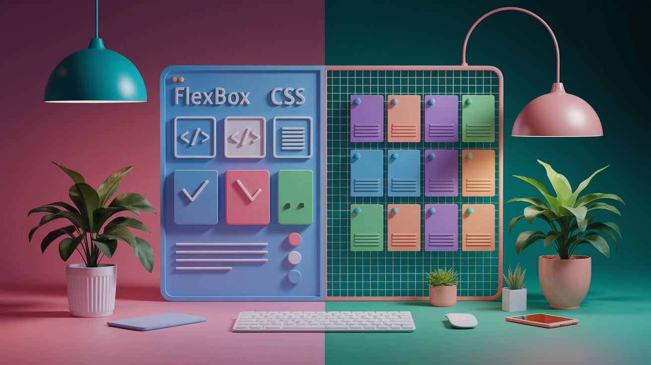
Flexbox works best for one dimensional layouts. Rows or columns where items need to align, wrap, or distribute space evenly. Use Flexbox for your navigation bar, the horizontal arrangement of social icons, and the interior of project cards where an image sits next to text. For example, display: flex; justify-content: space-between; align-items: center; on your header keeps the logo on the left and navigation links on the right, vertically centered. Add flex-wrap: wrap; when you need items to break onto new lines at smaller viewports.
CSS Grid handles two dimensional layouts where you control both rows and columns simultaneously. Apply Grid to your project gallery container with display: grid; grid-template-columns: 1fr; for mobile, then switch to grid-template-columns: repeat(2, 1fr); at 600px and repeat(3, 1fr); at 900px. The fr unit divides available space equally among columns, so three columns each get one third of the container width. Add gap: 2rem; to create consistent spacing between grid items without manual margins.
Combine both systems in a single layout. Your overall page structure might use a vertical Flexbox container with flex-direction: column; to stack sections, while each section’s interior uses Grid for complex arrangements or nested Flexbox for simpler alignments. For instance, your skills section could use Grid to display icon badges in a uniform grid, while your contact form uses Flexbox to align labels and inputs in a single column.
Five layout component examples:
Navigation bar: Flexbox with justify-content: space-between; to separate logo and links. Hero section: Flexbox with flex-direction: column; align-items: center; to center headline and CTA button. Project gallery: CSS Grid with repeat(auto-fit, minmax(300px, 1fr)) for responsive columns that adapt without breakpoints. Project card interior: Flexbox with flex-direction: row; gap: 1rem; to place image thumbnail beside project description. Footer: Flexbox with justify-content: center; gap: 1.5rem; to space social icons evenly.
Adding Media Queries and Breakpoints Effectively
Media queries let you apply different CSS rules when the viewport reaches a specific width. Write them with @media (min-width: 600px) { ... } to add styles that only activate above that threshold. This approach scales your layout up from the mobile base, which prevents overriding and conflicting rules. If you wrote desktop styles first and used max-width queries to scale down, you’d constantly fight with earlier declarations.
At your first breakpoint (600px), reveal the navigation menu by removing any display: none; or height: 0; rules applied for mobile. Switch the project grid from one column to two with grid-template-columns: repeat(2, 1fr);. Increase body font size by one or two pixels and bump up heading sizes slightly. Adjust padding inside sections to add more breathing room. Mobile might use padding: 2rem 1rem;, while tablets use padding: 3rem 2rem;.
At 900px, expand the project grid to three columns. Increase the max width of your main content container to 960px and center it with margin: 0 auto;. Scale typography again. Hero headlines might grow from 2rem to 3rem, section titles from 1.5rem to 2rem. Add hover effects to navigation links and project cards now that users have a mouse. For example, a:hover { color: var(--color-primary); } provides visual feedback that’s irrelevant on touch devices but expected on desktops.
At 1200px, lock your content width to 1140px to prevent text lines from stretching too wide on ultra wide monitors. Increase outer margins and internal padding one more time. You might also adjust the hero background image positioning or add decorative elements that would clutter smaller screens. This is your final breakpoint. Most designs don’t need more than three or four total.
Optimizing Images for a Fast, Responsive Portfolio

Images often account for 60 to 80 percent of a page’s total file size, so optimization directly impacts load time. Start by resizing every image to the maximum dimensions it will ever display. A hero background will never be larger than 1920px wide, so exporting a 4000px version wastes bandwidth. Project thumbnails displayed in a three column grid at 1200px viewport only need to be around 800px wide. Resize images in an editor or use build tools to generate multiple sizes automatically.
Serve different image sizes to different devices using the srcset attribute. For example, <img src="project.jpg" srcset="project-600.jpg 600w, project-900.jpg 900w, project-1200.jpg 1200w" alt="Project screenshot"> lets the browser choose the best file based on viewport width and pixel density. On a 375px phone, the browser downloads the 600px version. On a 2x retina laptop at 1440px logical width, it fetches the 1200px version. This eliminates wasted downloads.
Use modern formats like WebP for better compression without visible quality loss. A JPEG project screenshot at 100KB might compress to 60KB as WebP with identical visual quality. Wrap the image in a <picture> element to provide fallback formats: <picture><source srcset="project.webp" type="image/webp"><img src="project.jpg" alt="Project screenshot"></picture>. Browsers that support WebP load the smaller file. Older browsers fall back to JPEG.
Enable lazy loading by adding loading="lazy" to image tags that appear below the fold. The browser delays downloading those images until the user scrolls near them, speeding up initial page load. Lazy load your project gallery images and any large decorative graphics, but never lazy load hero images or anything visible immediately on page load.
Five image optimization techniques:
Resize images to actual display dimensions before uploading. Generate multiple sizes (small, medium, large) and use srcset to serve the right file. Convert images to WebP format and provide JPEG fallbacks via <picture>. Add loading="lazy" to below the fold images. Compress images with tools to reduce file size by 30 to 70 percent without visible degradation.
| Format | Use Case | Average Savings vs JPEG |
|---|---|---|
| JPEG | Photos, complex images with gradients | Baseline format, no savings |
| PNG | Graphics with transparency, logos, icons | Often larger than JPEG for photos; only use when transparency required |
| WebP | All image types, supports transparency and animation | 25–35% smaller than equivalent JPEG or PNG |
Enhancing Your Portfolio with JavaScript Interactivity

JavaScript adds dynamic behavior that CSS can’t handle alone. The most common portfolio feature is a mobile navigation toggle. Clicking a hamburger icon slides the menu into view. Select the button and menu elements with document.querySelector, then listen for a click event. When triggered, toggle a class like .nav-open on the menu and flip the button’s aria-expanded attribute from false to true. In your CSS, show the menu when .nav-open is present and hide it otherwise.
Form validation improves user experience by catching errors before submission. Listen for the form’s submit event, call event.preventDefault() to stop the default action, then check each required field. If the email input is empty or doesn’t match a basic pattern like /\S+@\S+\.\S+/, display an error message below the field and add an error class for styling. If all fields pass, allow the form to submit or send data via fetch to a backend endpoint.
Smooth scrolling makes anchor navigation feel polished. When a user clicks a nav link pointing to #projects, intercept the click, get the target section’s offset from the top, and use window.scrollTo({ top: offset, behavior: 'smooth' }) to animate the scroll instead of jumping instantly. This small enhancement gives the site a more intentional, cohesive feel.
Project filters let users view subsets of your work. Clicking “Web Design” hides all projects except those tagged with that category. Store category data in data-category attributes on each project card, then loop through cards and toggle a .hidden class based on whether the card’s category matches the active filter. Keep animations performant by using CSS transitions on opacity and transform rather than animating layout properties like height or width.
Keep JavaScript lightweight and progressive. The site should be fully navigable and readable even if JavaScript fails to load. Never hide critical content behind JavaScript only interactions. Use CSS for visual effects like hover states and transitions whenever possible. Reserve JavaScript for logic and state management.
Five interactive features to add:
Hamburger menu toggle that shows and hides navigation on mobile. Form validation that checks required fields and email format before submission. Smooth scroll behavior when clicking navigation links. Project filter buttons that show or hide portfolio items by category. Modal or lightbox that opens when a user clicks a project thumbnail to view full details.
Choosing Between Pure CSS or a Framework

Bootstrap provides a pre-built responsive grid system, typography defaults, and UI components like buttons, navbars, and forms. You can build a responsive portfolio quickly by applying utility classes: <div class="container"><div class="row"><div class="col-md-4">...</div></div></div> creates a three column layout at the medium breakpoint without writing any custom CSS. Bootstrap handles breakpoints, Flexbox alignment, and browser compatibility automatically, so you spend less time debugging and more time designing.
The trade off is file size and flexibility. Bootstrap’s CSS weighs around 150KB minified, even if you only use 20 percent of its features. Customizing the framework requires overriding default styles, which creates specificity battles and bloated stylesheets. If your portfolio design is straightforward and matches Bootstrap’s defaults, the framework accelerates development. If you want a unique visual identity or minimal file size, pure CSS gives you complete control.
Pure CSS with Flexbox and Grid requires more upfront work but produces leaner code. You write exactly the styles your site needs, nothing extra. Your stylesheet might only be 10 to 30KB minified, and you understand every rule because you wrote it. This approach improves performance and teaches you responsive design fundamentals, which makes you a stronger developer. The learning curve is steeper if you’re new to Flexbox and Grid, but the investment pays off on every future project.
Choose Bootstrap if you need to prototype fast, want tested cross browser compatibility, or prefer working with pre-built components. Choose pure CSS if you value performance, want a unique design, or are building this portfolio to learn responsive techniques from scratch.
| Feature | Bootstrap | Pure CSS |
|---|---|---|
| Setup Speed | Very fast—add CDN link and start applying classes | Slower—write all layout and component styles from scratch |
| File Size | ~150KB minified CSS, even if you use only 20% of features | 10–30KB minified—only includes what you write |
| Customization | Requires overriding framework defaults, can create specificity conflicts | Full control—every line of CSS is intentional and custom |
Testing Your Responsive Portfolio on Real Devices
Browser developer tools provide the first layer of testing. Open Chrome DevTools, click the device toolbar icon, and cycle through preset screen sizes: iPhone SE (375px), iPad (768px), laptop (1024px), desktop (1920px). Reload the page at each size and verify that navigation collapses correctly, images scale without overflow, and text remains legible. Use the network throttling option to simulate slow 3G and check load times. Anything over three seconds on mobile needs optimization.
Real device testing catches issues that emulators miss. Borrow or buy access to an actual iPhone, Android phone, and tablet. Open your portfolio on each device’s native browser (Safari on iOS, Chrome on Android) and test every interactive element: tap the hamburger menu, fill out the contact form, scroll through the project gallery. Touch targets should be at least 44px by 44px to prevent mis-taps. Text should be readable without zooming. Images should load quickly even on LTE.
Run a Lighthouse audit in Chrome DevTools under the “Audits” tab. Select Performance, Accessibility, Best Practices, and SEO, then generate a report. Lighthouse flags issues like missing alt text, low contrast ratios, unoptimized images, and layout shifts during load. Aim for scores above 90 in Performance and Accessibility. Fix flagged issues one by one. Add alt attributes, compress images, defer offscreen JavaScript. Then re-run the audit until scores improve.
Test across major browsers: Chrome, Firefox, Safari, and Edge. Each browser renders CSS slightly differently and supports features on different timelines. Safari on iOS still doesn’t support some newer CSS properties, so check that your layout doesn’t depend on unsupported features. Use caniuse.com to verify browser support for any modern CSS or JavaScript you’ve used.
Five testing steps to complete:
Test layout at 375px, 768px, 1024px, and 1920px viewports in browser dev tools. Open the site on real iOS and Android devices and verify touch interactions. Run Lighthouse audits and fix issues until Performance and Accessibility scores exceed 90. Test in Chrome, Firefox, Safari, and Edge to catch browser specific rendering bugs. Verify that images load quickly and forms submit correctly on slow network connections.
Deploying Your Portfolio Online
Static site hosting services provide the easiest deployment path for HTML, CSS, and JavaScript portfolios. Create a free account on a platform like Netlify, Vercel, or GitHub Pages. These hosts automatically serve your files over HTTPS, provide CDN caching for fast global load times, and integrate with Git repositories for continuous deployment. You push code to your repo, the host detects the change, builds the site if needed, and publishes the updated version. All in under a minute.
Connect your Git repository to the hosting platform. Most hosts let you link a GitHub, GitLab, or Bitbucket repo directly from their dashboard. Point the host to the branch you want to deploy (usually main or master) and specify the build command if you’re using a preprocessor or bundler. For a pure HTML site, no build command is needed. The host just copies your files to a public server. Once connected, every git push triggers an automatic rebuild and redeploy.
Configure a custom domain by updating DNS records at your domain registrar. Add an A record pointing your domain to the host’s IP address, or add a CNAME record pointing a subdomain like www to the host’s provided URL. Most hosts display the exact DNS records you need in their deployment settings. After saving DNS changes, wait 10 to 60 minutes for propagation, then visit your custom domain to verify the site loads correctly. The hosting platform automatically provisions an SSL certificate via Let’s Encrypt, so your site serves over HTTPS without extra configuration.
Enable continuous deployment so future updates deploy automatically. Edit a file locally, commit the change, and push to your repository. The hosting service detects the new commit, rebuilds the site, and publishes the update within seconds. This workflow eliminates manual FTP uploads and ensures your live site always matches your latest code. If a deploy breaks something, most hosts let you roll back to a previous version with one click.
Set up a deployment preview for every pull request or branch. Hosting platforms like Netlify generate a unique preview URL for each branch, so you can test changes in a production like environment before merging to main. Share the preview link with friends or clients for feedback, then merge and deploy only after approval.
Five deployment steps:
Create an account on a static hosting platform that supports Git integration. Connect your Git repository and configure the deploy branch and build settings. Push your code to trigger the first automated build and deployment. Update DNS records at your domain registrar to point your custom domain to the host. Verify the site loads over HTTPS at your custom domain and test the continuous deployment workflow.
Preventing Responsiveness Issues in Future Updates
Responsiveness isn’t a one time task. It requires maintenance every time you add content or change the design. Before publishing new sections or features, open the site at all three breakpoints (600px, 900px, 1200px) and verify that the new content adapts correctly. If you add a new project card, check that it fits in the Grid layout without breaking alignment. If you add a new hero image, confirm it loads fast and doesn’t push other content offscreen.
Re-run image optimization whenever you upload new photos or graphics. New images often arrive at full resolution from a camera or design tool, so resize and compress them before adding them to your assets folder. Use the same srcset and lazy loading techniques you applied during the initial build. Skipping this step even once bloats your page and slows load time.
Test navigation and forms after every update. Click every link to ensure anchor IDs still match and smooth scrolling works. Submit the contact form with valid and invalid inputs to verify validation logic still catches errors. These checks take five minutes and prevent user facing bugs.
Run a Lighthouse audit monthly, even if you haven’t made changes. Hosting providers occasionally update server configurations, browsers release new standards, and performance thresholds shift. A monthly audit catches regressions early. If scores drop, investigate the flagged issues. Maybe a third party script you embedded is now render blocking, or image sizes crept up over time.
Four ongoing maintenance tasks:
Test new content at all breakpoints before publishing. Optimize every new image with resizing, compression, srcset, and lazy loading. Re-run Lighthouse audits monthly and fix any performance or accessibility regressions. Verify navigation, forms, and interactive JavaScript after every code update.
When to Seek Additional Help or Take the Next Step
You might need external help if accessibility audits reveal issues you don’t know how to fix. Missing ARIA labels, incorrect heading hierarchy, or keyboard navigation traps. Accessibility is non-negotiable for professional portfolios, so consult Web Content Accessibility Guidelines (WCAG) documentation or hire an accessibility specialist to review your code. Many portfolios fail accessibility checks because developers skip this step entirely.
Advanced JavaScript features like project filters, lightbox modals, or animations built with libraries require deeper knowledge than a beginner tutorial provides. If you want complex interactions but lack JavaScript experience, follow a dedicated JavaScript course that covers DOM manipulation, event handling, and state management. The portfolio you’ve built provides a real world project to practice those skills on, so you’re not learning in isolation.
Branding and visual design challenges arise when your layout looks functional but doesn’t communicate your personality or professional identity. If you’re not a designer, hire a freelance designer for a few hours to create a color palette, typography system, and hero image that match your target industry. A designer can also provide mockups that guide your CSS work, ensuring the final site looks polished instead of generic.
Debugging deployment issues like DNS propagation delays, broken SSL certificates, or failed builds sometimes requires help from the hosting platform’s support team or community forums. Most static hosts provide detailed logs and error messages that point to the problem. If you’ve followed the deployment steps correctly and the site still won’t go live, open a support ticket with the host and include your build logs and DNS settings for faster troubleshooting.
Final Words
Dive in: you planned the five core sections, wrote semantic HTML, and applied mobile-first CSS with variables and breakpoints. You used Flexbox and Grid to lay out content and added light JavaScript for navigation and filters.
You optimized images with srcset/WebP, tested across devices, and deployed with a Git-based host. Small maintenance checks will keep things responsive over time.
Follow this how to build a responsive portfolio website step by step and you’ll end up with a fast, accessible portfolio you can proudly share. Nice work—keep iterating.
FAQ
Q: How to make a portfolio website step by step and how to make a responsive website for beginners?
A: Making a responsive portfolio website step by step means starting mobile-first: create semantic HTML with five sections (header, hero, about, projects, contact), style with CSS using breakpoints at 600/900/1200px, and add light JavaScript.
Q: What is the best portfolio maker for beginners?
A: The best portfolio maker for beginners is Carrd, offering simple drag-and-drop templates, responsive defaults, low cost, and fast publishing—ideal for quickly launching a clean portfolio before you learn custom code.
Q: What is an example of a portfolio website?
A: An example of a portfolio website is a single-page layout with a clear header, hero image, an about section, a projects gallery using CSS Grid, and a contact form that adapts to small screens.
