

What if responsive design stopped depending on the browser window and started listening to each component?
That’s the promise of CSS container queries.
They let your card, widget, or nav change layout based on the space its parent gives it, not the viewport.
Drop the same component into a sidebar or a wide article and it adapts automatically.
In this tutorial you’ll learn how to mark containers, write @container rules, combine them with media queries, and avoid common performance pitfalls so your components stay modular and reliable.
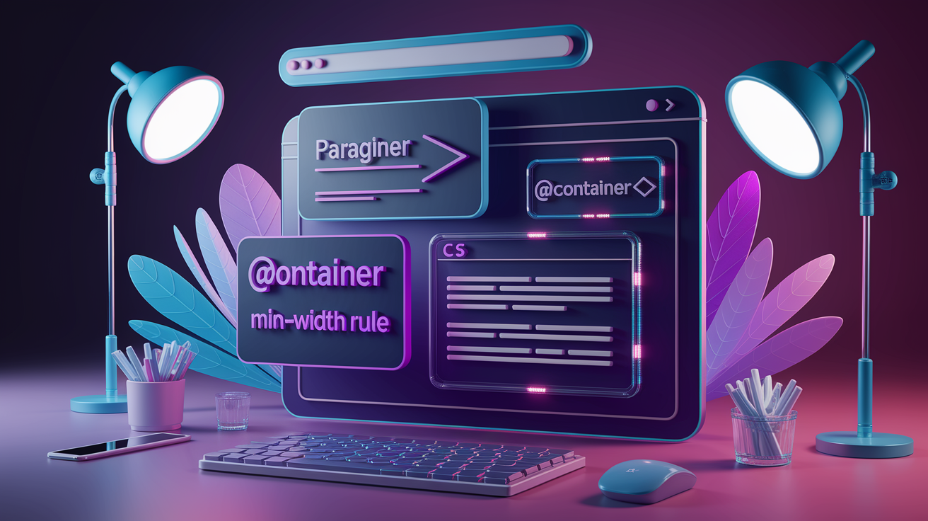
Understanding CSS Container Queries

Container queries let you write CSS that responds to the size of a parent container instead of the browser window. A media query checks the viewport width. A container query checks how much space the component actually has. That means a card can stack vertically when it’s squeezed into a narrow sidebar and switch to a horizontal layout when it lives in a wide content area, all without knowing anything about the viewport.
Browser support rolled out between 2022 and 2023. Chrome and Edge shipped container queries in version 105 (August 2022), Safari added them in version 16 (September 2022), and Firefox followed in version 110 (February 2023). As of November 2024, roughly 93% of users worldwide can use container queries without a polyfill.
Container queries solve a core limitation of media queries: viewport-based breakpoints force every instance of a component to behave the same way at the same screen width. If you drop a reusable card into a sidebar and into the main content area, both cards see the same viewport and apply the same styles, even though one has 250 pixels of space and the other has 800. Container queries let each card respond to its own context.
What you actually get:
- Components become truly modular and can be dropped into any layout without modification.
- No need to build separate “small,” “medium,” and “large” variants of the same component.
- Nested containers each apply their own responsive rules independently.
- Design systems and component libraries become easier to maintain.
- Dynamic or CMS-driven layouts adapt automatically without custom breakpoint logic.
Pros and Cons of Using CSS Container Queries

Container queries make components self-contained and reusable across different layout contexts. You write the responsive logic once, and the component adapts wherever you place it. That reduces duplication, simplifies design systems, and removes the need for viewport-specific variants. Components can live in grids, sidebars, modals, or flex containers and respond to the space they actually have.
Performance is the main tradeoff. Every element designated as a container creates a new layout containment context, which adds a small overhead during layout calculations. If you mark too many elements as containers, you’ll see slowdowns. Container queries also can’t replace media queries entirely. Page-level layout decisions (like switching from a single-column to a multi-column grid) still belong in media queries.
Pros:
- Components respond to their immediate parent size, not the viewport.
- Single component definition works in narrow sidebars and wide content areas.
- No need for duplicate “card-small” and “card-large” variants.
- Easier to maintain design systems and component libraries.
Cons:
- Performance overhead when creating many container contexts.
- Cannot query the container’s own size, only its parent’s.
- Browser support below 93% globally requires fallbacks for legacy users.
- Media queries are still needed for page-level responsive layout.
Use container queries for component-level responsiveness (cards, widgets, navigation items) and media queries for page-level structure (grid columns, major layout shifts). If you’re building a component library or design system, container queries will reduce complexity and improve portability.
What Is a Container?

A container is any element you explicitly mark with the container-type property. Once marked, the element becomes a query target. Its descendants can apply styles based on the container’s size. By default, every element is container-type: normal, which means it’s not a container and can’t be queried for size.
You set container-type to inline-size (measures width only) or size (measures both width and height). Most components use inline-size because it preserves natural height behavior and avoids collapsing the container. You can also assign a container-name to target a specific container in nested layouts.
| Property | Description |
|---|---|
| container-type | Defines whether the element can be queried (values: normal, inline-size, size). |
| container-name | Assigns an optional name to target the container in nested query contexts. |
Common container examples:
- A
.card-wrapperaround a product card in a grid or sidebar. - A
.sidebarelement containing navigation or widget components. - A
.grid-itemin a responsive flex or CSS Grid layout.
What Is a Container Query?

The @container rule lets you apply styles when a container meets a specific condition, like @container (min-width: 400px). The syntax mirrors media queries. You write a condition in parentheses, then nest the CSS rules you want to apply. Instead of checking the viewport, the query checks the inline-size (width) or block-size (height) of the nearest ancestor container.
You can target a specific container by name: @container card-grid (min-width: 30rem). If you don’t provide a name, the query matches the nearest ancestor that has container-type set. You can chain multiple conditions with and, or, and not, and you can use range operators like >, <, >=, and <=.
Key syntax components:
- The
@containerkeyword starts the rule. - An optional container name immediately follows (e.g.,
card-grid). - A condition in parentheses checks the container’s size or style (e.g.,
(min-width: 30rem)). - Nested selectors and rules apply when the condition is true.
Container queries target the container’s children, not the container itself. A container can’t change its own styles, only the styles of elements inside it. That’s the golden rule: you can’t change the dimension you’re measuring.
The main difference from media queries is scope. A media query applies globally to the entire page based on the viewport. A container query applies locally to the descendants of a specific container based on that container’s dimensions. Two instances of the same component can display differently on the same page if their containers have different widths.
What Is Container Query Style Scoping?

Style queries let you apply CSS rules based on the computed value of custom properties (CSS variables) in a container, not just its size. You use the style() function inside an @container rule to check a variable’s value: @container (style(--theme: dark)). If the container’s --theme variable equals dark, the nested styles apply.
Style queries are experimental and not enabled by default in most browsers. As of early 2024, you need to enable feature flags in Chromium-based browsers to test them. They’re defined in the CSS Containment Module Level 5 Editor’s Draft but haven’t reached stable cross-browser support yet. For production work, stick to size-based container queries.
Example style-based conditions:
@container (style(--bg-color: #000))applies styles when the container’s background color variable is black.@container (style(--spacing: large))switches layout when a spacing token is set to “large.”@container (style(--mode: compact))adjusts component density based on a custom mode property.
How to Implement CSS Container Queries
How to declare a container
You designate an element as a container by setting container-type on the parent element. Use container-type: inline-size to measure the width (inline dimension) or container-type: size to measure both width and height. Most components use inline-size because size can collapse the container’s height if the content doesn’t define it explicitly.
Add container-name if you want to target a specific container in nested layouts. The name is optional. If you skip it, the query will match the nearest ancestor with container-type set. Use the shorthand container property to set both type and name in one line: container: card-grid / inline-size.
Steps to declare a container:
- Choose the parent element that wraps the component you want to query.
- Add
container-type: inline-size;to that element in your CSS. - Optionally add
container-name: my-container;if you need to target it by name. - Verify the parent has explicit width from layout (flex, grid, or a width rule).
How to write your first container query
Start with a simple example: a <section> container and a <p> inside it. Set container-type: inline-size on the section, then write an @container rule that changes the paragraph’s font size when the section is wider than 12rem.
section {
  container-type: inline-size;
}

@container (min-width: 12rem) {
  p {
    font-size: 1.25rem;
  }
}
When the section has at least 12rem of width, the paragraph text becomes 1.25rem. If the section is narrower, the query doesn’t match and the paragraph keeps its default size.
Steps to write your first query:
- Mark the parent with
container-type: inline-size;. - Write
@container (min-width: [threshold])and nest the CSS rules you want inside. - Test by resizing the container or placing it in different layouts to confirm the styles toggle at the correct width.
How to combine container queries with media queries
Use media queries to control page-level layout (switching from one-column to two-column grids, showing or hiding sidebars) and container queries to control component-level responsiveness (stacking vs horizontal card layouts, navigation collapse). The two systems complement each other: media queries set the stage, container queries adapt the actors.
Inside a component, you can nest @container rules within @media rules or vice versa. For example, a media query might apply dark mode styles globally, and a container query inside adjusts a card’s layout based on its width. Keep the logic separated by scope: viewport decisions in media queries, component decisions in container queries.
Combination strategies:
- Use media queries to adjust grid column counts or sidebar visibility.
- Use container queries inside each component to adapt to the space it receives from the grid.
- Layer a media query for color scheme or orientation over container queries for layout shifts.
- Provide media-query fallbacks for browsers that don’t support container queries (below ~93% global support threshold).
Comparison: Container Queries vs. Media Queries

Media queries check the viewport dimensions (the entire browser window) and apply styles globally. Every element on the page sees the same viewport width, so a card in the sidebar and a card in the main content area both trigger the same breakpoints. Container queries check the size of a specific parent element and apply styles only to its children. That means two cards on the same page can display different layouts if their containers have different widths.
Media queries are ideal for page-level decisions like switching from a single-column to a multi-column grid, adjusting typography for small screens, or toggling navigation styles. Container queries are ideal for component-level decisions like stacking a card’s image and text vertically in a narrow sidebar or arranging them horizontally in a wide content area.
| Feature | Media Query | Container Query |
|---|---|---|
| Scope | Global, viewport-based | Local, container-based |
| Target | Browser window dimensions | Parent element dimensions |
| Use case | Page layout, major structure changes | Component layout, reusable modules |
| Modularity | Components must know viewport context | Components respond to immediate space |
Use media queries when you need to respond to device characteristics or viewport size (things like screen width, orientation, or color scheme). Use container queries when you need a component to adapt to the space it’s given, regardless of viewport size. In most projects, you’ll use both: media queries for the grid and major layout shifts, container queries for the cards, widgets, and navigation elements inside that grid.
How to Use CSS Container Queries in Real Projects
Components that benefit from container queries:
- Responsive cards that stack vertically in sidebars and display horizontally in wide content areas.
- Pricing tables that collapse features into accordion sections when space is limited.
- Navigation bars that switch from horizontal to vertical or icon-only layouts based on container width.
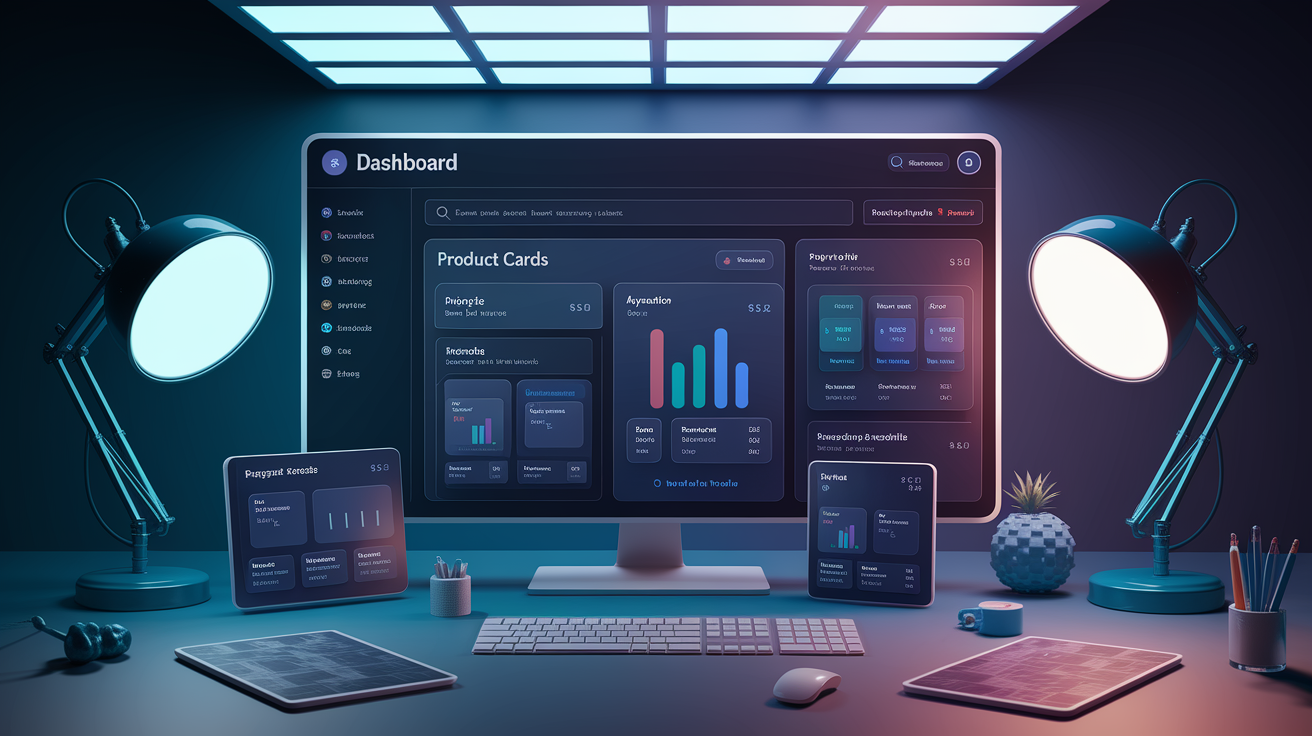
- Dashboard widgets that adjust chart size, hide labels, or collapse controls when placed in narrow panels.
- Pagination controls that show full page numbers in wide containers and collapse to prev/next buttons in narrow ones.
Implementation best practices:
- Use
container-type: inline-sizefor most components to preserve natural height behavior. - Define clear container boundaries. Don’t make every element a container; choose wrapper elements that naturally contain layout shifts.
- Use rem units for container query thresholds to respect user font-size preferences (e.g.,
@container (min-width: 20rem)instead of320px). - Test components in multiple container sizes during development. Place them in narrow and wide contexts to verify behavior.
As of late 2024, container queries are supported in Chrome/Edge 105+, Safari 16+, and Firefox 110+, covering roughly 93% of global users. If your user base includes older browsers, provide media-query fallbacks or use progressive enhancement. Apply base styles that work everywhere, then layer container-query enhancements for modern browsers. Polyfills exist but add complexity and performance overhead, so evaluate whether your support threshold justifies them or whether you can adopt container queries for new projects only.
Final Words
We jumped straight into hands-on examples showing how container queries let a component respond to its parent instead of the viewport. You saw container-type, container-name, the @container rule, and style queries in short, practical steps.
We compared container queries to media queries, covered pros and cons, and walked through implementation for cards, navbars, and grids. If you follow the steps and try the examples, this using CSS container queries for responsive components tutorial will help you build smaller, more modular responsive parts. Go try one now. It works.
FAQ
Q: What is the difference between container queries and media queries?
A: The difference between container queries and media queries is that container queries target a component’s container size, while media queries target the viewport; container queries make components respond independently and stay reusable.
Q: How to use a container in CSS?
A: To use a container in CSS, set container-type (for example size or inline-size) and optionally container-name on the parent, then write @container rules in child selectors to apply conditional styles.
Q: When to use container CSS?
A: Use container CSS when a component must adapt to its parent size, like cards, sidebars, or widgets, so styles remain modular and work inside different layouts without relying on viewport breakpoints.
Q: How to make a website responsive using media queries?
A: To make a website responsive using media queries, define @media breakpoints for viewport widths, adjust layout, spacing, and typography per breakpoint, and test the site across devices and screen sizes.
