

Stop copying the standard five breakpoints.
They rarely match your content.
This guide shows where to set pixels for mobile, tablet, and desktop and why those choices matter.
You’ll get a simple starting set (480, 768, 1024, 1440), copy-paste code, and a quick browser test.
Think of breakpoints like seams in clothing.
Place them where the fabric strains.
Do this and your pages stop collapsing or wasting space across devices.
Core Breakpoint Recommendations and Immediate Code Examples
Breakpoints are the viewport widths where your layout needs to change so it stays usable. Without them, a three-column desktop grid will squish into something unreadable on a phone. And a stacked mobile menu wastes space on a big screen.
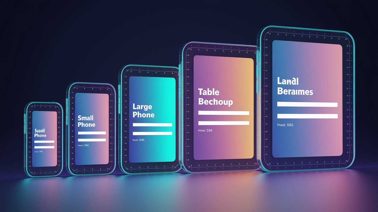
The most common breakpoints are 320px (older small phones), 480px (small to medium phones), 768px (tablets and large phones in portrait), 1024px (tablets in landscape and small laptops), and 1440px (standard desktops). You’ll know you need a breakpoint when resizing your browser makes text wrap badly, images squish, or tap targets shrink below 44px. Start with these five and adjust when your content visually breaks.
You apply breakpoints by writing media queries in your CSS. A mobile-first approach sets base styles for small screens and uses min-width queries to layer on changes as the viewport grows. Each query adds or overrides rules at the specified width, keeping your stylesheet organized and preventing style collisions.
/* Base — mobile styles */
body {
  font-size: 16px;
  padding: 12px;
}

.container {
  width: 100%;
}

/* 480px — medium phones */
@media (min-width: 480px) {
  body {
    padding: 16px;
  }
}

/* 768px — tablets and large phones */
@media (min-width: 768px) {
  .container {
    max-width: 720px;
    margin: 0 auto;
  }
  body {
    font-size: 18px;
  }
}

/* 1024px — small laptops */
@media (min-width: 1024px) {
  .container {
    max-width: 960px;
  }
}

/* 1440px — standard desktops */
@media (min-width: 1440px) {
  .container {
    max-width: 1200px;
  }
  body {
    font-size: 20px;
  }
}
Device-Based vs. Content-Based Breakpoints
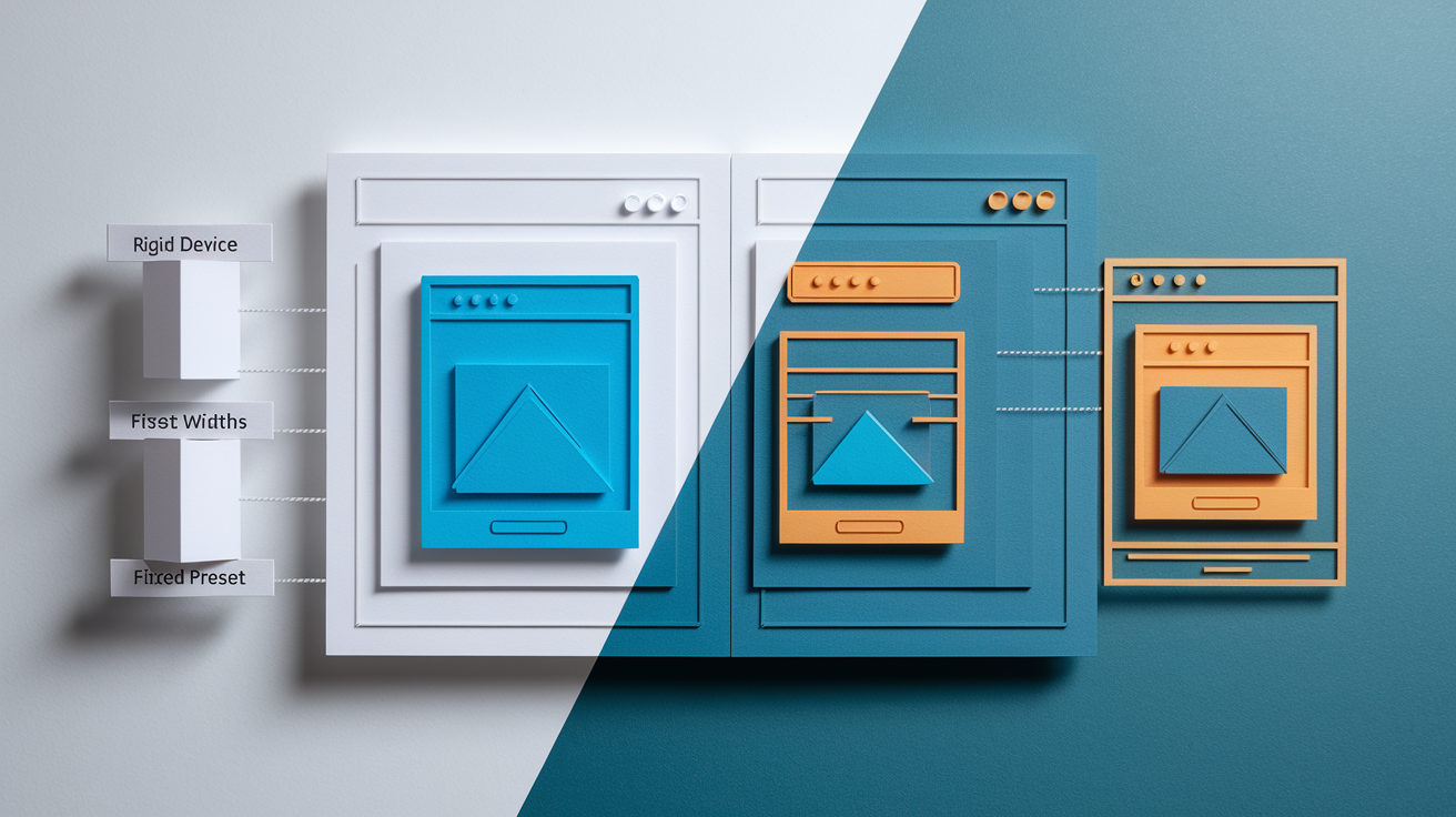
Device-based breakpoints map directly to the widths of popular phones, tablets, and laptops. This became standard in the early 2010s when a few dominant screen sizes covered most traffic. 320px for iPhone, 768px for iPad, 1024px for laptops. Frameworks and UI kits locked in these numbers. Many teams still use them out of habit or because analytics show traffic concentrated at those widths.
But device sizes keep changing. A rigid 768px breakpoint might work perfectly for an iPad but force awkward layout compromises on an 834px iPad Pro or a 720px Android tablet. Content-based breakpoints solve this by ignoring device labels. You add a breakpoint only when the layout actually starts to fail. When headlines wrap poorly, images overlap text, or buttons become too small to tap. You resize the browser, watch the design, and place a media query at the exact width where things break.
Content-driven breakpoints produce more maintainable layouts. They respond to real design problems instead of assumed hardware. You’ll still end up near common device widths most of the time, but you’ll add or skip breakpoints based on what your content needs, not what last year’s device stats suggest.
Mobile-First vs. Desktop-First Media Query Strategies

Mobile-first CSS starts with styles for the smallest screen and uses min-width media queries to progressively add to the layout as the viewport grows. You write your base rules without any query, then layer on tablet and desktop changes. This keeps your default CSS small and forces you to prioritize the core experience.
Desktop-first CSS does the opposite. Base styles target wide screens and max-width queries strip away complexity as the viewport shrinks. This was common before mobile traffic dominated. Some legacy projects still use it because the existing codebase was built that way.
| Aspect | Mobile-First | Desktop-First |
|---|---|---|
| Query type | min-width | max-width |
| Base styles | Small screens | Large screens |
| CSS size | Tends to be lighter | Can bloat with overrides |
| Best for | New projects, mobile-heavy traffic | Retrofitting old desktop sites |
Modern Device Landscape and How It Influences Breakpoint Choices
Devices don’t cluster neatly into three categories anymore. Phones range from 320px budget models to 428px iPhone Pro Max units. Tablets run from 768px iPads to 1024px+ Surface devices. Laptops start at 1280px and extend past 1920px. Foldable screens can shift mid-session. This variability means you can’t design for five fixed widths and call it done.
Pixel density complicates things further. A phone with a 1080px physical width often reports a 360px logical viewport because of high-DPI scaling. Your media queries respond to the logical width. So a “1024px tablet” in the spec might be a 2048px display at 2× density. This usually works in your favor. You design for logical pixels and the browser handles the scaling. But it means you can’t rely on raw resolution stats without understanding the density factor.
The practical implication? Test your breakpoints by resizing the browser and watching the layout, not by targeting every device model in your analytics. Pick a sensible starting set. 480px, 768px, 1024px, 1440px. Then adjust individual breakpoints when your navigation bar wraps badly, your images squish, or your two-column grid looks cramped. Let the content and the design guide the numbers. You’ll naturally cover the majority of real devices without chasing every new screen size that ships.
Framework and Tooling Breakpoints (Tailwind, Bootstrap, and Others)

| Framework | Breakpoints | Notes |
|---|---|---|
| Bootstrap | xs (<576px), sm (≥576px), md (≥768px), lg (≥992px), xl (≥1200px), xxl (≥1400px) | Six tiers; mobile-first; widely adopted across templates and themes |
| Tailwind | sm (640px), md (768px), lg (1024px), xl (1280px), 2xl (1536px) | Five defaults; min-width only; fully customizable in config |
| Foundation | small (0px), medium (640px), large (1024px), xlarge (1200px), xxlarge (1440px) | Mobile-first; includes named grid classes and visibility utilities |
| Material (MUI) | xs (0px), sm (600px), md (900px), lg (1200px), xl (1536px) | Five tiers; aligns with Material Design spec; component-level responsive props |
Major CSS frameworks ship with predefined breakpoint systems that reflect common device ranges and years of production use. Bootstrap groups devices into six tiers and uses mobile-first min-width queries. Tailwind provides five breakpoints and lets you override them in the config file. Foundation and Material UI follow similar patterns with slight pixel variations.
These defaults are useful starting points, especially when working with a framework’s grid and component library. The breakpoints are already wired into utility classes and grid columns. You can prototype responsive layouts quickly without writing custom media queries. If your project uses one of these tools, start with the framework’s breakpoints and only add custom queries when your content actually needs a different width.
You’re not locked into framework defaults. Tailwind and Bootstrap both let you replace or extend breakpoints in configuration. You can always write plain CSS media queries alongside framework utilities. The key is consistency. Pick one set of breakpoints for your project, document it, and apply it across components so your layout changes remain predictable and testable.
Final Words
We jumped straight into actionable breakpoint choices: core recommendations with code, device vs content approaches, mobile-first vs desktop-first patterns, modern device impacts, and framework defaults.
You saw common widths (320, 480, 768, 1024, 1440), a media-query example, and clear rules for when to set breakpoints based on content flow instead of device size.
Keep this practical breakpoints guide: where to set and why close by as you build. Test layouts, iterate, and you’ll ship interfaces that adapt smoothly.
FAQ
Q: What is the purpose of responsive breakpoints and why do they matter?
A: The purpose of responsive breakpoints is to adapt layouts to different screen widths, ensuring usability and visual stability by changing styles where the design stops working.
Q: What are the most common breakpoint widths and when should each be used?
A: The most common breakpoint widths are 320px (small phones), 480px (large phones), 768px (tablets), 1024px (small laptops/tablet landscape), and 1440px (large desktop screens).
Q: How do I apply breakpoints using CSS media queries?
A: You apply breakpoints with CSS media queries; prefer min-width for mobile-first or max-width for desktop-first, and wrap only the styles that must change at each breakpoint.
Q: Should I use device-based or content-based breakpoints?
A: You should prefer content-based breakpoints: use layout behavior to set breakpoints instead of targeting device widths, so styles change where the design actually needs adjustment.
Q: When should I choose mobile-first versus desktop-first media queries?
A: You should choose mobile-first when building modern sites (use min-width) for lighter base CSS; pick desktop-first (max-width) only for legacy flows or desktop-dominant designs.
Q: How does the modern device landscape affect breakpoint choices?
A: The modern device landscape changes breakpoint choices because overlapping phone, tablet, and laptop widths plus pixel density mean breakpoints must match layout behavior, not fixed device categories.
Q: How many breakpoints should I use in a project?
A: You should use as many breakpoints as your content needs—typically 3–10—keeping the smallest number that preserves readable layouts across phones, tablets, laptops, and wide screens.
Q: What breakpoint systems do popular frameworks use (Bootstrap, Tailwind, Foundation, Material)?
A: Frameworks define default tiers: Bootstrap uses xs, sm, md, lg, xl, xxl; Tailwind uses sm, md, lg, xl, 2xl; Foundation and Material provide similar preset ranges you can customize.
