

Think CSS Grid is just a fancier flexbox? Think again.
This css grid tutorial gets you hands-on fast: you’ll build responsive layouts with rows and columns and see results in minutes.
I’ll show the minimal setup — turn a container into a grid, define columns and rows, and place items so they auto-fill.
Then we’ll use fr, minmax(), and auto-fit/auto-fill to make layouts adapt without brittle hacks.
Ready to click Run and watch your layout snap into place?
Getting Immediate Hands-On Results with CSS Grid Layout

CSS Grid is a two-dimensional layout system that lets you build pages using rows and columns at the same time. When you apply display: grid to a parent container, you turn it into a grid container. That container defines vertical tracks (columns) and horizontal tracks (rows), and all direct child elements automatically become grid items. Think of it like drawing invisible lines across your screen that items can sit inside. The parent does all the heavy lifting. You tell it how many columns or rows you want, everything else flows into place.
Here’s the minimal setup: display: grid plus one line to define columns. For example, grid-template-columns: repeat(3, 1fr) creates three equal-width columns. The repeat() function saves you from typing “1fr 1fr 1fr” over and over. The fr unit stands for “fraction” and splits leftover space evenly. Once you have that, any HTML elements you add inside will automatically arrange themselves into the grid.
- Wrap your items in a container – any
<div>or<section>works. - Apply display: grid – this activates grid mode.
- Define columns – use grid-template-columns to specify track sizes (e.g., repeat(3, 1fr)).
- Add spacing – use gap: 1rem to put breathing room between items.
- Place your items – drop child elements into the HTML and they auto-fill the grid.
The browser creates numbered grid lines automatically. A three-column grid has four vertical lines (one before each column and one after the last). Items flow left to right, row by row, starting at the top. This default direction is called auto-placement in row mode. When the first row fills up, the browser creates a new row implicitly and keeps placing items until it runs out. You didn’t define that second row, but the browser added it anyway.
Core CSS Grid Concepts and Terminology

A grid container is the parent element with display: grid applied. All direct children are grid items. The container gets divided by grid lines, which are numbered starting at 1. Vertical lines run top to bottom, horizontal lines run left to right. The spaces between lines are called grid tracks. A three-column layout produces four vertical lines. A two-row layout produces three horizontal lines. Tracks equal columns (or rows) plus one. If you define three columns, you’ll have four vertical lines numbered 1, 2, 3, and 4 (or using negatives: -4, -3, -2, -1 counting backward from the end).
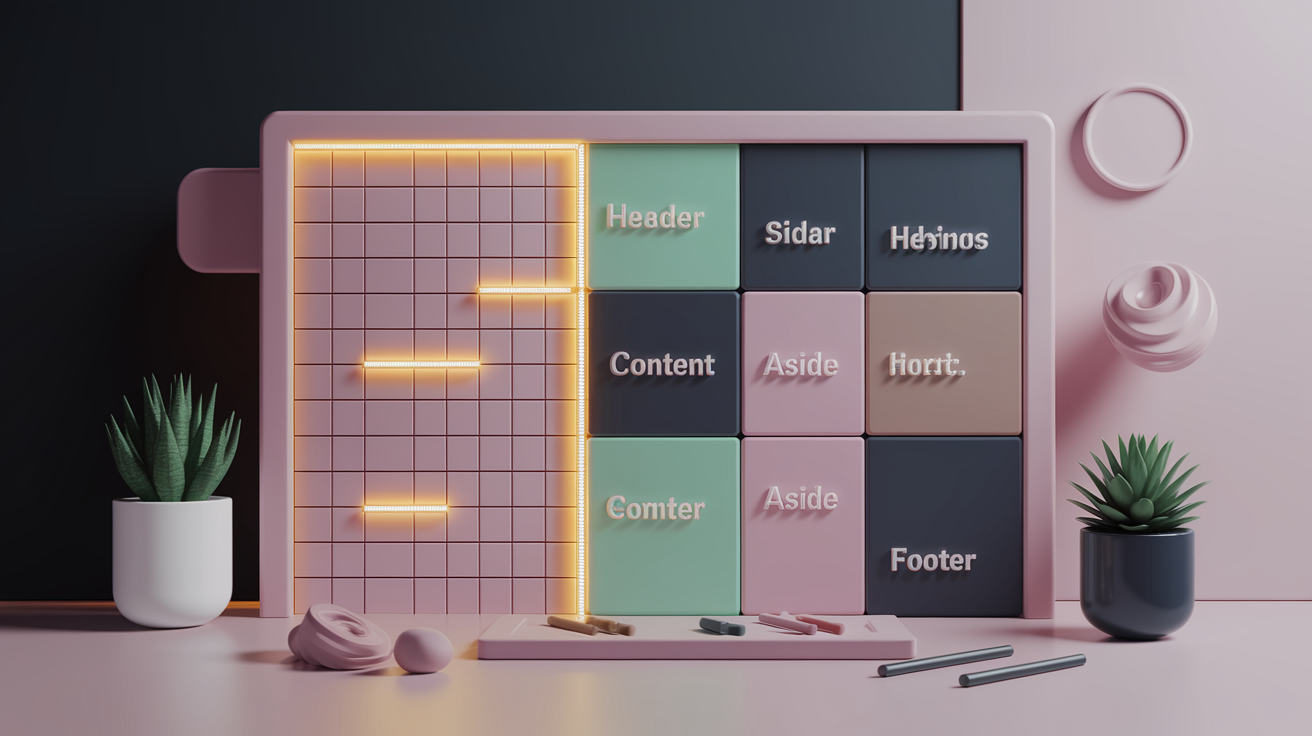
A grid area is a rectangular block made up of one or more grid cells. A grid cell is the smallest unit, the intersection of one row track and one column track. You can name areas using grid-template-areas. Let’s say you build a layout with four columns and three rows. You can name regions like “header”, “sidebar”, “content”, and “footer”, then assign child items to those regions. The browser automatically figures out the cell coordinates.
Explicit grid tracks are the ones you define in your CSS using grid-template-columns or grid-template-rows. Implicit grid tracks are created automatically when you place items outside the explicit grid. If you define a 2×2 grid but place an item starting at column line 5, the browser has to create extra columns in between. Those implicit tracks have a width of zero unless you set grid-auto-columns. If you don’t specify that size, your item might appear collapsed or invisible because the track is 0 pixels wide. DevTools in browsers like Firefox show these implicit lines as dotted.
Building Structured Layouts with Grid Template Properties
Use grid-template-columns and grid-template-rows to define explicit track sizes. You can mix units freely. grid-template-columns: 20px 1fr 40px creates three columns where the first is always 20 pixels, the third is always 40 pixels, and the middle column gets all remaining space. If you want four equal columns, write repeat(4, 1fr). The repeat() function takes a count and a track size. You can even pass a pattern like repeat(2, 50px 1fr) to create four columns that alternate between 50px and 1fr. Use minmax(min, max) to set a range. For example, minmax(200px, 1fr) means “at least 200 pixels wide but grow if there’s room.”
grid-template-areas lets you design layouts visually in your CSS. You write quoted strings that represent the rows, and each word represents a cell. Repeating the same word makes an item span multiple cells. A period (.) marks an empty cell. Here’s a 4×3 layout example:
grid-template-areas:
  "header header header header"
  "sidebar content content aside"
  "footer footer footer footer";
Then assign each child: grid-area: header, grid-area: sidebar, and so on. The browser figures out which cells belong to each name.
You can also name individual grid lines inside your track definitions. For example, grid-template-columns: [main-start] 1fr [content-start] 2fr [content-end] 1fr [main-end]. Then reference those names when positioning items: grid-column: main-start / content-end. It’s the same as numeric lines, but easier to read and maintain when layouts get complex.
When items overflow the explicit grid, the browser creates implicit tracks automatically. You control the size of those tracks with grid-auto-columns and grid-auto-rows. grid-auto-rows: 150px means any row the browser generates beyond your explicit rows will be 150 pixels tall. If you don’t set this, implicit tracks default to auto, which sizes them to fit their content.
| Property | Purpose |
|---|---|
| grid-template-columns | Define explicit column track sizes |
| grid-template-rows | Define explicit row track sizes |
| grid-template-areas | Name rectangular regions for easy assignment |
| grid-auto-columns / grid-auto-rows | Set size of implicitly created tracks |
Practical Item Placement in a CSS Grid

You place items by specifying start and end lines. grid-column-start and grid-column-end tell the browser which vertical lines to use. grid-column: 1 / 3 means start at line 1 and stop before line 3, spanning two columns. You can also use negative numbers. grid-column: 1 / -1 spans from the first line to the very last line in the explicit grid, making the item full-width. The same logic applies to rows with grid-row-start and grid-row-end, but watch out: 1 / -1 for rows only spans explicit rows, not implicit ones created later.
You can span tracks without knowing the exact line numbers by using the span keyword. grid-column: span 2 makes an item take up two columns starting from wherever auto-placement puts it. If an item set to span 3 lands in the last column of a 3-column grid, the browser can’t fit it, so it moves the item down to the next row where it has room. This overflow behavior is automatic and helps prevent broken layouts, but it can surprise you if you expect items to stay on the same row.
For alignment at the item level, use justify-self (horizontal placement inside the cell) and align-self (vertical placement inside the cell). The shorthand place-self combines both: place-self: center start aligns vertically center and horizontally start. Not all browsers supported place-self in older versions (Edge lagged behind), but modern browsers handle it. The default alignment is stretch, which makes items fill their grid cells completely unless you override it.
Handling Overlaps and z-index
Grid items can occupy the same cells, creating overlaps. When two items are assigned to the same area, they stack on top of each other in DOM order (later items appear above earlier ones). Use z-index to control layering. Set z-index: 10 on an item you want on top. This is useful for building layouts where a decorative background shape sits behind text, or when you need a sticky header to float above other content.
Sizing Strategies with fr, minmax(), and repeat()

The fr unit represents a fraction of free space left over after the browser subtracts fixed-size tracks. For example, grid-template-columns: 50px 1fr 2fr creates three columns. First, 50 pixels are set aside for the first column. Then the remaining width is split into three parts (1 + 2 = 3). The second column gets 1 part, the third column gets 2 parts. So if you have 300 pixels of free space, the second column is 100 pixels and the third is 200 pixels. Three columns each set to 1fr will always be equal width because they each get one-third of the leftover space.
minmax(min, max) lets you set a floor and ceiling. minmax(200px, 1fr) means “at least 200 pixels wide, but grow to take up one fraction of extra space if available.” This is powerful inside repeat(). fit-content(limit) sizes a track to fit its content up to a maximum. fit-content(400px) means the track will shrink to match the content but won’t exceed 400 pixels. min-content makes a track as narrow as the smallest unbreakable piece of content (like the longest word). max-content makes it as wide as the content wants to be without wrapping.
auto-fill and auto-fit both work with repeat() to create responsive grids. repeat(auto-fill, minmax(150px, 1fr)) tells the browser to create as many columns as will fit, each at least 150 pixels wide. When the viewport shrinks, columns wrap onto new rows. auto-fill creates extra empty tracks to fill the row if there’s space left over. auto-fit collapses those empty tracks to zero width and lets the existing columns expand. Use auto-fit when you want items to stretch and fill the row completely. Use auto-fill when you want the grid to maintain the column count even if some are empty.
- repeat(4, 1fr) – four equal columns that divide the available width evenly.
- minmax(200px, 1fr) – column at least 200 pixels wide, grows if there’s room.
- fit-content(400px) – column sizes to content, capped at 400 pixels.
- repeat(auto-fill, minmax(150px, 1fr)) – as many columns as fit, each 150px minimum.
- 10rem 1fr 1fr – first column fixed at 10rem, remaining two share leftover space equally.
- 50px 2fr 1fr – first column 50px, second gets twice the flexible space of the third.
Understanding Implicit Grid Behavior and Auto-Placement Rules

When you define a 2×2 grid but place an item at column line 5, the browser has to create implicit tracks to reach that line. Imagine a 2×2 grid with explicit columns ending at line 3. Placing an item with grid-column: 5 / 6 tells the browser to start at line 5. To get there, it adds column 3 (between lines 3 and 4) and column 4 (between lines 4 and 5). Those two new columns are implicit, and unless you’ve set grid-auto-columns, they default to width zero. Your item might disappear or look broken because it’s sitting in a zero-width track. Set grid-auto-columns: 1fr or grid-auto-columns: 150px to give implicit columns a visible size.
grid-auto-rows works the same way for vertical tracks. If you define three explicit rows but items keep coming, the browser creates new rows implicitly. grid-auto-rows: 150px makes every auto-generated row 150 pixels tall. If you skip this, the browser sizes rows to fit their content (auto height), which can cause layout jumps when content changes size.
grid-auto-flow controls the direction items fill the grid. The default is row, meaning items fill left to right, then wrap to the next row. grid-auto-flow: column fills top to bottom, then moves to the next column. grid-auto-flow: dense tries to fill in gaps left by larger items. If a big item spans multiple cells and leaves holes, dense mode will move smaller items up to fill those holes. This looks tidy but can reorder the visual layout in a way that doesn’t match the DOM order, which breaks keyboard navigation and screen readers. Only use dense when the order of items doesn’t matter for accessibility.
Applying Subgrid for Consistent Nested Layouts

Subgrid is part of CSS Grid Level 2 and lets a grid item inherit the parent grid’s lines instead of creating its own independent grid. When you set grid-template-columns: subgrid or grid-template-rows: subgrid on a child, that child’s own children align to the same columns or rows as the grandparent. This solves the problem of nested grids where you want inner elements to line up vertically or horizontally with outer grid tracks.
Imagine a card layout where each card is a grid item, and inside each card you have a title, image, and button. Normally, each card would create its own grid, and the buttons wouldn’t align across cards because each card’s content is different heights. With subgrid, you make each card inherit the parent’s row grid, so all buttons sit on the same row line across every card. display: contents is related but different. It makes an element’s box disappear, promoting its children up one level in the layout tree. It doesn’t inherit grid lines the way subgrid does.
Using CSS Grid for Real-World Layout Patterns

Responsive card grids are one of the most popular patterns. Use repeat(auto-fill, minmax(200px, 1fr)) on grid-template-columns. Each card is at least 200 pixels wide, but if there’s extra room, they expand. When the viewport shrinks below 200 pixels per card, the grid wraps cards to a new row. You don’t need media queries. The grid adapts automatically. Add gap: 1rem for spacing and you’ve built a flexible gallery or product grid that works on any screen size.
The header/sidebar/footer layout (sometimes called the “holy grail”) is simple with grid-template-areas. Define the layout as quoted strings and assign each section with grid-area. Here’s an example:
grid-template-areas:
  "header header header"
  "sidebar content aside"
  "footer footer footer";
grid-template-columns: 200px 1fr 200px;
grid-template-rows: auto 1fr auto;
The header and footer span all three columns. The sidebar and aside are fixed at 200 pixels, and the content area gets all remaining space.
Image galleries work great with implicit row growth. Set grid-template-columns: repeat(auto-fill, minmax(150px, 1fr)) and grid-auto-rows: 150px. Images flow into the grid, wrapping to new rows as needed. Each row is 150 pixels tall, and the number of columns adjusts based on viewport width. Add object-fit: cover on your images to fill each cell neatly without distortion.
Dashboard-style layouts often mix fixed and flexible areas. You might have a sidebar navigation at 250 pixels, a top toolbar at 60 pixels, and the rest flexible content. grid-template-columns: 250px 1fr and grid-template-rows: 60px 1fr creates that structure in two lines. Add grid-template-areas for named regions and you can rearrange the layout later without touching the HTML.
| Layout Type | Key Grid Feature |
|---|---|
| Card grid | repeat(auto-fill, minmax(…)) |
| Image gallery | Implicit row growth with auto-rows |
| Holy grail | grid-template-areas for named regions |
| Dashboard | Fixed + flexible tracks, named areas |
| Responsive wrap | auto-fit + minmax for breakpoint-free design |
Debugging CSS Grid and Understanding Browser Support

Browser DevTools visualize grid lines, track numbers, and area names directly on the page. In Firefox, open the Inspector, find an element with display: grid, and click the grid badge next to it. The browser draws numbered lines and highlights cells, making it easy to see where tracks start and end. This is especially useful when you’re using line numbers or named lines, because you can confirm the browser is counting the way you expect. Chrome and Edge have similar overlays in their DevTools. You can toggle grid overlays on and off, adjust colors, and even show multiple grids at once if you have nested layouts.
CSS Grid has excellent modern browser support. It landed in all major browsers in 2017, so unless you need to support Internet Explorer 11, you’re good to go. Some newer features like subgrid and the gap property rename landed later. The original property names were grid-gap, grid-column-gap, and grid-row-gap. In Chrome 66, those were renamed to gap, column-gap, and row-gap to align with Flexbox (gap also works in Flexbox now). Older code might still use the grid- prefix, but both versions work. The shorthand place-self wasn’t supported by Edge in earlier versions, so check compatibility on Caniuse if you need to support older browsers.
- Firefox Grid Inspector – shows track numbers, line names, and cell boundaries.
- Chrome DevTools overlays – toggle grid visualization with color-coded lines.
- Compatibility checks on Caniuse – confirm feature support for your target browsers.
- Debugging implicit grid lines – look for dotted lines in DevTools to spot auto-generated tracks.
Hands-On CSS Grid Exercises and Challenges

The only way to internalize grid behavior is to type it out and watch what happens in the browser. Reading explanations gets you familiar with the syntax, but building layouts yourself is what locks in the mental model. You’ll hit bugs, items won’t land where you expect, and you’ll learn to use DevTools to figure out why. That troubleshooting process is where real understanding happens.
The Devcodeth approach is incremental: start with a small working example, add one new feature, see it work, then add the next piece. Each step is a small win. Don’t try to build a full dashboard on your first try. Build a three-column grid. Then add a row. Then span an item. Then name some areas. Each change teaches you one behavior at a time, and those behaviors stack into more complex layouts naturally.
These exercises reinforce the core concepts. When you manually create a named-area layout, you see how the browser maps words to cells. When you build a responsive card grid, you watch columns appear and disappear as you resize the browser. When you force an item to reference column line 10 in a three-column grid, you see implicit tracks appear in DevTools. Hands-on repetition turns abstract rules into muscle memory.
- Build a 4×3 named-area template – define header, sidebar, content, footer using grid-template-areas, assign children with grid-area, and visualize it in DevTools.
- Create a responsive card grid – use repeat(auto-fit, minmax(200px, 1fr)) and add at least six cards; resize the browser to watch columns adjust.
- Demonstrate implicit track creation – define a 2×2 grid, then place one item at grid-column: 5 / 6 and observe the zero-width implicit tracks unless you set grid-auto-columns.
- Recreate a nested layout using subgrid – make a parent grid with three columns, then inside one grid item create a child grid with grid-template-columns: subgrid so inner items align with the outer columns.
Final Words
You built working grids right away: set display: grid, used grid-template-columns with repeat(3, 1fr), added gap, and placed items. That hands-on setup makes the browser create tracks and number lines for you.
We also walked through key terms, template areas, placement and spanning, sizing with fr and minmax(), implicit tracks, subgrid, and debugging tips. The step-by-step exercises give small wins as you try each pattern.
Use this css grid tutorial as a quick reference while you practice. Nice work. Keep building.
FAQ
Q: What is CSS Grid and how does it work?
A: CSS Grid is a two-dimensional layout system that lets a container define columns and rows (tracks) and then place child items on that grid for precise, responsive layouts.
Q: How do I set up a basic CSS Grid layout?
A: To set up a basic grid, apply display: grid to the container, add grid-template-columns: repeat(3, 1fr); then set a gap and drop in your grid items.
Q: What do grid-template-columns and grid-template-rows do?
A: Grid-template-columns and grid-template-rows define explicit track sizes using px, %, fr, or functions like repeat() and minmax(), shaping how columns and rows share space.
Q: What are grid container, grid items, tracks, lines, areas, and cells?
A: The grid container is the parent; grid items are its children; tracks are columns/rows; grid lines separate tracks; grid cells are single intersections; grid areas are named groups of cells.
Q: What are implicit tracks and how does auto-placement work?
A: Implicit tracks are grid tracks the browser creates when items exceed the explicit grid; auto-placement (grid-auto-flow) fills rows by default and dense packing may reorder items to fill gaps.
Q: How do fr, minmax(), repeat(), auto-fill and auto-fit affect sizing?
A: Fr, minmax(), repeat(), auto-fill and auto-fit control sizing: fr splits leftover space, minmax sets min/max bounds, repeat shortens syntax, and auto-fill/fit enable responsive track wrapping.
Q: How do I place items, span tracks, and control alignment?
A: To place and span items use grid-column and grid-row with start/end or span, use grid-area shorthand, and adjust alignment with justify-self, align-self, place-self, plus z-index for overlaps.
Q: What is subgrid and when should I use it?
A: Subgrid is a nested grid that inherits the parent’s grid lines so nested rows and columns align exactly, which is handy for consistent vertical alignment across nested components.
Q: How do I build responsive layouts like card grids or a holy grail layout?
A: To build responsive layouts use repeat(auto-fill/auto-fit, minmax(…)) for card grids, grid-template-areas for header/sidebar/footer holy grail layouts, and implicit rows for responsive galleries.
Q: How do I debug CSS Grid and check browser support?
A: To debug CSS Grid use DevTools grid inspectors (Firefox, Chrome overlays), check compatibility on caniuse, and watch for legacy names like grid-gap renamed to gap and older Edge quirks.
