

What if designing for desktop first is quietly wrecking your site’s conversions?
Mobile-first responsive design with progressive enhancement flips that risk into an advantage.
Start at a phone-sized canvas, design the core task, and add features only as screen and network allow.
That forces clarity, keeps pages lightweight for slow mobile networks, and protects SEO, mobile visits now top 55% and Google indexes mobile versions first.
Read on to learn the practical steps, breakpoints, and checks that make your site faster and more usable on real devices.
Defining the Mobile‑First Approach in Responsive Web Design

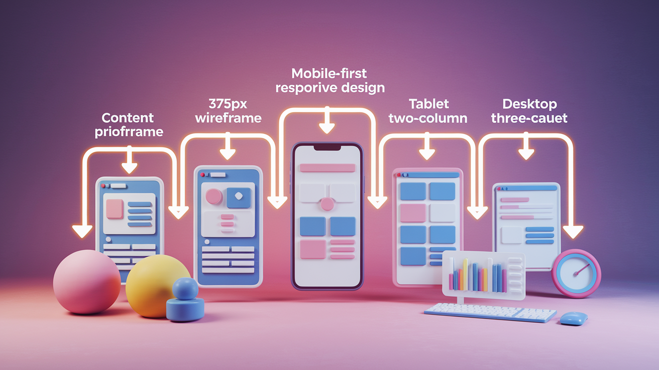
Mobile first responsive web design means you start building your site at the smallest screen size, usually 360 to 375px wide, and layer in additional features as the viewport grows. Instead of designing a full desktop experience and trying to squeeze it onto a phone (graceful degradation), you begin with the core mobile experience and build up for tablets and desktops. That shift in starting point changes everything.
Progressive enhancement builds from a solid foundation. You design the essential content and interactions first, make sure they work on a constrained screen with touch input and potentially slow networks, then add richer features when more space and bandwidth are available. Desktop first graceful degradation works the other way. It assumes a large screen, mouse, and fast connection, then strips features away to fit smaller devices. The problem? Mobile users often end up with a compromised experience, hidden navigation, and bloated page weight.
This approach matters because mobile traffic now accounts for more than 55% of global web visits, hitting 63.38% in 2024. Google has indexed the mobile version of your site first since 2019, so your mobile experience directly affects your search rankings. If your mobile site is slow, confusing, or incomplete, you lose both users and visibility.
Here are the top five characteristics of mobile first responsive web design:
Content priority. Identify the single most important task or piece of information and surface it immediately. Remove or defer secondary content.
Lightweight base layout. Start with a single column flow, minimal assets, and streamlined markup that loads fast on 3G and 4G networks.
Touch first controls. Design buttons, links, and interactive elements at a minimum of 44×44px to accommodate finger taps. Avoid hover dependent interactions.
Min width media queries. Write your base CSS for small screens, then use @media (min-width: 768px) and @media (min-width: 1024px) to progressively add styles for larger viewports.
Mobile performance emphasis. Optimize images, defer non critical scripts, and inline critical CSS to improve metrics like Largest Contentful Paint and Cumulative Layout Shift on mobile devices.
How Mobile‑First Responsive Web Design Works Mechanically

The technical heart of mobile first responsive web design is the CSS media query with a min-width condition. You write your default styles to serve the smallest screen, then wrap additional or overriding rules inside media queries that activate only when the viewport is wide enough. For example, your base stylesheet might define a single column card layout and 16px body text. Then @media (min-width: 768px) adds a two column grid and slightly larger headings. Finally, @media (min-width: 1024px) introduces a three column layout, persistent sidebar, and hover states. The browser applies each layer in order as the viewport grows, building complexity upward instead of stripping it downward.
Breakpoints are the viewport widths where your layout shifts. Common ranges include 320 to 480px for smartphones, 768px for tablets, 1024px for laptops, and 1200px and above for desktops. Modern best practice favors content driven breakpoints. You add a breakpoint when your content starts to look awkward or unreadable, rather than targeting specific device models. That keeps your design flexible as new screen sizes appear.
Six key mechanisms make mobile first responsive design work:
Fluid grids. Use percentage or fractional widths (CSS Grid fr units, Flexbox flex-grow) so columns and containers scale smoothly between breakpoints.
Min width media queries. Layer styles progressively. Each query adds or refines rules for wider viewports without overriding the entire stylesheet.
Responsive images. Serve appropriately sized image files using srcset and the <picture> element, or rely on CSS max-width: 100% to prevent images from exceeding their container.
Typography scaling. Set base font sizes in rem or em units and use viewport units (vw, vh) or clamp functions to scale headings and body text fluidly.
Viewport meta tag. Include <meta name="viewport" content="width=device-width, initial-scale=1"> in your HTML <head> so mobile browsers render your page at the correct logical width instead of zooming out.
Content driven breakpoints. Test your layout by resizing the browser window and add a breakpoint whenever text wraps awkwardly, images crowd each other, or navigation becomes cramped.
Core Principles Behind Mobile‑First Design Strategy

Mobile first design starts with ruthless content prioritization. You identify the single primary task your user needs to complete (booking a room, reading an article, adding an item to cart) and you design the smallest screen to deliver that task with zero friction. Secondary information gets progressive disclosure: accordions, tabs, or “read more” links that reveal details on demand. This constraint forces clarity. If you can’t justify an element on a 375px screen, it probably isn’t essential.
Navigation on mobile should be simple and reachable. Use a single column layout, concise text blocks, and full width call to action buttons so users can scan and tap without zooming or hunting. A hamburger menu or tab bar keeps navigation accessible without dominating the viewport. Avoid intrusive interstitials and pop ups that cover content. Google penalizes mobile pages that use them, and users close them in frustration.
Performance is a core principle, not an afterthought. Mobile networks are slower and more variable than wired connections, so every kilobyte and every render blocking script matters. Compress images, defer non critical JavaScript, and inline critical CSS to paint content as fast as possible. Faster load times improve engagement, reduce bounce rate, and support better search rankings.
| Principle | Description |
|---|---|
| Content Priority | Identify and surface the primary user task immediately. Defer or hide secondary content using progressive disclosure techniques. |
| Touch First Interaction | Design for taps, swipes, and pinches with large touch targets (44×44px minimum), clear spacing, and no reliance on hover states. |
| Performance by Default | Optimize assets, minimize scripts, and structure markup to deliver the fastest possible experience on constrained mobile networks. |
Breakpoints, Layout Patterns, and CSS Structure in Mobile‑First Responsive Design

Your base mobile layout should assume a viewport width between 360 and 375px, the most common smartphone sizes. At this size, stick to a single column flow. Stack content vertically, use full width buttons, and keep navigation minimal. Text should be at least 16px to avoid triggering browser zoom on iOS, and touch targets should be 44×44px or larger. Images and media should span the full content width or sit in clearly defined containers.
As the viewport widens, you introduce layout complexity at natural breakpoints. Around 768px, you have room for a two column grid, expanded navigation (a horizontal menu bar or visible sidebar), and larger images. Forms can move from stacked fields to side by side pairs, and modals can be replaced with inline panels. At 1024px and above, three column layouts become practical. You can add persistent sidebars, data visualizations with more detail, hover states for interactive elements, and keyboard shortcuts for power users.
Smartphone Layout
Start with a single column flow and a mobile first mindset. Every element stacks vertically: header, hero image, headline, body text, call to action button, footer. Use Flexbox or CSS Grid with flex-direction: column or a single column grid template. Set your base font size to 16px, line height around 1.5, and generous padding (at least 16px) around interactive elements. Keep the interface thumb friendly. Primary actions should sit within easy reach of the bottom third of the screen.
Tablet Scaling
At the 768px breakpoint, introduce a two column grid using CSS Grid grid-template-columns: 1fr 1fr or Flexbox with flex-wrap: wrap. Navigation can expand from a hamburger menu into a horizontal bar with visible links. Images can sit beside text instead of above it. Forms benefit from side by side label and input pairs. Replace full screen modals with smaller overlays or inline drawers, and increase font sizes slightly (18 to 20px for headings) to take advantage of the extra space.
Desktop Scaling
At 1024px and wider, add a three column layout where appropriate: main content, sidebar, and supplementary panel. Persistent navigation (sidebar or top bar) stays visible. Hover states become useful again. Underline links on hover, show tooltips, and enable drag and drop interactions. You can display richer data visualizations, larger images, and more detailed tables. Use the extra width to reduce scroll depth and surface more content above the fold, but keep the core experience consistent with the mobile and tablet versions.
| Breakpoint | Layout Pattern | Key Enhancements |
|---|---|---|
| 360–480px | Single column | Full width buttons, stacked content, hamburger menu, 16px body text, 44×44px touch targets |
| ~768px | Two columns | Horizontal navigation, side by side form fields, larger images, inline panels instead of modals |
| 1024px+ | Three columns | Persistent sidebar, hover states, keyboard shortcuts, richer data visualizations, reduced scroll depth |
| 1200px+ | Wide desktop | Additional whitespace, larger media, multi panel dashboards, advanced filtering and search UI |
Performance Optimization in Mobile‑First Responsive Web Design

Mobile networks are slower and less reliable than desktop broadband, so performance optimization is non negotiable. The goal is to deliver content as quickly as possible and keep interactions smooth. Core Web Vitals (Largest Contentful Paint, Cumulative Layout Shift, and Interaction to Next Paint) are Google’s benchmarks for user experience, and mobile scores weigh heavily in search rankings.
Start by optimizing images. Convert JPEGs and PNGs to modern formats like WebP or AVIF, which offer better compression without visible quality loss. Use responsive image techniques (srcset and <picture>) to serve smaller files to smaller screens. Lazy load images that sit below the fold so the browser prioritizes visible content. Defer non critical JavaScript and CSS, inline critical styles in the <head>, and minify all assets to reduce file size. A content delivery network (CDN) caches static assets closer to users, reducing latency and speeding up repeated visits.
Seven performance optimization techniques for mobile first responsive web design:
Use WebP or AVIF image formats. These formats compress images more efficiently than JPEG or PNG, cutting file sizes by 25 to 50% without visible quality loss.
Implement lazy loading. Load images and iframes only when they enter the viewport, reducing initial page weight and improving LCP.
Inline critical CSS. Embed the CSS needed to render above the fold content directly in the HTML <head> to eliminate render blocking requests.
Defer non critical scripts. Add defer or async attributes to <script> tags so JavaScript doesn’t block the initial render.
Minify and compress assets. Strip whitespace and comments from HTML, CSS, and JavaScript, and enable gzip or Brotli compression on your server.
Use a CDN. Serve static files from edge servers geographically close to your users to reduce latency and improve load times.
Run Lighthouse audits. Use Chrome DevTools Lighthouse to diagnose performance issues, accessibility gaps, and best practice violations, especially on mobile.
Comparing Mobile‑First and Traditional Responsive Approaches

Responsive web design is reactive. You build a layout that detects the viewport size and adjusts: fluid grids, flexible images, media queries. The design shifts to fit whatever screen it lands on. Mobile first is proactive. You prioritize the mobile experience from the start, design for constraints, and add features as the viewport allows. Both produce layouts that work across devices, but mobile first forces you to think about content priority, performance, and touch interaction before you add any desktop niceties.
SEO and user behavior data reinforce the mobile first case. Google has used mobile first indexing since 2019, meaning the mobile version of your site is the primary source for ranking signals. One in five adults access the internet only via mobile devices, and 83% of social media usage happens on mobile. If your mobile experience is slow, cluttered, or incomplete, you lose traffic, engagement, and conversions. Traditional desktop first responsive design can leave mobile as an afterthought, with bloated assets, hidden content, and interactions that assume a mouse.
Five key distinctions between mobile first and traditional responsive approaches:
Performance default. Mobile first designs start lean and fast. Traditional responsive designs often inherit desktop asset bloat.
SEO alignment. Mobile first matches Google’s indexing strategy. Desktop first risks lower rankings if the mobile experience suffers.
User intent. Mobile first assumes users want quick, focused tasks. Desktop first assumes users have time and bandwidth for richer experiences.
Progressive enhancement vs graceful degradation. Mobile first adds features upward. Desktop first strips features downward, often leaving mobile users with a compromised experience.
Maintenance simplicity. Mobile first prioritizes a single content hierarchy, making updates and testing more consistent across breakpoints.
Real‑World Examples of Mobile‑First Responsive Websites
Companies that serve millions of mobile users have adopted mobile first design out of necessity. Their experiences show how starting small and scaling up delivers better performance, clearer UX, and stronger engagement.
Google championed mobile first indexing and built tools like AMP (Accelerated Mobile Pages) to push the web toward faster mobile experiences. Google’s own properties (Search, Maps, Gmail) are designed mobile first. The search results page on mobile is streamlined, with large tap targets, minimal clutter, and instant loading pages. Desktop versions add features like advanced search filters and richer knowledge panels, but the core experience works perfectly on a phone.
Airbnb
Airbnb’s booking flow is optimized for thumb friendly taps and swipes. On mobile, search and filter controls sit within easy reach at the bottom of the screen. Property cards stack vertically with large images and clear pricing. On tablets, the layout shifts to a two column grid with a persistent map panel. Desktop users get additional filters, comparison tools, and a larger map, but the core booking flow remains identical. The mobile first foundation keeps the experience consistent and fast across devices.
Spotify
Spotify uses a card based UI optimized for one hand use on phones. Playlists, albums, and podcasts are presented as vertically stacked cards with large cover art and clear labels. Navigation sits in a bottom tab bar, easy to reach with your thumb. On tablets, Spotify introduces a two column layout with a persistent sidebar for playlists. Desktop users get a three column interface with richer controls, but the core card based navigation remains the same. The design scales without losing the mobile first clarity.
BBC
The BBC redesigned its news site mobile first, prioritizing headline, summary, and image in that order. On phones, articles are single column with large, readable type and minimal distractions. Images load responsively, and navigation is tucked into a hamburger menu. On tablets, the layout shifts to a two column grid with a visible section menu. Desktop users see a multi column homepage with more stories above the fold and a persistent navigation bar. The content hierarchy remains consistent. Mobile first design forced the BBC to clarify what mattered most.
Dropbox
Dropbox’s core file management interface works perfectly on a phone before adding desktop only power features. On mobile, folders and files are listed vertically with large tap targets. You can upload, share, and preview files without friction. Tablets add a two pane view (folder list on the left, file preview on the right). Desktop users get drag and drop, keyboard shortcuts, and advanced sharing controls, but the mobile experience is complete and fast. Dropbox designed for the constraints of a small screen first, then layered in the extras.
Step‑by‑Step Framework for Implementing Mobile‑First Responsive Web Design
Building a mobile first responsive web design project follows a clear workflow. You start with the smallest screen, validate the core experience, then scale upward. Each step builds on the previous one, so your design stays consistent and your code stays maintainable.
Define content priorities and user tasks. List the primary actions users need to complete (read an article, book a service, add to cart) and rank them in order. Identify the single most important task and design the mobile layout to deliver it immediately. Remove or defer secondary content. Anything that doesn’t support the core task can be hidden behind progressive disclosure or moved to a separate page.
Design the smartphone layout at 360 to 375px. Build a single column layout with stacked content blocks. Set body text to at least 16px to prevent iOS auto zoom, and make all touch targets at least 44×44px. Use full width buttons for primary actions and place them within thumb reach. Keep navigation simple, a hamburger menu or bottom tab bar. Optimize images and defer non critical scripts to keep the page fast. Test on a real phone to validate touch interactions, legibility, and load time.
Scale to tablet at ~768px using a two column layout. Add a media query at @media (min-width: 768px) and introduce a two column grid with CSS Grid or Flexbox. Expand navigation from a hamburger menu to a horizontal bar or visible sidebar. Lay out form fields side by side where appropriate, and increase image sizes to fill the wider viewport. Replace full screen modals with inline panels or smaller overlays. Slightly increase font sizes for headings to take advantage of the extra space, but keep the content hierarchy identical to mobile.
Scale to desktop at 1024px+ with three columns and richer interactions. Add a second media query at @media (min-width: 1024px) and introduce a three column layout where it makes sense: main content, sidebar, supplementary panel. Add persistent navigation (top bar or sidebar) and enable hover states for links and buttons. Display richer data visualizations, larger images, and more detailed tables. Introduce keyboard shortcuts and drag and drop interactions for power users, but keep the core workflow consistent with mobile and tablet.
Test across real devices for touch, accessibility, performance, and typography. Validate your design on actual phones, tablets, and desktops, not just browser emulators. Test touch interactions: can users tap buttons reliably? Is scrolling smooth? Check typography: is text readable without zooming? Run Lighthouse audits to measure performance and accessibility. Test with screen readers to ensure semantic markup and logical tab order. Measure Core Web Vitals (LCP, CLS, INP) on mobile and iterate to improve scores.
Accessibility Essentials in Mobile‑First Responsive Web Design
Accessibility and mobile first design go hand in hand. Many accessibility best practices (large touch targets, clear contrast, semantic markup, logical navigation) are already core to mobile first strategy. When you design for the constraints of a small screen and touch input, you’re also designing for users with motor impairments, vision limitations, or assistive technology.
WCAG (Web Content Accessibility Guidelines) requires sufficient color contrast (at least 4.5:1 for body text, 3:1 for large text), semantic HTML (headings, lists, landmarks), and keyboard navigability. Touch targets should be at least 44×44px, large enough for users with limited dexterity. Text should be resizable without breaking the layout, and interactive elements should have visible focus states. Responsive layouts naturally support accessibility because they adapt to different screen sizes, orientations, and zoom levels, making content readable and navigable for everyone.
Five essential accessibility practices for mobile first responsive web design:
Use semantic HTML elements. Use <header>, <nav>, <main>, <article>, and <footer> to create logical document structure. Screen readers rely on these landmarks for navigation.
Ensure 44×44px minimum touch target size. Make buttons, links, and interactive controls large enough for reliable touch input, especially on mobile where precision is harder.
Maintain 4.5:1 color contrast for body text. Use sufficient contrast between text and background colors to ensure readability for users with low vision or color blindness.
Provide visible focus states. Outline buttons, links, and form fields clearly when focused via keyboard navigation. Never remove focus outlines without adding an accessible replacement.
Test with screen readers and keyboard only navigation. Validate your layout with VoiceOver (iOS), TalkBack (Android), or NVDA/JAWS (desktop) to ensure content is announced logically and all interactions are keyboard accessible.
Testing Tools and Methods for Validating Mobile‑First Responsive Web Design

Testing mobile first responsive web design requires a combination of browser emulators, real device validation, and automated tools. Emulators are fast and convenient for layout checks, but real devices reveal touch performance, font rendering, and network behavior that emulators miss.
Start with browser DevTools to test breakpoints and layout shifts. Chrome, Firefox, and Safari all include responsive design modes that let you resize the viewport, simulate different screen sizes, and toggle device orientation. Use these tools to verify that your media queries activate correctly, your layout doesn’t break at edge cases, and images and typography scale smoothly. Then move to real devices. Borrow phones and tablets, or use cloud based testing services that stream real hardware. Test touch interactions, scroll performance, and readability under different lighting conditions. Run Google’s Mobile Friendly Test to check for common mobile UX issues, and use Lighthouse to audit performance, accessibility, and SEO on mobile.
| Tool/Method | Purpose |
|---|---|
| Browser DevTools responsive mode | Test layout changes across breakpoints, verify media queries, simulate different viewport sizes and orientations |
| Real device testing (phones, tablets) | Validate touch interactions, scroll performance, font rendering, and real world network conditions |
| Google Mobile Friendly Test | Check for mobile UX issues like small text, close tap targets, and viewport configuration problems |
| Lighthouse mobile audits | Measure Core Web Vitals (LCP, CLS, INP), accessibility compliance, and performance on simulated mobile networks |
Applying Mobile‑First Responsive Web Design in Real Projects
Real world projects benefit from mobile first when you combine the design strategy with modern tooling and workflows. Design systems and component libraries make it easier to scale mobile first patterns across multiple pages and features. Tools like UXPin, Merge, and Forge let you prototype with real responsive CSS and reusable components, so your designs behave like the final product from day one. Git integration keeps your design source of truth synced with your codebase, reducing handoff friction and keeping mobile first layouts consistent.
Six practical tips for applying mobile first responsive web design in real projects:
Map content priorities before you sketch a single screen. List user tasks in order, identify the primary goal, and decide what gets deferred or hidden. This list drives every layout decision.
Build a base mobile stylesheet first. Write your default CSS for the smallest screen, using single column layouts, touch friendly controls, and optimized assets. This becomes your foundation.
Use scalable components from a design system. Define buttons, cards, forms, and navigation patterns once, then apply them at all breakpoints. Libraries like MUI, shadcn/ui, or Bootstrap provide responsive starting points.
Prototype with code backed tools. Use tools that render real CSS and responsive behavior (UXPin Merge, Figma Dev Mode, or Framer) so you catch layout issues early instead of discovering them in QA.
Test continuously on real devices. Keep a few phones and tablets at your desk and check every major change on actual hardware. Emulators are useful, but real touch feedback and performance matter.
Validate with user testing and analytics. Watch real users complete tasks on mobile, measure bounce rates and task completion, and iterate based on what breaks or frustrates them.
Final Words
We jumped straight into building a mobile-first site: defining the approach, the mechanics (CSS min-width queries, fluid grids), and why mobile traffic and indexing make it essential.
Then we walked through core principles, breakpoints and layouts, performance tips, accessibility checks, testing tools, and real examples. You also got a step-by-step framework to go from a 360–375px base layout to desktop.
Use the checklist, test on real devices, and iterate. Keep practicing. mobile first responsive web design will make your sites faster, clearer, and more user-friendly.
FAQ
Q: When did mobile first web design start?
A: Mobile-first web design began in the late 2000s, gaining clear momentum around 2009–2010 as smartphones grew and designers started building layouts starting with small screens first.
Q: What is mobile first approach in responsive web design?
A: The mobile-first approach in responsive web design is designing for the smallest screens first (360–375px), then using progressive enhancement to add layout, interaction, and performance for larger viewports.
Q: When did responsive web design start?
A: Responsive web design started around 2010 when Ethan Marcotte popularized fluid grids, flexible images, and media queries to make layouts adapt across different screen sizes.
Q: Should web design be mobile first?
A: Web design should be mobile-first because most traffic is on phones (55%+, 63.38% in 2024), Google indexes mobile content first since 2019, and it forces content and performance prioritization.
