

What if your images are the main reason your site feels slow on phones?
This post shows practical fixes using srcset, the picture element, and CSS image-set.
You’ll learn how the browser picks the best file, how to serve WebP/AVIF with safe fallbacks, and how to swap crops for true art direction at breakpoints.
Follow the examples and you’ll serve smaller files, sharper images on high-DPI screens, and faster pages that help Core Web Vitals.
Sound useful?
Core Concepts Behind How Responsive Web Design Images Work

Responsive web design images let the browser pick the best file from a set of alternatives. The selection happens based on viewport size, device pixel ratio, and media conditions. Instead of hardcoding one image and forcing every user to download the same file, you give the browser enough information to decide which size or format will work best. A phone on a 3G connection gets a smaller file. A high-DPI laptop gets a sharper, higher-resolution version. The browser handles the selection automatically once you structure the markup correctly.
The selection flow works like this: the browser evaluates the viewport width, calculates the target display size in CSS pixels, checks the device pixel ratio (DPR), and then picks the optimal variant from your list. When you use width descriptors like 300w or 900w, the browser combines those values with the sizes attribute to figure out which file covers the effective width. On a 1024px viewport with sizes="60vw", the browser calculates 614.4 CSS pixels. On a 2x display, it doubles that to roughly 1,228.8 pixels and selects the source file that covers that range.
Responsive web design images use five major techniques, each solving a different problem:
srcset with density descriptors (1x, 2x, 4x) serves high-DPI screens the sharper file without changing the on-screen dimensions.
srcset with width descriptors (300w, 900w) combined with the sizes attribute picks images based on rendered width and DPR.
<picture> with media attributes delivers different crops or compositions at different breakpoints. This is art direction.
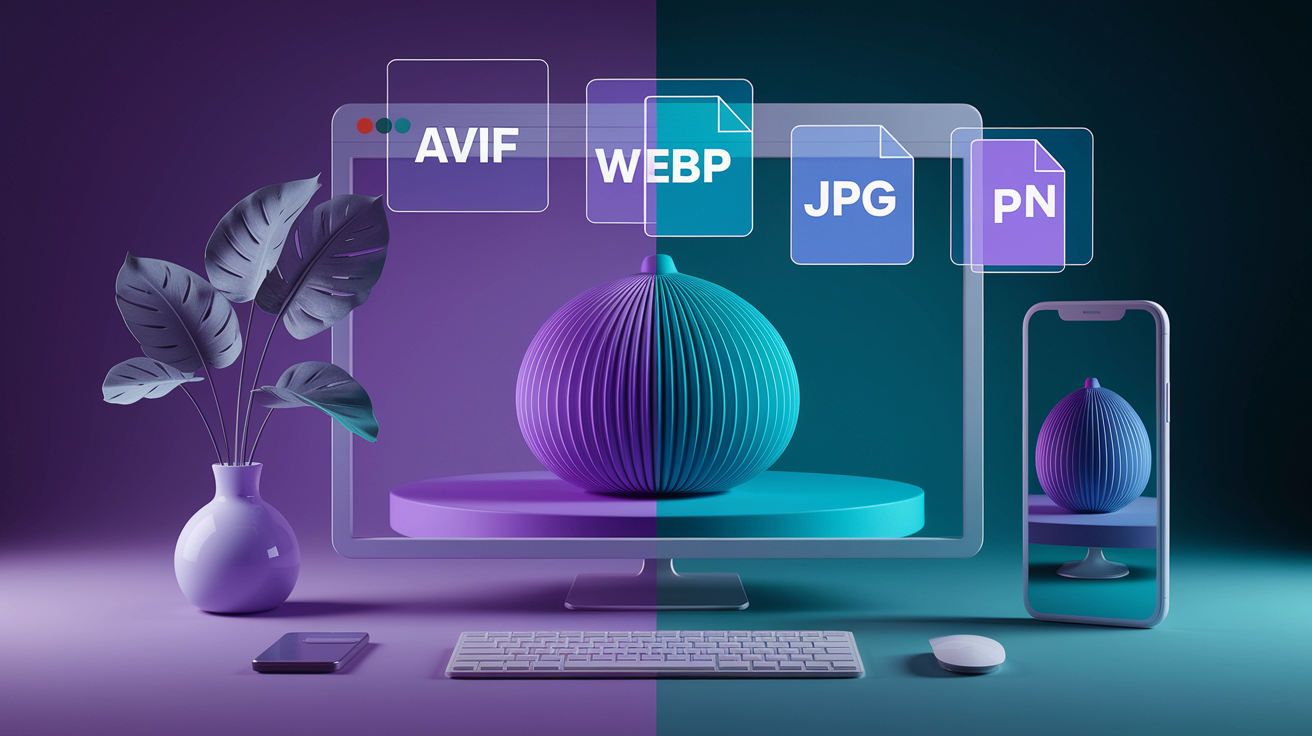
<picture> with type attributes offers next-gen formats like AVIF and WebP with automatic fallback to JPG.
CSS image-set() applies similar resolution or format selection to background images.
Implementing Responsive Web Design Images With srcset, sizes, and Descriptors

The srcset attribute sits inside an <img> tag and holds a list of image files along with descriptors that tell the browser how big each file is or what pixel density it targets. You can’t mix descriptor types in the same srcset, so you’ll either use density descriptors or width descriptors. Never both at once.
Density descriptors work well when the on-screen size stays constant but you want sharper rendering on high-DPI screens. Width descriptors pair with the sizes attribute to handle images that change size across breakpoints. The sizes attribute tells the browser the rendered width of the image in CSS pixels, using viewport units or media queries. The browser does the math and selects the file that covers the calculated pixel budget.
Using X-Descriptors
Density descriptors like 1x, 2x, and 4x represent the device pixel ratio. A file marked 2x will be downloaded on a display with DPR 2.0, which is common on retina laptops and newer phones. The browser will render the image at the same CSS dimensions as the 1x version, but with double the pixel density for sharper detail. An image that appears 900×600 on screen might pull a 1800×1200 file on a 2x display and a 3600×2400 file on a 4x display. If you don’t provide a descriptor, the browser assumes 1x.
Using W-Descriptors
Width descriptors like 300w tell the browser the intrinsic pixel width of the source file. You pair them with the sizes attribute to declare the image’s rendered width. For example, sizes="60vw" on a 1024px viewport means the image will occupy 614.4px. The browser multiplies that by the device pixel ratio and picks the file closest to the result. On a 2x screen, the effective target becomes roughly 1,228.8px, and the browser will select a source file wide enough to cover that.
Avoiding Common Descriptor Mistakes
Don’t mix 1x/2x with 300w/900w in the same srcset. The browser will ignore the entire attribute if you do. Don’t add width or height attributes to an <img> when you’re relying on the sizes attribute for selection, because the fixed attributes can override sizes and produce blurry or incorrectly sized results. Instead, use the sizes attribute alone or add an inline aspect-ratio style to prevent layout shift without locking the dimensions.
<img
  src="hero-default.jpg"
  srcset="hero-300.jpg 300w,
          hero-900.jpg 900w,
          hero-1800.jpg 1800w"
  sizes="(max-width: 640px) 100vw,
         (max-width: 960px) 60vw,
         50vw"
  alt="City skyline at sunset"
  style="aspect-ratio: 3 / 2;">
Using the Picture Element for Art Direction and Format Switching in Responsive Web Design Images
The <picture> element wraps multiple <source> tags and a fallback <img>. Each <source> can target a specific media query, MIME type, or both. The browser evaluates them in order and uses the first match. This setup lets you serve completely different compositions at different breakpoints or offer next-gen formats with automatic fallback to older formats.
Art direction means delivering a different crop, focal point, or even a completely different image per breakpoint. A wide landscape might work well on desktop but feel cramped on a phone. Instead of scaling the same file, you can serve a tighter crop or a portrait-oriented variant that keeps the subject centered. The media attribute on each <source> controls which breakpoint gets which file.
AVIF produces the smallest files and supports transparency, but browser support is still growing and encoding can be slow.
WebP offers strong compression with wider browser support than AVIF, and handles transparency well.
JPG is the universal fallback with full browser support, but larger file sizes than next-gen formats and no transparency.
PNG is the fallback for images requiring transparency when WebP or AVIF aren’t supported.
Breakpoint-Based Art Direction
Use the media attribute on <source> to declare which viewport range gets which file. List the narrowest breakpoint first and work up to the widest, then put the <img> fallback at the end. The browser will pick the first <source> whose media query matches. You can combine this with srcset and sizes inside each <source> to handle DPR and sizing at the same time.
Format Switching Using type Attribute
The type attribute tells the browser the MIME type of the file in the srcset. List AVIF first, WebP second, and JPG last. The browser will download the first type it supports and ignore the rest. This gives older browsers a JPG while newer browsers get the smaller AVIF or WebP file. You can’t preload these type-based variants with <link rel="preload"> because the link element doesn’t support a type attribute for images.
Limitations and Browser Support Considerations
Safari doesn’t support imagesrcset on preload links, so preloading responsive images only works reliably in Chromium and Firefox. The <picture> element itself has good support, but you still need the fallback <img> for very old browsers. Type-based format switching can’t be preloaded, so your LCP image will only benefit from preload if it uses density or width descriptors without MIME-type variants.
<picture>
  <source
    srcset="hero-wide.avif"
    type="image/avif"
    media="(min-width: 960px)">
  <source
    srcset="hero-wide.webp"
    type="image/webp"
    media="(min-width: 960px)">
  <source
    srcset="hero-square.avif"
    type="image/avif">
  <source
    srcset="hero-square.webp"
    type="image/webp">
  <img src="hero-square.jpg" alt="Product feature highlight">
</picture>
Responsive Background Images in CSS Using image-set()
CSS background images can’t use the srcset or <picture> syntax, so the image-set() function fills that gap. You list multiple file options with density descriptors or MIME types, and the browser picks the best match. The syntax mirrors srcset but lives inside a background-image declaration. Add a -webkit-image-set() prefixed version for older WebKit browsers.
Only one image downloads. The browser evaluates the list and requests the file that matches the device’s pixel density or format support. You can combine density descriptors with different formats by listing AVIF or WebP first and falling back to JPG. The browser will skip formats it doesn’t recognize and download the first supported option.
| Technique | Purpose | Browser Notes |
|---|---|---|
| image-set() with 1x/2x | Serve high-DPI background images | Prefix with -webkit- for older WebKit |
| image-set() with type() | Offer WebP/AVIF with JPG fallback | Modern browsers only; Safari 14+ |
| Media queries + background-image | Art direction for backgrounds | Universal support, verbose CSS |
| SVG background | Resolution-independent icons/logos | Works everywhere, not for photos |
| object-fit on img with background sizing | Preserve aspect ratio, crop or contain | Works on inline images, not true backgrounds |
.hero {
  background-image:
    -webkit-image-set(
      url("hero-1x.webp") 1x,
      url("hero-2x.webp") 2x
    );
  background-image:
    image-set(
      url("hero-1x.avif") type("image/avif") 1x,
      url("hero-2x.avif") type("image/avif") 2x,
      url("hero-1x.webp") type("image/webp") 1x,
      url("hero-2x.webp") type("image/webp") 2x,
      url("hero-1x.jpg") 1x,
      url("hero-2x.jpg") 2x
    );
}
Optimizing Responsive Web Design Images for Performance and Core Web Vitals

Serving the right size is only half the job. Compression and format choice control the actual byte count. A JPG saved at 70% quality in Photoshop might be 217KB, but running it through a dedicated compression service can shrink it to 160KB without visible quality loss. PNG images benefit from color-table reduction. Dropping from 256 colors to 40 might keep visual quality while cutting file size from 16KB to 12KB.
Lighthouse includes an “Improve image delivery” audit that flags images larger than necessary and estimates the kilobyte savings from resizing them to the rendered dimensions. If your Largest Contentful Paint element is an oversized image, the audit will show how much of the load time comes from downloading unnecessary pixels. Real-user monitoring tools can break down Resource Load Duration and show the percentage of page load occupied by a single LCP image. Values over 50% indicate a heavy optimization opportunity.
JPG quality should stay between roughly 20% and 70%. Going above 70% bloats the file without meaningful quality gains. Going below 20% introduces blocky artifacts that hurt hard edges and text. PNG-8 works well for flat-color graphics and supports full transparency, but only holds 256 colors. PNG-24 preserves photographic detail and partial transparency but produces much larger files. SVG scales infinitely and avoids dithering in gradients, but it’s not suitable for photos and file size grows with vector complexity.
Optimization steps for responsive web design images:
Choose the correct format per use case. JPG for photos, PNG-8 for flat graphics, PNG-24 when transparency is required, SVG for logos and icons.
Compress images with a tool like Compress JPEG or TinyPNG before deploying. Measure savings and confirm visual quality.
Generate multiple sizes and formats (AVIF, WebP, JPG) to cover DPR and format support without manual intervention.
Audit with Lighthouse or another page-speed tool to identify oversized images and quantify potential LCP improvements.
Monitor real-user Core Web Vitals to see how LCP and resource load times behave under production traffic patterns.
Use a CDN or automated pipeline to create and cache variants so you don’t store dozens of files manually.
| Format | Best Use Case | Compression Type | Transparency |
|---|---|---|---|
| JPG | Photos, complex imagery | Lossy (20–70% quality range) | No |
| PNG-8 | Flat-color graphics, ≤256 colors | Lossless, color-table based | Full (on/off) |
| PNG-24 | Photos with partial transparency | Lossless, preserves full detail | Partial (alpha channel) |
| SVG | Logos, icons, flat vector art | XML text (gzip-friendly) | Yes (via fill-opacity/stroke-opacity) |
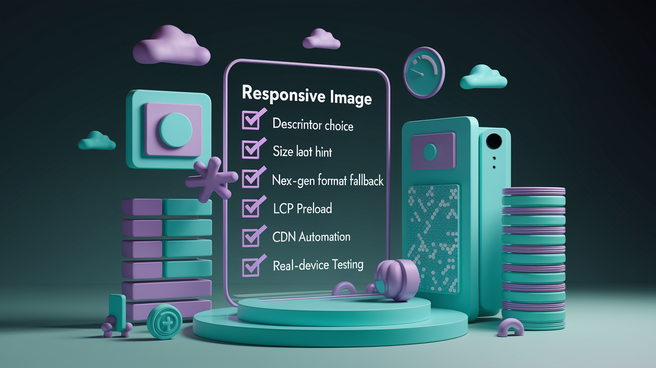
Lazy Loading, Preloading, and Progressive Strategies for Responsive Web Design Images
Lazy loading defers off-screen images until the user scrolls near them. Add loading="lazy" to any <img> or <picture> element and the browser handles the rest. Critical images, especially the LCP element, should use loading="eager" or omit the attribute entirely to avoid delayed downloads. Combining lazy loading with a blur-up placeholder or a low-resolution inline image gives users a preview while the full file loads.
Preloading tells the browser to fetch a critical image early, before the HTML parser discovers the <img> tag. Use <link rel="preload" as="image"> with the imagesrcset and imagesizes attributes to preload responsive images. The browser will evaluate the sizes and srcset exactly as it would for an <img>, pick the correct file, and start downloading it before render. Safari doesn’t support imagesrcset on preload links, so this technique only works reliably in Chromium and Firefox. When using density descriptors, omit the href attribute on the <link> to prevent non-supporting browsers from downloading the wrong file.
Using imagesrcset and imagesizes for Preloading
Copy the same srcset and sizes values from your <img> into the imagesrcset and imagesizes attributes on the preload link. The browser will pick the same file it would have chosen during normal rendering and fetch it early. You can’t preload MIME-type-based variants because <link> doesn’t support the type attribute for images. If your LCP image uses <picture> with AVIF/WebP/JPG switching, you’ll need to pick one format to preload or skip preloading and rely on browser prioritization.
Best practices for lazy loading and preloading responsive web design images:
Use loading="lazy" on below-the-fold images to defer requests until scroll.
Keep the LCP image eager-loaded and add a preload link with imagesrcset and imagesizes to start the download early.
Omit href on the preload link when using imagesrcset with density descriptors to avoid double downloads in Safari.
Add a low-resolution inline placeholder or blur-up image to improve perceived load speed and reduce layout shift.
Test preload behavior in Chrome, Firefox, and Safari to confirm the correct file is fetched and that fallback behavior works in unsupported browsers.
<link rel="preload" as="image"
  imagesrcset="hero-300.jpg 300w,
               hero-900.jpg 900w,
               hero-1800.jpg 1800w"
  imagesizes="(max-width: 640px) 100vw, 60vw">

<img
  src="hero-default.jpg"
  srcset="hero-300.jpg 300w,
          hero-900.jpg 900w,
          hero-1800.jpg 1800w"
  sizes="(max-width: 640px) 100vw, 60vw"
  loading="eager"
  alt="Product hero shot">
Automated Pipelines and CDNs for Responsive Web Design Images

Generating multiple sizes and formats manually is slow and error-prone. Image CDNs and automated pipelines handle resizing, format conversion, and caching without manual intervention. You upload one high-resolution master file, and the service generates variants on demand or at build time. The CDN serves the correct file based on query parameters, request headers, or client hints.
Server-side automation typically works by detecting the rendered width from JavaScript, sending a request to a PHP or Node.js script, and caching the resized file on disk with a filename built from the display width plus a hash of the original file’s last-modified time and source path. The first request triggers the resize. Subsequent requests serve the cached file instantly. Common breakpoint arrays include widths like 100, 300, 600, 900, 1200, 1600, and 1800 pixels to cover phones, tablets, and desktops with margin for 2x displays.
Key automation and caching strategies:
Use an image CDN with automatic format detection and resizing to reduce manual variant creation.
Store cached variants with filenames that include display width and a hash of the source file’s modification time to bust the cache when the original changes.
Configure the server-side resize script to choose the closest target width from a predefined array instead of generating arbitrary sizes.
Combine client-side JavaScript detection (matchMedia, element.offsetWidth) with a single bundled AJAX request to reduce round trips when multiple images need resizing at once.
| Variant Width | Target Use Case | DPR Coverage | Selection Condition |
|---|---|---|---|
| 300px | Phone portrait, small thumbnails | 1x on 320–640px viewports | sizes ≤ 300px |
| 600px | Phone landscape, tablet portrait | 2x on 320px or 1x on ~600px | sizes ≤ 600px |
| 900px | Tablet landscape, small desktop | 1x on ~900px or 2x on ~450px | sizes ≤ 900px |
| 1800px | Large desktop, retina displays | 2x on ~900px or 1x on ~1800px | sizes > 900px |
Testing, Debugging, and Cross-Browser Behavior for Responsive Web Design Images

Test responsive web design images on real devices and multiple browsers to confirm the correct file is downloaded at each breakpoint and DPR. Browser developer tools show which file the browser requested in the Network panel. Look for the image name and size to verify it matches your expectations. Firefox correctly downloads AVIF backgrounds when available, but Safari lacks support for imagesrcset in preload links, so you’ll see different behavior in the two browsers.
Use Lighthouse or another page-speed tool to detect oversized images and measure potential savings. The “Improve image delivery” audit flags images that are larger than their rendered dimensions and shows the kilobyte difference. If an image is 1800×1200 but renders at 900×600 on screen, the audit will recommend serving a smaller file. Real-user monitoring tools can break down resource load duration and show how much of the page load is occupied by a single LCP image. Values over 50% indicate a heavy optimization target.
Responsive image testing and debugging checklist:
Open the Network panel and filter by images. Reload the page and confirm the correct file is requested at the current viewport and DPR.
Resize the browser window across your breakpoints and watch for new requests when the sizes or media attributes change.
Test on a high-DPI device (2x or higher) to confirm the sharper file is downloaded and rendered crisply.
Check Safari, Chrome, and Firefox to verify imagesrcset preload behavior and AVIF/WebP/JPG format fallback order.
Run Lighthouse and review the “Improve image delivery” audit for oversized images and potential byte savings.
Monitor real-user Core Web Vitals to see how LCP and resource load times behave under production traffic and network conditions.
Key Principles To Remember When Working With Responsive Web Design Images
Don’t mix density descriptors and width descriptors in the same srcset. Provide layout hints with sizes or inline aspect-ratio styles to prevent layout shift without locking dimensions. Use next-gen formats like AVIF and WebP with JPG fallback to reduce file size. Test across DPRs and breakpoints to confirm the browser selects the correct file. Use CDNs or automated pipelines to generate and cache variants so you don’t store dozens of files manually.
Core rules for responsive web design images:
Always choose between 1x/2x or 300w/900w descriptors. Never mix both in one srcset.
Use the sizes attribute to declare rendered width when using width descriptors. Omit fixed width/height attributes to avoid selection conflicts.
List next-gen formats first in <picture> or image-set() and fall back to JPG for maximum browser support.
Preload LCP images with imagesrcset and imagesizes when supported. Omit href when using density descriptors to avoid double downloads.
Test on real devices and check the Network panel to verify the correct file is downloaded at each breakpoint and DPR.
Final Words
You jumped straight into how browsers pick the best file — viewport, target display size math, and DPR — then the practical srcset/sizes rules and common pitfalls.
You also covered picture for art direction and format switching, image-set for CSS backgrounds, lazy loading plus preload patterns, performance tuning, automated CDNs, and testing tips.
Use responsive web design images to cut load time, sharpen visuals, and boost LCP. Tweak one thing, test across screens, and you’ll see the payoff.
FAQ
Q: What are responsive images and why do they matter?
A: Responsive images are image files and markup that let the browser pick the best file for viewport, DPR, and media conditions, reducing bandwidth, speeding load, and improving Core Web Vitals.
Q: How does the browser decide which responsive image to load?
A: The browser decides by evaluating viewport size, calculating the target display size, checking device pixel ratio (DPR), then selecting the closest matching srcset variant to avoid waste.
Q: What’s the difference between width (w) and density (x) descriptors?
A: Width (w) descriptors list image intrinsic widths and require sizes to map display width; density (x) descriptors target DPR (1x, 2x) and don’t need sizes.
Q: How should I use sizes with srcset in practice?
A: Use sizes to describe the image’s expected display width (for example 60vw → 614.4px at 1024px viewport); the browser uses that plus DPR to pick the file.
Q: When should I use the picture element instead of srcset?
A: Use picture when you need art direction (different crops per breakpoint) or format switching via type, so browsers pick AVIF/WebP first then fall back to JPG.
Q: How does type-based format switching work with picture?
A: Type-based switching uses
Q: How do I handle responsive background images in CSS?
A: Use image-set() to list multiple resolutions and formats for background images, include -webkit-image-set for older WebKit, and prefer SVG for vector graphics, not photos.
Q: How should I optimize images for performance and Core Web Vitals?
A: Optimize by compressing files, serving next-gen formats, sizing images correctly, preloading critical LCP images, using CDNs, and removing oversized images detected by Lighthouse.
Q: When should I preload vs lazy-load images?
A: Preload critical images (LCP) with imagesrcset/imagesizes where supported; lazy-load noncritical images with loading=”lazy” and use a blur-up placeholder to improve perceived speed.
Q: How can CDNs and automation help manage responsive images?
A: CDNs can auto-generate multiple sizes and formats, serve from the edge, cache variants, and support hashed filenames and breakpoint arrays to simplify responsive delivery.
Q: How do I test and debug responsive image behavior across browsers?
A: Test using Lighthouse and browser devtools, check DPR breakpoints, verify AVIF/WebP support (Firefox/Safari differences), ensure imagesrcset behavior, and fix oversized image warnings.
